在Chrome中重复线性渐变渲染问题
问题描述 投票:1回答:2
我遇到了一个重复线性渐变的错误,这会影响Chrome中的渲染质量。它们在FireFox中看起来很完美。
我有60度条纹的元素。在FireFox中,条纹的边缘非常光滑,看起来很漂亮。但是,在Chrome中,每个条纹的边缘都是锯齿状的,与FireFox中的渲染相比看起来有点不起眼。
background: repeating-linear-gradient(-60deg, rgba(231, 117, 29, 1.0), rgba(231, 117, 29, 1.0) 10px,rgba(236, 144, 74,1.0) 10px, rgba(236, 144, 74, 1.0) 20px) repeat scroll 0% 0% / 23px 100%;
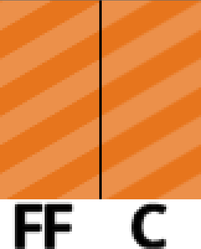
以1x和5x缩放比较一些比较图像:
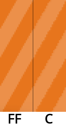
在5倍变焦图像中,您可以看到在FireFox中,条纹边缘是消除锯齿的,而在Chrome中不存在抗锯齿或非常差。
我有小提琴显示效果,这在FireFox和Chrome中并排运行时非常独特:Fiddle
我已经尝试了什么?
我知道并尝试过先前问题和网络的建议,包括添加各种CSS技巧来强制3d加速(即translate(0),perspective: 1000等)和transform-style: preserve-3d。
我也知道在Chrome中使用45度角是平滑的。但是,由于我正在使用的矩形的形状,我想尽可能使用60度角。
我想要什么结果?
我真的很想看到Chrome中的条纹在FireFox中呈现顺畅。
我根本没有关于如何实现这一点的其他想法。
2个回答
投票
在接受了几个月的低质量之后,我终于找到了解决这个问题的方法,其中涉及使用SVG而不是repeating-linear-gradiant。
我创建了一个包含条带的SVG,然后将其嵌入到条带范围内:
body {
  background: #20262E;
}

.slide {
  background-color: rgba(231, 117, 29, 1.0);
  border: 1px solid black;
  height: 80px;
  overflow: hidden;
}

.stripe {
  width: 120%;
  height: 100%;
  display: inline-block;
}

.stripe svg {
  animation: slide 1s linear infinite;
  color: rgba(236, 144, 74,1.0);
}

@keyframes slide {
    0% { transform: translateX(0); }
    100% { transform: translateX(-40px); }
}
<div class="slide">
<span class="stripe">
<svg xmlns="http://www.w3.org/2000/svg" width="100%" height="100%">
<defs>
<pattern id="stripe" patternUnits="userSpaceOnUse" width="20" height="20" patternTransform="rotate(60)">
<line x1="0" y="0" x2="0" y2="20" stroke="currentColor" stroke-width="20" />
</pattern>
</defs>
<rect width="100%" height="100%" fill="url(#stripe)" opacity="1" />
</svg>
</span>
</div>.stripe元素的宽度设置为父级的120%,以允许条带的右侧在容器内正确地进行动画处理。
结果在这里清晰可见:
您可以看到虽然Chrome和FireFox的条纹呈现的略有不同,但Chrome正确地对其进行抗锯齿处理,因此它看起来比之前更加平滑。
还有一个Fiddle显示这个工作。
投票
我遇到过同样的问题。我在没有SVG的情况下通过在颜色变化时添加单个渐变像素来解决它。例:
background: repeating-linear-gradient(-60deg, white 0, blue 1px, blue 10px, white 11px, white 20px);

最新问题
- 无法使用 Spark dataframe 和 scala 创建 CSV,而是创建文件夹名称中包含“.csv”的文件夹
- 导入模块的多个版本/分支以在 Julia 中进行基准测试
- react-snap 指向 js 和 css 中图像的 localost:4567
- 在 html 视频上当前播放位置不会改变
- 我们有 2 个相同的 URL,其中 1 个末尾带有 / ,另一个没有 .谷歌会考虑不同的页面还是相似的页面?
- 使用分隔符读取制表符分隔的文件
- AWS lambda 实例的粘性
- 适用于 Outlook 的 Office 加载项未在应用程序上侧载
- Doxygen:如何在中添加 C 注释
- 如何检测背景嘈杂的图像中的正方形
- Testcontainers container.getHost() 在本地与 GitLab 管道的行为不同
- Spark:java.lang.NoClassDefFoundError:scala/collection/mutable/ArraySeq$ofRef
- Azure IoT 中心是否同时维护设备孪生和数字孪生?
- 搜索引用或重构时如何限制搜索目录?
- 3d 空间中 3 点之间的角度
- AWS Fargate 服务 - 传入流量运行状况,但没有传出流量运行状况
- React Useeffect - 在浏览器中连续运行
- 2024:chrome 无法访问 python selenium
- Spring Boot 服务中的 POST 负载为零
- .github worflow yml 文件应该被忽略吗?