使用文本在div后面垂直对齐hr
问题描述 投票:3回答:3
我正在尝试创建一个横幅/标题,在主div后面有一条线。我希望标题的行和文本位于中间(垂直),如下所示:
问题是如果我改变浏览器的大小,hr和文本不对齐(垂直)。以下是第一个版本:
.section {
	clear: both;
	padding: 0px;
	margin: 0px;
}

.col {
    text-align:center;
	display: block;
	float:left;
	margin: 1% 0 1% 0%;
}
.col:first-child { margin-left: 0; }

.group:before,
.group:after { content:""; display:table; }
.group:after { clear:both;}
.group { zoom:1; /* For IE 6/7 */ }

.span_3_of_3 { width: 100%; }
.span_2_of_3 { width: 66.66%; }
.span_1_of_3 { width: 33.33%; }

@media only screen and (max-width: 480px) {
	.col {  margin: 1% 0 1% 0%; }
	.span_3_of_3, .span_2_of_3, .span_1_of_3 { width: 100%; }
}

#middle
{
  background:#CCC;
  color:#FC3699;
  height:100px;
  margin-top:0;
  line-height:100px;
}

hr {
  margin-top:40px;
  border:2px solid #FC3699;
}
<div class="section group">
<div class="col span_1_of_3">
<div class="topsection">
<div class="header"><hr /></div>
</div>
</div>
<div id="middle" class="col span_1_of_3">
aaaaaaa
</div>
<div class="col span_1_of_3">
<div class="topsection">
<div class="header"><hr /></div>
</div>
</div>
</div>这是第二个版本。而不是有3列我可以使用下面的代码片段。问题出在这一行:
高度:100像素; line-height:100px;
我希望高度为100%。但线高不能:
.main {
    height:100%;
    min-height:100px;
    display: block;
    text-align: center;
    overflow: hidden;
    white-space: nowrap;
}

.main > span {
    width:200px;
    height:100px;
    line-height: 100px;
    background:#F1F1F1;
    position: relative;
    display: inline-block;
}

.main > span:before,
.main > span:after {
    content: "";
    position: absolute;
    top: 50%;
    width: 9999px;
    height: 3px;
    background: #FC3699;
}

.main > span:before {
    right: 100%;
    margin-right: 15px;
}

.main > span:after {
    left: 100%;
    margin-left: 15px;
}
<div class="main">
<span style="vertical-align: middle;">Text</span>
</div>这是第三个也是最好的版本,我只需要text-aling:center;文本。但即使我在CSS中添加它,它也不起作用是有原因的:
.main {
    height:100%;
    min-height:100px;
    display: block;
    text-align: center;
    overflow: hidden;
    white-space: nowrap;
}

.main > span {
    width:200px;
    height:100px;
    line-height: 100px;
    background:#F1F1F1;
    position: relative;
    display: inline-block;
}

.main > span:before,
.main > span:after {
    content: "";
    position: absolute;
    top: 50%;
    width: 9999px;
    height: 3px;
    background: #FC3699;
}

.main > span:before {
    right: 100%;
}

.main > span:after {
    left: 100%;
}

#child {
    display: table-cell;
    vertical-align: middle;
}
<div class="main">
<span><div id="child">Text</div></span>
</div>3个回答
3
投票
投票
如果flexbox是一个选项,这很容易 - 你只需要给
  display: flex;
  justify-content:center;
  align-items:center;
并且您可以取消所有定位和宽度计算 - 请参阅下面的演示:
.main {
  height: 100%;
  min-height: 100px;
  display: flex;
  justify-content:center;
  align-items:center;
  width: 100%;
  text-align: center;
  white-space: nowrap;
}
.main > span {
  width: 200px;
  height: 100px;
  background: #F1F1F1;
  display: inline-flex;
  justify-content:center;
  align-items:center;
}
.main:before,
.main:after {
  content: "";
  height: 3px;
  background: #FC3699;
  flex:1;
}
<div class="main">
<span>Text</span>
</div>1
投票
投票
问题是你有1%的.col边距和hr的固定位置。
我建议使用:before作为包装,并将其垂直放置在包装纸中间。这样即使更改了包装器高度,行也将相对于包装器位于相同的位置(jQuery仅用于演示):
$(document).ready(function() {
  setInterval(function() {
    $('.col3').animate(
      {height: 300},
      2000,
      function() {
        $('.col3').animate({height: 120}, 2000);
      });
  }, 5000);
})
* {
box-sizing: border-box;
}
.col3 {
width: 33.33333%;
height: 120px;
display: inline-block;
background-color: grey;
color: #fc3699;
z-index: 10;
position: relative;
margin: 1% 0;
}
.col3:before {
content: '';
height: 100%;
vertical-align: middle;
display: inline-block;
}
.wrapper {
position: relative;
text-align: center;
}
.wrapper:before {
content: '';
display: block;
width: 100%;
height: 4px;
background-color: #fc3699;
position: absolute;
left: 0;
top: 50%;
margin-top: -2px;
}<script src="https://ajax.googleapis.com/ajax/libs/jquery/2.1.1/jquery.min.js"></script>
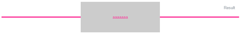
<div class="wrapper">
<div class="col3">
aaaaa
</div>
</div>1
投票
投票
我是这样做的,带有一个图标:
<div class="propos_underline marginbottom">
            <div class="icon icon-cubes"></div>
            <div class="clear"></div>
        </div>
CSS:
.propos_underline{
  height: 1px;
  width: 60%;
  margin: 0 auto;
  background-color: #d4d8da;
  position: relative;
}

.propos_underline .icon{
   position: absolute;
   width: 70px;
   height: 40px;
   background: #ffffff;
   font-size: 30px;
   margin: auto;
   top: 0;
   bottom: 0;
   left: 0;
   right: 0;
   color: #d4d8da;
}
.icon-cubes:before {
   content: "\e993";
}
结果:

最新问题
- 如何更改QTextOption.ShowTabsAndSpaces使用的字符?
- std::Optional 的替代品,可以报告失败原因
- 如何使用 Powershell 获取 MSI 属性:版本值(在 MECM 的检测方法规则中找到)?
- 客户在 woocommerce 注册时通过电子邮件确认
- C 中的全局文件指针
- 使用struct __sk_buff *skb从tc代码中获取PID
- 如果存在金丝雀但无法找出其价值,如何利用 BOF 漏洞
- MQTT 客户端未订阅给定主题(或回调未按预期工作)
- 每次调用特定的 make 目标时都从命令行调用更新 CMAKE 变量?
- 如何在Window上编译Steinberg ASIO SDK?
- 使用 array_push() 将二维数组的行追加到另一个二维数组
- 如何抑制来自 Perl 模块的错误消息?
- PHP - array_push 错误的 JSON 格式
- HttpClientModule 在 Angular 18 中已弃用,替代品是什么?
- 我可以在 MySQL 中生成的列表达式中使用局部变量吗?
- SignTool 错误:此文件格式无法签名,因为无法识别 - Maui .net8
- AWS DMS(数据库迁移服务)数据类型转换问题
- 尽管从站 ID 正确,但从所需寄存器检索的数据不正确
- 特定月份每个工作日的出现次数与另一列的文本相结合
- 在不支持adcx adox操作的平台上转换它们
© www.soinside.com 2019 - 2024. All rights reserved.