删除空格每个div元素
问题描述 投票:1回答:4
美好的一天,
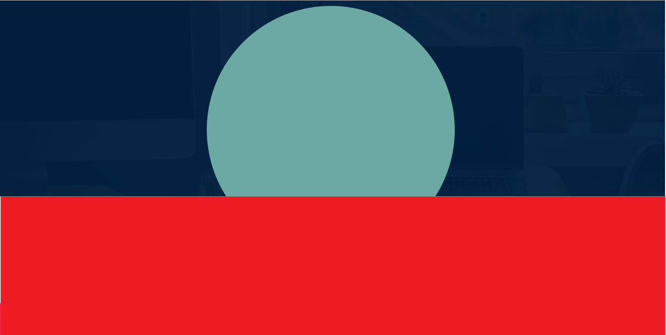
正如您在图像中看到的那样,它们在桌面视图中相互粘贴,但是在实际代码中我无法做到这一点,我尝试使用溢出但结果不是我所期望的。继承人我的代码https://jsfiddle.net/Jury/0bqpLw1h/1/ ..非常感谢你的帮助
<body>
<div class="body">
    <header>
        <div class="menu-toggle" id="hamburger">
                <i class="fas fa-bars"></i>
        </div>
        <div class="overlay"></div>
        <nav>
            <img src="img/logo2.png" alt="Logo" class="logo">
            <ul>
                <li><a href="#">Home</a></li>
                <li><a href="#">Services</a></li>
                <li><a href="#">About</a></li>
                <li><a href="#">Contact</a></li>
            </ul>
            <div class="menu">
                <a href="#" class="btn">Contact</a>
                <a href="#" class="btn btninfo">Info</a>
            </div>
        </nav>
    </header>
    <div class="content">
            <h1 class="possible">Everything is Possible</h1>
            <div class="circle">

            </div>
    </div>

    <div class="about">
        <h1>Helow</h1>
    </div>
</div>
4个回答
0
投票
投票
* {
    margin: 0;
    padding: 0;
    box-sizing: border-box;
}

html {
    font-size: 10px;
}

a {
    text-decoration: none;
}

.body {
    height: 100vh;
    background-image: linear-gradient(
                    rgba(0, 31, 63, 0.958),
                    rgba(0, 31, 63, 0.958) )
                    ,url(img/bgmain.jpg);
    background-size: cover;
    background-repeat: no-repeat;
    background-attachment: fixed;

}

.overlay{
	background-color: rgba(0,0,0,.95);
	position: fixed;
	right: 0;
	left: 0;
	top: 0;
	bottom: 0;
	transition: opacity 650ms;
	transform: scale(0);
	opacity: 0;
    display: none;
}

/* Hamburger Menu */

.menu-toggle {
    position: fixed;
    top: 2.5rem;
    right: 2.5rem;
    color: #eeeeee;
    font-size: 3rem;
    cursor: pointer;
    z-index: 1000;
    display: none;
}

/* End of Hamburger Menu */

/* Navagation Link */
header {
    font-family: "Raleway", sans-serif;
    position: relative;
    width: 100%;
    height: 10rem;
    z-index: 2;
}

nav {
    /* padding-top: 5rem; */
    display: flex;
    height: 100%;
    justify-content: space-between;
    align-items: center;
    text-transform: uppercase;
    font-size: 1.4rem;
}

nav img {
    height: 7rem;
    margin: 0 0 0 12rem;
}

nav ul {
    display: flex;
}

nav ul li {
    list-style: none;
}

nav ul li a {
    font-weight: 900;
    font-size: 1.4rem;
    padding: 1rem 0;
    margin: 0 1rem;
    position: relative;
    color: #eee;
}

.menu {
    margin: 0 12rem 0 0;
}

.menu a {
    font-size: 1rem;
    margin: 0 .1rem;
    outline: none;
}

.menu a:last-child{
    margin-right: 0;
}

nav ul li a::before,
nav ul li a::after {
    content: '';
    position: absolute;
    width: 100%;
    height: 2px;
    background-color: #f4511e;
    left: 0;
    transform: scaleX(0);
	transition: all .5s;
}

nav ul li a::before{
	top: 0;
	transform-origin: left;
}

nav ul li a::after{
	bottom: 0;
	transform-origin: right;
}

nav ul li a:hover::before,
nav ul li a:hover::after{
	transform: scaleX(1);
}

.btn {
        border: none;
        border-radius: 30px;
        background-color: #f4511e;
        color: #fff;
        font-size: 1rem;
        font-weight: bold;
        text-align: center;
        padding: 9px;
        width: 70px;
        text-transform: uppercase;
}

.btninfo{
    padding: 9px 19px;
}
/* End of Navagation Menu */

/* Content of the Website */

/* .content {
    height: 100vh;
    overflow: hidden;
} */

.possible {
    color: #fff;
    text-align: center;
    letter-spacing: 10px;
    text-transform: uppercase;
    padding-top: 6rem;
    font-family: "Coiny", sans-serif;
    font-size: 3.2rem;
}

.circle {
    position: absolute;
    border-radius: 50%;
    width: 100%;
    height: 50rem;
    background-color: #6CA9A5;
    z-index: 1;
    margin: 0;
    margin-top: -75%;
}

.about {
    height: 100vh;
    width:100%;
    background-color: crimson;
    z-index: 3;
    position:absolute;
    /*bottom : 0;*/
}


/* Media Queries for tablet and mobile */

@media screen and (max-width: 990px) {

    .menu-toggle {
        display: block;
    }

    nav {
        display: none;
        flex-direction: column;
        justify-content: space-evenly;
        align-items: center;
        height: 100vh;
        text-align: center;
    }

     nav ul {
        flex-direction: column;
    }

    nav ul li {
        margin-top: 5rem;
    }

     nav ul li a {
        margin 0;
        font-size: 3rem;
    }

    nav ul li:first-child{
        margin-top: 0;
    }

    .overlay.menu-open,
        nav.menu-open{
	  display: flex;
	  transform: scale(1);
	  opacity: 1;
    }

  nav img {
      height: 15rem;
      margin: 0;
  }

  .menu {
      margin-right: 0;
  }
}
<!DOCTYPE html>
<html lang="en">
<head>
<meta charset="UTF-8">
<meta name="viewport" content="width=device-width, initial-scale=1.0">
<meta http-equiv="X-UA-Compatible" content="ie=edge">
<link href="https://fonts.googleapis.com/css?family=Raleway|Coiny|Roboto|Montserrat" rel="stylesheet">
<link rel="stylesheet" href="https://use.fontawesome.com/releases/v5.7.1/css/all.css">
<link rel="stylesheet" href="style.css">
<title>Jury Gregorio - Welcome</title>
</head>
<body>
<div class="body">
<header>
<div class="menu-toggle" id="hamburger">
<i class="fas fa-bars"></i>
</div>
<div class="overlay"></div>
<nav>
<img src="img/logo2.png" alt="Logo" class="logo">
<ul>
<li><a href="#">Home</a></li>
<li><a href="#">Services</a></li>
<li><a href="#">About</a></li>
<li><a href="#">Contact</a></li>
</ul>
<div class="menu">
<a href="#" class="btn">Contact</a>
<a href="#" class="btn btninfo">Info</a>
</div>
</nav>
</header>
<div class="content">
<h1 class="possible">Everything is Possible</h1>
<div class="circle">
</div>
</div>
<div class="about">
<h1>Helow</h1>
</div>
</div>
<script>
var open = document.getElementById('hamburger');
var changeIcon = true;
open.addEventListener("click", function(){
var overlay = document.querySelector('.overlay');
var nav = document.querySelector('nav');
var icon = document.querySelector('.menu-toggle i');
overlay.classList.toggle("menu-open");
nav.classList.toggle("menu-open");
if (changeIcon) {
icon.classList.remove("fa-bars");
icon.classList.add("fa-times");
changeIcon = false;
}
else {
icon.classList.remove("fa-times");
icon.classList.add("fa-bars");
changeIcon = true;
}
});
</script>
</body>
</html>0
投票
投票
css的微小变化可以使图像看起来像。只需在.about做一个小改动。这将有效。 output of the below code
        .about {
            position: absolute;
            height: 100vh;
            background-color: crimson;
            z-index: 3;
            width: 100%;
            margin-top: -270px;
        }
0
投票
投票
我做了一些更改以及对CSS文件的一些简要解释,特别是.content和.circle选择器。最佳浏览桌面环境。
0
投票
投票
只需在媒体查询之前添加此样式,并在此小提琴https://jsfiddle.net/v8r463je/上查看它
 .about {
            position: absolute;
            height: 100vh;
            background-color: crimson;
            z-index: 3;
            width: 100%;
            margin-top: -270px;
        }
.content{
    background-color: #0b2947;
}
/* Media Queries for tablet and mobile */
这里输出
* {
    margin: 0;
    padding: 0;
    box-sizing: border-box;
}

html {
    font-size: 10px;
}

a {
    text-decoration: none;
}

.body {
    height: 100vh;
    background-image: linear-gradient(
                    rgba(0, 31, 63, 0.958),
                    rgba(0, 31, 63, 0.958) )
                    ,url(img/bgmain.jpg);
    background-size: cover;
    background-repeat: no-repeat;
    background-attachment: fixed;

}

.overlay{
	background-color: rgba(0,0,0,.95);
	position: fixed;
	right: 0;
	left: 0;
	top: 0;
	bottom: 0;
	transition: opacity 650ms;
	transform: scale(0);
	opacity: 0;
    display: none;
}

/* Hamburger Menu */

.menu-toggle {
    position: fixed;
    top: 2.5rem;
    right: 2.5rem;
    color: #eeeeee;
    font-size: 3rem;
    cursor: pointer;
    z-index: 1000;
    display: none;
}

/* End of Hamburger Menu */

/* Navagation Link */
header {
    font-family: "Raleway", sans-serif;
    position: relative;
    width: 100%;
    height: 10rem;
    z-index: 2;
}

nav {
    /* padding-top: 5rem; */
    display: flex;
    height: 100%;
    justify-content: space-between;
    align-items: center;
    text-transform: uppercase;
    font-size: 1.4rem;
}

nav img {
    height: 7rem;
    margin: 0 0 0 12rem;
}

nav ul {
    display: flex;
}

nav ul li {
    list-style: none;
}

nav ul li a {
    font-weight: 900;
    font-size: 1.4rem;
    padding: 1rem 0;
    margin: 0 1rem;
    position: relative;
    color: #eee;
}

.menu {
    margin: 0 12rem 0 0;
}

.menu a {
    font-size: 1rem;
    margin: 0 .1rem;
    outline: none;
}

.menu a:last-child{
    margin-right: 0;
}

nav ul li a::before,
nav ul li a::after {
    content: '';
    position: absolute;
    width: 100%;
    height: 2px;
    background-color: #f4511e;
    left: 0;
    transform: scaleX(0);
	transition: all .5s;
}

nav ul li a::before{
	top: 0;
	transform-origin: left;
}

nav ul li a::after{
	bottom: 0;
	transform-origin: right;
}

nav ul li a:hover::before,
nav ul li a:hover::after{
	transform: scaleX(1);
}

.btn {
        border: none;
        border-radius: 30px;
        background-color: #f4511e;
        color: #fff;
        font-size: 1rem;
        font-weight: bold;
        text-align: center;
        padding: 9px;
        width: 70px;
        text-transform: uppercase;
}

.btninfo{
    padding: 9px 19px;
}
/* End of Navagation Menu */

/* Content of the Website */

/* .content {
    height: 100vh;
    overflow: hidden;
} */

.possible {
    color: #fff;
    text-align: center;
    letter-spacing: 10px;
    text-transform: uppercase;
    padding-top: 6rem;
    font-family: "Coiny", sans-serif;
    font-size: 3.2rem;
}

.circle {
    position: relative;
    border-radius: 50%;
    width: 50rem;
    height: 50rem;
    background-color: #6CA9A5;
    margin: 10rem auto;
    z-index: 1;

}

 .about {
            position: absolute;
            height: 100vh;
            background-color: crimson;
            z-index: 3;
            width: 100%;
            margin-top: -270px;
        }
.content{
	background-color: #0b2947;
}


/* Media Queries for tablet and mobile */

@media screen and (max-width: 990px) {

    .menu-toggle {
        display: block;
    }

    nav {
        display: none;
        flex-direction: column;
        justify-content: space-evenly;
        align-items: center;
        height: 100vh;
        text-align: center;
    }

     nav ul {
        flex-direction: column;
    }

    nav ul li {
        margin-top: 5rem;
    }

     nav ul li a {
        margin 0;
        font-size: 3rem;
    }

    nav ul li:first-child{
        margin-top: 0;
    }

    .overlay.menu-open,
        nav.menu-open{
	  display: flex;
	  transform: scale(1);
	  opacity: 1;
    }

  nav img {
      height: 15rem;
      margin: 0;
  }

  .menu {
      margin-right: 0;
  }
}
<!DOCTYPE html>
<html lang="en">
<head>
<meta charset="UTF-8">
<meta name="viewport" content="width=device-width, initial-scale=1.0">
<meta http-equiv="X-UA-Compatible" content="ie=edge">
<link href="https://fonts.googleapis.com/css?family=Raleway|Coiny|Roboto|Montserrat" rel="stylesheet">
<link rel="stylesheet" href="https://use.fontawesome.com/releases/v5.7.1/css/all.css">
<link rel="stylesheet" href="style.css">
<title>Jury Gregorio - Welcome</title>
</head>
<body>
<div class="body">
<header>
<div class="menu-toggle" id="hamburger">
<i class="fas fa-bars"></i>
</div>
<div class="overlay"></div>
<nav>
<img src="img/logo2.png" alt="Logo" class="logo">
<ul>
<li><a href="#">Home</a></li>
<li><a href="#">Services</a></li>
<li><a href="#">About</a></li>
<li><a href="#">Contact</a></li>
</ul>
<div class="menu">
<a href="#" class="btn">Contact</a>
<a href="#" class="btn btninfo">Info</a>
</div>
</nav>
</header>
<div class="content">
<h1 class="possible">Everything is Possible</h1>
<div class="circle">
</div>
</div>
<div class="about">
<h1>Helow</h1>
</div>
</div>
<script>
var open = document.getElementById('hamburger');
var changeIcon = true;
open.addEventListener("click", function(){
var overlay = document.querySelector('.overlay');
var nav = document.querySelector('nav');
var icon = document.querySelector('.menu-toggle i');
overlay.classList.toggle("menu-open");
nav.classList.toggle("menu-open");
if (changeIcon) {
icon.classList.remove("fa-bars");
icon.classList.add("fa-times");
changeIcon = false;
}
else {
icon.classList.remove("fa-times");
icon.classList.add("fa-bars");
changeIcon = true;
}
});
</script>
</body>
</html>最新问题
- 是否可以在--test-targets命令中指定多个注释
- 如何使用已签名自定义属性的DispatchProxy拦截方法?
- 将 Function App 计划从消耗更新为标准时出现意外错误。但仅限于部分人
- 为什么我的网站在 iPhone 上加载时出现错误,即使它在 Android 上运行良好?
- 创建动态日期,这样我就不用手动输入明年的日期了
- React 中的主题更改
- Spring 调度程序 - 获取下一个事件的时间
- 访问 Azure VM 上的开放端口
- futurebuilder 在初始化之前运行
- 适用于 iOS 的 .NET MAUI 自定义 ScrollView 中的错误
- 单元测试使用 Mockito 单元测试 Servlet:模拟行为未执行
- 在x86汇编中,为什么当分子来自RDRAND时DIV会抛出异常?
- maui:在 mvvm 中单击按钮后从视图内部导航到另一个视图
- UIButton颜色未恢复为原始颜色
- 获取所有选定行的表格单元格的内容
- Windows 11 Copilot 的日志存储在哪里?
- docker laravel mysql 权限被拒绝
- 如何在 TypeScript 中声明“任意”模块?
- TYPO3:何时/如何使用define('TYPO3_MODE','FE');
- 使用 cvs2git 将 cvs 转换为 git ;如何优雅地解决错误“符号的多个定义”
© www.soinside.com 2019 - 2024. All rights reserved.