两个div元素需要并排
问题描述 投票:-1回答:1
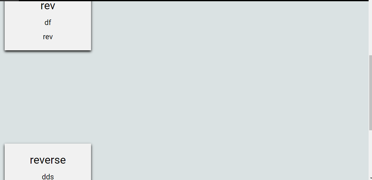
我有一个单一的div模板,我已经通过PHP生成了多个带有动态内容的divs.现在的问题是我的divs创建在不规则的位置(检查下面的图片),我想要的是。"我希望每行有四个大小相同的div,每个div必须是并排的,并且每个div之间需要保持一个小的间隙"。
这是我的div。
<div class="row" id="except">
  <div class="column">
    <div class="card">
      <h1><?php echo"$value"; ?></h1>
      <h3><?php echo"$description";?></h3>
      <h3><?php echo"$index";?></h3>
    </div>
  </div>
</div>
这是我为每个div设计的CSS。
<style>
    #except{
      width:1200px;
      height:500px;
      margin-left:160px;
    }
* {
  box-sizing: border-box;
}

body {
  font-family: Arial, Helvetica, sans-serif;
}

/* Float four columns side by side */
.column {
  float: left;
  width: 25%;
  padding: 0 10px;
}

/* Remove extra left and right margins, due to padding */
.row {margin: 0 -5px;}

/* Clear floats after the columns */
.row:after {
  content: "";
  display: table;
  clear: both;
}

/* Responsive columns */
@media screen and (max-width: 600px) {
  .column {
    width: 100%;
    display: block;
    margin-bottom: 20px;
  }
}

/* Style the counter cards */
.card {
  box-shadow: 0 4px 8px 0 rgba(0, 0, 0, 1);
  padding: 16px;
  text-align: center;
  background-color: #f1f1f1;
  transition: width 2s,height 4s;
  transition-timing-function: ease-in-out;
}
    .card:hover{
      background-color: lightgreen;
      transition-timing-function: ease-in-out;
      width: 300px;
      height: 300px;
    }
</style>
1个回答
1
投票
投票
简单的解决方法,只要把行的div去掉就可以了。我使用这个完全相同的代码从w3学校为我的商店和所有我不得不做的是删除行div和它的工作。)
编辑,添加了下面的代码。我不得不删除php部分的测试目的。编辑2,你也需要摆脱#except其他明智的,将打破它。
<!DOCTYPE html>
<html lang="en">
<head>
    <meta charset="UTF-8">
    <title>Title</title>

    <style>

        * {
            box-sizing: border-box;
        }

        body {
            font-family: Arial, Helvetica, sans-serif;
        }

        /* Float four columns side by side */
        .column {
            float: left;
            width: 25%;
            padding: 0 10px;
        }

        /* Remove extra left and right margins, due to padding */
        .row {margin: 0 -5px;}

        /* Clear floats after the columns */
        .row:after {
            content: "";
            display: table;
            clear: both;
        }

        /* Responsive columns */
        @media screen and (max-width: 600px) {
            .column {
                width: 100%;
                display: block;
                margin-bottom: 20px;
            }
        }

        /* Style the counter cards */
        .card {
            box-shadow: 0 4px 8px 0 rgba(0, 0, 0, 1);
            padding: 16px;
            text-align: center;
            background-color: #f1f1f1;
            transition: width 2s,height 4s;
            transition-timing-function: ease-in-out;
        }
        .card:hover{
            background-color: lightgreen;
            transition-timing-function: ease-in-out;
            width: 300px;
            height: 300px;
        }
    </style>

</head>
<body>

    <div class="column">
        <div class="card">
            <h1>Rev</h1>
            <h3>Df</h3>
            <h3>Rev</h3>
        </div>
    </div>
    <div class="column">
        <div class="card">
            <h1>Rev</h1>
            <h3>Df</h3>
            <h3>Rev</h3>
        </div>
    </div>


</body>
</html>
1
投票
投票
你需要修改你的css代码,如下图所示。
#except {
    width: 100%;
    height: 100%;
    display: flex;
    flex-wrap: wrap;
}
.column {
    float: left;
    width: 25%;
    padding: 0 10px;
    margin-bottom: 20px;
    flex-basis: 25%;
}
最新问题
- STM32F401RE 的 PWM 问题
- STM32 ADC DMA 低原始/电压读数
- 无法在 VBA 中使用 Getdetailsof 获取 Microsoft Word 文档属性
- 从另一个组件调用useEffect和useLayoutEffect
- 从 apisetu.gov.in API 获取车辆登记详细信息
- 如何禁用chrome中突然被杀死时的“恢复选项卡”弹出窗口?
- DateOnly 和 TimeOnly 映射到 SQL Server
- file_put_contents 在 php 中自动递增重复的 int 值?
- 错误:“I/进程 (26960):正在发送信号。PID:26960 SIG:9 与设备的连接丢失。”在 android studio 上使用 flutter 时
- 如何在 zip 文件上使用 grep 命令
- Uiautomatorviewer 获取 UI 层次结构 XML 文件时出错:com.android.ddmlib.SyncException:远程对象不存在
- 解决有关格式说明符的 C 宏扩展编译错误
- 保存并加载kerascv yolo模型(TypeError:'_DictWrapper'对象不可调用)
- 菜单栏应用程序的选项卡视图无法正确呈现
- 根据两个相邻元素之间的差异将数组拆分为子数组
- 基于W_number的sql列移位
- 检查 Makefile 中是否存在库
- 解决有关格式说明符的 C 宏扩展编译错误
- 如何让Javascript水平平滑滚动
- 使用同一个表上的其他列计算列
© www.soinside.com 2019 - 2024. All rights reserved.