图像不适合bootstrap 4中的轮播
问题描述 投票:-2回答:3
我有一个带图像的旋转木马。但是图像显示得太大了。
这是我的HTML代码:
<header>
    <div id="carouselExampleIndicators" class="carousel slide" data-ride="carousel">
      <ol class="carousel-indicators">
        <li data-target="#carouselExampleIndicators" data-slide-to="0" class="active"></li>
        <li data-target="#carouselExampleIndicators" data-slide-to="1"></li>
        <li data-target="#carouselExampleIndicators" data-slide-to="2"></li>
      </ol>
      <div class="carousel-inner" role="listbox">
        <!-- Slide One - Set the background image for this slide in the line below -->
        <div class="carousel-item active" style="background-image: url(/images/holz_5.jpg)">
          <div class="carousel-caption d-none d-md-block">
            <h3>First Slide</h3>
            <p>This is a description for the first slide.</p>
          </div>
        </div>
        <!-- Slide Two - Set the background image for this slide in the line below -->
        <div class="carousel-item" style="background-image: url(/images/holz_6.jpg)">
          <div class="carousel-caption d-none d-md-block">
            <h3>Second Slide</h3>
            <p>This is a description for the second slide.</p>
          </div>
        </div>
        <!-- Slide Three - Set the background image for this slide in the line below -->
        <div class="carousel-item" style="background-image: url(/images/holz_4.jpg)">
          <div class="carousel-caption d-none d-md-block">
            <h3>Third Slide</h3>
            <p>This is a description for the third slide.</p>
          </div>
        </div>
      </div>
      <a class="carousel-control-prev" href="#carouselExampleIndicators" role="button" data-slide="prev">
        <span class="carousel-control-prev-icon" aria-hidden="true"></span>
        <span class="sr-only">Previous</span>
      </a>
      <a class="carousel-control-next" href="#carouselExampleIndicators" role="button" data-slide="next">
        <span class="carousel-control-next-icon" aria-hidden="true"></span>
        <span class="sr-only">Next</span>
      </a>
    </div>
  </header>
这是我的css代码:
.carousel-item {
  height: 65vh;
  min-height: 300px;
  background: no-repeat center center scroll;
  -webkit-background-size: cover;
  -moz-background-size: cover;
  -o-background-size: cover;
  background-size: cover;
  object-fit: cover !important;
}
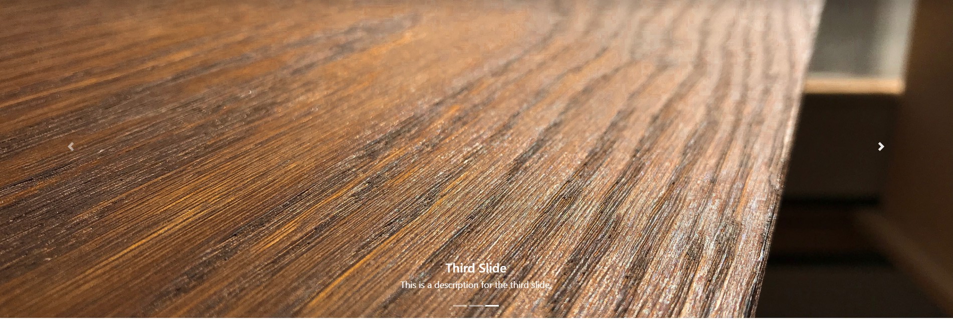
这是它的样子:
这是原始图片:
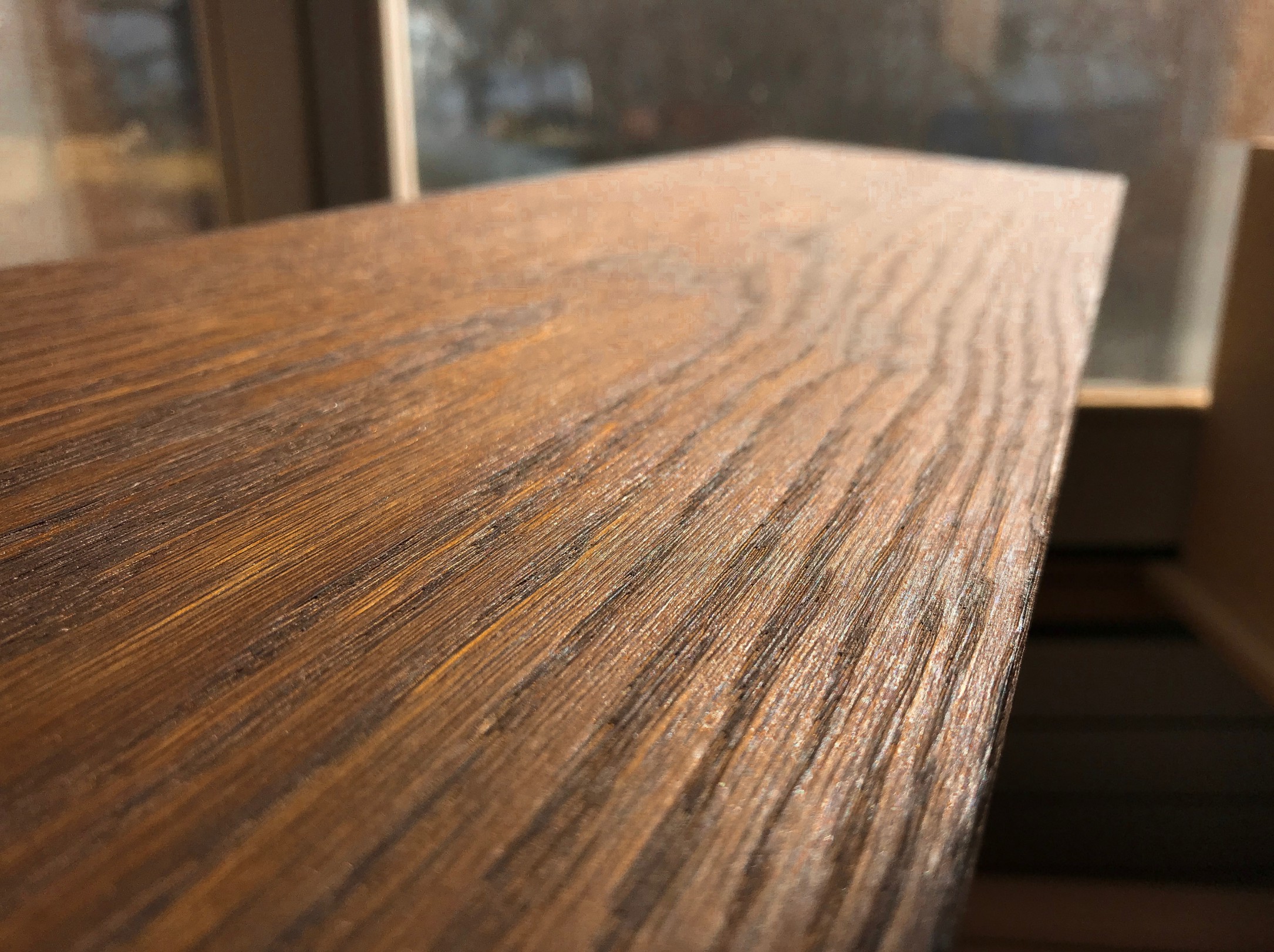
为什么它在图片中如此放大?我希望它保持原始尺寸,适合旋转木马。
3个回答
1
投票
投票
您可以将代码与此进行比较。这些图片在这里完美缩放。
更新:从CSS代码中删除img样式标记,以避免所有单个图像的全局样式。
.carousel-item {
  background: no-repeat center center scroll;
  -webkit-background-size: cover;
  -moz-background-size: cover;
  -o-background-size: cover;
  background-size: cover;
  object-fit: cover !important;
}
<link rel="stylesheet" href="https://stackpath.bootstrapcdn.com/bootstrap/4.3.1/css/bootstrap.min.css" integrity="sha384-ggOyR0iXCbMQv3Xipma34MD+dH/1fQ784/j6cY/iJTQUOhcWr7x9JvoRxT2MZw1T" crossorigin="anonymous">
<script src="https://code.jquery.com/jquery-3.3.1.slim.min.js" integrity="sha384-q8i/X+965DzO0rT7abK41JStQIAqVgRVzpbzo5smXKp4YfRvH+8abtTE1Pi6jizo" crossorigin="anonymous"></script>
<script src="https://cdnjs.cloudflare.com/ajax/libs/popper.js/1.14.7/umd/popper.min.js" integrity="sha384-UO2eT0CpHqdSJQ6hJty5KVphtPhzWj9WO1clHTMGa3JDZwrnQq4sF86dIHNDz0W1" crossorigin="anonymous"></script>
<script src="https://stackpath.bootstrapcdn.com/bootstrap/4.3.1/js/bootstrap.min.js" integrity="sha384-JjSmVgyd0p3pXB1rRibZUAYoIIy6OrQ6VrjIEaFf/nJGzIxFDsf4x0xIM+B07jRM" crossorigin="anonymous"></script>
<div id="carouselExampleIndicators" class="carousel slide" data-ride="carousel">
<ol class="carousel-indicators">
<li data-target="#carouselExampleIndicators" data-slide-to="0" class="active"></li>
<li data-target="#carouselExampleIndicators" data-slide-to="1"></li>
<li data-target="#carouselExampleIndicators" data-slide-to="2"></li>
</ol>
<div class="carousel-inner">
<div class="carousel-item active">
<div class="carousel-caption d-none d-md-block">
<h3>Third Slide</h3>
<p>This is a description for the third slide.</p>
</div>
<img src="https://i.stack.imgur.com/8h5Xz.jpg" class="d-block w-100" alt="...">
</div>
<div class="carousel-item">
<div class="carousel-caption d-none d-md-block">
<h3>Third Slide</h3>
<p>This is a description for the third slide.</p>
</div>
<img src="https://i.stack.imgur.com/8h5Xz.jpg" class="d-block w-100" alt="...">
</div>
<div class="carousel-item">
<div class="carousel-caption d-none d-md-block">
<h3>Third Slide</h3>
<p>This is a description for the third slide.</p>
</div>
<img src="https://i.stack.imgur.com/8h5Xz.jpg" class="d-block w-100" alt="...">
</div>
</div>
<a class="carousel-control-prev" href="#carouselExampleIndicators" role="button" data-slide="prev">
<span class="carousel-control-prev-icon" aria-hidden="true"></span>
<span class="sr-only">Previous</span>
</a>
<a class="carousel-control-next" href="#carouselExampleIndicators" role="button" data-slide="next">
<span class="carousel-control-next-icon" aria-hidden="true"></span>
<span class="sr-only">Next</span>
</a>
</div>0
投票
投票
这是我的整个css:这可能是覆盖的东西吗?
*,
*::before,
*::after {
  box-sizing: border-box;
}

html,
body {
  height: 100%;
  margin: 0;
  padding: 0;
}

html {
  font-family: sans-serif;
  line-height: 1.15;
  -webkit-text-size-adjust: 100%;
  -ms-text-size-adjust: 100%;
}

.carousel-item {
  height: 65vh;
  min-height: 300px;
  background: no-repeat center center scroll;
  -webkit-background-size: cover;
  -moz-background-size: cover;
  -o-background-size: cover;
  background-size: cover;
  object-fit: cover !important;
}
h1,
h2,
h3,
h4,
h5,
h6 {
  margin-bottom: 0.5rem;
  font-family: inherit;
  font-weight: 500;
  line-height: 1.2;
  color: inherit;
}

.row {
  display: -ms-flexbox;
  display: flex;
  -ms-flex-wrap: wrap;
  flex-wrap: wrap;
  margin-right: -15px;
  margin-left: -15px;
}

.row img {
  width: 24px;
  height: 24px;
}

.navbar-brand img {
  width: 24px;
  height: 24px;
}

.border-top {
  border-top: 1px solid #dee2e6 !important;
}

footer {
  display: block;
}

.featurette-divider {
  margin: 5rem 0; /* Space out the Bootstrap <hr> more */
}

.featurette-heading {
  font-weight: 300;
  line-height: 1;
  letter-spacing: -0.05rem;
}

@media (min-width: 40em) {
  /* Bump up size of carousel content */
  .carousel-caption p {
    margin-bottom: 1.25rem;
    font-size: 1.25rem;
    line-height: 1.4;
  }

  .featurette-heading {
    font-size: 50px;
  }
}

@media (min-width: 62em) {
  .featurette-heading {
    margin-top: 7rem;
  }
}

.marketing h2 {
  font-weight: 400;
}

.p-2 {
  padding: 0.5rem !important;
  padding-top: 0.5rem !important;
  padding-right: 0.5rem !important;
  padding-bottom: 0.5rem !important;
  padding-left: 0.5rem !important;
}

#testimonia {
  background: rgba(228, 136, 31, 0.8);
  padding: 30px 0 30px 0;
  text-align: center;
  margin-top: 40px;
  font-weight: 400;
  line-height: 1;
  letter-spacing: -0.05rem;
}

#testimonia p {
  font-size: 25px;
}

.navbar-brand {
  font-size: 20px;
  color: #000;
  font-weight: bold;
}

img {
  width: 500px;
  height: 500px;
}

hr {
  box-sizing: content-box;
  height: 0;
  overflow: visible;
}

footer {
  padding-bottom: 30px;
}

#btn1 {
  margin-bottom: 20px;
}

.modal-header {
  background: #e4881f;
}
.full-screen {
  background-size: cover;
  background-position: center;
  background-repeat: no-repeat;
}

a {
  color: #e4881f;
}
0
投票
投票
我认为旋转木马显示器没有任何问题。您需要决定如何在轮播中显示图像。
有两种选择:
1)不要限制旋转木马的高度。
如果不限制旋转木马高度,则整个图像将可见。但是在大屏幕上高度会非常大。所以,在某些时候它更好地约束旋转木马的高度。
2)限制旋转木马的高度。
正如我在您的代码中看到的那样,您已将高度限制为65vh。当您约束轮播项目高度时,图像可以显示在任一个中
cover模式 - 图像填充容器,但如果纵横比不同,可能会裁剪。contain模式 - 图像不会被裁剪,显示整个图像。但根据纵横比,您可能在容器内水平或垂直放置空白区域。
正如我在您的代码中看到的那样,您使用了background-size: cover,因此垂直裁剪图像以填充容器区域。
为了更好地理解,您可以访问下面的stackoverflow文章,了解图像在cover或contain模式中的位置:https://stackoverflow.com/a/27941378/1266447
最新问题
- 有人可以向我解释一下Cookies的samesite属性吗
- 增加节点预言机中 OUT BIND 的大小。 NJS-016:缓冲区太小,无法在错误时进行 OUT 绑定(本机)
- 将elasticsearch CURL请求转换为java
- Laravel 更改时区未反映正确的时间
- Firebase 实时数据库中用于 React 中 CRUD 操作的规则
- xhtml2pdf django 中阿拉伯语的问题
- 正则表达式选择单词中仅包含数字的符号
- Rollup.js 未解决的依赖关系
- 使用 Spring Boot 覆盖 kafka 属性
- 尝试将弹出窗口居中时出现 QML 渐变边框颜色问题
- 为什么将字典传递给 pd.DataFrame() 会生成空数据帧?
- SQL 从连接表中选择不同条件的两行
- 尝试为clamAV指定二进制路径
- discord 机器人时间戳延迟问题
- Deno fresh 应用程序中岛屿加载缓慢的问题
- 悬停时 CSS 旋转框,光标下方有灯光
- ansible 仅在任务失败的情况下运行救援
- AWS RDS MySQL 在私有子网中,如何从我的本地计算机访问 RDS
- 如何更改使用工厂创建的嵌套实体的默认值?
- 如何在Spring授权服务器中使用外部HTML登录表单
© www.soinside.com 2019 - 2024. All rights reserved.