如何让我的设计响应所有屏幕?
问题描述 投票:0回答:1
我需要一些帮助来使我的设计对小屏幕做出响应,这对大屏幕有一点好处,但对小屏幕则不然,请帮助使其响应。
我的
welcome-message body {
margin: 0;
padding: 0;
font-family: Arial, sans-serif;
background-color: #369ee3;
display: flex;
justify-content: center;
align-items: center;
min-height: 100vh;
position: relative;
}
.welcome-message {
text-align: center;
color: #fff;
position: absolute;
top: 60px;
left: 0;
right: 0;
}
.card {
background-color: #fff;
border-radius: 8px;
padding: 40px;
box-shadow: 0 4px 8px rgba(0, 0, 0, 0.1);
max-width: 500px;
width: 100%;
text-align: center;
margin: 20px;
}
.input-group {
margin-bottom: 20px;
}
.input-group input {
width: calc(100% - 20px);
padding: 10px;
border: 1px solid #ccc;
border-radius: 5px;
margin: 0 auto;
outline-color: #009edf;
border: 1px solid #009edf;
}
.btn-login {
width: 100%;
padding: 10px;
border: none;
border-radius: 5px;
background-color: #3498db;
color: #fff;
cursor: pointer;
}
.btn-login:hover {
background-color: #2980b9;
}
.logo-container {
position: absolute;
top: 20px;
left: 20px;
}
.h2-container {
position: absolute;
top: 20px;
right: 20px;
}
.logo {
width: 100px;
height: auto;
}<body>
<div class="logo-container">
<img src="IMlogo.gif" alt="Logo" class="logo">
</div>
<div class="h2-container">
<h2 style="color: #fff; font-family: Lato,Helvetica Neue,Helvetica,Arial,sans-serif; line-height: 1.53333">FS Pro Console</h2>
</div>
<div class="welcome-message">
<h3 style="font-size: 1.125em">
Welcome to the FS Pro Console. Here you can manage your licenses.
</h3>
</div>
<div class="card">
<h2 style="color: #009edf; font-family: Lato,Helvetica Neue,Helvetica,Arial,sans-serif;font-weight:400">
Log in to your IM Account
</h2>
<form>
<div class="input-group">
<input type="email" placeholder="Email address" required>
</div>
<div class="input-group">
<input type="password" placeholder="Password" required>
</div>
<button type="submit" class="btn-login">Log in</button>
</form>
</div>
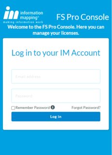
</body>我想要在小屏幕上进行设计,就像这个屏幕截图一样
1个回答
0
投票
投票
您可以使用 CSS flexbox 和 grid 轻松完成此设计,而不是使用绝对位置。但是,在此代码中,如果您想要响应式设计,则需要使用媒体查询。我从你的样式中删除了你的 .logo-container 和 .logo css 并添加了这个:
   /* ... Your other CSS (remove the .logo-container styles) ... */
   .logo {
      position: absolute;
      top: 20px;
      left: 20px;
      width: 50px;
      height: auto;
  }


/* ... For responsive ... */
@media (max-width: 600px) {
  .card {
    margin-top:140px; /* ... Change as per your need ... */
  }

  .logo {
    top: 10px;
  }

  .h2-container {
    top:0;
    font-size: 0.8rem;
  }

}
最新问题
- c++概念和模板参数
- 如何在子目录中运行ASP.NET Core 6.0应用程序?
- NSInspiration getArgument NSString/CFString 会导致访问不良
- model.fit() 类权重在训练模型时不起作用
- 在实例计数设置为 0 的情况下调用 glMultiDrawElementsIndirect 时 gl_DrawID 的值
- 如何将不可空列的 DEFAULT 值设置为 SELECT 查询的 TOP 1 结果?
- 如何在C中从第二行读取字符串文件?
- 简单的 Kafka 生产者/消费者 - 消费者不消费所有消息
- 使用Redisson创建缓存时出现InaccessibleObjectException
- 旧金山字体+SpriteKit
- @JsonProperty(access = Access.READ_ONLY) 字段解析后填充为空值
- Flutter Web 应用程序和 firebase:无法在模块外部使用 import 语句
- R 编程:将日期从字符更改为 POSIXct |取回 NA 值
- BPN 和 PN 有什么区别?
- 我在正在进行的 springboot 项目中使用 Kafka 流,我想从输入主题中提取时间戳,如何做到这一点?
- Visual Studio:意外的 PDB 错误;远程过程调用 (23)
- 使用 MS Word VBA 获取目标图像标题
- Go 和 Ruby 之间的互操作性:验证 RSA 签名
- 如何为 SwiftData 中的 `Predicate<each Input>` 类型编写带有 `where` 子句的扩展方法?
- 根据角色限制对产品的访问 WooCommerce
© www.soinside.com 2019 - 2024. All rights reserved.