为什么我的 justify-content 属性不起作用?
问题描述 投票:0回答:12
我试图通过将“justify-content”属性应用到父 div 来在模板的侧边栏和内容区域之间添加一些空间,但它并没有在侧边栏和内容区域之间添加该空间。我不确定我做错了什么。
#wrapper {
    display: flex;
    flex-direction: row;
    justify-content: space-around;
    flex-flow: row wrap;
    flex: 1 100%;
    width:92.5%;
    align-self: center;
    margin: 0;
}

#wrapper article.content-main {
    flex: 6;
    order: 2;
}

#wrapper article.content-main section {
    background-color: rgba(149, 21, 130, 0.61);
    border: 2px solid #c31cd9;
    padding: 0.9em;
}

#wrapper aside {
    flex: 1;
    padding: 0.4em;
    background-color: rgba(17, 208, 208, 0.56);
    border: 2px solid #15d0c3;
    position: sticky;
}
<body>
<header>
<h1>This is a placeholder <br />
for header</h1>
</header>
<div id="wrapper">
<article class="content-main">
<section>
<h2>Heading goes here...</h2>
<time datetime="2014-05-21T02:43:00">Officialy Posted On May 21<sup>st</sup> 2:35 A.M.</time>
<p>Content will go here...</p>
</section>
</article>
<aside>
<p>More content soon...</p>
</aside>
</div>
</body>12个回答
213
投票
投票
justify-contentjustify-content它会产生效果的一些例子:
如果您的弹性项目都是不灵活的(
或flex: none
),并且小于容器。flex: 0 0 auto如果您的弹性项目是灵活的,但由于每个灵活项目上都有一个
,因此无法增长以吸收所有可用空间。max-width
在这两种情况下,
justify-content但是,在您的示例中,您的弹性项目具有
flex: 1flex: 6max-widthjustify-content67
投票
投票
我发生的事情是我没有在容器(具有
display: flexjustify-contentjustify-content17
投票
投票
在对 CMS 中的现有代码进行主题化时,我还遇到了一个让我困惑了一段时间的问题。我想将 Flexbox 与
justify-content:space-between在该系统中,物品是浮动的,并且容器具有
:before:after:before:afterdisplay:none14
投票
投票
我在
justify-contentmargin: 0 autoautojustify-contentjustify-content4
投票
投票
有时
justify-content flex-directioncolumnalign-item2
投票
投票
应该有更多空间供
justify-content您可以使用
flex-basis就这么简单
.content-main{
  flex-basis: 40%;
}
aside{
  flex-basis: 40px;
}
1
投票
投票
始终确保为容器指定
widthheightpadding : 0 (or auto) ;margin : 0 (or auto) ;0
投票
投票
如果,
justify-content: space-between;
无法正常工作,请确保:
  display: flex;
  flex-direction: column;
然后尝试
display: flex;
  flex-direction: column;
  justify-content: space-between;
  height: 100vh;
0
投票
投票
如果将高度设置为固定值(100px 或 30rem 等),而不是百分比或可用填充,则可以解决此问题。我不认为
justify-content: space-between0
投票
投票
我遇到了类似的问题,第一个和最后一个图像都粘在两端,中间一个对齐为之间的空间,所以我在之前和之后使用了一个技巧,现在所有图像都按预期工作,请检查下面的代码以了解详细信息。
HTML
<div className="flexContainer">
  <img src="image1.jpg" alt="..." />
  <img src="image2.jpg" alt="..." />
  <img src="image3.jpg" alt="..." />
</div>
我的CSS
.flexContainer {
  display: flex;
  justify-content: space-between;
  width: 100%;
}

.flexContainer::before,
.flexContainer::after {
   content: "";
}
0
投票
投票
如果您发现有明显的间距,但元素不会随
justify-content: space-aroundwidth: 100%-12
投票
投票
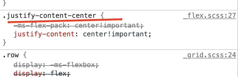
转到检查元素并检查 .justify-content-center 是否在“样式”选项卡下列为类名称。如果没有,您可能使用的是 bootstrap v3,其中未定义 justify-content-center。
如果是这样,请更新引导程序,对我有用。
最新问题
- 外部命名空间中带有非类型参数的友元函数模板不是友元
- Javascript click() 函数同时单击所有按钮
- 在文本区域内渲染 HTML
- 错误:Twitter 验证码出现在自动创建帐户时
- 我尝试在java中进行冒泡排序,但在第20行出现错误
- 在 git 中强制合并的最佳方法是什么?
- 尝试使用 Python HMAC 库验证消息
- 导入“sqlalchemy”无法解决
- 重塑 Windows Vista 中的“玻璃”
- .net 和 msn Messenger 之间的链接
- 自定义关闭对话框菜单按钮
- 如何使用JBuddy SDK创建一个简单的yahoo Messenger客户端?
- 您可以将 SQL 查询字符串传递给 Web API 控制器吗?
- 将回形针迁移到 Carrierwave 的网址错误
- 在 winform C# 应用程序中调用 Web api 并获取响应
- 代码行未在 Jupyter Notebook 中编译
- WinForms 地图位置坐标
- 扫描后的二维码重定向至自定义链接
- STS API返回的AWS_SESSION_TOKEN有什么作用?
- 如何检查同义词后面的表是否存在
© www.soinside.com 2019 - 2024. All rights reserved.