CSS边框(一侧半径另一侧边框)
问题描述 投票:-2回答:1
我试图为我的电子邮件页面获得这种外观。
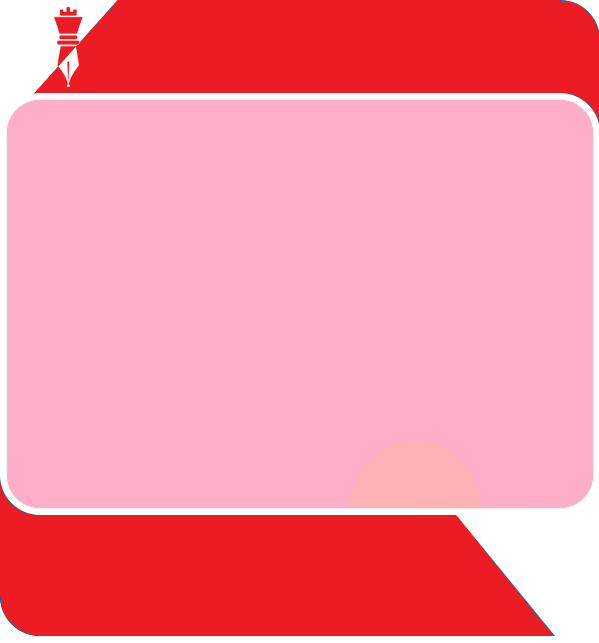
但是,我被卡住了。试着用边框来做。我想它也失败了。左上角的图标是一个图片,其余的应该是css和html。我只做到了这一步。https:/jsfiddle.netru9L8c564。
CSS代码。
/*////// FRAMEWORK STYLES //////*/

.flexibleContainerCell {
  padding: 10px;
}

.flexibleImage {
  height: auto;
}

.bottomShim {
  padding-bottom: 20px;
}

.imageContent,
.imageContentLast {
  padding-bottom: 20px;
}

.nestedContainerCell {
  padding-top: 20px;
  padding-Right: 20px;
  padding-Left: 20px;
}


/*////// GENERAL STYLES //////*/

body,
#bodyTable {
  background-color: #F5F5F5;
}

#bodyCell {
  padding-top: 40px;
  padding-bottom: 40px;
}

#emailBody {
  background-color: #FFFFFF;
  border: 1px solid #DDDDDD;
  border-collapse: separate;
  border-radius: 4px;
}

h1,
h2,
h3,
h4,
h5,
h6 {
  color: #202020;
  font-family: PT Sans;
  font-size: 20px;
  line-height: 125%;
  text-align: Left;
}

p {
  color: #202020;
  font-family: Verdana;
  font-size: 12px;
  line-height: 130%;
  text-align: Left;
}

.textContent,
.textContentLast {
  color: #404040;
  font-family: Helvetica;
  font-size: 16px;
  line-height: 125%;
  text-align: Left;
  padding-bottom: 20px;
}

.textContent a,
.textContentLast a {
  color: #2C9AB7;
  text-decoration: underline;
}

.nestedContainer {
  background-color: #E5E5E5;
  border: 1px solid #CCCCCC;
}

.emailButton {
  background-color: #2C9AB7;
  border-collapse: separate;
  border-radius: 4px;
}

.buttonContent {
  color: #FFFFFF;
  font-family: Helvetica;
  font-size: 18px;
  font-weight: bold;
  line-height: 100%;
  padding: 15px;
  text-align: center;
}

.buttonContent a {
  color: #FFFFFF;
  display: block;
  text-decoration: none;
}

.emailCalendar {
  background-color: #FFFFFF;
  border: 1px solid #CCCCCC;
}

.emailCalendarMonth {
  background-color: #2C9AB7;
  color: #FFFFFF;
  font-family: Helvetica, Arial, sans-serif;
  font-size: 16px;
  font-weight: bold;
  padding-top: 10px;
  padding-bottom: 10px;
  text-align: center;
}

.emailCalendarDay {
  color: #2C9AB7;
  font-family: Helvetica, Arial, sans-serif;
  font-size: 60px;
  font-weight: bold;
  line-height: 100%;
  padding-top: 20px;
  padding-bottom: 20px;
  text-align: center;
}
帮助图片中的红色部分将是真棒。TY.
1个回答
1
投票
投票
创建你想要的形状不仅仅需要border-radius,你可以用这个语法针对div的特定角来做曲线。
border-radius: 45px 0 0 0;
或者...
border-radius: 0 45px 0 45px;
等,每个数字都定义了一个不同的角。
要添加斜角,你需要在 divtd 中添加一个 :after 元素,类似于这样。
 div:after{
     content: "";
     position: absolute;
     border-left: 45px solid transparent;
     border-bottom: 45px solid transparent;
     border-right: 45px solid red;
}
最新问题
- 使用 VueJS、ExpressJS、MySQL 的架构 - MVP MVC MVVM?
- 如何在React中使用动画材质ui图标
- sanic - 如何指定所需的 JSON?
- 拖动组react-konva后如何获取/更新孩子的位置
- Gitlab 注册表的 Varnish 设置
- 在C#中将当前UTC时间转换为微秒格式
- Auto Scaling 组、ECS 容量提供商和 ECS 服务 Auto Scaling 之间的区别
- 如何在输出到html之前停止asp.net编码字符?
- 为什么我不能复制粘贴
- 如何使用Markdown在表格中插入图片
- 更改 Azure DevOps 配置文件中的联系电子邮件
- 上传和翻译绘图文件的问题
- 如何在Stripe中获取Client ID?
- Spring 安全性导致 404 并显示消息“无静态资源登录”
- 用 zustand 坚持本机反应
- 如何获取 javascript 地图对象中特定索引处的键?
- 在控制器中使用@UseGuards时实现循环依赖时未定义的依赖关系
- 窗口函数 LEAD 不是下一个
- 调试应用程序脚本
- 条件格式公式可突出显示不同单元格中或同一单元格内的重复字符串
© www.soinside.com 2019 - 2024. All rights reserved.