支持或禁用CSS背景素材IE
问题描述 投票:0回答:1
在文本上使用背景-剪辑在IE上一切都能正常工作!在IE11上,它只是出现一个无法阅读的黑框,动画本身可以工作,但不是剪辑。
.main-menu .nav li a {
    font-family: freight-big-pro, serif;
    font-size: 4rem;
    font-weight: 400;
    color: #0f0e0e;
    text-decoration: none;
    -webkit-background-clip: text;
    background-clip: text;
    -webkit-text-fill-color: transparent;
    background-image: -webkit-gradient(linear, left bottom, left top, from(#cfac7e), color-stop(50%, #cfac7e), color-stop(50%, #0f0e0e));
    background-image: linear-gradient(0deg, #cfac7e, #cfac7e 50%, #0f0e0e 50%);
    background-size: 100% 200%;
    background-position: 0% 0%;
}
在IE11上,它只是出现了一个黑色的盒子和无法阅读的文本,动画本身的工作,但它不是剪切。
现在,由于IE上的文本不支持背景剪贴,有什么办法可以在IE上禁用这个功能吗?
1个回答
0
投票
投票
你说的 在IE11上,它只是出现了一个黑色的盒子,无法阅读文本,动画本身可以工作,但它不剪裁。
我建议尝试使用 -webkit-background-clip: 文本 Polyfill 可能有助于解决IE 11浏览器的这个问题,并且在IE和其他浏览器中也能正常显示。
例子
<!doctype html>
<html>
<head>
<script src="https://raw.github.com/TimPietrusky/background-clip-text-polyfill/master/background-clip-text-polyfill.js"></script>
<style>

body {
  font: 1em sans-serif;
  background:#fff;
  margin:0 1em;
}

h1 {
  color: red;
  -webkit-text-fill-color: transparent;
  background: -webkit-linear-gradient(transparent, transparent),
             url(http://timpietrusky.com/cdn/army.png) repeat;
  background: -o-linear-gradient(transparent, transparent);
  -webkit-background-clip: text;
}

/*
 * This style will be shared with the SVG because
 * I have to replace the DOM element in Firefox.
 * Otherwise the SVG pattern will be broken.
 */
.headline {
  font: bold 2.25em sans-serif;
}

svg {
  height: 8em;
  width: 100%;
}

/*
 * Just some styling... ignore it
 */
article {
  font-size:1.2em;
  border-top:.15em solid #7BB03B;
  height:100%;
  text-align:center;
}

a {
  text-decoration:none;
  color:#5794C7;
  transition:color .15s ease-in-out;

  &:hover {
    color:#7BB03B;
  }
}
</style>
<script>
/**
  -webkit-background-clip: text Polyfill

  # What? #
  A polyfill which replaces the specified element with a SVG
  in browser where "-webkit-background-clip: text"
  is not available.

  Fork it on GitHub
  https://github.com/TimPietrusky/background-clip-text-polyfill

  # 2013 by Tim Pietrusky
  # timpietrusky.com
**/

Element.prototype.backgroundClipPolyfill = function () {
  var a = arguments[0],
      d = document,
      b = d.body,
      el = this;

  function hasBackgroundClip() {
    return b.style.webkitBackgroundClip != undefined;
  };

  function addAttributes(el, attributes) {
    for (var key in attributes) {
      el.setAttribute(key, attributes[key]);
    }
  }

  function createSvgElement(tagname) {
    return d.createElementNS('http://www.w3.org/2000/svg', tagname);
  }

  function createSVG() {
    var a = arguments[0],
        svg = createSvgElement('svg'),
        pattern = createSvgElement('pattern'),
        image = createSvgElement('image'),
        text = createSvgElement('text');

    // Add attributes to elements
    addAttributes(pattern, {
      'id' : a.id,
      'patternUnits' : 'userSpaceOnUse',
      'width' : a.width,
      'height' : a.height
    });

    addAttributes(image, {
      'width' : a.width,
      'height' : a.height
    });
    image.setAttributeNS('http://www.w3.org/1999/xlink', 'xlink:href', a.url);

    addAttributes(text, {
      'x' : 0,
      'y' : 80,
      'class' : a['class'],
      'style' : 'fill:url(#' + a.id + ');'
    });

    // Set text
    text.textContent = a.text;

    // Add elements to pattern
    pattern.appendChild(image);

    // Add elements to SVG
    svg.appendChild(pattern);
    svg.appendChild(text);

    return svg;
  };

  /*
   * Replace the element if background-clip
   * is not available.
   */
  if (!hasBackgroundClip()) {
    var img = new Image();
    img.onload = function() {
      var svg = createSVG({
        'id' : a.patternID,
        'url' : a.patternURL,
        'class' : a['class'],
        'width' : this.width,
        'height' : this.height,
        'text' : el.textContent
      });

      el.parentNode.replaceChild(svg, el);
    }
    img.src = a.patternURL;
  }
};

var element = document.querySelector('.headline');

/*
 * Call the polyfill
 *
 * patternID : the unique ID of the SVG pattern
 * patternURL : the URL to the background-image
 * class : the css-class applied to the SVG
 */
element.backgroundClipPolyfill({
  'patternID' : 'mypattern',
  'patternURL' : 'http://timpietrusky.com/cdn/army.png',
  'class' : 'headline'
});
</script>
</head>
<body>
<h1 class="headline">-webkit-background-clip: text | Polyfill</h1>

<article>
  <h1>This is my sample text...</h1>
</article>
</body>
</html>
输出:
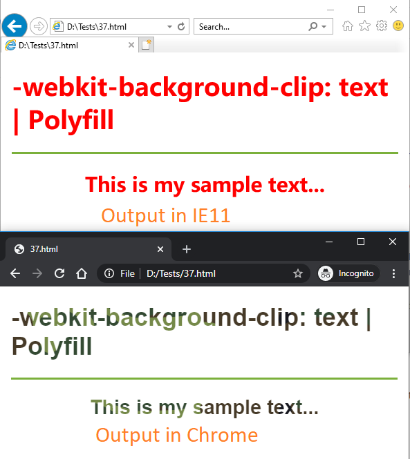
参考: -webkit-background-clip: text polyfill
最新问题
- NPM shasum、完整性和签名字段之间的区别和用途是什么?
- ASP.NET Core 应用程序中的 Azure AD B2C 身份验证
- 超简单GCD的时间复杂度
- ASP.NET Core 6.0 表单验证错误:“fieldNameHere 字段是必需的。”即使不存在这样的字段
- 检查 id 是否存在并在触发函数中采取相应行动
- 如何通过 SPI 发送超过 ESP32 RAM 数量的数据?
- 检查触发函数中是否存在id并采取相应行动
- 构建容器在缓存node_modules时内存不足
- SwiftUI 三元集主题在重新打开视图之前不会更新
- 分支定界算法寻找带约束的最短路径
- 检查 plpgsql 中是否存在 id 并采取相应行动
- 为什么 Maven 会警告我有关编码的问题?
- 如何使用dexie.js 添加新条目
- 通过 AzureDevOps Services REST API 将二进制文件上传到 git LFS?
- 将数组值作为参数传递给 azure devops yaml 模板
- 我是 Flutter 新手,我正在尝试运行我的应用程序,并且我得到这个“kotlin-android”插件需要 Android Gradle 插件之一
- F# Array.tryFindIndex 从索引开始搜索
- 如何通过 SPI 发送比 ESP32 内存更多的数据
- 稍后将类型替换为另一种类型
- 在Linux上获取共享内存大小的便捷方法
© www.soinside.com 2019 - 2024. All rights reserved.