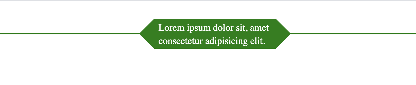
我想使用css创建此形状
问题描述 投票:0回答:1

#arrowbox:before {
    right: 100%;
    top: 50%;
    border: solid transparent;
    content: " ";
    height: 0;
    width: 0;
    position: absolute;
    pointer-events: none;
    border-color: rgba(0, 128, 0, 0);
    border-right-color: #008000;
    border-width: 25px;
    margin-top: -25px;
}
1个回答
2
投票
投票
您可以通过一些透视和旋转来做到这一点:
.box {
  margin:20px;
  padding:20px calc(50% - 100px); /* this will fix the max width to 2x100px */
  /* the horizontal lines (one on each side)*/
  background:
    linear-gradient(red,red) left,
    linear-gradient(red,red) right;
  background-size:calc(50% - 100px) 2px;
  background-repeat:no-repeat;
  /* */
  text-align:center;
  position:relative;
}
.box::before,
.box::after{
  content:"";
  position:absolute;
  top:-10px; /* lower than 0 to avoid the overlap due to rotation */
  /* same as the padding */
  left:calc(50% - 100px);
  right:calc(50% - 100px);
  /* */
  bottom:50%;
  border:3px solid red;
  border-bottom:none;
  border-radius:15px 15px 0 0;
  /* adjust here to control the shape  */
  transform:var(--s,scaley(1)) perspective(40px) rotateX(25deg);
  /* */
  transform-origin:bottom;
}
.box::after {
  --s:scaley(-1);
}
<div class="box"> some text here</div>
<div class="box"> more and more <br> text here</div>
<div class="box"> even more <br> and more <br> text here</div>具有歪斜变换的另一个想法:
.box {
  margin:20px;
  padding:20px calc(50% - 100px); /* this will fix the max width to 2x100px */
  /* the horizontal lines (one on each side)*/
  background:
    linear-gradient(red,red) left,
    linear-gradient(red,red) right;
  background-size:calc(50% - 100px) 2px;
  background-repeat:no-repeat;
  /* */
  text-align:center;
  position:relative;
}
.box::before,
.box::after,
.box span::before,
.box span::after{
  content:"";
  position:absolute;
  top:0;
  left:calc(50% - 100px);
  right:50%;
  bottom:50%;
  border:2px solid red;
  border-bottom:none;
  border-right:none;
  border-radius:10px 0 0 0;
  transform:var(--s,scaleX(1)) skew(-35deg);
  transform-origin:right bottom;
}
.box::after {
  --s:scalex(-1);
}
.box span::before {
  --s:scaleY(-1);
}
.box span::after {
  --s:scale(-1);
}
<div class="box"><span></span> some text here</div>
<div class="box"><span></span> more and more <br> text here</div>
<div class="box"><span></span> even more <br> and more <br> text here</div>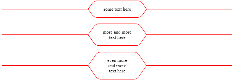
最新问题
- snmpsim-command-responder 由于没有名为“asyncore”的模块而失败
- 在禁用 ASLR 的情况下对固定地址进行探测
- AttributeError:“res.config.settings”对象没有属性“get_debranding_settings”
- 一个Swing组件不能添加到多个容器中吗?
- Flutter 中的 Firestore Vector 和 findNearest
- QueueTrigger 未在具有托管身份的 Azure 中触发
- Pydantic V2 是否兼容 AWS Lambda?
- Python 事件循环中的意外行为
- 添加新的动态无线电输入时脸颊无线电出现问题
- 如何解决 flutter doctor 错误并提示已连接设备(医生检查崩溃)?
- git - 将另一个分支上的提交应用到工作副本/在分支和存储库之间共享内容
- Persona(BrowserId)身份验证在 Express 3.0 中永远不会成功(使用护照浏览器 ID)
- 尝试创建帖子时收到 401,即使我使用应用程序密码
- 复制文件但不复制 git 历史记录?
- 使用推力来处理 CUDA 类中的向量?
- 在 Microsoft XNA Framework (MonoGame) 中旋转相机
- 什么时候适合将 unique_ptr 分配给共享_ptr?
- HKUnit 中的自定义单位用于简单测量,如质量、长度和体积
- 如何获取路由的原始路径或端点函数名称?快速API
- EC2 实例上的 RDS 连接超时
© www.soinside.com 2019 - 2024. All rights reserved.