自定义本机基础的选项卡
问题描述 投票:8回答:3
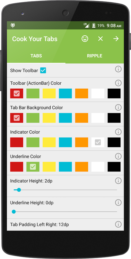
我需要在我的反应本机应用程序中自定义选项卡(更改其背景颜色),如图所示
我已经尝试过这个style={{ backgroundColor: '#C0C0C0' }},但我一直在寻找默认主题。
3个回答
48
投票
投票
您可以将自己的样式应用于本地基本选项卡,如下所示。
<Tabs tabBarUnderlineStyle={{borderBottomWidth:2}}>
    <Tab heading="Popular" tabStyle={{backgroundColor: 'red'}} textStyle={{color: '#fff'}} activeTabStyle={{backgroundColor: 'red'}} activeTextStyle={{color: '#fff', fontWeight: 'normal'}}>
        // tab content
    </Tab>
    <Tab heading="Popular" tabStyle={{backgroundColor: 'red'}} textStyle={{color: '#fff'}} activeTabStyle={{backgroundColor: 'red'}} activeTextStyle={{color: '#fff', fontWeight: 'normal'}}>
        // tab content
    </Tab>
</Tabs>
14
投票
投票
如果你使用TabHeading而不是string标题的组件,使用tabStyle,textStyle或Tab上的TabHeading道具将无效(至少截至目前)。你必须手动设置TabHeading,Icon和Text的样式。
这是一个例子 -
这不行
<Tabs tabBarUnderlineStyle={{borderBottomWidth:2}}>
   <Tab heading={<TabHeading>
                 <Icon name="icon_name" />
                 <Text>Popular</Text>
               </TabHeading>}
      tabStyle={{backgroundColor: 'red'}} textStyle={{color: '#fff'}}
      activeTabStyle={{backgroundColor: 'red'}} activeTextStyle={{color: '#fff', fontWeight: 'normal'}}>
       // tab content
   </Tab>
   <Tab
       heading={<TabHeading>
                 <Icon name="icon_name" />
                 <Text>Popular</Text>
               </TabHeading>}
      tabStyle={{backgroundColor: 'red'}} textStyle={{color: '#fff'}}
      activeTabStyle={{backgroundColor: 'red'}} activeTextStyle={{color: '#fff', fontWeight: 'normal'}}>
       // tab content
   </Tab>
</Tabs>
即使你将tabStyle和其他道具移动到TabHeading组件,它也无法工作。
但这会奏效
<Tabs tabBarUnderlineStyle={{borderBottomWidth:2}}>
   <Tab heading={<TabHeading style={{backgroundColor: 'red'}}>
                 <Icon name="icon_name" style={{color: '#ffffff'}} />
                 <Text style={{color: '#ffffff'}}>Popular</Text>
               </TabHeading>}>
       // tab content
   </Tab>
   <Tab
       heading={<TabHeading style={{backgroundColor: 'red'}}>
                 <Icon name="icon_name" style={{color: '#ffffff'}} />
                 <Text style={{color: '#ffffff'}}>Popular</Text>
               </TabHeading>}>
       // tab content
   </Tab>
</Tabs>
如果要激活切换样式切换
<Tabs tabBarUnderlineStyle={{borderBottomWidth:2}} initialPage={this.state.currentTab} onChangeTab={({ i }) => this.setState({ currentTab: i })}>
   <Tab heading={<TabHeading style={this.state.currentTab == 0 ? styles.activeTabStyle : styles.inactiveTabStyle}>
                 <Icon name="icon_name" style={this.state.currentTab == 0 ? styles.activeTextStyle : styles.inactiveTextStyle} />
                 <Text style={this.state.currentTab == 0 ? styles.activeTextStyle : styles.inactiveTextStyle}>Popular</Text>
               </TabHeading>}>
       // tab content
   </Tab>
   <Tab
       heading={<TabHeading style={this.state.currentTab == 1 ? styles.activeTabStyle : styles.inactiveTabStyle}>
                 <Icon name="icon_name" style={this.state.currentTab == 1 ? styles.activeTextStyle : styles.inactiveTextStyle} />
                 <Text style={this.state.currentTab == 1 ? styles.activeTextStyle : styles.inactiveTextStyle}>Popular</Text>
               </TabHeading>}>
       // tab content
   </Tab>
</Tabs>
我试过☝解决方案。太糟糕了! (在我看来)。
所以我选择了原来的答案并决定不在我的标题标题中有一个图标(这是一个更好的代价,而不是处理状态变化延迟)
我也注意到他们有tabStyle和其他props为TabHeading,所以也许他们正在努力,这只是一个错误在这个时间点?
无论如何,我只想指出这一点。
0
投票
投票
请注意,如果您在Tabs组件的renderTabBar方法中使用ScrollableTab,则上述示例是部分解决方案,您必须在Tabs和Tab组件的嵌套组件上应用所需的样式。因此,如果您使用的是ScrollableTab组件,我建议您将样式直接应用于ScrollableTab组件。检查以下示例:
<Tabs renderTabBar={() => <ScrollableTab style={{ backgroundColor: "your colour" }} />}>
 Your Tab Content
</Tabs>
有关更多参考,请参阅this github issue
最新问题
- 具有手动触发器的独立工作线程模型中的 C# Azure 函数
- 如何在codeigniter中将http重定向到https
- SQL Server 中的动态 SQL 生成
- 如何为按钮添加平滑度?
- VBA可以将打印区域设置为工作表中的公式吗?
- 在 npm 安装 redux-devtools-extension
- 在 React/Esri 应用程序中通过 JSON 配置进行配置时,小部件不添加层
- Acumatica GI 在邮递员中不返回任何结果
- 如何从 AWS Glue 作业将数据写入 Iceberg 表中
- 处理第 1 行时出错:TypeError: openai.createCompletion 不是函数
- Unity 中的 Obi Fluid - 更改解算器重力矢量对粒子没有影响
- 将物理常数加载到八度音程中
- 为什么 `std::string_view` 不可修改?
- 如何修复 AWS Cognito Lambda 触发器返回 {####} 而不是正确的 OTP?
- 首次使用 Next-Auth 登录后如何立即为用户提供随机用户名?
- 如何在不裁剪的情况下旋转WPF ContainerVisual?
- 如何使用IdentityUser创建两个不同的用户表
- 如何将导航栏中的所有图标重新定位到中间
- 我希望当我通过 PhantomJS 加载页面 HTML 时执行我的 JS
- Prisma $transaction API 与事先做出的承诺
© www.soinside.com 2019 - 2024. All rights reserved.