我是前端菜鸟,所以通过邮件发送时自动生成的html页面没有正确呈现,它在实时服务器中正常运行
问题描述 投票:0回答:1
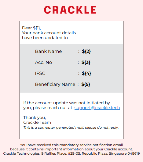
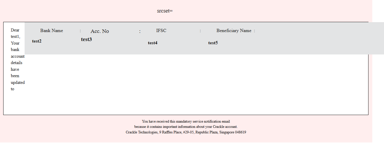
注意:-“之所以用‘内联css’编写,是因为gmail不考虑大纲CSS,它以普通形式呈现html,它只能呈现内联css。”对于那些不知道的人。 这是代码,抱歉我对此完全陌生
<!DOCTYPE html>
<html lang="en">
<head>
<meta charset="UTF-8" />
<meta name="viewport" content="width=device-width, initial-scale=1.0" />
<title>message_generation</title>
<link rel="preconnect" href="https://fonts.googleapis.com" />
<link rel="preconnect" href="https://fonts.gstatic.com" crossorigin />
<link
href="https://fonts.googleapis.com/css2?family=Montserrat:ital,wght@0,100..900;1,100..900&display=swap"
rel="stylesheet"
/>
</head>
<body
style="
font-size: 15px;
background-color: rgb(255, 255, 255);
font-family: 'Montserrat';
padding: 1%;
padding-bottom: 1%;
margin: 7px;
display: flex;
align-self: center;
align-items: center;
"
>
<div
class="outer"
style="
background-color: rgb(255, 238, 238);
height: 90%;
padding-top: 1%;
padding-bottom: 1%;
padding-left: 1%;
padding-right: 1%;
width: 100%;
"
>
<img
src="./crackle.png"
href="https://crackle.tech/"
alt=""
srcset=""
style="
height: auto;
width: 150px;
align-self: center;
padding-bottom: 20px;
padding-top: 8px;
padding-right: 8px;
display: flex;
align-items: center;
margin: auto;
align-self: center;
"
/>
<div
class="inner"
style="
font-size: 15px;
background-color: white;
font-family: 'Montserrat';
padding-bottom: 5%;
margin: auto;
border: 1px solid black;
display: flex;
flex-direction: column;
width: 100%;
align-self: center;
align-content: center;
flex: content;
"
>
<p style="padding-left: 2%; font-size: 12px">
Dear ${1}, <br />
Your bank account details <br />
have been updated to <br />
</p>
<br />
<div
class="contain"
style="
background-color: #e3e4e5;
display: flex;
justify-content: center;
min-width: 100%;
flex-direction: column;
height: 30%;
gap: 8px;
height: 30%;
padding-top: 13px;
padding-bottom: 8px;
align-self: center;
word-wrap: break-word;
padding: none;
margin-bottom: 15px;
"
>
<div
style="
display: grid;
grid-template-columns: auto 1fr;
gap: 8px;
align-items: center;
font-size: 13px;
white-space: wrap;
padding-left: 20px;
flex-wrap: wrap;
"
>
<p style="margin: 0; flex-direction: row">
Bank Name
:
</p>
<p style="margin: 0; flex-direction: row; font-weight: 600">${2}</p>
<br />
</div>
<div
style="
display: grid;
grid-template-columns: auto 1fr;
gap: 8px;
align-items: center;
font-size: 13px;
white-space: wrap;
padding-left: 20px;
"
>
<p style="margin: 0">
Acc. No
:
</p>
<p style="margin: 0; font-weight: 600">${3}</p>
<br />
</div>
<div
style="
display: grid;
grid-template-columns: auto 1fr;
gap: 8px;
align-items: center;
font-size: 13px;
white-space: wrap;
padding-left: 20px;
"
>
<p style="margin: 0">
IFSC
:
</p>
<p style="margin: 0; font-weight: 600">${4}</p>
</div>
<br />
<div
style="
display: grid;
grid-template-columns: auto 1fr;
gap: 8px;
align-items: center;
font-size: 13px;
white-space: wrap;
padding-left: 20px;
"
>
<p
style="
margin: 0;
size: 11px;
flex-wrap: wrap;
flex-wrap: break;
display: flex;
align-self: baseline;
"
>
Beneficiary Name :
</p>
<p
style="
margin: 0;
word-wrap: break-word;
font-weight: 600;
width: 80%;
overflow-wrap: break-word;
display: flex;
align-items: baseline;
"
>
${5}
</p>
</div>
<br />
</div>
<br />
<div class="regards" style="padding: 7px; font-size: 12px">
<p
style="
margin: 0;
white-space: nowrap;
padding-left: 1%;
padding-right: 3%;
"
>
If the account update was not initiated by <br />
you, please reach out at
<a
href="mailto:[email protected]"
style="padding-left: 3px; padding-right: 5px"
>[email protected]</a
>
<br />
<br />
Thank you, <br />
Crackle Team
<br />
<i style="font-size: 10px"
>This is a computer generated mail, please do not reply.</i
>
</p>
</div>
</div>
<p style="text-align: center; font-size: 10px">
You have received this mandatory service notification email <br />
because it contains important information about your Crackle account.
<br />
Crackle Technologies, 9 Raffles Place, #29-05, Republic Plaza, Singapore
048619
</p>
</div>
</body>
</html>
我尝试了chatgpt 4,但它没有帮助,我尝试调整CSS但我无法找到解决方案, 我没有想法,我的猜测是它以 body 作为输出,而“外部”div 被塞在 body 内,也许这就是原因。
1个回答
-2
投票
投票
非常奇怪的是,您使用的是内联 CSS,这使您的代码对于查看者来说是一场噩梦,因此查找错误非常复杂,您必须尽可能简化代码。
最新问题
- 如何在 GNU GCC 上启用 c++23?
- React.js 中使用 useParams 的未定义参数
- 列表中其值总和最多为 K 的元素的最大数量,复杂度为 O(log n)
- JS:如何删除动画而不只是停止它们?
- 两个独立的 Java 桌面应用程序之间的通信
- Java 8 JavaFX - 如何设置单个选项卡标题文本的颜色
- python函数根据主数据帧设置值
- 验证贝宝账户
- 运行分布式 API 测试的工具
- IFogSim:GUI 和代码之间的链接
- Pytest Monkeypatch 用于测试的多进程函数
- 使用 HR (95%CI) 绘制森林图
- 无法在Android Studio中添加插件
- 如何配置nest/Bull redis连接
- 错误:包“imageio”需要不同的 Python:2.7.17 不在“>=3.5”中
- 内容安全策略阻止 Firefox 中的本地主机
- Microsoft SQL Server 删除前导零和所有字符字母
- Php 已安装,但在 Apache2 版本 24.04 中未加载
- 如何从 NSArray 中选择一个对象?
- Typescript 如何从字符串中提取多个文字
© www.soinside.com 2019 - 2024. All rights reserved.