如何使用CSS制作修剪的半圆(D形)?
问题描述 投票:0回答:2
我需要帮助理解clip-path CSS属性,以便在下面制作我的修剪圆圈版本...
更像是设计版本:

如果你可以在灰色背景上看到,我的圆圈看起来要大得多,而且当它被剪裁时会更圆。
我可以做些什么来制作一个更圆的圆圈?我的想法是:
- 使用剪辑路径,如下面的代码段所示
- 使用伪
:after元素或带半径的右边框 - 从photoshop剪切圆形图像并将其用作背景图像。
最好,我想避免使用背景图像。但是,我需要记住响应性,因为当我们调整窗口大小时,圆圈无法彻底改变形状。
clip-path是正确的方法吗?有人可以使用CSS以另一种方式建议更简单和优雅的解决方案吗?
提前谢谢,这是我写的一个片段,说明了我如何修剪“绿/蓝”背景:
.page-banner {
  background: grey;
  width: 100%;
  height: 300px;
  background-position: top;
  overflow: hidden;
}

.page-banner-text {
  position: absolute;
  background: #00525d8a;
  padding-left: 100px;
  width: 60%;

  /* adjustments to snippet */
  top: 10px;
  left: 10px;
  height: 300px;

  /* this is the code for circle */
  clip-path: circle(560px at left);
  padding-right: 250px;
}
<div class="page-banner">
<div class="container">
<div class="page-banner-text">
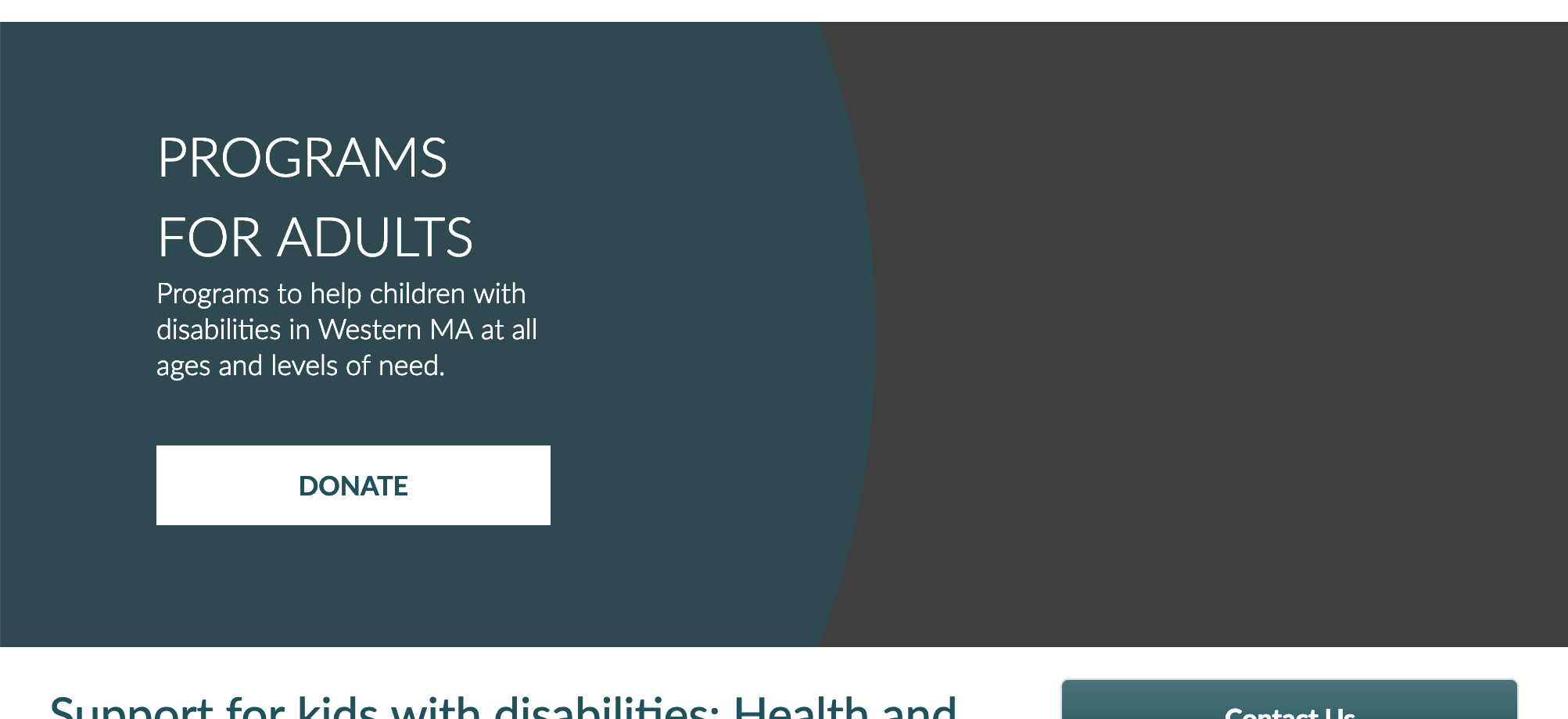
<h1 class="block-title">Programs For Adults</h1>
<p>Programs to help children with disabilities in Western MA at all ages and levels of need.</p>
<div id="banner-donate-button"><a href="#" class="" target="_self" title="Donate">DONATE</a></div>
</div>
</div>
</div>2个回答
1
投票
投票
根据我的评论,为什么不在你的div上使用边界半径而不是使用剪辑路径来创建你的D(which is not supported very well)。
* {
  box-sizing: border-box;
}

.page-banner {
  position: relative;
  background: url(https://www.fillmurray.com/300/900) center center no-repeat;
  background-size: cover;
  width: 100%;
  overflow: hidden;         /* hide overflowing bits of circle */
  min-height: 300px;        /* just give enough height to fit text at smallest screen width size */
}

.circle {
  background-color: rgba(50, 108, 116, 0.9);   /* use rgba for transparent effect */
  color: white;
  transform: translate(-50%, -50%);            /* move the circle left 50% of it's own width and up 50% of it's own height */
  border-radius: 50%;
  padding-top: 100%;                           /* this gives us a responsive square */
  position: absolute;
  top:50%;                                     /* this vertically centers the circle */
  left:0;
  width:100%;
  min-width:600px;                              /* this is the miniimum dimensions to allow circle to fill smaller screens */
  min-height:600px;
}

.page-banner-text {
  position: absolute;                           /* just positions the text on the right of the cirecle */
  left: 50%;
  top: 50%;
  transform: translateY(-50%);
  padding:2em;
  width:40%;
}
<div class="page-banner">
<div class="circle">
<div class="page-banner-text">
<h1 class="block-title">Programs For Adults</h1>
<p>Programs to help children with disabilities in Western MA at all ages and levels of need.</p>
<div id="banner-donate-button"><a href="#" class="" target="_self" title="Donate">DONATE</a></div>
</div>
</div>
</div>它响应的唯一问题是随着屏幕变宽,D变得更平坦(随着半径的延伸),但你可以通过在圆形div中添加最大宽度和高度来解决这个问题
0
投票
投票
你可以简单地使用
- 一个内圈元素,你可以用qazxsw poi等于元素的qazxsw poi和qazxsw poi的一半来实现
- 通过
border-radius定位,负height和width值 - 在一个外边界框内,通过
position: relative修剪
一个简单的实现:
topleft最新问题
- JavaScript 正则表达式替换修剪尾随空格
- GetConnectionStringOrSetting 是否已弃用?最好的替代品是什么?
- 无法连接minikube后端服务
- 按特定列值分组 - Pandas
- 如何在 ASP.NET Core 中向“IConfiguration”添加新的键/值
- 如何将 System.Collections.Generic.IEnumerable<UnityEngine.AnimationClip>' 转换为 'UnityEngine.AnimationClip
- 视图中的 Django 身份验证和重定向与模板中的重定向
- 如何保持页眉和侧边栏固定并在剩余空间中打开其余页面?
- 哈希整个对象而不先转换为 byte[]
- 如何根据两个条件对数组进行排序
- 如何访问自动实现属性的支持变量?
- C++中如何检查模板函数是否存在?
- 使用 tokio::sync::mpsc 将消息从同步发送到异步代码,发送者通道始终关闭
- 在字符串输出中显示“”
- 随机字符串出现在 URL 末尾 - Wordpress
- Discord.py 开始时即使在正确的短语上也不起作用
- 使用 Azure for Students 帐户的 Azure 机器学习工作室中的高端 GPU 虚拟机配额不足
- java.lang.NoClassDefFoundError:org/hibernate/criterion/Criterion
- 从本地存储获取数据时,“List<dynamic>”类型不是“Iterable<String>”类型的子类型?
- 从Python中的嵌套numpy数组中删除公共值
© www.soinside.com 2019 - 2024. All rights reserved.