如何在 Flutter 中为 LinearProgressIndicator 添加边框/角半径?
问题描述 投票:0回答:12
我正在尝试向 Flutter 中的
LinearProgressIndicator当我在下面的代码中将
LinearProgressIndicatorTextContainer(
decoration: new BoxDecoration(
borderRadius:
new BorderRadius.all(const Radius.circular(20.0))),
child: LinearProgressIndicator(
value: _time,
),
)

12个回答
投票
1) 使用小部件
 Container(
          margin: EdgeInsets.symmetric(vertical: 20),
          width: 300,
          height: 20,
          child: ClipRRect(
            borderRadius: BorderRadius.all(Radius.circular(10)),
            child: LinearProgressIndicator(
              value: 0.7,
              valueColor: AlwaysStoppedAnimation<Color>(Color(0xff00ff00)),
              backgroundColor: Color(0xffD6D6D6),
            ),
          ),
        )
2)使用依赖
不同类型指标列表https://pub.dev/packages/percent_indicator
尝试这个模板代码
        child:  Padding(
          padding: EdgeInsets.all(15.0),
          child:  LinearPercentIndicator(
            width: MediaQuery.of(context).size.width - 50,
            animation: true,
            lineHeight: 20.0,
            animationDuration: 2000,
            percent: 0.9,
            linearStrokeCap: LinearStrokeCap.roundAll,
            progressColor: Colors.greenAccent,
          ),
        )

投票
编辑:我只是想指出我的答案并没有考虑到操作栏内“值”填充的末尾,这是OP想要的。然而,似乎很多人来这个问题寻找我提供的答案,(就像我在找到答案并回来回复之前一样)。
因此,如果您需要该指标的内部也有圆形边缘,到目前为止,我认为阿米特接受的答案是最好的路线。如果指示器的内部可以有平坦的边缘,并且您不想使用第三方软件包,我认为我下面的答案仍然是最好的选择。
原文:
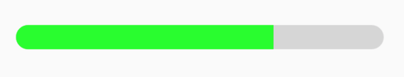
您实际上不需要使用第三方包,并且可以使用 ClipRRect 小部件包装您的 LinearProgressIndicator 并为其指定圆形边框半径。如果你想给它一个特定的厚度/高度,那么你可以使用容器作为中介:
ClipRRect(
  borderRadius: BorderRadius.circular(8),
  child: Container(
    height: 10,
      child: LinearProgressIndicator(
        value: 0.35, // percent filled
        valueColor: AlwaysStoppedAnimation<Color>(Colors.orange),
        backgroundColor: Color(0xFFFFDAB8),
      ),
    ),
  )
如果放置在另一个具有定义宽度的小部件中,则会产生此结果:

投票
让我们尝试一下我的自定义进度条,简单且不使用任何库:)

class ProgressBar extends StatelessWidget {
 final double max;
 final double current;
 final Color color;

 const ProgressBar(
  {Key? key,
  required this.max,
  required this.current,
  this.color = AppColors.secondaryColor})
  : super(key: key);
  @override
  Widget build(BuildContext context) {
  return LayoutBuilder(
  builder: (_, boxConstraints) {
    var x = boxConstraints.maxWidth;
    var percent = (current / max) * x;
    return Stack(
      children: [
        Container(
          width: x,
          height: 7,
          decoration: BoxDecoration(
            color: Color(0xffd3d3d3),
            borderRadius: BorderRadius.circular(35),
          ),
        ),
        AnimatedContainer(
          duration: Duration(milliseconds: 500),
          width: percent,
          height: 7,
          decoration: BoxDecoration(
            color: color,
            borderRadius: BorderRadius.circular(35),
          ),
        ),
      ],
    );
  },
);
}
}
投票
您可以尝试以下代码:
Container(
   decoration: const BoxDecoration(
   borderRadius: BorderRadius.all(Radius.circular(40.0))),
   child: const ClipRRect(
                  borderRadius: BorderRadius.all(Radius.circular(20)),
                  child: LinearProgressIndicator(
                    minHeight: 5.0,
                    value: 0.2,
                    color: Colors.white,
                    backgroundColor: Color(0xFF3B2D73),
                  ),
                ),
投票
我将留下我的答案,以防有人正在寻找一些自定义的、基本的自定义 BorderRadius
      Container(
        height: 24.0,
        margin: EdgeInsets.only(top: 12.0, bottom: 2.0),
        decoration: BoxDecoration(
          color: Colors.grey,
          borderRadius: BorderRadius.all(Radius.circular(4.0)),
        ),
        clipBehavior: Clip.antiAlias,
        child: FractionallySizedBox(
          alignment: Alignment.centerLeft,
          widthFactor: 0.57,
          heightFactor: 1.0,
          child: Container(
            decoration: BoxDecoration(
              color: Colors.blueAccent,
              borderRadius: BorderRadius.all(Radius.circular(4.0)),
            ),
            clipBehavior: Clip.antiAlias,
          ),
        ),
      ),
欢迎尝试一下:)
投票
不需要将 LinearPercentIndicator 包装在 Container 小部件内。您只需使用 LinearPercentIndicator 即可获得所需的输出。
查看模板代码
    LinearPercentIndicator(
        lineHeight: 40.0,
        barRadius: const Radius.circular(20.0),
        percent: 0.7,
        animation: true,
        animationDuration: 1000,
        backgroundColor: Color(0xFFD6D6D6),
        progressColor: Color(0xFF5BFB82),
    ),
投票
要使内部条变圆,我们需要使用以下逻辑:
使外部进度条变圆,使用ClipRRect并设置borderRadius
为了使内部栏变圆,我们可以使用Container,其中我们将使用borderRadius使一侧(右侧)变圆。然后,我们将使用 Stack 将其放置在进度条的顶部。 容器的宽度实际上就是进度条中显示的进度。
      Container(
          width: (MediaQuery.of(context).size.width - 30) *
              calculateProgressBarValue(Data1, Data2),
          height: 6,
          decoration: BoxDecoration(
              borderRadius: const BorderRadius.only(
                topLeft: Radius.circular(CommonDimens.MARGIN_10),
                bottomLeft: Radius.circular(CommonDimens.MARGIN_10),
              ),
              color: progressBarColor,

        ),
完整代码:
ClipRRect(
      borderRadius: const BorderRadius.all(Radius.circular(10)),
      child: Stack(
        children: [
          ClipRRect(
            borderRadius: const BorderRadius.all(Radius.circular(10)),
            child: LinearProgressIndicator(
              minHeight: 6.0,
              valueColor:
                  AlwaysStoppedAnimation<Color>(Colors.grey),
              value: 1,
            ),
          ),
          Positioned(
            right: 0,
            child: Container(
              width: ((MediaQuery.of(context).size.width) - 30) *
                  calculateProgressBarValue(Data1,Data2),
              height: 6,
              decoration: BoxDecoration(
                  borderRadius: const BorderRadius.only(
                    topLeft: Radius.circular(CommonDimens.MARGIN_10),
                    bottomLeft: Radius.circular(CommonDimens.MARGIN_10),
                  ),
                  color: progressBarColor,
            ),
          ),
        ],
      ),
    );
投票
您可以尝试我的库(capped_progress_indicator),它可以实现您想要的功能,并且工作方式与 Flutter 的原始
LinearProgressIndicatorCircularProgressIndicator所以这只是安装软件包并更改代码的问题
LinearProgressIndicator(
  // ...
)
到
import 'package:capped_progress_indicator/capped_progress_indicator.dart';

LinearCappedProgressIndicator(
  // ...
)
您还可以根据自己的喜好更改圆角半径
LinearCappedProgressIndicator(), // Circle end (default).
LinearCappedProgressIndicator(cornerRadius: 5), // Rounded end.
LinearCappedProgressIndicator(cornerRadius: 0), // Square end.
投票
您可以利用 curved_progress_bar ,它同时具有 CurvedCircularProgressIndicator 和 CurvedLinearProgressIndicator,其工作方式与普通 CircularProgressIndicator 和 LinearProgressIndicator 一样。
投票
现在可以轻松制作带有弯角的进度指示器了。
首先导入包:percent_indicator
然后,使用下面的代码并设计你的弯角进度指示器。
LinearPercentIndicator(
 barRadius: Radius.circular(16), // just using this, you can curve your corner as much you want
 width: double.infinity,
 lineHeight: 6,
 percent: percentage.trouble() / 100.0,
 progressColor: Color(0xFFF69904),
 backgroundColor: Color(0xFFE9ECEF),
 )
希望使用这个可以解决您的问题。
投票
2023 年更新
Container(
      padding: EdgeInsets.symmetric(
        vertical: MediaQuery.of(context).size.height * 0.015,
      ),
      child: ClipRRect(
        borderRadius: BorderRadius.circular(4.0),
        child: const LinearProgressIndicator(
          semanticsLabel: 'Carregando categorias',
          semanticsValue: 'Carregando categorias',
          backgroundColor: Colors.red,
          color: Colors.yellow,
        ),
      ),
    );
    ```
投票
一个更简单、更简洁的例子;)
const height = 30;
final radius = BorderRadius.circular(999);
final width = MediaQuery.of(context).size.width;

return Stack(
  children: [
    Container(
      height: 30,
      width: width,
      decoration: BoxDecoration(
        color: Colors.grey,
        borderRadius: radius,
      ),
    ),
    Container(
      height: 30,
      width: height * 0.3,
      decoration: BoxDecoration(
        color: Colors.greenAccent,
        borderRadius: radius
      ),
    ),
  ],
);
最新问题
- 三星互联网、Opera 阻止重定向到 Android 应用程序
- 当 ctrl a select all 或 ctrl home 转到 vscode 中的文件开头时,如何排除选择文件中的标头?
- 表格 td 必须采用 max-width 200px 那么只有它应该换行
- 无法在运行 Spark 应用程序的 pod 上使用 configmap 挂载配置文件
- 设置 SECURE_HSTS_SECONDS 会不可逆转地破坏您的网站吗?
- 雪花过滤功能如何防止sql注入
- Oracle中如何查询特殊字符“&”?
- 网络抓取时 R 代码无法识别错误(tryCatch)
- 无效限定符 - 对于两组布尔条件
- 在 SageMaker studio 中创建项目时,获取 CloudFormation 的配置失败
- 带有 xyz 键的容器
- 如何将CSS文件加载到jsp中登录页面
- power bi deskstop - daxstudio 中计算的列结果不同
- 在 Bash 中向数组添加新元素而不指定索引
- 尝试将pfx转换为base64字符串和asp.net core kestral证书绑定抛出错误
- 向组合框添加按钮并调整内部文本框编辑控件的大小
- 无法访问kubernetes openfunction
- Azure DevOps 是否有办法在发布管道期间替换 ZIP 工件中的文件?
- ASP.NET Core:使用自定义内容丰富 AAD 令牌声明?
- Airbyte 使用 cdc 增量加载(以 mariadb 作为源、duckdb 作为目标)时出现错误