为 iPad Air 和 iPad Pro 设置媒体查询
问题描述 投票:0回答:1
我陷入了为不同 iPad 设备设置媒体查询的困境。在我的下一个 Js 代码中,我创建了三张卡片(或 div),均匀地排成一行(react-bootstrap网格系统用于它)。默认情况下,卡片可以占据整个宽度作为网格系统的一部分,但我想将其宽度限制为特定像素。 为此,我尝试使用 CSS 媒体查询将宽度设置为卡片类
.post-card-main-wrapperCSS:
/* Default styles for all devices */
.post-card-main-wrapper {
  position: relative;
  margin: 0 auto;
  width: 320px;
}

/* Styles for iPad Pro */
@media only screen and (min-width: 1024px) {
  .post-card-main-wrapper {
    width: 400px;
  }
}

/* Styles for iPad Air */
@media only screen and (min-width: 768px) and (max-width: 1023px) {
  .post-card-main-wrapper {
    width: 220px;
    height: 350px;
  }
}

/* Styles for smaller screens (e.g., iPhone) */
@media only screen and (max-width: 767px) {
  .post-card-main-wrapper {
    width: 300px;
    height: 450px;
  }
}

/* Styles for the smallest screens (e.g., iPhone SE) */
@media only screen and (max-width: 479px) {
  .post-card-main-wrapper {
    width: 300px;
    height: 450px;
    margin: 0;
  }
}
HTML:
<div class="featured-articles-container row">
    <div class="col-sm-12 col-12">
        <div class="featured-posts">
            <div class="container-fluid">
                <div class="row">
                    <div class="col-xl-12 col-md-12 col-sm col-12">
                        <div class="ant-divider css-dev-only-do-not-override-1i536d8 ant-divider-horizontal ant-divider-with-text ant-divider-with-text-left ant-divider-no-default-orientation-margin-left" role="separator">
                            <span class="ant-divider-inner-text" style="margin-left:100px">
                                <h2>Featured Posts</h2>
                            </span>
                        </div>
                    </div>
                </div>
                <div class="justify-content-center row">
                    <div class="col-xl-4 col-md-4 col-sm col-10">
                        <div class="post-card-main-wrapper">
                            <div class="post-card-img-wrapper"><img src="https://yuma.sharkthemes.com/blog-one/wp-content/uploads/sites/3/2022/01/hand-person-girl-woman-hair-photography-78292-pxhere.com_-600x800.jpg" height="100%" width="100%"></div>
                            <div class="post-card-content-wrapper" style="background:white">
                                <span class="ant-typography css-dev-only-do-not-override-1i536d8">PHOTOGRAPHY, PORTRAIT</span>
                                <h3>Some Article Title Here</h3>
                                <span class="ant-typography css-dev-only-do-not-override-1i536d8">December 2, 2022</span>
                                <div class="ant-typography ant-typography-ellipsis ant-typography-ellipsis-multiple-line css-dev-only-do-not-override-1i536d8" style="font-size: 16px; margin-top: 1em; -webkit-line-clamp: 4;">Lorem ipsum dolor sit amet, consectetur adipiscing elit, sed do eiusmod tempor incididunt ut labore.</div>
                            </div>
                        </div>
                    </div>
                </div>
            </div>
        </div>
    </div>
</div>
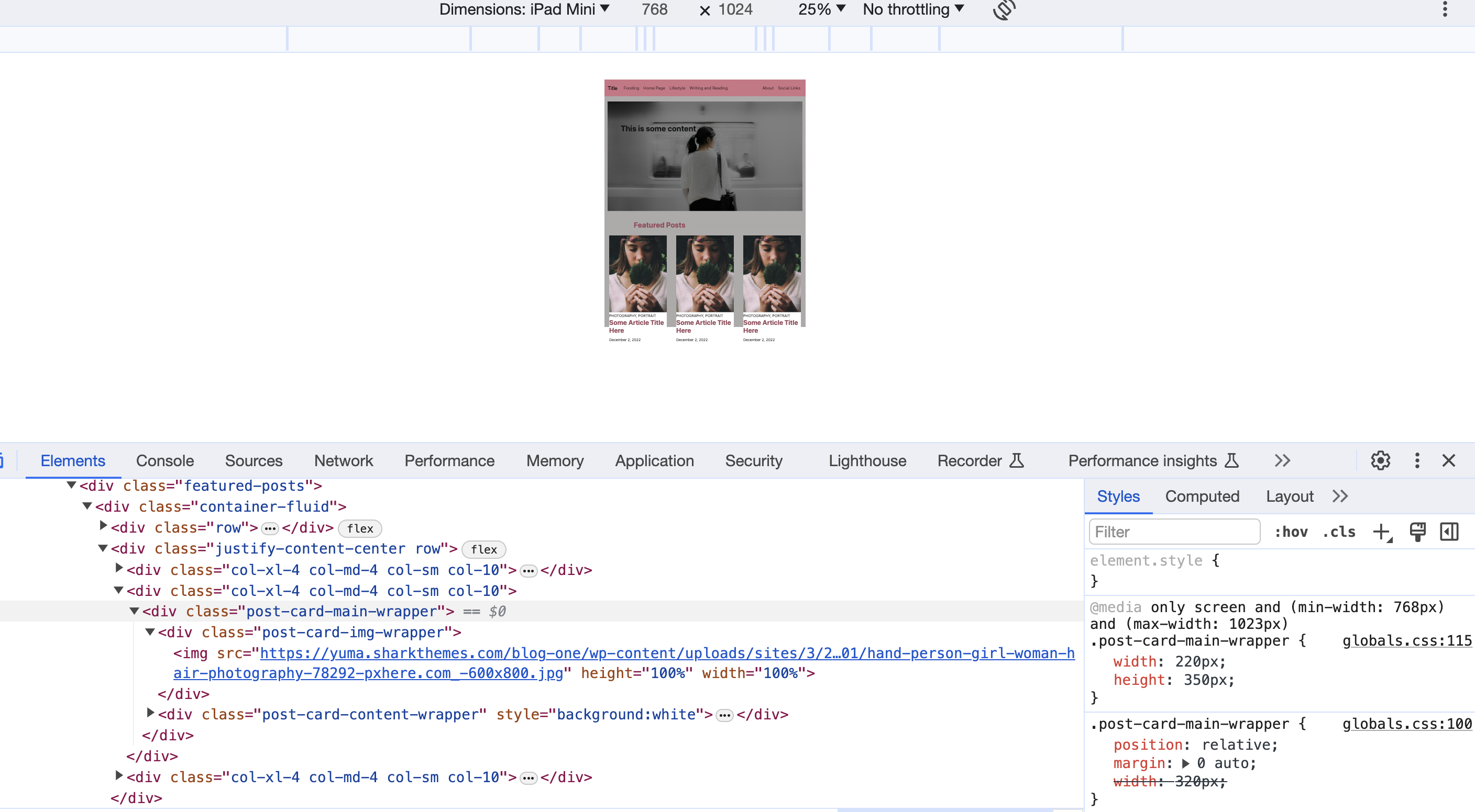
还添加主桌面视图(使用 iPad Air 进行开发)屏幕截图:

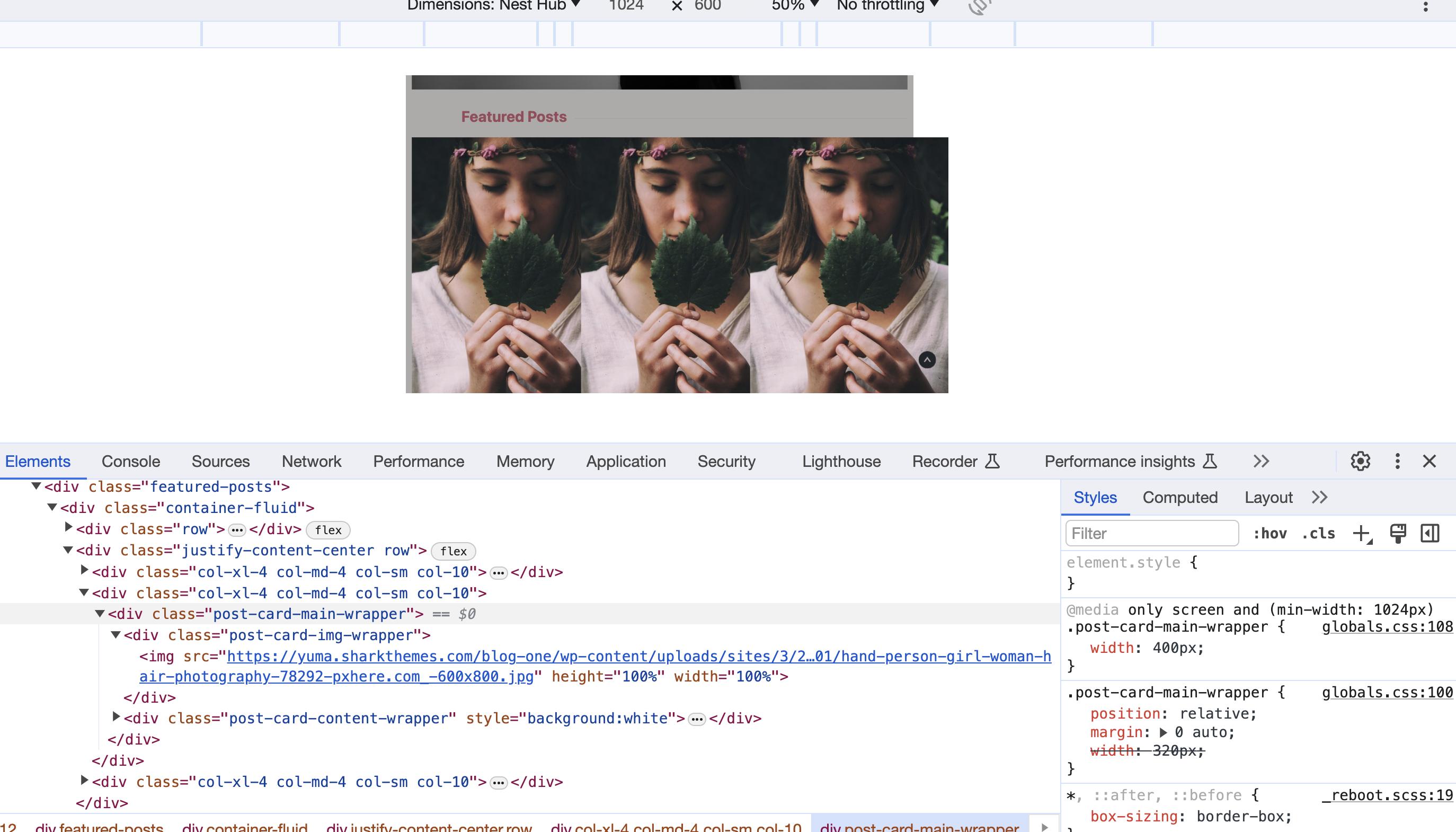
现在的问题是,当我尝试将卡片的特定宽度设置为等距时 一个设备的列(或网格),它会扰乱另一设备的宽度。大多数时候,这是iPad Air和iPad Pro之间的战斗。
用于 iPad Air 的查询,卡片间距和宽度适当,看起来不错。即使我尝试对 iPad Pro 使用单独的查询,它总是选择针对 iPad Air 的查询,并且卡片看起来完全挤在一起,没有任何空间。
添加更多截图以供参考:


我无法找出针对 iPad 以及其他不太常见(现实生活)设备解决此问题的正确方法。如果您能在 Google Chrome 维度中为所有当前设备使用正确的媒体查询提供任何帮助和解决方案,以及在指定响应式 CSS 时是否需要遵循任何规则,我们将不胜感激。
1个回答
0
投票
投票
安装怎么样
.post-card-main-wrapper { max-width:100%; }经您许可,我没有修复 html,只是删除了 css 中的媒体请求,将代码减少到两行:
.post-card-main-wrapper {
  margin: 0 auto 30px;
  width: min(400px, 100%);
}
<link href="https://cdn.jsdelivr.net/npm/[email protected]/dist/css/bootstrap.min.css" rel="stylesheet" crossorigin="anonymous">
<div class="container-fluid">
<div class="row">
<div class="col-12">
<div class="ant-divider css-dev-only-do-not-override-1i536d8 ant-divider-horizontal ant-divider-with-text ant-divider-with-text-left ant-divider-no-default-orientation-margin-left" role="separator">
<span class="ant-divider-inner-text" style="margin-left:100px">
<h2>Featured Posts</h2>
</span>
</div>
</div>
</div>
<div class="justify-content-center row">
<div class="col-xl-4 col-md-4">
<div class="post-card-main-wrapper">
<div class="post-card-img-wrapper"><img src="https://yuma.sharkthemes.com/blog-one/wp-content/uploads/sites/3/2022/01/hand-person-girl-woman-hair-photography-78292-pxhere.com_-600x800.jpg" height="100%" width="100%"></div>
<div class="post-card-content-wrapper" style="background:white">
<span class="ant-typography css-dev-only-do-not-override-1i536d8">PHOTOGRAPHY, PORTRAIT</span>
<h3>Some Article Title Here</h3>
<span class="ant-typography css-dev-only-do-not-override-1i536d8">December 2, 2022</span>
<div class="ant-typography ant-typography-ellipsis ant-typography-ellipsis-multiple-line css-dev-only-do-not-override-1i536d8" style="font-size: 16px; margin-top: 1em; -webkit-line-clamp: 4;">Lorem ipsum dolor sit amet, consectetur adipiscing elit, sed do eiusmod tempor incididunt ut labore.</div>
</div>
</div>
</div>
</div>
</div>最新问题
- 协议扩展中的快速闭包
- 如何在R中使用两种不同类型的日期格式将字符转换为日期?
- 错误 self.cap = cv2.VideoCapture(0) 期望“if”语句后有一个缩进块
- php mysqli_stmt_execute() 在 mysql v8.0.36-28 下返回 false,没有报告错误
- 第一个全加器中的“进位”
- 下一个中间件不传递服务器返回的cookie
- 如何在不创建本地驱动程序的情况下连接到远程 Playwright 服务器?
- Powershell:使用安全字符串调用 Webrequest
- 多次运行函数
- 是否可以PUT/PATCH位于vite+react项目的public文件夹中的json文件?
- Zig 中的全局`comptime var`
- 在 Nuget 中分发 DLL
- 如何从 OneDrive 在 Excel 工作表上启用宏
- 如何卸载 Visual-studio-code insider
- 缺少参数“user”。 Prisma 关系错误
- 无法在Windows中启动docker Desktop
- 保证 Firebase 实时数据库中多个路径的更新顺序
- 使用 Web Crypto API 签署 CloudKit Web 服务请求
- 如何根据mongoDB中的另一个集合字段更改集合中的字段
- 如何为Spring ControlFlowPointcut指定多个方法?
© www.soinside.com 2019 - 2024. All rights reserved.