悬停时从中心填充元素
问题描述 投票:0回答:3
我如何创建一个按钮,以便 悬停时背景颜色从元素的中心 到元素的左侧和右侧填充元素。
例子:
我知道如何使用 CSS3
transitions形状不会改变大小我只想用
transition3个回答
42
投票
投票
另一种实现类似效果的方法是使用
linear-gradientbackground-imagebackground-size0% 100%100% 100%background-size0%100%Gradients 的支持比 transforms 低,与 web-tiki's 提供的答案相比,这是一个缺点,但这种方法不需要任何额外的伪元素,这意味着它们可以用于其他目的。
div {
  position: relative;
  display: inline-block;
  padding: 15px 70px;
  border: 5px solid #B17461;
  color: #B17461;
  font-size: 30px;
  font-family: arial;
  background-image: linear-gradient(#B17461, #B17461);
  background-position: 50% 50%;
  background-repeat: no-repeat;
  background-size: 0% 100%;
  transition: background-size .5s, color .5s;
}
div:hover {
  background-size: 100% 100%;
  color: #fff;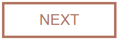
}<div>NEXT</div>根据渐变图像的位置,可以使用完全相同的方法来生成各种不同的填充方法。
div {
  position: relative;
  display: inline-block;
  padding: 15px 70px;
  border: 5px solid #B17461;
  color: #B17461;
  font-size: 30px;
  font-family: arial;
  background-image: linear-gradient(#B17461, #B17461);
  background-repeat: no-repeat;
  transition: background-size .5s, color .5s;
}
.center-right-left, .center-top-bottom, .center-corner {
  background-position: 50% 50%;
}
.to-left {
  background-position: 100% 50%;
}
.to-right {
  background-position: 0% 50%;
}
.to-top {
  background-position: 50% 100%;
}
.to-bottom {
  background-position: 50% 0%;
}
.center-right-left, .to-left, .to-right {
  background-size: 0% 100%;
}
.center-top-bottom, .to-top, .to-bottom {
  background-size: 100% 0%;
}
.center-corner {
  background-size: 0% 0%;
}
div:hover {
  background-size: 100% 100%;
  color: #fff;
}
<h4>From center towards left and right</h4>
<div class='center-right-left'>NEXT</div>
<h4>From center towards top and bottom</h4>
<div class='center-top-bottom'>NEXT</div>
<h4>From center towards corners</h4>
<div class='center-corner'>NEXT</div>
<h4>From right to left</h4>
<div class='to-left'>NEXT</div>
<h4>From left to right</h4>
<div class='to-right'>NEXT</div>
<h4>From bottom to top</h4>
<div class='to-top'>NEXT</div>
<h4>From top to bottom</h4>
<div class='to-bottom'>NEXT</div>14
投票
投票
要在悬停时从中心用纯色填充元素,您可以使用伪元素和 CSS3 过渡。
在下面的例子中,背景是用一个伪元素制作的,并在悬停时从 0 水平缩放到 1:
div {
  position: relative;
  display: inline-block;
  padding: 15px 70px;
  border: 5px solid #B17461;
  color: #B17461;
  font-size: 30px;
  font-family: arial;
  transition: color .5s;
}
div:before {
  content: '';
  position: absolute;
  top: 0; left: 0;
  width: 100%; height: 100%;
  background: #B17461;
  z-index: -1;
  transform:scaleX(0);
  transition: transform .5s;
}
div:hover {
  color: #fff;
}
div:hover:before {
  transform: scaleX(1);
}<div>NEXT</div>-1
投票
投票
你可以用这个结构做一个按钮
<button>
<text layer>
<image layer>
</button>


on.hover -> button > image
transform-origin: center
insert desired effect here
*编辑——看起来你想要文本在过渡发生时有颜色变化..
你可以在 div 中做一个 2 图像按钮 悬停时隐藏白色背景图像并显示包含棕色图像的 div
<div container>
<img borwn butn>
</div>
设置容器的宽度为0像素并固定在中心 然后仅对宽度进行动画处理将为您提供所需的结果。
最新问题
- 我的代码有问题,需要帮助修复它
- Splunk:在多个数据源上执行相同的查询
- fork后选择阅读
- 第一次使用 select(),也许是一个基本问题?
- 如何将数据库日志提取到splunk中?我只需要警告、错误、严重、ORA-* 日志。任何示例道具更改将不胜感激
- 将可写信号设置为与之前相同的值是否会将组件标记为脏?
- 如何在Python中安装dbconnect模块?
- discord.ext.commands.errors.CommandInvokeError:命令引发异常:AttributeError:'str'对象没有属性'author'
- 将状态变量传递给另一个组件
- 如何在 dart 中解析 PDF 文件的内容?
- 从 MySQL 调用 C# 函数
- 如果条件在输入时为真或稍后变为真,则状态转换
- 如何使用agora sdk在flutter中实现类似于whatsapp语音通话的音频通话
- Kotlin/Native 错误:入口点不能是挂起函数
- 是否有未来一小时的每小时气候预报数据?
- UIKit 自定义折线图视图,线条下方带有渐变遮罩
- “FIRStorageHandle”的声明必须在需要之前从模块“FirebaseStorage.FIRStorageTypedefs”导入
- 我使用STRING_AGG解决了POSTGRES SQL中的问题
- 文档自签名以来已被更改或损坏 使用 PDFBox 时出现问题
- Nuxt.js 默认布局未应用
© www.soinside.com 2019 - 2024. All rights reserved.