CSS:调整父表列列宽以包含子div,其他列使用自动宽度
问题描述 投票:0回答:1
目前
我有一个100%宽度的表,其中包含3列,其中有一个textarea,用户可以在其中输入文本。
我的目标是具有以下列宽行为:
- 第1列=最小宽度为600px
- 第2列=相对于其他列的自动宽度
- 第3列=相对于其他列的自动宽度
奖励目标:如果屏幕宽度足够小,1个或多个列无法完全显示,请添加水平滚动。
码:
table {
  border-collapse: collapse;
  width: 100%;
  border: 1px solid black;
  table-layout: fixed;
}

th, td {
  text-align: center;
  border: 1px solid black;
  padding: 10px;
}

.container {
  border: 1px solid blue;

}

.text-area {
  width: 100%;
  box-sizing: border-box;
  display: flex;
}

.fixed-min {
  min-width: 600px;
}
<!DOCTYPE html>
<html>
<body>
<table>
<tbody>
<tr>
<th>Column 1 - has min width</th>
<th>Column 2</th>
<th>Column 3</th>
</tr>
<tr>
<td>
<div class="container fixed-min">
<textarea class="text-area">Respect the minimum column width for this column.
</textarea>
</div>
</td>
<td>
<div class="container">
<textarea class="text-area">This column width should revert to default for the table.
</textarea>
</div>
</td>
<td>
<div class="container">
<textarea class="text-area">This column width should also revert to the default for the table.
</textarea>
</div>
</td>
</tr>
</tbody>
</table>
</body>
</html>https://jsfiddle.net/bjLxuvfz/1/
问题
第1列的最小宽度为600px,但(1)类“容器”和(2)宽度不调整。
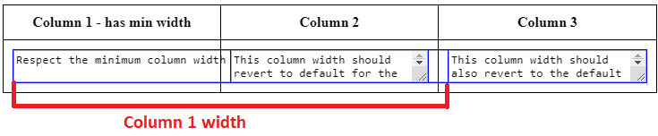
预期行为:
- 当窗口大小为600px时,列1宽度= 600px,列2和列3处于最小自动大小。可选:带水平滚动条。
- 当窗口尺寸很大时,例如1000px +,第1列到第3列是自动调整大小的,第1列宽度> 600px。
注意:
- 如果可以实现所需的结果,我想保持表的结构和div相同。
- 这是基于我的上一个查询:CSS: center textarea inside <td> for 100% table
1个回答
1
投票
投票
我已经根据要求进行了更改,为了实现这个删除table-layout:fixed并添加外部div到table,使其在响应/移动模式下工作。请检查希望这将解决您的问题。我也建议按照标准在thead中制作。
table {
  border-collapse: collapse;
  width: 100%;
  border: 1px solid black;

}

th, td {
  text-align: center;
  border: 1px solid black;
  padding: 10px;
}

.container {
  border: 1px solid blue;

}

.text-area {
  width: 100%;
  box-sizing: border-box;
  display: flex;
}

.fixed-min {
  min-width: 600px;
}
.res-table{
  max-width:100%;
  width: 100%;
  overflow-x: auto;
}
<!DOCTYPE html>
<html>
<body>
<div class="res-table">
<table>
<tbody>
<tr>
<th width="600px">Column 1 - has min width</th>
<th>Column 2</th>
<th>Column 3</th>
</tr>
<tr>
<td>
<div class="container fixed-min">
<textarea class="text-area">Respect the minimum column width for this column.
</textarea>
</div>
</td>
<td>
<div class="container">
<textarea class="text-area">This column width should revert to default for the table.
</textarea>
</div>
</td>
<td>
<div class="container">
<textarea class="text-area">This column width should also revert to the default for the table.
</textarea>
</div>
</td>
</tr>
</tbody>
</table>
</div>
</body>
</html>最新问题
- 使用 gt 库在 R 中的数据帧上转换列(通过标签对行进行分组)
- 绕垂直轴旋转 45 度元素
- 关于CQRS和数据更新时更新UI的问题
- 如何通过 CancellationToken 停止异步进程?
- 如何从使用 Vite 构建的单独站点交叉加载资源,就像在 HTML 文件中使用 Webpack 一样?
- 导致 Angular 16 中同一组件呈现的项目之间导航失败的原因是什么?
- 如何更改Python LSTM模型代码以预测年度而不是月份(数据集包含年度数据),但模型给出每月
- 关闭时不断弹出提示
- 使用 linq 将字典值转换为列表
- Pybind11 无法弄清楚如何访问元组元素
- 使用 WSL 和 VS Code 配置解释器
- 同时按时间戳和另一个字段对 SQL 结果进行排序
- 如何在 Kubernetes pod 中安装包
- 如何使用 Terraform 的文件配置程序从本地计算机复制到虚拟机?
- Access-Control-Allow-Origin 未添加到 Spring Boot 应用程序的 Rest API 中
- Unity 图层重叠并且光线投射不会忽略我想要的图层
- 在 Rmarkdown for Word 中,如何指定 r 输出的字体?
- 无法从基于python2.7和django 1.4的本地遗留项目连接到云数据存储
- 如何知道 HuggingFace BertTokenizer 中哪些单词是用未知标记编码的?
- 如何在 Java 中将 ArrayList 从一个方法传递到另一个方法?
© www.soinside.com 2019 - 2024. All rights reserved.