在CSS过渡期间绘制边框颜色
问题描述 投票:3回答:1
button {
  background: none;
  border: 0;
  box-sizing: border-box;
  margin: 1em;
  padding: 1em 2em;
  box-shadow: inset 0 0 0 2px #f45e61;
  color: #f45e61;
  font-size: inherit;
  font-weight: 700;
  position: relative;
  vertical-align: middle;
}
button::before, button::after {
  box-sizing: inherit;
  content: " ";
  position: absolute;
  width: 100%;
  height: 100%;
}
.draw {
  transition: color 0.25s;
}
.draw::before, .draw::after {
  border: 2px solid transparent;
  width: 0;
  height: 0;
  transition: width 1.25s ease-out 1.25s, height 1.25s ease-out 1.25s;

}
.draw::before {
  top: 0;
  left: 0;
}
.draw::after {
  bottom: 0;
  right: 0;
}
.draw:hover {
  color: #60daaa;
}
.draw:hover::before, .draw:hover::after {
  width: 100%;
  height: 100%;
}
.draw:hover::before {
  border-top-color: #60daaa;
  border-right-color: #60daaa;
  transition: width 0.25s ease-out, height 0.25s ease-out 0.25s;
}
.draw:hover::after {
  border-bottom-color: #60daaa;
  border-left-color: #60daaa;
  transition: border-color 0s ease-out 0.5s, width 0.25s ease-out 0.5s, height 0.25s ease-out 0.75s;
}
<section class="buttons">
<button class="draw">Draw</button>
</section>我有一个工作笔(https://codepen.io/anon/pen/vdgdxO),在悬停时(右上角左下方)改变元素的边框颜色,并进行一些过渡以使其平滑。
我想能够在几秒钟后“反转”边框颜色变化。基本上,当相反的颜色改变颜色时,我想改变边框颜色:
- 边框变色
- 边框改变颜色
- border-bottom change color和border-top恢复原来的颜色
- border-left change color&border-right返回其原始颜色
- border-top change color和border-bottom恢复原来的颜色
- border-right change color&border-left恢复原来的颜色等。
现在我只有颜色变化,但我不知道如何“扭转”它。我也希望这种过渡永远循环,但我对从何处开始毫无头绪。有什么建议?
1个回答
8
投票
投票
我会使用多个linear-gradient和一个复杂的动画(通过动画每个的大小/位置)来获得最终结果。如果你获得了技巧,你可以轻松调整不同的值,以获得你想要的任何动画。
.draw {
  padding: 20px 50px;
  outline:none;
  border: none;
  box-shadow: none;
  background-image:
  linear-gradient(#f45e61, #f45e61),
  linear-gradient(#f45e61, #f45e61),
  linear-gradient(#f45e61, #f45e61),
  linear-gradient(#f45e61, #f45e61),

  linear-gradient(#60daaa, #60daaa),
  linear-gradient(#60daaa, #60daaa),
  linear-gradient(#60daaa, #60daaa),
  linear-gradient(#60daaa, #60daaa);

  background-position: 0 0, 0 0, 0 100%, 0 100%,
                       0 0, 0 0, 0 100%, 100% 0;
  background-size: 3px 0%, 0% 3px, 0% 3px, 3px 0%,
                   3px 100%, 100% 3px, 100% 3px,3px 100%;
  background-color:transparent;
  background-repeat:no-repeat;
  transition:0.2s linear;
}

.draw:hover {
  background-position: 0 100%, 0 0, 0 100%, 100% 0,
                       0 0, 0 0, 0 100%, 100% 0;
  background-size: 3px 0%, 100% 3px, 0% 3px,3px 0%,
                   3px 100%, 100% 3px, 100% 3px,3px 100%;
  animation: animate 1.4s linear infinite 0.2s;
}

@keyframes animate {
  0% {
  background-position: 0 100%, 0 0, 0 100%, 100% 0,
                       0 0, 0 0, 0 100%, 100% 0;
  background-size: 3px 0%, 100% 3px, 0% 3px,3px 0%,
                   3px 100%, 100% 3px, 100% 3px,3px 100%;
  }
  40% {
  background-position: 0 100%, 100% 0, 100% 100%, 100% 0,
                       0 0, 0 0, 0 100%, 100% 0;
  background-size: 3px 0%, 100% 3px, 0% 3px,3px 100%,
                   3px 100%, 100% 3px, 100% 3px,3px 100%;
  }
  60% {
  background-position: 0 100%, 100% 0, 100% 100%, 100% 100%,
                       0 0, 0 0, 0 100%, 100% 0;
  background-size: 3px 0%, 0% 3px, 100% 3px,3px 100%,
                   3px 100%, 100% 3px, 100% 3px,3px 100%;
  }
  70% {
  background-position: 0 100%, 100% 0, 0% 100%, 100% 100%,
                       0 0, 0 0, 0 100%, 100% 0;
  background-size: 3px 100%, 0% 3px, 100% 3px,3px 0%,
                   3px 100%, 100% 3px, 100% 3px,3px 100%;
  }
  80% {
  background-position: 0% 0%, 0% 0, 0% 100%, 100% 100%,
                       0 0, 0 0, 0 100%, 100% 0;
  background-size: 3px 100%, 0% 3px, 0% 3px,3px 0%,
                   3px 100%, 100% 3px, 100% 3px,3px 100%;
  }
  100% {
  background-position: 0% 0%, 0 0, 0 100%, 100% 100%,
                       0 0, 0 0, 0 100%, 100% 0;
  background-size: 3px 0%, 100% 3px, 0% 3px,3px 0%,
                   3px 100%, 100% 3px, 100% 3px,3px 100%;
  }
}
<button class="draw">Draw</button>它是如何工作的?
结构:我们有8个linear-gradient。 4将简单地创建初始边框并且不会移动(它们放置在底层),并且将使用4来绘制将在初始边界上方创建动画的线(它们放置在顶层)。
顺序很重要,因为在背景属性中,每个梯度每个都有8个值。你会注意到3px值只会指定每个渐变的宽度或高度(类似于border-width),并且它在动画过程中不会改变。
动画:我将调整每个渐变的位置/大小以创建动画。它分为两部分:一个小过渡和一个大动画。转换仅用于创建动画的初始状态,这就是用于转换的持续时间与动画延迟相同的原因。
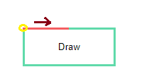
- 第一步是从左到右为顶部边框设置动画。要做到这一点,渐变应位于
(0,0) [top,left],大小为0% 3px [width height]。然后我只需将大小更改为100% 3px,我将获得所需的动画(前面描述的3px不会改变)。 - 现在为第二个边框设置动画,我们也是这样做的。我们需要一个位于
(100%,0) [top,right]的梯度,其大小为3px 0% [width height],我们为3px 100%制作动画:
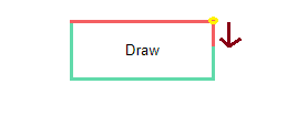
- 现在,由于我们有两个边框,我们需要为第三个边框设置动画并隐藏第一个边框。我不会详细说明第三个边框,因为它与上面的相似,所以让我们看看如何隐藏顶部边框。第一个直观的想法是简单地将其大小设置回
0% 3px,但这只会创建逆动画,因此我们将有一个右到左动画,这是坏的。这里的技巧是调整渐变的位置,使其成为(100%,0) [top,right]而不是(0,0),因为当渐变为100%大小时,两个位置都是等效的(所以我们在上一步为动画第二个时执行此操作)。现在,我们可以将大小放回到0% 3px,我们将有一个从左到右的动画:
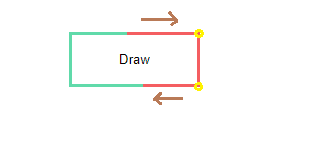
- 我们继续使用相同的逻辑,直到我们回到初始状态,并通过在动画属性中指定
infinite,我们将获得所需的效果。
所以主要的想法是有一个大小等于0%的渐变,我们在给定的方向上动画到全尺寸(100%),然后我们改变它的位置(这对全尺寸没有任何影响)然后动画将它的大小恢复为0.我们将它与我们拥有的4个渐变混合。
UPDATE
为了避免与所有这些渐变混淆,这里是一个更新,其中我使用静态边框的伪元素,因此我们只为动画保留4个渐变:
.draw {
  position:relative;
  padding: 20px 50px;
  outline:none;
  border: none;
  box-shadow: none;
  background-image:
  linear-gradient(#f45e61, #f45e61),
  linear-gradient(#f45e61, #f45e61),
  linear-gradient(#f45e61, #f45e61),
  linear-gradient(#f45e61, #f45e61);

  background-position: 0 0, 0 0, 0 100%, 0 100%;
  background-size: 3px 0%, 0% 3px, 0% 3px, 3px 0%;
  background-color:transparent;
  background-repeat:no-repeat;
  transition:0.2s linear;
}
.draw:before {
  content:"";
  position:absolute;
  z-index:-1;
  top:0;
  right:0;
  left:0;
  bottom:0;
  border:3px solid #60daaa;
}

.draw:hover {
  background-position: 0 100%, 0 0, 0 100%, 100% 0;
  background-size: 3px 0%, 100% 3px, 0% 3px,3px 0%;
  animation: animate 1.4s linear infinite 0.2s;
}

@keyframes animate {
  0% {
  background-position: 0 100%, 0 0, 0 100%, 100% 0;
  background-size: 3px 0%, 100% 3px, 0% 3px,3px 0%;
  }
  40% {
  background-position: 0 100%, 100% 0, 100% 100%, 100% 0;
  background-size: 3px 0%, 100% 3px, 0% 3px,3px 100%;
  }
  60% {
  background-position: 0 100%, 100% 0, 100% 100%, 100% 100%;
  background-size: 3px 0%, 0% 3px, 100% 3px,3px 100%
  }
  70% {
  background-position: 0 100%, 100% 0, 0% 100%, 100% 100%;
  background-size: 3px 100%, 0% 3px, 100% 3px,3px 0%;
  }
  80% {
  background-position: 0% 0%, 0% 0, 0% 100%, 100% 100%;
  background-size: 3px 100%, 0% 3px, 0% 3px,3px 0%;
  }
  100% {
  background-position: 0% 0%, 0 0, 0 100%, 100% 100%;
  background-size: 3px 0%, 100% 3px, 0% 3px,3px 0%
  }
}
<button class="draw">Draw</button>最新问题
- Azure blob 批量删除命令抛出错误
- 在 HTTP header 中传递用户名/密码作为参数还是 HTTP Body 中哪个更好?
- 完整日历自定义按钮 - 省略号图标
- 无法动态设置输入(月份)值Vue 3 [已关闭]
- 如何在不使用任何字符串方法的情况下获得以下代码中大写的 am pm ?
- 如何在 PL/pgSQL 中返回一组不进行强制转换的复合类型?
- 如何在 PL/pgSQL 中返回一组不进行强制转换的复合类型?
- 我如何检查两个数字之间是否有任意数字?
- 重用 terraform 中父模块中声明和定义的变量
- dotnet dbcontext Scaffold ef和scaffold-dbcontext命令找不到包
- 如何在Java中处理多个退出点
- Azure Graph Explorer 查询可识别安装了 SQL Server 的虚拟机
- 用 PHP 或 Javascript 生成实际的 Youtube 下载链接
- Flutter自定义onTap缩放效果
- Bootstrap 5 中按钮超出其容器,我该怎么办?
- 将 Textile 标记转换为 Markdown?
- CSS 样式未应用于 React 项目中的 body 标签
- 无法加载使用fastai 2.7.11 SaveModelCallback保存的模型
- 尝试读取 Office365 日历时出现问题
- 修改和删除表并应用于DBContext
© www.soinside.com 2019 - 2024. All rights reserved.