父级div的背景色
问题描述 投票:0回答:2
我正在尝试实现复杂的设计,并且在剪切和遮罩方面遇到困难。我假设需要组合修剪或遮罩,因为我不确定其他方法如何使它工作。我需要将父级或相邻div的背景片段进行透明处理。主div的阴影很小,因此如果使用纯色代替则很明显。我已经开始制作仅是标记和CSS的粗俗原型,但现在在这里说明了我需要做的很好。
我需要删除/剪切父div的白色背景并使其透明,因为真实的身体/背景不只是纯色。我研究了剪切路径和其他功能,但实际上,我需要做的与我所阅读的内容相反。这是我到目前为止的标记和样式:
body {
    background-color: #C4C4C4;
}
.big-div {
    width: 300px;
    height: 100px;
    background-color: #fff;
    left: 100px;
    position: absolute;
    box-shadow: 5px 5px 5px #000;
}
.number {
    border-radius: 20px;
    height: 50px;
    width: 50px;
    border: solid .5em #C4C4C4;
    padding: .5em;
    top: 10px;
    text-align: center;
    background: #008DCC content-box;
    left: -40px;
    position: absolute;
    clip: circle(100px, 200px, 300px, 400px);
}
和简单的标记:
<div class="big-div">
    <div class="number">
        <p>2</p>
    </div>
</div>
[如果我没有尽我所能说明我的观点,这是从Figma 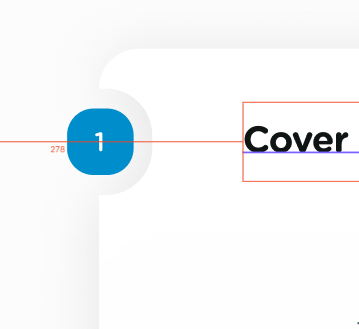
感谢您提供任何提示或建议
2个回答
1
投票
投票
这是在较大元素上使用径向渐变作为背景的一种可能的替代方法。
[有效地,我们使用的是带有很小渐变色的径向背景(仅包括1个像素,用于使边缘平滑),将透明的圆圈放置在其他白色背景上。
body {
  /* This gradient is not part of the solution, it just shows that the background is visible beneath the main element*/
  background: linear-gradient(to bottom, #C4C4C4, #B4B4B4 50%, #B4B4B4 50%, #C4C4C4);
}

.big-div {
  width: 300px;
  height: 100px;
  left: 100px;
  position: absolute;
  box-shadow: 5px 5px 5px #000;
  background-image: radial-gradient(circle at 0px 40px, rgba(0, 0, 0, 0) 0%, rgba(0, 0, 0, 0) 30px, rgba(255, 255, 255, 1) 31px, rgba(255, 255, 255, 1) 100%);
}

.number {
  border-radius: 50%;
  height: 50px;
  width: 50px;
  top: 15px;
  text-align: center;
  background: #008DCC content-box;
  left: -25px;
  position: absolute;
  line-height: 50px;
}
<div class="big-div">
<div class="number">
1
</div>
</div>0
投票
投票
您要删除prent div的背景吗?试试:background-color:rgba(0,0,0,0);
最新问题
- EFCore 在添加时更改实体的 ID。无法跟踪实体,因为具有键值的另一个实例已被跟踪
- GitLab 管道上传的正确 TWINE_REPOSITORY_URL 是什么?
- join 期间 ctrl+c 上的 Python 线程行为
- 内循环的时间复杂度
- Chrome 扩展:将自定义事件从内容脚本传递到 React/Next.js 应用程序
- 调整职员用户按钮大小
- 如何强制MacOS PKG要求用户在安装后将安装程序移至垃圾箱?
- 如何在 iOS 和 Web 的 React Native 中实现可调整大小、可移动和可移动的可拖动矩形?
- 找不到模块“@google/generative-ai”
- 任务:expo-modules-core:configureCMakeDebug[arm64-v8a]失败
- Elasticsearch:如何计算同一请求中每个字段聚合的术语总数
- Amazon Managed Airflow (MWAA) 工作一段时间后出现错误(ResourceNotFoundException)
- Docker authz 插件问题
- java.lang.NoClassDefFoundError: org/apache/hadoop/fs/impl/prefetch/PrefetchingStatistics 运行 pyspark 时
- 由于 SSL 证书错误,无法使用 Streamlit 应用程序
- 如何将 GitHub actions 输出转换为环境变量?
- 如果两个表 JPA 中的列名称不同,则进行 OnetoOne 映射
- Laravel JavaScript 将数组从后端传递到 JavaScript 中的数组
- 为什么在执行一个 sudo 命令之前我无法打开 Mac 文件(不允许操作)?
- 如何将服务器上的文本图像转换为javascript图像?
© www.soinside.com 2019 - 2024. All rights reserved.