带有颜色范围的 CSS 条件格式
问题描述 投票:0回答:5
我希望使用 div 和 span 创建一个基本图表,并希望根据设置其高度的值对图表中的每一列应用条件格式。我无法破解的技巧是我想让它的功能有点像示例中的 Excel 条件格式:
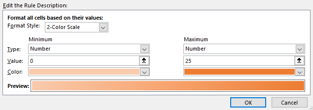
颜色在一定范围内(浅到深)。 有没有一种简单的方法可以做到这一点?我可以看到如何将静态值应用于静态颜色,但希望我可以像这个 excel 示例那样对颜色范围做一些事情。
因此,下面的屏幕截图显示了一个柱形图,其中每列都有不同的橙色阴影,具体取决于该列的值:

越接近25,颜色越深。同样,值越低,橙色越浅。
5个回答
投票
听起来您的目标是根据值将条形着色在两种颜色之间。如果是这样的话,你可以使用css动画来模拟颜色渐变。
想法是这样的:
- 设置动画,将背景设置为两种颜色之一。这有效地计算了两种颜色之间的渐变。您可以使用
和@keyframes
来完成此操作。animation - 暂停动画,因为我们不希望它实际播放。这是用
完成的。animation-play-state - 选择动画中的特定帧以获得正确的中间颜色。这可以用负数
来完成。animation-delay
.bars {
  display: flex;
  justify-content: space-evenly;
}

.bar {
  animation: color-gradient 25s linear 1;
  animation-fill-mode: forwards;
  animation-play-state: paused;
  width: 3em;
}

@keyframes color-gradient {
  from { background: red; }
  to   { background: blue; }
}
<div class="bars">
<div class="bar" style="height: 5em; animation-delay: -5s;"></div>
<div class="bar" style="height: 10em; animation-delay: -10s;"></div>
<div class="bar" style="height: 15em; animation-delay: -15s;"></div>
<div class="bar" style="height: 20em; animation-delay: -20s;"></div>
<div class="bar" style="height: 25em; animation-delay: -25s;"></div>
</div>如果需要,可以通过使动画持续时间长于 25 秒来调整粒度。
投票
我将提供两个选项,也许您可以根据您的需要提供更多详细信息。
第一个可能不是您想要的,因为它根据特定高度设置特定渐变。只会为此提供一个 Codepen。 https://codepen.io/jfirestorm44/pen/yLMNPPM?editors=1100
下一篇是我认为您想要的更多内容。如果您知道条形图的最大高度,您可以使用它来设置
linear-gradient更新: HTML
<div id="container">
  <div id="first" class="bar"></div>
  <div id="second" class="bar"></div>
  <div id="third" class="bar"></div>
  <div id="fourth" class="bar"></div>
  <div id="fifth" class="bar"></div>
</div>
SCSS
.bar {
  @for $i from 1 through 5 {
    $height: 20px * $i;
    $light: 75% + $i * -5;
    &:nth-child(#{$i}) {
      position: absolute;
      bottom: 50%;
      left: 20% + ($i * 10%);
      width: 20px;
      height: $height;
      font-size: 25px;
      transform: translate(-80%, 0);
      background: hsl(35, 100%, $light);
    }
  }
}
更新了 Codepen:https://codepen.io/jfirestorm44/pen/jOBPopj?editors=1100
添加 JS 选项:
let inputNum = document.getElementById("number");
let button1 = document.getElementById("button1");
let border = document.getElementById("border");
let dropDown = document.getElementById("cars");
function color() {
  if (inputNum.value > 0) {
    let bar = document.createElement("div");
    bar.classList.add("bar");
    border.appendChild(bar);
    let bars = document.getElementsByClassName("bar");

    let carName = document.createElement("p");
    carName.classList.add("carType");
    carName.textContent = cars.options[cars.selectedIndex].text;
    border.appendChild(carName);
    let names = document.getElementsByClassName("carType");

    let height = inputNum.value * 26;
    for (let i = 0; i < bars.length; i++) {
      names[names.length - 1].style.top = "275px";
      names[names.length - 1].style.left = -5 + i * 30 + "px";
      bars[bars.length - 1].style.height = height + "px";
      bars[bars.length - 1].style.backgroundColor =
        "hsl(35, 100%," + (75 - height / 5.2) + "%)";
      bars[bars.length - 1].style.left = 10 + i * 30 + "px";
    }
  }
}
#container {
position: absolute;
top: 40px;
left: 0;
width: 400px;
height: 300px;
}
#border {
position: relative;
left: 100%;
top: 0;
width: 90%;
height: 90%;
border-left: 2px solid grey;
border-bottom: 2px solid grey;
transform: translate(-100%, 0);
}
#numberContainer {
position: relative;
left: -5%;
}
.num {
line-height: 10px;
}
.num:before {
content: "";
position: absolute;
left: 18px;
width: 100%;
height: 10px;
border-bottom: 1px lightgrey solid;
}
.bar {
position: absolute;
bottom: 0;
width: 20px;
}
#button1 {
position: relative;
top: 0;
width: 60px;
height: 20px;
}
.car {
position: absolute;
top: 10px;
}
.carType {
position: absolute;
bottom: -85px;
writing-mode: vertical-rl;
text-orientation: upright;
}<div id="container">
<div id="border">
<div id="numberContainer">
<p class="num">10</p>
<p class="num">9</p>
<p class="num">8</p>
<p class="num">7</p>
<p class="num">6</p>
<p class="num">5</p>
<p class="num">4</p>
<p class="num">3</p>
<p class="num">2</p>
<p class="num">1</p>
<p class="num">0</p>
</div>
</div>
</div>
<input type="number" min="0" max="10" value="0" id="number"/>
<label for="cars">Choose a car:</label>
<select name="cars" id="cars">
<option value="volvo">Volvo</option>
<option value="saab">Saab</option>
<option value="mercedes">Mercedes</option>
<option value="audi">Audi</option>
</select>
<button type="button" onclick="color()" id="button1">Submit</button>投票
[编辑]此答案仅从左到右对条形进行着色,左侧的颜色最浅。
我会让容器具有白色背景,条形为黑色,然后在伪元素的帮助下在所有内容上添加渐变,该伪元素已将
mixed-blend-mode: lighten作为奖励,我添加了另一个具有重复线性渐变的伪元素,该渐变由真正的浅灰色组成,以创建水平线。然后我将
mixed-blend-mode: darken我还通过随机化每个条形的 CSS 属性来随机化条形的高度。
此解决方案可扩展,因此无论您有多少条形,您仍然可以获得所有条形的渐变,而无需更改 CSS 代码。
let bars = document.querySelectorAll('.bar');

function randomize(max, min) {
  min = min || 0;

  return Math.floor(Math.random() * (max - min) + min);
}

for (const bar of bars) {
  bar.style.setProperty('--bar-height', `${randomize(10, 2)}rem`);
}
.container {
position: relative;
display: inline-flex;
margin-left: 4.5rem;
align-items: flex-end;
background-color: #fff;
padding: 0px 1rem;
}
.container::before,
.container::after {
content: '';
position: absolute;
top: 0px;
bottom: 0px;
left: 0px;
right: 0px;
}
.container::before {
background: linear-gradient(to right, #fbe5d6, #843c0c);
mix-blend-mode: lighten;
}
.container::after {
background: repeating-linear-gradient(to top, #f4f1f1, #f4f1f1 1px, transparent 1px, transparent 1rem);
z-index: 10;
mix-blend-mode: darken;
}
.bar {
width: 1.5rem;
height: var(--bar-height);
background-color: #000;
}
.bar + .bar {
margin-left: 3rem;
}<div class="container">
<div class="bar"></div>
<div class="bar"></div>
<div class="bar"></div>
<div class="bar"></div>
<div class="bar"></div>
</div>投票
结合使用我和贾斯汀的答案,但适用于普通 CSS。
这个答案是使用 HSL 和 CSS 变量来设置颜色和高度。
随机值
let bars = document.querySelectorAll('.bar');

function randomize(max, min) {
  min = min || 0;

  return Math.floor(Math.random() * (max - min) + min);
}

for (const bar of bars) {
  let maxValue = 25;
  let randomValue = randomize(maxValue, 2);
  let height = randomValue/2;

  let hue = '24deg';
  let saturation = '82%';
  let maxHue = 90;
  let minHue = 30;
  let hueRange = maxHue - minHue;
  let lightness = `${maxHue - hueRange * (randomValue/maxValue)}%`;

  bar.style.setProperty('--bar-height', `${height}rem`);
  bar.style.setProperty('--color-background-bar', `hsl(${hue}, ${saturation}, ${lightness})`);
}
.container {
display: inline-flex;
margin-left: 4.5rem;
align-items: flex-end;
padding: 0px 1rem;
background: repeating-linear-gradient(to top, #eee, #eee 1px, transparent 1px, transparent 1rem);
}
.bar {
width: 1.5rem;
height: var(--bar-height);
background-color: var(--color-background-bar);
}
.bar + .bar {
margin-left: 3rem;
}<div class="container">
<div class="bar"></div>
<div class="bar"></div>
<div class="bar"></div>
<div class="bar"></div>
<div class="bar"></div>
</div>增加价值
静态值范围从 5 到 25,如 OP 的图片所示。
let bars = document.querySelectorAll('.bar');

bars.forEach((bar, index) => {
  let maxValue = 25;
  let customValue = 5 + index * 5;
  let height = customValue/2;

  let hue = '24deg';
  let saturation = '82%';
  let maxHue = 90;
  let minHue = 30;
  let hueRange = maxHue - minHue;
  let lightness = `${maxHue - hueRange * (customValue/maxValue)}%`;

  bar.style.setProperty('--bar-height', `${height}rem`);
  bar.style.setProperty('--color-background-bar', `hsl(${hue}, ${saturation}, ${lightness})`);
});
.container {
display: inline-flex;
margin-left: 4.5rem;
align-items: flex-end;
padding: 0px 1rem;
background: repeating-linear-gradient(to top, #eee, #eee 1px, transparent 1px, transparent 1rem);
}
.bar {
width: 1.5rem;
height: var(--bar-height);
background-color: var(--color-background-bar);
}
.bar + .bar {
margin-left: 3rem;
}<div class="container">
<div class="bar"></div>
<div class="bar"></div>
<div class="bar"></div>
<div class="bar"></div>
<div class="bar"></div>
</div>投票
我知道这是一个较旧的问题,但现在可以使用 CSS 变量和
color-mixlet bars = document.querySelectorAll('.bar');
let i = 0;
for (const bar of bars) {
bar.style.setProperty('--value', `${i+=2}`);
}.container {
--min: 0;
--max: 10;
--incs: oklch;
--value: 0.5;
--high-color: #843c0c;
--low-color: #fbe5d6;
display: inline-flex;
align-items: flex-end;
background-color: #fff;
padding: 1rem;
gap: 3rem;
border: 1px solid grey;
}
.bar {
--normed: calc(100% * (var(--value) - var(--min))/(var(--max) - var(--min)));
background-color: color-mix(
in var(--incs),
var(--high-color) var(--normed),
var(--low-color)
);
width: 1.5rem;
height: calc(1rem * var(--value));
}<div class="container">
<div class="bar"></div>
<div class="bar"></div>
<div class="bar"></div>
<div class="bar"></div>
<div class="bar"></div>
</div>你甚至可以使用 3 种颜色渐变,就像这里的这个问题:
最新问题
- Neo4j 2.0.0RC1 启动服务失败 87
- 在装饰XMLHttpRequest的onreadystatechange方法的函数中获取URL
- 基于键数组列表上的对象数组将每个键转换为数组列表的新对象
- 适用于 WeasyPrint 和 jinja2 的 AWS Lambda 层
- 在 nuxt.js 中设置 Google Analytics 4
- Blazor Net 8.0 自定义身份验证不起作用
- 在 C# 中声明一个带有 null 检查的 init 属性访问器,并且没有可空分析警告
- Angular - QueryList.changes 但使用信号(怎么做?)
- 网络驱动器上的 Powershell 脚本即使在运行 Unblock-File 后仍然给出安全提示
- WPF - 访问命令的 TreeViewItem 的根 UserControl DataContext
- 为什么在 Spring 中,如果目标 bean 仅定义一个构造函数,则不再需要构造函数上的 @Autowired 注解?
- 如何使用 TelecomManager.placeCall() 删除已拨电话?
- 为什么我得到这段代码的 null 或未定义值,我正在尝试将我的 botpress 与 stackAi 连接,
- viewport-fit=cover 在 iOS Safari 上不起作用?
- 在带有 Capacitor 的 React 应用程序中使用 NFC 扫描功能
- mongoimport 将数据类型应用为所有字段的字符串
- 如何在 Android 中使用 Hilt 在基类中进行字段注入
- 使用雅虎财经 API - 未定义的输出
- 如何使用 bs4 从元素中提取文本
- 对 Google Cloud Run REST api 的最终用户进行身份验证