Css阴影框::使用边框方法进行arrox之后
问题描述 投票:1回答:2
我正在尝试通过这种设计实现几个要素:
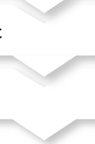
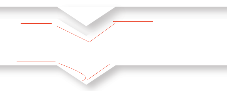
我设法做的事情:
对于第一个div,我没有为:: before箭头创建内部框阴影,而为:: after箭头进行框阴影
对于最后一个div,我设法做到了,但是当我尝试更改箭头的大小以使其变大时,框阴影不再起作用...
body {
  background-color: white;
}
.test{
  margin-top: -30px!important;
}
.test2{
  z-index:13;
}
.test3{
  z-index:12;
}
.test4{
  z-index:11;
}
.test5{
  z-index:10;
}
.triangle {
  position: relative;
  margin: 3em;
  padding: 1em;
  box-sizing: border-box;
  background: white;
  box-shadow: 0px 3px 10px 0 black;
}
.triangle::before{
    content: "";
    position: absolute;
    width: 0;
    height: 0;
    margin-left: -0.5em;
    top: 0;
    left: 40%;
    width: 0;
    height: 0;
    border-style: solid;
    border-width: 20px 50px 0 50px;
    border-color: lightgrey transparent transparent transparent;
    //box-shadow: 0px 3px 10px 0 black;

  }
.triangle::after{
    content: "";
    position: absolute;
    width: 0;
    height: 0;
    margin-left: -0.5em;
    bottom: -20px;
    left: 40%;
    width: 0;
    height: 0;
    border-style: solid;
    border-width: 20px 50px 0 50px;
    border-color: lightgrey transparent transparent transparent;
    //box-shadow: 0px 3px 10px 0 black;

  }


.toto::after{
    content: "";
    position: absolute;
    width: 0;
    height: 0;
    margin-left: -0.5em;
    bottom: -2em;
    left: 50%;
    box-sizing: border-box;

    border: 1em solid black;
    border-color: transparent transparent lightgrey lightgrey;

    transform-origin: 0 0;
    transform: rotate(-45deg);

    box-shadow: -3px 3px 3px 0 rgba(0, 0, 0, 0.4);
  }
<div class="triangle test2">Inner box shadow for before content not working</div>
<div class="triangle test test3">box shadow for after content not working</div>
<div class="triangle test test4">Content 3</div>
<div class="triangle test test5">Content 4</div>
<div class="triangle toto">Managed to do it but the arrow is not editable(I want to make it longer)</div>任何人都已经有这个问题,或者知道如何解决这个问题?
谢谢,
本杰明
2个回答
1
投票
投票
这适用于clip-path
.box {
  margin: 50px;
  height: 100px;
  position:relative;
  z-index:0;
  filter: drop-shadow(0 0 5px #000);
}
.box::before {
  content:"";
  position:absolute;
  z-index:-1;
  top:0;
  left:0;
  right:0;
  bottom:0;
  background: #f2f2f2;
  clip-path: polygon(
   0 0,
   calc(50% - 20px) 0, 50% 20px, calc(50% + 20px) 0, /* top arrow */
   100% 0,
   100% calc(100% - 20px),
   calc(50% - 20px) calc(100% - 20px), 50% 100%, calc(50% + 20px) calc(100% - 20px), /* bottom arrow */
   0 calc(100% - 20px));
}
<div class="box"></div>使用CSS变量,您可以轻松处理它:
.box {
  --w:40px; /* width of the arrow */
  --h:20px; /* height of the arrow */
  margin: 50px;
  height: 100px;
  padding:var(--h) 0;
  position:relative;
  z-index:0;
  filter: drop-shadow(0 0 5px #000);
}
.box::before {
  content:"";
  position:absolute;
  z-index:-1;
  top:0;
  left:0;
  right:0;
  bottom:0;
  background: #f2f2f2;
  clip-path: polygon(
   0 0,
   calc(50% - var(--w)/2) 0, 50% var(--h), calc(50% + var(--w)/2) 0, /* top arrow */
   100% 0,
   100% calc(100% - var(--h)),
   calc(50% - var(--w)/2) calc(100% - var(--h)), 50% 100%, calc(50% + var(--w)/2) calc(100% - var(--h)), /* bottom arrow */
   0 calc(100% - var(--h)));
}
<div class="box"></div>
<div class="box" style="--w:60px;"></div>
<div class="box" style="--w:200px;--h:40px"></div>2
投票
投票
您可以使用过滤器/阴影
https://developer.mozilla.org/en-US/docs/Web/CSS/filter-function/drop-shadow
drop-shadow()CSS函数将阴影效果应用于输入图像。其结果是<filter-function>。
可能的用途:
body {
  background-color: white;
}

.test {
  margin-top: -30px!important;
}

.test2 {
  z-index: 13;
}

.test3 {
  z-index: 12;
}

.test4 {
  z-index: 11;
}

.test5 {
  z-index: 10;
}

.triangle {
  position: relative;
  margin: 3em;
  padding: 1em;
  box-sizing: border-box;
  background: white;
  filter: drop-shadow(0px 3px 10px black);
}

.triangle::after {
  content: "";
  position: absolute;
  width: 0;
  height: 0;
  margin-left: -0.5em;
  bottom: -20px;
  left: 40%;
  width: 0;
  height: 0;
  border-style: solid;
  border-width: 20px 50px 0 50px;
  border-color: white transparent transparent transparent;
}

.toto::after {
  content: "";
  position: absolute;
  width: 0;
  height: 0;
  margin-left: -0.5em;
  bottom: -2em;
  left: 50%;
  box-sizing: border-box;
  border: 1em solid black;
  border-color: transparent transparent white white;
  transform-origin: 0 0;
  transform: rotate(-45deg);
}
<div class="triangle test2">Inner box shadow for before content not working</div>
<div class="triangle test test3">box shadow for after content not working</div>
<div class="triangle test test4">Content 3</div>
<div class="triangle test test5">Content 4</div>
<div class="triangle toto">Managed to do it but the arrow is not editable(I want to make it longer)</div>最新问题
- 关闭AVPictureInPictureController
- 版本选项卡 (PowerApps) 上的灰色版本删除按钮
- 使用 Spring AOP 作为库的自定义注释不起作用
- 我发现引用的错误显示“此 MinMaxScaler 实例尚未安装。”该怎么办?
- 使用javascript中的filter()方法来查找数组中的最大数字
- 通过依赖注入提供的对象的多个实例
- 如何使用 css 将文本放置在图像上?
- <mat-toolbar>更改所有页面的高度
- python 尝试除了误用 - 我应该用什么代替?
- 如何防止在目标分支更新时(合并另一个拉取请求时)自动重建打开的拉取请求
- Redis 与 MemoryCache
- 如何使用逻辑应用azure将SharePoint文件作为电子邮件附件发送
- Devexpress grid 如何添加带参数的自定义按钮
- 为什么 python timezone.utc 和 ZoneInfo("UTC") 不是等效的 tzinfo 对象?如何检查它们是同一个TZ?
- 恐慌:gob:类型 elliptic.p256Curve 没有导出字段
- laravel eloquent ->whereHas - 编写你自己的存在(子查询)
- 今天Java类讨论了类是一种数据类型,怎么样? [已关闭]
- 如何处理DuplicateKeyException并同时保留所需的ModelAttributes?
- 在Oracle APEX中,如何实现条码扫描?
- 获取 Java Web Servlet 的 ClassNotFound 错误
© www.soinside.com 2019 - 2024. All rights reserved.