响应式 CSS:将列始终彼此相邻定位
问题描述 投票:0回答:1
在桌面上有 4 列彼此相邻,在平板电脑上只有 2 列彼此相邻。 不知何故,这两列不会按照应有的方式对齐。
我总共使用了 12 列。 col-x 用于台式机,col-s-x 用于平板电脑。
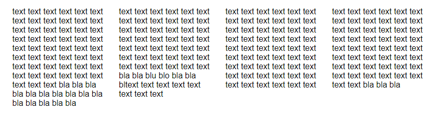
桌面设计按预期工作:
平板电脑版本:
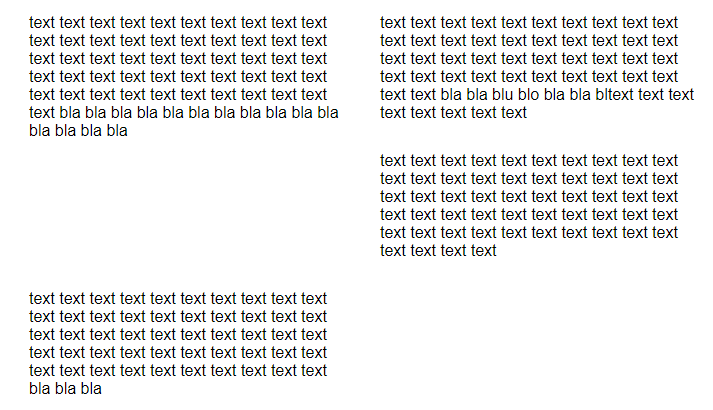
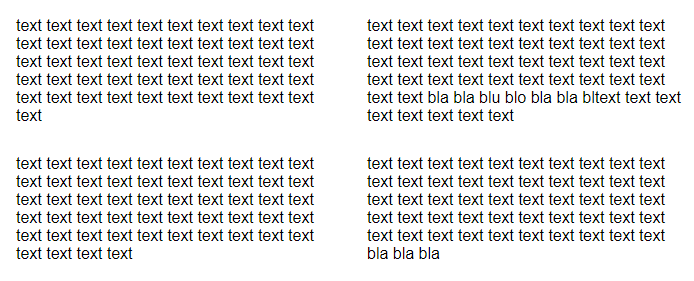
仅当我删除第一列的一些文本时,第二行的列才会彼此相邻放置:
*
{
    box-sizing: border-box;
}

[class*="col-"]
{
    float: left;
    padding: 15px;
    /*border: 1px solid red;*/
}

.row::after
{
    content: "";
    clear: both;
    display: table;
}

/* For mobile phones: */
[class*="col-"]
{
    width: 100%;
}

@media only screen and (min-width: 600px)
{
    /* For tablets: */
    .col-s-1 {width: 8.33%;}
    .col-s-2 {width: 16.66%;}
    .col-s-3 {width: 25%;}
    .col-s-4 {width: 33.33%;}
    .col-s-5 {width: 41.66%;}
    .col-s-6 {width: 50%;}
    .col-s-7 {width: 58.33%;}
    .col-s-8 {width: 66.66%;}
    .col-s-9 {width: 75%;}
    .col-s-10 {width: 83.33%;}
    .col-s-11 {width: 91.66%;}
    .col-s-12 {width: 100%;}
}

@media only screen and (min-width: 768px)
{
    /* For desktop: */
    .col-1 {width: 8.33%;}
    .col-2 {width: 16.66%;}
    .col-3 {width: 25%;}
    .col-4 {width: 33.33%;}
    .col-5 {width: 41.66%;}
    .col-6 {width: 50%;}
    .col-7 {width: 58.33%;}
    .col-8 {width: 66.66%;}
    .col-9 {width: 75%;}
    .col-10 {width: 83.33%;}
    .col-11 {width: 91.66%;}
    .col-12 {width: 100%;}
}
<div class="row">
<div class="col-3 col-s-6">text text text text text text text text text text text text text text text text text text text text text text text text text text text text text text text text text text text text text text text text text text text text text text text text text text text
</div>
<div class="col-3 col-s-6">text text text text text text text text text text text text text text text text text text text text text text text text text text text text text text text text text text text text text text text text text text bla bla blu blo bla bla bltext text text text text text text text
</div>
<div class="col-3 col-s-6">text text text text text text text text text text text text text text text text text text text text text text text text text text text text text text text text text text text text text text text text text text text text text text text text text text text text text text</div>
<div class="col-3 col-s-6">text text text text text text text text text text text text text text text text text text text text text text text text text text text text text text text text text text text text text text text text text text text text text text text text text text bla bla bla</div>
</div>我搜索了一段时间,但不知道如何调用这种行为来更具体地研究。
当有第二行 div 时,它会在平板电脑上完美对齐,但会导致桌面版本崩溃。
感谢您的帮助!
1个回答
0
投票
投票
我只是将整个代码与 CSS 一起复制粘贴到 React 应用程序中,并且工作得非常好。 如果它不适合您的情况,我可以建议您使用网格布局。 它会自动处理此类开箱即用的响应问题,您只需提及所需的列数即可。
以下是如何做到这一点的示例:
<div className="container">
      <div className="column One">Column 1</div>
      <div className="column Two">Column 2</div>
      <div className="column Three">Column 3</div>
</div>
然后您可以按如下方式使用CSS:
* {
  box-sizing: border-box;
  margin: 0;
  padding: 0;
}

.container {
  display: grid;
  grid-template-columns: repeat(3, minmax(250px, 1fr));
}

.column {
  background-color: pink;
}
如果您想针对不同的屏幕尺寸使用不同的列数,
然后您可以使用媒体查询并更改 repeat(
最新问题
- Bootstrap 5 与 col-md-5 的边距问题
- 如何正确从VCS中删除gradle包装器?
- 为什么我在 nginx 上托管的 Angular 应用程序无法工作?
- 如何使继承自 UUID 的自定义类型作为 pydantic 模型工作
- 如何将 Google 表单的响应转换为所选响应的一系列行
- 如何为使用 Swagger 创建的不记名令牌设置 expiresIn 值
- 如何修改较早的 git 提交,就像 git --amend 修改最新的提交一样?
- Spring Boot - GetMapping 到具有不同路径的相同方法的更简单方法
- Jekyll:按标题哈希按字母顺序对页面进行排序,仅当存在时才用另一个哈希替换
- Flutter Textformfield 前缀文本
- 在 Spring boot 项目中无法使用日期请求参数调用 GET API
- 我们无法使用 cvs 作为输入文件在同一 vnet 下使用 terraform 创建多个子网
- 使用 Java CDK 进行 AWS Lambda 事件过滤
- 实现index(after:)方法倒序显示
- 如何将变量的两个字符值转换为数字值?
- 如何将不完整的字符串日期修复为特定格式
- 从数据帧列中提取子字符串,作为整数插入到新列中
- 视图定义中美元符号 $ 意味着什么?
- 有没有办法仅在具有活动部署的节点上部署DaemonSet?
- Kotlin 序列化忽略字段
© www.soinside.com 2019 - 2024. All rights reserved.