CSS 创建一个 div,当另一个同级 div 与其内容一样宽时,该 div 占用父级的剩余宽度?
问题描述 投票:0回答:4
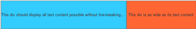
我该如何创建下一个布局:
两个 div 共享公共父级的宽度。它们都在一行中显示文本内容,而 -
- 右侧的 div 与文本内容一样宽
- 左侧的 div 占据了父级的所有剩余宽度,并使用 text-overflow: ellipsis 在文本被剪切的位置显示“...”。
这是我认为我所知道的应该如何实施 -
.parent {
  width: 400px;
  height: 200px;
}

.left {
  display: block;
  white-space: nowrap;
  text-overflow: ellipsis;
  overflow: none;
}

.right {
  display: inline-block;
}
<div class='parent'>
<div class='left'> This div should display all text content possible without line-breaking and display '...' where its being cut </div>
<div class='right'> This div is as wide as its text content </div>
</div>它应该看起来像
4个回答
3
投票
投票
您可以使用 Flexbox 来实现此目的,只需在父元素上设置
display: flexflex-shrink: 0.parent {
width: 400px;
height: 200px;
display: flex;
}
.left {
white-space: nowrap;
text-overflow: ellipsis;
overflow: hidden;
background: red;
}
.right {
background: lightblue;
flex-shrink: 0;
}<div class='parent'>
<div class='left'> This div should display all text content possible without line-breaking and display '...' where its being cut </div>
<div class='right'> This div is as wide as its text content </div>
</div>2
投票
投票
我认为使用
Flexboxdisplay: flex;.parentflex:1;.left.parent {
width: 100%;
height: 200px;
display: flex;
}
.left {
white-space: nowrap;
text-overflow: ellipsis;
overflow: hidden;
background: pink;
flex:1;
}
.right {
background: green;
}<div class='parent'>
<div class='left'> This div should display all text content possible without line-breaking and display '...' where its being cut </div>
<div class='right'> This div is as wide as its text content </div>
</div>0
投票
投票
试试这个
.parent {
   width: 300px;
   height: 200px;
   overflow: hidden;
   display: flex;
}
.left {
   white-space: nowrap;
   text-overflow: ellipsis;
   overflow: hidden;

 }
.right {
   white-space: nowrap;
   text-overflow: ellipsis;
   overflow: hidden;

}
<div class='parent'>
<div class='left'> This div should display all text content possible without line-breaking and display '...' where its being cut </div>
<div class='right'> This div is as wide as its text content </div>
</div>**
0
投票
投票
您可以根据您的要求使用
flexboxdisplayCSS
.container {
  display: flex;
  max-width: 500px;
  border: 1px solid #ddd;
  padding: 5px;
}
.one,
.two {
  flex-grow: 1;
  word-break: break-all;
  padding: 10px;
  color: #fff;
}
.one {
  background-color: red;
}
.two {
  background-color: blue;
}
最新问题
- 无需 PHP 或任何其他服务器语言的联系表单
- Unity 通过单击按钮从菜单切换到游戏
- MySQL 针对没有索引的表优化 SQL
- 具有不同配置值的单元测试静态构造函数
- GitHub Actions CI 中的 Ccache 命中率为 0.00%
- 创建一个 1:1 比例的元素,在另一个元素内居中
- Sequelize:包括通过belongsToMany关联查询对象时不在defaultScope上工作
- 如何使用 rsync 在同一命令中排除目录和隐藏目录
- bash awk:打印两个匹配之间的行并删除其他两个匹配之间的换行符
- 找不到班级
- “startIndex 不能大于字符串长度”:使用 Unity nuget 包时出现奇怪错误
- 是否需要使用 Ansible 创建 docker 镜像
- PHP CURL 未正确处理编码的返回数据
- 自动日志文件下载器,收到 404 错误?
- 使用 pvlib 绘图时出现按键错误
- 在数据框中的不同变量之间迭代 mutate 函数
- 问题:_tkinter.TclError:无法调用“标签”命令:应用程序已被销毁
- csh 脚本 - 获取子字符串或从字符串中删除最后一个字符
- 为什么我无法使用selenium找到xpath?
- ASP.NET Core 8 Cors 标头未显示
© www.soinside.com 2019 - 2024. All rights reserved.