如何在另一个div下重叠div?
问题描述 投票:0回答:1
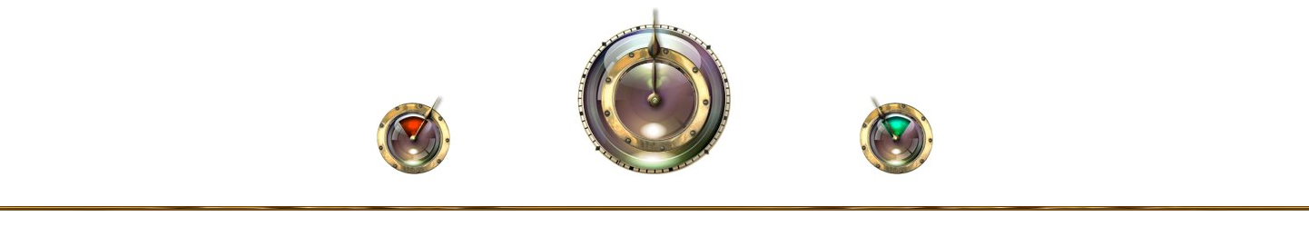
我想建立一个网页,我有这个。
我做了这个代码。
    <div style=" width: 100%; text-align: center;">
        <div style="display: inline-block;"><img class="img-responsive" src="/i/g-6-4-9-131_9649_9.jpg" style="float:left;"></div>
        <div style="display: inline-block;"><img class="img-responsive" src="/i/g-6-4-7-131_9647_7.jpg" style="float:left;"></div>
        <div style="display: inline-block;"><img class="img-responsive" src="/i/g-6-4-8-131_9648_8.jpg" style="float:left;"></div>
        <img class="img-responsive" src="/i/g-6-4-6-131_9646_6.jpg" style="width: 100%; height: 5px">
    </div>
我想这样(图片下的一行)。
谁能帮帮我?非常感谢您的阅读。
EDIT :
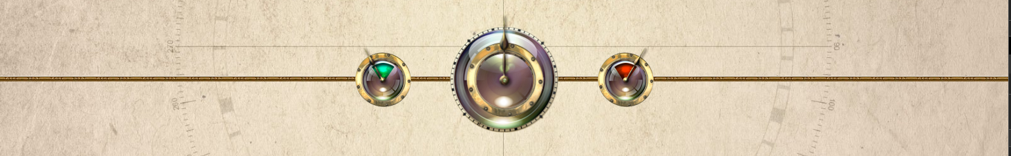
当在主div的背景下传递img的时候,我得到的是这样的。
<div style=" width: 100%; text-align: center; background-image:url(/i/g-6-4-6-131_9646_6.jpg)">
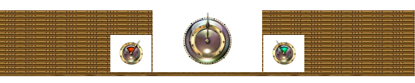
并试图使用z-index这种方式,我得到这个:
<img class="img-responsive" src="/i/g-6-4-6-131_9646_6.jpg" style="width: 100%; height: 5pxz-index: -1; position: absolute; top: 50%">
1个回答
1
投票
投票
你可以用z-index来 "重叠 "divs.z-index是div的级别。你可以把它设置为正值和负值。
因此,例如:z-index: -1会把这个div放在另一个div的后面,z-index: 2会把它放在另一个容器的前面。
在你的例子中,你很可能需要使用position: absolute;来将该行直接放在其他图片的下方,因为div和图片都是以块的形式显示,自然不会重叠。
所以,你的代码应该是这样的。
  <div style=" width: 100%; text-align: center;">
    <div style="display: inline-block;"><img class="img-responsive" src="/i/g-6-4-9-131_9649_9.jpg" style="float:left;"></div>
    <div style="display: inline-block;"><img class="img-responsive" src="/i/g-6-4-7-131_9647_7.jpg" style="float:left;"></div>
    <div style="display: inline-block;"><img class="img-responsive" src="/i/g-6-4-8-131_9648_8.jpg" style="float:left;"></div>
    <img class="img-responsive" src="/i/g-6-4-6-131_9646_6.jpg" style="width: 100%; height: 5px; z-index: -1; position: absolute; top: 50%">
</div>
你得试试哪个位置(顶部)适合你的需求。
1
投票
投票
解决了做 。
 <div style=" width: 100%; text-align: center; background: repeat-x center url('/i/g-6-4-6-131_9646_6.jpg')">
        <div style="display: inline-block;">
            <img class="img-responsive" src="/i/g-6-4-9-131_9649_9.jpg" style="float:left;">
        </div>
        <div style="display: inline-block;">
            <img class="img-responsive" src="/i/g-6-4-7-131_9647_7.jpg" style="float:left;">
        </div>
        <div style="display: inline-block;">
            <img class="img-responsive" src="/i/g-6-4-8-131_9648_8.jpg" style="float:left;">
        </div>
    </div>
非常感谢!
最新问题
- 使用 beautifulsoup 进行网页抓取时出现问题
- 如何让ADS1115发送ALERT脉冲?
- 如何对 2D numpy 数组进行平方或求幂(按元素)?
- 应用程序服务在重新启动之前无法使用管理身份访问密钥保管库
- Apache POI:ZLIB 输入流意外结束
- 从 postgres 返回 real[] 数组作为完整浮点值
- 在 ggplot2 中明确定义要执行的组
- 谷歌图表时间线元素边框半径
- 为什么我添加__add__函数时不能使用*?
- 如何在 Next.js 服务器组件中使用 Material-ui 风格的组件
- 如何为垫子按钮添加自定义颜色?
- 装配计算器无法获取输入并通过程序工作
- NextJS Dashboard 应用程序用户 API 身份验证
- 如何更改 React Native 中底部栏(导航选项卡下方)的颜色
- 你能有一个指向子对象类的数据成员的指针吗?
- Python 中具有多个值的字典
- Go 文件的定义是什么?
- pip找不到满足要求的版本django==2.2.1
- 如何在 PanderaPolars / PanderaPandas 中创建带有过滤条件的列检查?
- 在 VS Code 中为 PostgreSQL 提供更好的语法突出显示
© www.soinside.com 2019 - 2024. All rights reserved.