如何实现这样的设计风格?
问题描述 投票:0回答:1
我知道这个标题很模糊。 我不知道如何更好的拟定标题,因为我不知道设计风格的名称。
请问这种设计 "风格 "的名称是什么,如何用css和html实现这种效果?
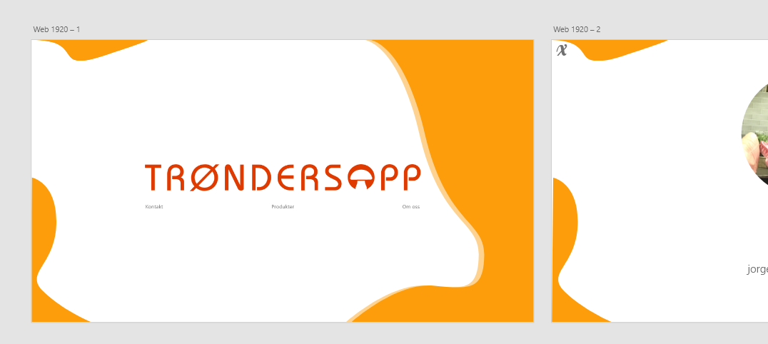
我试着用HTML和css重新制作了这个设计,下面是代码。
* {
  margin: 0;
  padding: 0;
  box-sizing: 0;
}

/*BG*/

main,
.container {
  height: 100vh;
  width: 100vw;
}

body {
  overflow: hidden;
}

#left-top,
#left-bottom,
#right {
  position: absolute;
  z-index: -10;
}

#left-top {
  left: 0;
  top: 0;
}

#left-bottom {
  left: 0;
  bottom: 0;
  transform: translate(-0.5vw);
}

#right {
  right: 0;
  top: 0;
  bottom: 0;
  transform: translate(10vw);
}
.container {
  display: flex;
  justify-content: center;
  align-items: center;
  flex-direction: column;

  max-height: 100vh;
  max-width: 100vw;

  border: 1vh solid lime;
}

.logo {
  max-width: 50%;

  display: flex;
  justify-content: center;
  align-items: center;
}

.logo img {
  width: 80vw;
  height: inherit;
}

.links {
}
<!DOCTYPE html>
<html lang="en">
<head>
<meta charset="UTF-8" />
<meta name="viewport" content="width=device-width, initial-scale=1.0" />
<title>Document</title>
<link rel="stylesheet" href="style.css" />
<link rel="stylesheet" href="index.css" />
</head>
<body>
<main>
<div class="container">
<img id="left-top" src="https://picoolio.net/images/2020/06/10/Path-52825c75a57b036c8.png" alt="" />
<img id="left-bottom" src="https://picoolio.net/images/2020/06/10/Path-486011727790f3e3d.png" alt="" />
<img id="right" src="https://i.ibb.co/WPqF1dV/Component-4-1.png" alt="" />
<div class="logo">
<img src="https://picoolio.net/images/2020/06/10/Trondersopp_LOGO_B1ac81c93ec7cb89e0.png" alt="Trondersopp_LOGO_B1ac81c93ec7cb89e0.png" border="0" />
</div>
<div class="links">
<ul>
<li>
<a href="">Kontakt</a>
</li>
<li>
<a href="">Produkter</a>
</li>
<li>
<a href="">om oss</a>
</li>
</ul>
</div>
</div>
</main>
<script src="main.js"></script>
</body>
</html>每当我放大绝对位置的背景片就会这样移动。
怎样才能实现这样的设计,风格名称是什么?
1个回答
1
投票
投票
* {
  margin: 0;
  padding: 0;
  box-sizing: 0;
}

/*BG*/

main,
.container {
  height: 100vh;
  width: 100vw;
}

body {
  overflow: hidden;
}

#left-top,
#left-bottom,
#right {
  position: absolute;
  z-index: -10;
}

#left-top {
  left: 0;
  top: 0;
  width: 20vw;
}

#left-bottom {
  left: 0;
  bottom: 0;
  height: 50vh;
}

#right {
  right: 0;
  top: 0;
  bottom: 0;
  height: 100vh;
}
.container {
  display: flex;
  justify-content: center;
  align-items: center;
  flex-direction: column;

  max-height: 100vh;
  max-width: 100vw;
}

.logo {
  max-width: 70vw;

  display: flex;
  justify-content: center;
  align-items: center;
}

.logo img {
  top: 45vh;
  left: 50%;
  transform: translate(-50%, -50%);
  position: absolute;
  width: 100%;
  height: inherit;
  z-index: -10;
}

.links {
  margin: 51vh auto auto 7vw;
  width: 110vw;
  display: grid;
  grid-template-columns: auto auto auto auto;
  grid-column-gap: 1vw;
  grid-row-gap: 1vw;
}

.link-text {
  width: 100%;
  text-align: center;
}

.link-text a {
  text-decoration: none;
  color: #777;
  font-size: 1.25vw;
  font-family: helvetica;
}
<!DOCTYPE html>
<html lang="en">
<head>
<meta charset="UTF-8" />
<meta name="viewport" content="width=device-width, initial-scale=1.0" />
<title>Document</title>
<link rel="stylesheet" href="style.css" />
<link rel="stylesheet" href="index.css" />
</head>
<body>
<main>
<div class="container">
<img id="left-top" src="https://picoolio.net/images/2020/06/10/Path-52825c75a57b036c8.png" alt="" />
<img id="left-bottom" src="https://picoolio.net/images/2020/06/10/Path-486011727790f3e3d.png" alt="" />
<img id="right" src="https://i.ibb.co/WPqF1dV/Component-4-1.png" alt="" />
<div class="logo">
<img src="https://picoolio.net/images/2020/06/10/Trondersopp_LOGO_B1ac81c93ec7cb89e0.png" alt="Trondersopp_LOGO_B1ac81c93ec7cb89e0.png" border="0" />
</div>
<div class="links">
<div class="link-text"><a href="">Kontakt</a></div>
<div class="link-text"><a href="">Produkter</a></div>
<div class="link-text"><a href="">om oss</a></div>
</div>
</div>
</main>
<script src="main.js"></script>
</body>
</html>在上面的代码中,我把图片的尺寸和链接都改了,在 <div> 标签来实现这个设计... 你可以直接复制粘贴你的作品代码,因为我想这是你想在屏幕上看到的。
解释
1- 我首先给你的图片添加了vw和vh的尺寸,使它们根据视口的不同做出响应......
2- 其次,我给你的logo图片指定了一个z-index,并在指定绝对位置后,根据你的需要通过左和顶的帮助来定位。
3- 第三,我使用了css网格布局的链接,但这不是必要的,因为你也可以使用其他方法。css网格信息的链接
4-我用css设计了一些东西(主要是链接部分),你可以在你的代码中去完成......
以上只是一个简单的概述。
最新问题
- dplyr:如何使用distinct(..., .keep_all = TRUE) 但指定要保留哪一行?
- Azure 搜索故障排除:使用文本拆分和 Azure 嵌入技能嵌入未填充到索引中的数据
- 如何在 autosys 中每月安排工作 - 前 5 个工作日(周一至周五)?
- 如何在启动时在kong docker容器内运行curl命令?
- TradingView 轻量级图表库无法使用自己的数据
- Wordpress 恶意软件 - 如何删除它?
- Flutter:收听通过 rtmp 直播的音频
- 在联结表中键入ORM软删除链接
- 有没有办法适当缩小类型?
- 重新加载包含文档查看器的 MVC5 部分视图
- 如何利用C++中的寻路算法让敌人追赶玩家?
- Text() 和 .navigationBarTitle() 具有不同的左边距
- <spyOn>:找不到可以监视的对象
- 如何向 bash 传递参数?
- Prop 意外突变
- Google Oauth2 登录后将 JWT 传递到 UI 应用程序
- .NET Framework 4.8 - 返回 OnActionExecuting(HttpActionContext actionContext) 错误 406 的内容
- 非常奇怪:tzlocal.get_localzone() 基于 python3 别名的不同输出?
- 如何在 sql 视图中排序
- 基于 ICD-10 标准的抑郁症严重程度 R 代码
© www.soinside.com 2019 - 2024. All rights reserved.