如何用CSS将矩形图像“裁剪”成正方形?
问题描述 投票:0回答:14
我知道用 CSS 实际修改图像是不可能的,这就是为什么我将裁剪放在引号中。
我想做的是拍摄矩形图像并使用 CSS 使它们显示为正方形而不扭曲图像。
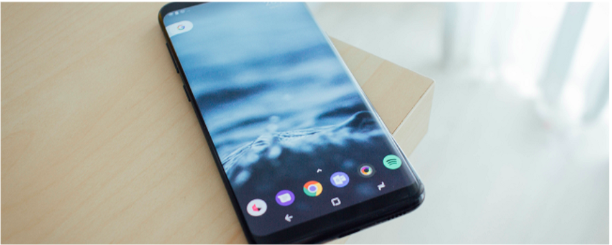
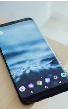
我基本上想把这个:

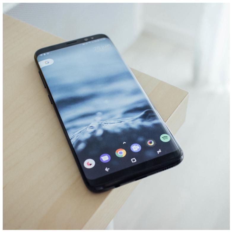
进入此:

14个回答
投票
一个纯CSS解决方案,没有包装器
divimg {
object-fit: cover;
width: 230px;
height: 230px;
}
投票
假设它们不必位于 IMG 标签中...
HTML:
<div class="thumb1">
</div>
CSS:
.thumb1 {
  background: url(blah.jpg) 50% 50% no-repeat; /* 50% 50% centers image in div */
  width: 250px;
  height: 250px;
}

.thumb1:hover { YOUR HOVER STYLES HERE }
编辑:如果 div 需要链接到某个地方,只需调整 HTML 和样式,如下所示:
HTML:
<div class="thumb1">
<a href="#">Link</a>
</div>
CSS:
.thumb1 {
  background: url(blah.jpg) 50% 50% no-repeat; /* 50% 50% centers image in div */
  width: 250px;
  height: 250px;
}

.thumb1 a {
  display: block;
  width: 250px;
  height: 250px;
}

.thumb1 a:hover { YOUR HOVER STYLES HERE }
注意,这也可以修改为响应式,例如%宽度和高度等。
投票
如果图像位于具有 responsive 宽度的容器中:
.rect-img-container {
  position: relative;
}

.rect-img-container::after {
  content: "";
  display: block;
  padding-bottom: 100%;
}

.rect-img {
  position: absolute;
  width: 100%;
  height: 100%;
  object-fit: cover;
}
<div class="rect-img-container">
<img class="rect-img" src="https://picsum.photos/id/0/367/267" alt="">
</div>(编辑:从 sass 更新为纯 css) (编辑:添加虚拟图像以供参考)
投票
- 将图像放入 div 中。
- 给你的div明确的正方形尺寸。
- 将 div 上的 CSS 溢出属性设置为隐藏 (
)。overflow:hidden - 将您的想象放入 div 中。
- 利润。
例如:
<div style="width:200px;height:200px;overflow:hidden">
    <img src="foo.png" />
</div>
投票
使用背景大小:封面 - http://codepen.io/anon/pen/RNyKzB
CSS:
.image-container {
  background-image: url('https://i.stack.imgur.com/GA6bB.png');
  background-size:cover;
  background-repeat:no-repeat;
  width:250px;
  height:250px;
}
标记:
<div class="image-container"></div>
投票
查看 CSS
aspect-ratiohttps://developer.mozilla.org/en-US/docs/Web/CSS/aspect-ratio
.square-image{
  width: 50%;
  background-image: url('https://picsum.photos/id/0/367/267');
  background-size: cover;
  background-position: center;
  aspect-ratio: 1/1;
}
<div class="square-image"></div>您也可以使用常规
img.square-image{
width: 50%;
object-fit: cover; /* Required to prevent the image from stretching, use the object-position property to adjust the visible area */
aspect-ratio: 1/1;
}<img src="https://picsum.photos/id/0/367/267" class="square-image"/>投票
我实际上最近遇到了同样的问题,并最终采用了略有不同的方法(我无法使用背景图像)。它确实需要一点点 jQuery 来确定图像的方向(我确信你可以使用纯 JS 代替)。
我写了一篇关于它的博客文章如果您有兴趣了解更多解释,但代码非常简单:
HTML:
<ul class="cropped-images">
  <li><img src="http://fredparke.com/sites/default/files/cat-portrait.jpg" /></li>
  <li><img src="http://fredparke.com/sites/default/files/cat-landscape.jpg" /></li>
</ul>
CSS:
li {
  width: 150px; // Or whatever you want.
  height: 150px; // Or whatever you want.
  overflow: hidden;
  margin: 10px;
  display: inline-block;
  vertical-align: top;
}
li img {
  max-width: 100%;
  height: auto;
  width: auto;
}
li img.landscape {
  max-width: none;
  max-height: 100%;
}
jQuery:
$( document ).ready(function() {

    $('.cropped-images img').each(function() {
      if ($(this).width() > $(this).height()) {
        $(this).addClass('landscape');
      }
    });

});
投票
今天您可以使用
aspect-ratioimg {
aspect-ratio: 1 / 1;
}
它在现代浏览器中也得到了广泛的支持: https://caniuse.com/mdn-css_properties_aspect-ratio
投票
object-fit: cover但它可能无法在 IE/Edge 上运行。按照如下所示,使用 just CSS 修复它,以便在所有 浏览器上工作。
我采取的方法是使用 absolute 将图像定位在容器内,然后使用以下组合 将其放在中心:
position: absolute;
top: 50%;
left: 50%;
transform: translate(-50%, -50%);
一旦它位于中心,我就给予图像,
// For vertical blocks (i.e., where height is greater than width)
height: 100%;
width: auto;

// For Horizontal blocks (i.e., where width is greater than height)
height: auto;
width: 100%;
这使得图像得到Object-fit:cover的效果。
这是上述逻辑的演示。
https://jsfiddle.net/furqan_694/s3xLe1gp/
此逻辑适用于所有浏览器。
原图

垂直裁剪
水平裁剪
方形容器
投票
我有类似的问题,无法“妥协”背景图像。 我想出了这个。
<div class="container">
    <img src="http://lorempixel.com/800x600/nature">
</div>

.container {
    position: relative;
    width: 25%; /* whatever width you want. I was implementing this in a 4 tile grid pattern. I used javascript to set height equal to width */
    border: 2px solid #fff; /* just to separate the images */
    overflow: hidden; /* "crop" the image */
    background: #000; /* incase the image is wider than tall/taller than wide */
}

.container img {
    position: absolute;
    display: block;
    height: 100%; /* all images at least fill the height */
    top: 50%; /* top, left, transform trick to vertically and horizontally center image */
    left: 50%;
    transform: translate3d(-50%,-50%,0);
}

//assuming you're using jQuery
var h = $('.container').outerWidth();
$('.container').css({height: h + 'px'});
希望这有帮助!
投票
使用CSS:溢出:
.thumb {
   width:230px;
   height:230px;
   overflow:hidden
}
投票
使用具有方形尺寸的 div,其中图像位于 .testimg 类中:
.test {
width: 307px;
height: 307px;
overflow:hidden
}

.testimg {
    margin-left: -76px

}
或带有图像背景的方形 div。
.test2 {
width: 307px;
height: 307px;
    background: url(https://i.stack.imgur.com/GA6bB.png) 50% 50%
}
这里有一些例子:http://jsfiddle.net/QqCLC/1/
更新了图像中心
.test {
  width: 307px;
  height: 307px;
  overflow: hidden
}

.testimg {
  margin-left: -76px
}

.test2 {
  width: 307px;
  height: 307px;
  background: url(https://i.stack.imgur.com/GA6bB.png) 50% 50%
}
<div class="test"><img src="https://i.stack.imgur.com/GA6bB.png" width="460" height="307" class="testimg" /></div>
<div class="test2"></div>投票
我采取了不同的方法。基本上,您必须裁剪矩形图像以使其适合正方形,仅此而已。最好的方法是,如果图像宽度大于高度,则从图像的左侧和右侧稍微裁剪图像。如果图像高度大于图像宽度,则裁剪图像的底部。这是我的解决方案。不过我需要 PHP 的一些帮助。
    <div style="position: relative; width: 154px; height: 154px; overflow: hidden;">
<?php
        //get image dimmensions whichever way you like. I used imgaick
        $image = new Imagick("myimage.png");
        $width = $image->getImageWidth();
        $height = $image->getImageHeight();
        if($width > $height){
 ?>
        <img src="myimage.png" style="display: block; position: absolute; top: 0px; left: 50%; transform: translateX(-50%); -ms-transform: translateX(-50%); -webkit-transform: translateX(-50%); height: 100%; " />
 <?php
        }else{
 ?>
        <img src="myimage.png" style="display: block; position: absolute; top: 0px; left: 0px; width: 100%; " />
 <?php
        }
 ?>

    </div>
投票
2023答案
img {
    width: 200px; /* Dtermine size of square */
    aspect-ratio: 1/1; /* Keeps height equal to width */
    object-fit: cover; /* No distortion of image, and no empty space */
}
<img src="https://i.stack.imgur.com/GA6bB.png">最新问题
- 线程使用调度程序且主线程正在等待线程完成时发生死锁
- rundeck 可以接受来自 slack 的输入,并使用 slack 用户提供的参数来运行特定作业吗?
- 有没有办法检查NEAR协议使用的RocksDB实例的内容?
- 无法注册独资经营者消息活动
- 在 Excel 365 中找到和/或重新安装 MS Query 的链接
- 如何通过CSS在UL/LI html列表中设置项目符号颜色,而不使用任何图像或span标签[重复]
- 带参数的 C# Postgres 过程
- MVVM 社区工具包在 Avalonia 应用程序中保持两个视图与一个模型同步
- TEXTJOIN() 与 ()*()*() 的 AND() 逻辑未按预期工作
- 如何分析 Maven pom.xml 中的错误(pom linter 是否存在冗余或忽略的属性?)
- 光线统一穿过物体
- 运行 FAISS 相似性搜索时内核崩溃
- 如何迭代元组项
- 带参数和不带参数的存储过程
- pycapnp:导入的类型不可见
- 过渡效果是从左上角开始,但需要从左上角开始
- 具有KRAFT认证的Kafka
- 有状态 Camunda 7ExternalTaskHandler
- Leaflet Routing Machine:如何以 JSON / GeoJSON 导出路线详细信息和坐标?
- 如何忽略git中的.env文件?