Angular 11 - 如何使用 Angular Material 设置文件输入按钮的样式
问题描述 投票:0回答:4
我看到了很多关于此的问题,但没有一个能解决我的问题。
我有:
Angular 11、Angular Material 8 和如下文件输入:
<div class="form-group">
    <input #myInput type="file" formControlName="fi"
                     id="fi" name="fi" (change)="postMethod($event.target.files)">
</div>
我需要什么:
我需要自定义这个按钮的颜色、文本和大小。
如何定制?谢谢。
4个回答
6
投票
投票
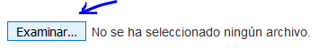
最终用这种方式解决了(适用于 Angular Material 和 Bootstrap):
我设置了3个独立的组件:
- 将可见的按钮(可以是 Angular Material 按钮或 Bootstrap 按钮,如下所示)
- 文件输入
- 将包含文件名的标签
HTML
<div>
  <button #file class="btn btn-light">Examinate</button>
  <div style="display: inline-block">
      <input #myInput formControlName="file"
      id="file" name="file" (change)="postMethod($event.target.files)" type="file"/>
      <p>{{file}}</p>
  </div>
</div>
CSS
使用 CSS,我强制输入为 overlay 按钮,并设置
opacity=0- 按钮:
float:left;
position:absolute;
z-index:-1;
- 输入:
opacity: 0; //Not visible
font-size: 0;
//Button dimensions
width: 90px;
height: 37px;
float: left;
- 输入(悬停):
cursor: pointer;
- 标签:
float: left;
margin-left: 6px;
margin-top: 7px;
这是最终结果:
2
投票
投票
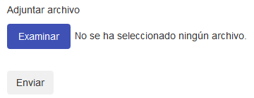
您根本无法设置输入类型文件的样式,最好的方法是创建与输入类型文件对应的覆盖元素。
使用材质,您几乎可以设计与材质有关的所有内容,当然,您可以将材质中的类添加到自定义组件,但这不是材质的用途。
简单的例子,你不想这样做:
<div class="mat-card"></div>
如果你能做到这一点:
<mat-card></mat-card>
输入也是如此,如果你希望它是材质风格,你应该创建这样的东西:
HTML:
<mat-card class="input-container">
  <button #file mat-flat-button color="primary">Examinar...
      <input multiple (change)="onFileSelected($event)" style="opacity: 0; position:absolute; left:0px; top:0px; width:100%; height:100%;" type="file"/>
  </button>
  {{files|json}}
</mat-card>
TS:
  files: string[] = [];
  onFileSelected(event) {
    if (event.target.files.length > 0) {
      for (let i = 0; i < event.target.files.length; i++) {
        this.files.push(event.target.files[i].name);
        console.log(event.target.files[0].name);
      }
    }
  }
CSS:
.input-container {
  position:relative;
}
这是一个简单的例子。
但我仍然更喜欢使用某种 npm 包,例如:https://www.npmjs.com/package/ngx-dropzone
0
投票
投票
您可以使用 css 更改样式。
input[type=file]::file-selector-button {
  cursor: pointer;
  border: 0;
  padding: 8px;
  background-color: rgb(91, 105, 194);
  border-radius: 8px;
  color: white;
}

input[type=file]::file-selector-button:hover {
  background-color: rgb(54, 61, 115);
}
<div>
<input
type="file"
[accept]="'.csv'"
multiple
id="file-upload-multiple"/>
<label class="custom-file-label">Select file</label>
</div>-2
投票
投票
在你的
css/scss/sass#fi {
background-color: pink;
...
}
使用 Angular Material 设计单个按钮的样式并不是一个好方法。如果您想设置组的样式,那么我建议阅读以下内容:https://material.angular.io/guide/customizing-component-styles
编辑:
file这是一个简单的例子,它是如何工作的:
.fileContainer {
    overflow: hidden;
    position: relative;
    cursor: pointer;
    background-color: pink;
}

.fileContainer [type=file] {
    cursor: inherit;
    display: block;
    font-size: 999px;
    filter: alpha(opacity=0);
    min-height: 100%;
    min-width: 100%;
    opacity: 0;
    position: absolute;
    right: 0;
    text-align: right;
    top: 0;
}
<label class="fileContainer">
File upload
<input type="file"/>
</label>最新问题
- 连续运行两个终极线程组
- 有没有办法在代码中覆盖 Kedro 数据集查询?
- 找不到 Chromecast 序列号来注册我的设备
- 基于 EVE-NG QEMU 的节点未启动
- del 操作在 .py 文件中非常慢,而在 .ipynb 文件中则非常快
- 我需要返回 Sheet1 到 Sheet2 中每个行项目的季度总和和年初至今总和
- iOS React Native 中自动填充 OTP
- C# - 有没有办法在 Linux 上临时保护文件不被删除?
- Docker 登录未使用正确的端口
- 3.3 后与 2.2 后的不同结果
- 如何接受或关闭cookie弹出窗口,因为此弹出窗口没有关闭/接受/拒绝的按钮?
- Expo 更新无法在 Windows 上运行 Android 构建
- 我需要帮助了解此解决方案中如何考虑所有子数组
- 栏中间文字自动调整
- Spring Data REST 支持反应式增删改查存储库吗?
- 使用 Selenium 和 Python 单击按钮,直到不再存在
- 正确更新 mutablestate uistate 以设置视图模型中的当前选定项
- Powerbi 生成错误的总数(MAX 的替代方案)
- 如何在Fedora 37上安装dart sass?
- 是否可以在.Net 6 Worker Service中捕获OnSessionChange?
© www.soinside.com 2019 - 2024. All rights reserved.