用外部元素扰乱流动
问题描述 投票:1回答:2
我有一个flexbox,其元素显示如下:
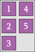
问题是:是否有办法破坏Flexbox外部的流量,以便被阻止的元素将移动到下一个位置,如:
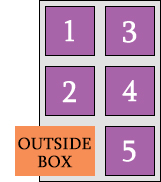
flexbox是某种排序框,所以我不能在其中放置任何其他元素来排序。通常,列的高度相等,但有时我需要第一列更短。
我尝试过以各种组合制作盒子flow: left和display: inline-block,但我无法完成它。
.container {
  width: 120px;
  height: 180px;
  margin: 40px 0 0 100px;
}

.flexbox {
  display: flex;
  flex-direction: column;
  flex-wrap: wrap;
  justify-content: flex-start;
  width: 120px;
  height: 180px;
  background: pink;
}

.inbox {
  width: 50px;
  height: 50px;
  margin: 5px;
  background: purple;
  color: #fff;
  margin-left: auto;
}

.box {
  float: left;
  width: 110px;
  height: 60px;
  margin: -60px 0 0 -60px;
  background: orange;
}
<div class="container">
<div class="flexbox">
<div class="inbox"> 1 </div>
<div class="inbox"> 2 </div>
<div class="inbox"> 3 </div>
<div class="inbox"> 4 </div>
<div class="inbox"> 5 </div>
</div>
<div class="box"></div>
</div>编辑我只对左下角感兴趣,所以任何一种技巧都可以。
2个回答
1
投票
投票
如果您使用flex-wrap: wrap-reverse以及column-reverse flex direction和justify-content: flex-end,您可以获得配置,但不能获得元素的顺序。
请注意,元素的顺序与标记相反 - 请参阅下面的演示:
.container {
  width: 120px;
  height: 180px;
  margin: 40px 0 0 100px;
}

.flexbox {
  display: flex;
  flex-direction: column-reverse; /* CHANGED */
  flex-wrap: wrap-reverse; /* CHANGED */
  justify-content: flex-end; /* CHANGED */
  width: 120px;
  height: 180px;
  background: pink;
}

.inbox {
  width: 50px;
  height: 50px;
  margin: 5px;
  background: purple;
  color: #fff;
  margin-left: auto;
}

.box {
  float: left;
  width: 110px;
  height: 60px;
  margin: -60px 0 0 -60px;
  background: orange;
}
<div class="container">
<div class="flexbox">
<div class="inbox"> 1 </div>
<div class="inbox"> 2 </div>
<div class="inbox"> 3 </div>
<div class="inbox"> 4 </div>
<div class="inbox"> 5 </div>
</div>
<div class="box"></div>
</div>0
投票
投票
它不是最好的解决方案,它可以为您提供升级的基础(比如在等式中添加ajax)。希望这对你有用!
var element = document.getElementsByClassName('box')[0];
var rect = element.getBoundingClientRect();
x = rect.left;
w = rect.width;
var xa = document.getElementsByClassName('inbox');
var k = Array.from(xa).slice(-1).pop();
var rect2 = k.getBoundingClientRect();
x2 = rect2.left;
if(x+w > x2){
console.log(x + w , x2)
 k.style.left =+ (x) +"px";
}
.container {
width: 120px;
height: 180px;
margin: 40px 0 0 100px;
}
.flexbox {
display: flex;
flex-direction: row;
flex-wrap: wrap;
justify-content: flex-start;
width: 120px;
height: 180px;
background: pink;
}
.inbox {
position:relative;
width: 50px;
height: 50px;
margin: 5px;
background: purple;
color: #fff;
}
.box {
float: left;
width: 110px;
height: 60px;
margin: -60px 0 0 -60px;
background: orange;
}<div class="container">
<div class="flexbox">
<div class="inbox"> 1 </div>
<div class="inbox"> 2 </div>
<div class="inbox"> 3 </div>
<div class="inbox"> 4 </div>
<div class="inbox"> 5 </div>
</div>
<div class="box"></div>
</div>最新问题
- DateUtil 中的 CompareIgnoreTime()
- 使用 Build Tools 2022 安装 MSTest 需要哪些工作负载?
- 如何在Python中抓取Instagram帐户信息
- Adobe AIR 可以利用的最大内存量是多少?
- Python 到 Redis 集群的连接超时
- Appsheet 使用机器人更新现有行列
- 元素的屏幕坐标,通过 Javascript
- 如何使用NestJS在Bull Board注册多个队列
- 如何防止在行提交时不断重新渲染 MUI `DataGrid`?
- 我无法连接到 Digital Ocean Managed (Postgres) 数据库
- 谷歌地图圆形光标
- 选择一个表中具有另一个表中所有指定特征的所有记录
- 如何全局同步斜杠命令
- 随机附加的未使用添加错误
- 测量用户访问网站期间花费的时间
- ECS 零停机部署如何工作?
- 如何在`IClassFixture`中获取`ITestOutputHelper`?
- “url”参数有效,但上游响应无效
- eBPF msg_verdict 程序的内核入口点在哪里?
- 如何向 useSelector 传递附加参数
© www.soinside.com 2019 - 2024. All rights reserved.