1 行时和 2 行时中心元素之间的空间?
问题描述 投票:0回答:1
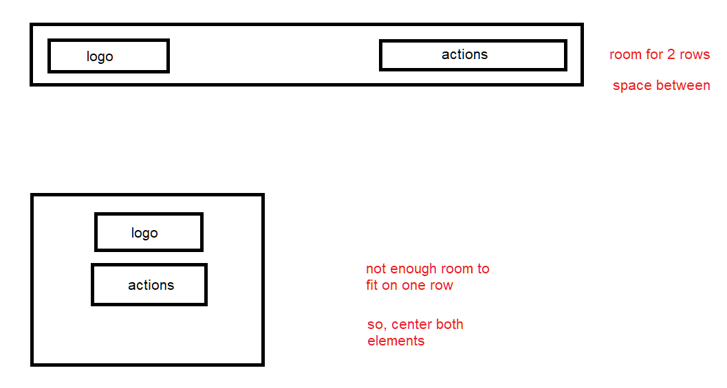
我正在开发一个导航栏,其中有 2 个元素。左边的标志,右边的动作列表(这个元素有一个动态数量的元素)。
当他们可以排成一排时,我希望他们这样做。
但是,当它们不再适合 1 行时,我希望将它们放在不同的行中,然后居中。像这样:
.container {
  display: flex;
  justify-content: space-between;
  flex-flow: wrap;
  width: 100%;
  border: 1px solid #ddd;
}

.logo {
  background-color: red;
}

.actions {
  display: flex;
  background-color: yellow
}
<div class="container">
<div class="logo">logo</div>
<div class="actions">
<div class="action-1">action 1</div>
<div class="action-2">action 2</div>
</div>
</div>这可能吗?如果是这样,它会使用 grid 还是 flexbox?
1个回答
0
投票
投票
要实现这个行为,你可以添加一个媒体查询,当屏幕宽度小于某个值时,将容器的 flex-direction 属性更改为 column。以下是如何修改代码的示例:
.container {
  display: flex;
  justify-content: space-between;
  flex-wrap: wrap;
  border: 1px solid #ddd;
}

.logo {
  background-color: red;
}

.actions {
  display: flex;
  background-color: yellow;
  align-items: center; /* center items vertically */
}

@media (max-width: 768px) { /* adjust breakpoint value as needed */
  .container {
    flex-direction: column; /* switch to column layout when screen is narrow */
    align-items: center; /* center items horizontally */
  }

  .actions {
    margin-top: 10px; /* add some spacing between logo and actions */
  }
}
本例中,当屏幕宽度小于768像素时,媒体查询将容器的flex-direction设置为column,并水平居中对齐项目。它还通过在 actions 元素上设置 margin-top 来在 logo 和 actions 之间增加一些间距。您可以根据设计需要调整断点值和间距。
评论更新:
.container {
  display: flex;
  justify-content: space-between;
  align-items: center; /* center items vertically */
  border: 1px solid #ddd;
}

.logo {
  background-color: red;
}

.actions {
  display: flex;
  flex-grow: 1; /* allow container to grow to fill remaining space */
  flex-shrink: 1; /* allow container to shrink if necessary */
  flex-wrap: wrap; /* allow elements to wrap to a new line */
  align-items: center; /* center items vertically */
  justify-content: flex-end; /* align items to the right */
  gap: 10px; /* add some spacing between action items */
}

.action {
  padding: 5px 10px; /* add some padding to action items */
  background-color: yellow;
  white-space: nowrap; /* prevent text from wrapping */
}

.action:hover {
  background-color: #ffcc00;
}
在这个例子中,
.actionsflex-grow: 1flex-shrink: 1justify-content: flex-end您可以根据需要调整
gappadding.action最新问题
- 使用 azure 数据浏览器进行 azure kusto 查询
- 如何解决 Firebase 计划函数错误:9 FAILED_PRECONDITION
- Javascript 逻辑运算符 && 用于分配属性
- 在二维数组上使用 numpy.interp 的最快方法
- Bash 删除变量中最后 2 个“/”符号之前的所有符号
- 将 JSON 导出到各个列
- 从 iTerm2 选项卡标题中删除 shell 名称
- Git、Spring 工具套装:无法在弹出窗口中编辑用户名
- MS Access VBA 无法处理环视。需要双早/晚正则表达式匹配。 “运行时错误‘5017’:应用程序定义或对象定义的错误”
- Databricks SQL 将不接受相关列错误:非等式谓词中不允许相关列
- 获取特定系列的输出所需的 Excel 公式
- 在函数签名中声明和命名类型,以便可以在函数中重复使用
- 如何将数据发送到 Chrome 扩展程序?
- 无法获取正在运行的 Outlook 实例和新的 Interop.Outlook.Application 以管理员身份而不是 Windows 用户身份打开 Outlook
- 嵌套 tibble 中的 Tidyeval 和 rlang
- 使用Flexbox复制leetcode的日历布局,但间隙不均匀且不一致
- 如何使用 Postgresql 将数据重塑为更长的格式?
- 与sql中的另一个表合并时如何获取小于实际日期的最近行
- 如何缩放具有固定左上角的节点?
- 在 Ubuntu 上打开 QDockWidget 会关闭之前的 QDockWidget
© www.soinside.com 2019 - 2024. All rights reserved.