CSS 网格:使网格行填满屏幕,将下一行推到屏幕外
问题描述 投票:0回答:1
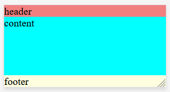
有没有办法通过纯 HTML/CSS 来做到这一点?这就是我想要实现的目标:
|---------------------------| <-- start of screen
|          header           |   fixed height
|---------------------------|
|                           |
|                           |
|          content          |   fill screen
|                           |
|                           |
|---------------------------| <-- end of screen
|          footer           |   auto
|---------------------------|
一些我见过但没有回答我的问题的东西:
如何制作具有固定页眉和页脚且其余部分位于中间的 CSS 网格
body {
    width: 100%;
    min-height: 100%;
    margin: 0 0 0 0;
    background-color: gray;
}

.app-wrapper {
    display: grid;
    grid-template-columns: repeat(4, 1fr);
    grid-template-rows: auto 1fr auto;
    grid-template-areas:
        "header header header header"
        "contnt contnt contnt contnt"
        "footer footer footer footer"
    ;

    height: 100vh;
    width: 100%;
}

.header {
    grid-area: header;
    background-color: lightcoral;
}

.content {
    grid-area: contnt;
    background-color: aqua;
}

.footer {
    grid-area: footer;
    background-color: lightyellow;
}
<body>
<div class="app-wrapper">
<div class="header">
header
</div>
<div class="content">
content
</div>
<div class="footer">
footer
</div>
</div>
</body>1个回答
0
投票
投票
解决方案:将
headercontenthtml, body {
width: 100%;
min-height: 100%;
margin: 0 0 0 0;
background-color: gray;
}
.facade-wrapper {
display: grid;
grid-template-columns: repeat(4, 1fr);
grid-template-rows: auto 1fr auto;
grid-template-areas:
"header header header header"
"contnt contnt contnt contnt"
;
height: 100vh;
width: 100%;
}
.header {
grid-area: header;
background-color: lightcoral;
}
.content {
grid-area: contnt;
background-color: aqua;
}
.footer {
grid-area: footer;
background-color: lightyellow;
}<body>
<div class="app-wrapper">
<div class="facade-wrapper">
<div class="header">
header
</div>
<div class="content">
content
</div>
</div>
<div class="footer">
footer
</div>
</div>
</body>最新问题
- 通过 PowerShell 检索所有 Azure AD 应用程序的“API 权限”
- 设置 QEMU 时出现 Github 操作错误 - 错误:无法找到可执行文件:docker
- 创建包含“11”或以“10”结尾的 DFA
- .NET Lambda 使用 CDK 部署:部署后如何解压二进制文件?
- Electron无法加载preload.js问题
- 如何在 JSX 中使用项目资源中的图片作为 img 标签?
- Flutter 空安全
- 在Python中使用并行处理进行数据迁移
- 产品展示中的产品描述
- Laravel 4 分页 - 无法超越第 1 页
- 如何配置 Perl Tidy 不换行?
- 如何在 Laravel 中合并两个集合?
- 覆盖的创建方法不会触发关系()->create()
- Unity,从不同的游戏对象生成预制件
- Prestashop 1.7 在电子邮件total_shipping_tax_excl 中添加新变量
- Symfony 2 - 在 ROLE_USER 下添加用户角色
- Compose 函数在将状态值传递给另一个函数时会进行重构
- GrapesJS 如何实现全局块
- JUnit 针对同一函数最佳实践测试多个值
- 从 CSS 网格中删除子项
© www.soinside.com 2019 - 2024. All rights reserved.