如何使用flexbox css设置顶部和底部内容
问题描述 投票:3回答:3
flexbox我是新手。我尝试设置顶部,底部和右侧内容。 See Demo
但是我需要设置图片的移动尺寸。
左侧和右侧的高度不同。
我们可以设置上面提到的图像还是其他任何类型来设置手机和平板电脑的屏幕尺寸
.main {
  display: -webkit-box;
  display: -ms-flexbox;
  display: flex;
  -ms-flex-wrap: wrap;
  flex-wrap: wrap;
}

.left {
  background: #f00;
  -webkit-box-flex: 0;
  -ms-flex: 0 0 25%;
  flex: 0 0 25%;
  max-width: 25%;
}

.center {
  background: #ddd;
  -webkit-box-flex: 0;
  -ms-flex: 0 0 50%;
  flex: 0 0 50%;
  max-width: 50%;
}

.right {
  background: #f00;
  -webkit-box-flex: 0;
  -ms-flex: 0 0 25%;
  flex: 0 0 25%;
  max-width: 25%;
}
<div class="main">
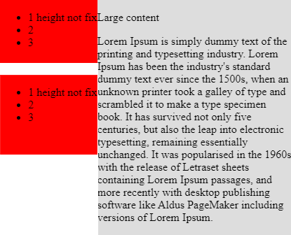
<div class="left">
<ul>
<li>1 height not fix</li>
<li>2</li>
<li>3</li>
</ul>
</div>
<div class="center">
<p>
Large content
</p>
<p>
Lorem Ipsum is simply dummy text of the printing and typesetting industry. Lorem Ipsum has been the industry's standard dummy text ever since the 1500s, when an unknown printer took a galley of type and scrambled it to make a type specimen book. It has
survived not only five centuries, but also the leap into electronic typesetting, remaining essentially unchanged. It was popularised in the 1960s with the release of Letraset sheets containing Lorem Ipsum passages, and more recently with desktop
publishing software like Aldus PageMaker including versions of Lorem Ipsum.
</p>
</div>
<div class="right">
<ul>
<li>1 height not fix</li>
<li>2</li>
<li>3</li>
</ul>
</div>
</div>3个回答
1
投票
投票
我只是将媒体查询添加到您的css。您可以为各种屏幕修改它,并为每个屏幕设置width,position等。
.main{
  display: -webkit-box;
    display: -ms-flexbox;
    display: flex;
-ms-flex-wrap: wrap;
    flex-wrap: wrap;
}
.left{
  background:#f00;
}
.center{
  background:#ddd;
}
.right{
  background:#f00;
  }


  @media screen and (min-width: 980px) {
.left{
   -webkit-box-flex: 0;
    -ms-flex: 0 0 25%;
    flex: 0 0 25%;
    max-width: 25%;
}
.center{
    -webkit-box-flex: 0;
    -ms-flex: 0 0 50%;
    flex: 0 0 50%;
    max-width: 50%;
}
.right{
   -webkit-box-flex: 0;
    -ms-flex: 0 0 25%;
    flex: 0 0 25%;
    max-width: 25%;
  }

}

@media screen and (max-width: 980px) {
 .left{
   -webkit-box-flex: 0;
    -ms-flex: 0 0 100%;
    flex: 0 0 100%;
    max-width: 100%;
}
.center{
    -webkit-box-flex: 0;
    -ms-flex: 0 0 100%;
    flex: 0 0 100%;
    max-width: 100%;
}
.right{
   -webkit-box-flex: 0;
    -ms-flex: 0 0 100%;
    flex: 0 0 100%;
    max-width: 100%;
  }
}
<div class="main">
<div class="left">
<ul>
<li>1 height not fix</li>
<li>2</li>
<li>3</li>
</ul>
</div>
<div class="center">
<p>
Large content
</p>
<p>
Lorem Ipsum is simply dummy text of the printing and typesetting industry. Lorem Ipsum has been the industry's standard dummy text ever since the 1500s, when an unknown printer took a galley of type and scrambled it to make a type specimen book. It has survived not only five centuries, but also the leap into electronic typesetting, remaining essentially unchanged. It was popularised in the 1960s with the release of Letraset sheets containing Lorem Ipsum passages, and more recently with desktop publishing software like Aldus PageMaker including versions of Lorem Ipsum.
</p>
</div>
<div class="right">
<ul>
<li>1 height not fix</li>
<li>2</li>
<li>3</li>
</ul>
</div>
</div>编辑:解决您问题的最佳方法是使用css grid:Flexbox是一维的,Grid是二维的
.main{
 display: grid;
  grid-gap: 10px;
}

.left { grid-area: left; }
.center { grid-area: main; }
.right { grid-area: right; }

.left{
  background:#f00;
  padding: 10px;
}
.center{
  background:#ddd;
    padding: 10px;

}
.right{
  background:#f00;
    padding: 10px;

  }

  @media screen and (min-width: 980px) {
.main{
 display: grid;
  grid-template-areas:'left  main main  right'
    				  'left  main main  right';
  grid-gap: 10px;
}
}

@media screen and (max-width: 980px) {
 .main{
  grid-template-areas:'left  main main '
    				  'right  main main ';
}
}
<div class="main">
<div class="left">
<ul>
<li>1 height not fix</li>
<li>2</li>
<li>3</li>
</ul>
</div>
<div class="center">
<p>
Large content
</p>
<p>
Lorem Ipsum is simply dummy text of the printing and typesetting industry. Lorem Ipsum has been the industry's standard dummy text ever since the 1500s, when an unknown printer took a galley of type and scrambled it to make a type specimen book. It has survived not only five centuries, but also the leap into electronic typesetting, remaining essentially unchanged. It was popularised in the 1960s with the release of Letraset sheets containing Lorem Ipsum passages, and more recently with desktop publishing software like Aldus PageMaker including versions of Lorem Ipsum.
</p>
</div>
<div class="right">
<ul>
<li>1 height not fix</li>
<li>2</li>
<li>3</li>
</ul>
</div>
</div>0
投票
投票
0
投票
投票
.main{
      display: -webkit-box;
        display: -ms-flexbox;
        display: flex;
        -ms-flex-wrap: wrap;
        flex-wrap: wrap;
    }
    .left{

      -webkit-box-flex: 0;
        -ms-flex: 0 0 30%;
        flex: 0 0 30%;
        max-width: 30%;
    }
    .center{
      background:#ddd;
        -webkit-box-flex: 0;
        -ms-flex: 0 0 70%;
        flex: 0 0 70%;
        max-width: 70%;
    }

     ul {
       background:#f00;
       margin-top: 0;
       margin-bottom: 20px;
       padding-top: 15px;
       padding-bottom: 15px;
     }
<div class="main">
  <div class="left">
    <ul>
    <li>1 height not fix</li>
    <li>2</li>
    <li>3</li>
    </ul>

     <ul>
    <li>1 height not fix</li>
    <li>2</li>
    <li>3</li>
    </ul>
  </div>
  <div class="center">
    <p>
    Large content
    </p>
    <p>
    Lorem Ipsum is simply dummy text of the printing and typesetting industry. Lorem Ipsum has been the industry's standard dummy text ever since the 1500s, when an unknown printer took a galley of type and scrambled it to make a type specimen book. It has survived not only five centuries, but also the leap into electronic typesetting, remaining essentially unchanged. It was popularised in the 1960s with the release of Letraset sheets containing Lorem Ipsum passages, and more recently with desktop publishing software like Aldus PageMaker including versions of Lorem Ipsum.
    </p>
  </div>

</div>
最新问题
- 如何使用 Boto3 Python 在 S3 中创建 zip 文件?
- 如何将维基百科英文页面标题导入到 postgresql 表中?
- 在图形 2D 上绘制可追踪的文本
- Flutter:获取 mp4 文件的长度/持续时间
- 在 VBScript 中检索 Cookie 并发送 Cookie 和 Post 变量
- 路径处的数据模型编译失败
- 在python编译的exe文件中使用QWebEngineView出现错误“网络服务崩溃,重新启动服务”
- 从单一列表创建组合表
- Symfony2 仍然无法在我的控制器上工作
- 当尝试使用 Shapeless 将 Map 转换为 scala 对象时,编译器不会拾取余积导数
- 如何动态添加点击处理程序到 Ember Octane 组件 - 动态“on”修饰符
- 将 Firebase 管理与 REST 结合使用
- 将变量拆分为多个变量
- `nx target`和原生命令有什么区别?
- 如何在expo中启用自动重新加载?
- 没有可用于指定 RuntimeIdentifier“browser-wasm”的 Microsoft.AspNetCore.App 运行时包
- 如何从扩展值填充页面上的输入?
- 获取两个字符串之间的公共字符数
- 如何将 DebuggerDisplay 属性应用于 Enum?
- 如果所有三个参数严格不相等,则返回 true 的函数。 JS [已关闭]
© www.soinside.com 2019 - 2024. All rights reserved.