如何在WPF中设置小扩展头和扩展内容?
问题描述 投票:0回答:1
我正在创建一个自定义虚拟键盘。目前,对于所有标点符号,我将其设置在另一个网格上。扩展器内容似乎可以保持标点符号视图。但是,如果我希望扩展器内容能够查看其中的内容,则目前需要设置内容的大小。
如何使用按钮大小扩展器,点击时,内容将扩展到更大的尺寸?

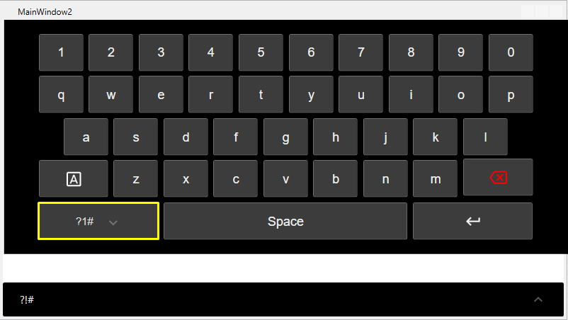
如何制作扩展器的大小如下图(黄色矩形),但点击扩展器时,内容将像GIF一样展开?
<Button HorizontalAlignment="Left" Height="52.25" Margin="0,238.5,0,0" VerticalAlignment="Top" Width="168.187" Background="#FF3C3C3C" FontFamily="Arial" FontSize="18" BorderBrush="#FF6E6E6E">
    <Expander Header="?!#" ExpandDirection="Up" Background="{x:Null}" Foreground="White" HorizontalAlignment="Left" VerticalAlignment="Top">
        <!-- How add content grid which can be expander at full while maintaining the expander header to small size? -->
    </Expander>
</Button>
1个回答
2
投票
投票
我建议你把扩展键盘的Buttons放在另一个Panel中,用Visibility控制Panel的ToggleButton。
当你使用Expander(就像你做的那样)来保存扩展键盘时,这可以很容易地完成,类似于:
<Grid Background="Gray" Height="300">
    <!-- Basic Keyboard Buttons can be placed here -->
    <Button HorizontalAlignment="Left" Margin="0,0,0,30" VerticalAlignment="Top" Content="Put some Buttons from the BASIC Keyboard here"/>
    <!-- Button to bring the extanded Keyboard into view -->
    <ToggleButton x:Name="ExtendedKeyboardActive" HorizontalAlignment="Left" VerticalAlignment="Center" Content="?!#" Width="50"/>
    <!-- Extended Keyboard (Note: I would rather use a simple <Grid/> instead of an <Expander/> but it is up to you)-->
    <Expander VerticalAlignment="Bottom" ExpandDirection="Up" IsExpanded="{Binding IsChecked, ElementName=ExtendedKeyboardActive}" Background="LightGray">
        <Grid Height="300">
            <!-- Content of the extaned Keyboard -->
            <Button HorizontalAlignment="Left" Margin="0,0,0,30" VerticalAlignment="Top" Content="Put some Buttons from the EXTENDED Keyboard here"/>
            <!-- Button ti hide the extended Keyboard (optional if it the 'ExtendedKeyboardActive' is not covered over by the extended Keyboard Grid) -->
            <ToggleButton IsChecked="{Binding IsChecked, ElementName=ExtendedKeyboardActive}" Width="50" HorizontalAlignment="Left" VerticalAlignment="Center" Content="ABC" />
        </Grid>
    </Expander>
</Grid>
或者你可以使用PopUp,因为Expander有这个Arrow-Circle-Thing总是显示而不是真正需要(感谢@Bradley Uffner)。
<Grid Background="Gray">
    <!-- Basic Keyboard Buttons can be placed here -->
    <Button HorizontalAlignment="Left" Margin="0,0,0,30" VerticalAlignment="Bottom" Content="Put some Buttons from the BASIC Keyboard here"/>
    <!-- Button to bring the extanded Keyboard into view -->
    <ToggleButton x:Name="ExtendedKeyboardActive" HorizontalAlignment="Left" VerticalAlignment="Bottom" Content="?!#" Width="50"/>
    <!-- Extended Keyboard -->
    <Popup IsOpen="{Binding IsChecked, ElementName=ExtendedKeyboardActive}" Placement="Center" Height="{Binding ActualHeight, RelativeSource={RelativeSource AncestorType={x:Type Grid}}}" Width="{Binding ActualWidth, RelativeSource={RelativeSource AncestorType={x:Type Grid}}}">
        <Grid Background="LightGray">
            <!-- Content of the extended Keyboard -->
            <Button HorizontalAlignment="Left" Margin="0,0,0,30" VerticalAlignment="Bottom" Content="Put some Buttons from the extended Keyboard here"/>
            <!-- Button to go back to the basic Keyboard -->
            <ToggleButton IsChecked="{Binding IsChecked, ElementName=ExtendedKeyboardActive}" Width="50" HorizontalAlignment="Left" VerticalAlignment="Bottom" Content="ABC" />
        </Grid>
    </Popup>
</Grid>
最新问题
- Python 初学者问:字符串看起来完全一样,但显示的结果不同?
- 在 Unity 和 Meta Quest 中从 RenderTexture 上的触摸位置投射光线时纠正坐标错位
- 在 gtsummary 表中按小数点对齐列号
- 使用 redux-starter-kit 的 configureStore() 设置 saga 中间件
- 我可以将 stdout / stderr 从附加进程转发到 lldb 的控制台吗?
- Firestore客户端实例是否需要显式关闭?
- 使用 jsPDF addImage JPEG 将 p5.js sketch canvas 下载为 PDF
- 远程 JMX 在 Cassandra 4.0 和 4.1 中不起作用
- Golang:如何检查collection.Find是否没有找到任何文档?
- BeautifulSoup:只要进入标签内部,无论有多少个封闭标签
- 我可以重复使用空的或静态的 GRPC 响应吗?
- AWS API Gateway REST API 是否没有设置来禁用 CloudFormation 模板中的execute-api 端点?
- Heroku:如何将seeds.rb推送到现有的rails应用程序?
- 为什么 Inkscape 中的文本看起来很奇怪(粗/粗体,更接近)?
- PHP isset COOKIE 语句未检测到 cookie
- 使用X509证书进行RSA加密和解密2
- 如何在Azure DevOps API中获取工作项的附件缩略图?
- django KeyError 中的错误 /accounts/register/
- 来自 IF 的 Google Sheets 数组错误不能在公式下方的行中包含任何内容
- 我想将 .docx 转换为 .dotx
© www.soinside.com 2019 - 2024. All rights reserved.