AntD 日期范围选择器的自定义 CSS
问题描述 投票:0回答:3
我正在尝试对表单上的 AntD 组件进行颜色编码,以便当我创建新记录时,配色方案为绿色而不是蓝色(当编辑现有记录时)。标准输入运行良好,我可以有条件地覆盖边框和框阴影的样式,但是我有点卡在 DateRange 组件上。我已经设法有条件地应用边框和框阴影:
          <RangePicker
            disabled={editVPMapMode || isVenueCreateMode}
            className={isEditMode ? "" : "createDateRangePicker"}
            showTime={{ format: "HH:mm" }}
            name="StartEndDate"
            format="DD/MM/YYYY HH:mm"
            onChange={(e) => onDateChange(e, "RangePicker")}
          />
注意 className 属性中的条件。 CSS 中引用了这个类名:
.createDateRangePicker.ant-calendar-picker-input.ant-input:hover {
  border-color: #1f9643e5 !important;
  outline: 0 !important;
  -webkit-box-shadow: 0 0 0 2px rgba(49, 139, 54, 0.342) !important;
  box-shadow: 0 0 0 2px rgba(49, 139, 54, 0.342) !important;
}

.createDateRangePicker:hover {
  border-color: #1f9643e5 !important;
}

.createDateRangePicker.ant-picker-focused {
  border-color: #1f9643e5 !important;
  outline: 0 !important;
  -webkit-box-shadow: 0 0 0 2px rgba(49, 139, 54, 0.342) !important;
  box-shadow: 0 0 0 2px rgba(49, 139, 54, 0.342) !important;
}

.createDateRangePicker .ant-picker-active-bar {
  background-color: #1f9643e5 !important;
}
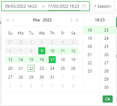
这导致 DateRange 组件具有我想要的一些功能:
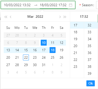
请注意,根据上述条件,输入部分如何具有绿色边框。但是,您还可以看到组件的其余部分还有很多蓝色需要更改。
当我检查发送到浏览器的元素时,我可以看到 DropDown 日历部分与主 DateRange 组件分开:
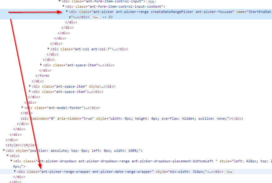
另请注意,我的 className createDateRangePicker 未传递到下部下拉部分。
我有我想要覆盖的 CSS 类:
.ant-picker-cell-in-view.ant-picker-cell-range-start .ant-picker-cell-inner {
  background-color: #27c456 !important;
}

.ant-picker-cell-in-view.ant-picker-cell-range-end .ant-picker-cell-inner {
  background-color: #27c456 !important;
}

.ant-picker-cell-in-view.ant-picker-cell-today
  .ant-picker-cell-inner::before {
  border-color: #1f9643e5 !important;
}

.ant-picker-cell-in-view.ant-picker-cell-range-start:not(.ant-picker-cell-range-start-single)::before,
.ant-picker-cell-in-view.ant-picker-cell-in-range::before,
.ant-picker-cell-in-view.ant-picker-cell-range-end:not(.ant-picker-cell-range-end-single)::before,
.ant-picker-time-panel-column
  > li.ant-picker-time-panel-cell-selected
  .ant-picker-time-panel-cell-inner {
  background: #e6ffe8 !important;
}

.ant-btn-primary {
background-color: #27c456 !important;
border-color: #1f9643e5 !important;
}
要执行此操作:
但是,我只能执行一次覆盖,并且无法像上面的其他控件一样将其设置为有条件的 - 主要是因为那里没有使用 className。
我希望这对某人来说足够有意义,他们可以帮助我指出解决这个问题的正确方向。
3个回答
3
投票
投票
看起来我错过了一些简单的事情。我最初错过了一个名为 dropdownClassName 的 antD 属性。我添加如下:
          <RangePicker
            disabled={editVPMapMode || isVenueCreateMode}
            className={isEditMode ? "" : "createDateRangePicker"}
            dropdownClassName={isEditMode ? "" : "createDateRangePicker"}
            showTime={{ format: "HH:mm" }}
            name="StartEndDate"
            format="DD/MM/YYYY HH:mm"
            onChange={(e) => onDateChange(e, "RangePicker")}
          />
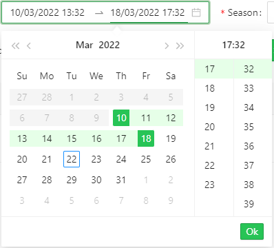
然后更新上面的第二组 CSS 以查找提供的类:
.createDateRangePicker
  .ant-picker-cell-in-view.ant-picker-cell-range-start
  .ant-picker-cell-inner {
  background-color: #27c456 !important;
}

.createDateRangePicker
  .ant-picker-cell-in-view.ant-picker-cell-range-end
  .ant-picker-cell-inner {
  background-color: #27c456 !important;
}

.createDateRangePicker
  .ant-picker-cell-in-view.ant-picker-cell-today
  .ant-picker-cell-inner::before {
  border-color: #1f9643e5 !important;
}

.createDateRangePicker
  .ant-picker-cell-in-view.ant-picker-cell-range-start:not(.ant-picker-cell-range-start-single)::before,
.createDateRangePicker
  .ant-picker-cell-in-view.ant-picker-cell-in-range::before,
.createDateRangePicker
  .ant-picker-cell-in-view.ant-picker-cell-range-end:not(.ant-picker-cell-range-end-single)::before,
.createDateRangePicker
  .ant-picker-time-panel-column
  > li.ant-picker-time-panel-cell-selected
  .ant-picker-time-panel-cell-inner {
  background: #e6ffe8 !important;
}

.createDateRangePicker .ant-btn-primary {
  background-color: #1f9643e5 !important;
  border-color: #1f9643e5 !important;
}
现在我需要的颜色取决于我是否处于编辑模式:
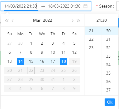
或创建模式:
1
投票
投票
只要使用这个功能,它就可以直接将其加载到div中。


0
投票
投票
要自定义 Ant Design (AntD) 日期范围选择器的 CSS,您可以利用 DatePicker 组件提供的 dropdownClassName 属性。
此属性允许您将自定义 CSS 类应用到日期范围选择器的下拉面板,从而实现有针对性的样式。
dropdownClassName="my-calender" // Applies custom CSS class to the dropdown panel
.my-calender {
  /* Add your custom styles here */
}
最新问题
- 如何修复 React 中的“列表中的每个子项都应该有一个唯一的‘key’属性’警告?
- 如何在 QML Qt Charts 中绘制数据(使用 python)
- “以不同用户身份”打开 Powershell 时,Powershell 无法运行 Connect-AzAccount
- AttributeError:“Trainer”对象没有属性“tuner”
- urllib3 - 超时和重试
- 使用get_object_references获取snowflake中对象的所有级别依赖关系
- Python 中科学计数法中的指数数字
- 如何制作仅从 3 面带有边框活动项的菜单?
- Seaborn 2d histplot:显示每个 bin 中的计数
- ApexCharts 仅显示第一个和最后一个 x 轴标签
- Web API JWT 令牌未经授权错误,尽管在授权标头中传递了令牌
- 使用OpenCV从图像中检测具有一定宽度的线
- 仅在客户端运行某些代码的最佳方法是什么?
- 是否可以在没有模拟器和Android手机的情况下运行Android应用程序
- 如果没有 Android 手机,如何开始进行 Android 开发?
- jboss 7.4.4 及以上补丁可以与 JDK 17 一起使用吗?
- PHP 多字节正则表达式不适用于 UTF-8
- 如何检测redhat中的防火墙拒绝了哪些端口?
- Pandas 值计数而不对结果进行排序
- C# 编译器不接受 null 作为可空泛型类型属性
© www.soinside.com 2019 - 2024. All rights reserved.