如何使浮动操作按钮背景渐变?
问题描述 投票:0回答:8
FAB代码:
<android.support.design.widget.FloatingActionButton
        android:id="@+id/fab"
        android:layout_width="wrap_content"
        android:layout_height="wrap_content"
        android:layout_gravity="bottom|right|end"
        android:layout_margin="16dp"
        android:src="@drawable/add_chat"
        android:tint="@android:color/white" />
</android.support.design.widget.CoordinatorLayout>
渐变背景代码:
<shape xmlns:android="http://schemas.android.com/apk/res/android"
android:shape="oval">
<gradient
    android:angle="90"
    android:endColor="#e4849f"
    android:startColor="#d96e30" />
</shape>
android:backgroundTint="" 或 app:backgroundTint="" 都只使用颜色资源。有人能建议怎么做吗? 谢谢!!
8个回答
13
投票
投票
步骤 1. 创建一个新的 drawable.xml 并向其中添加此代码
 <?xml version="1.0" encoding="utf-8"?>
    <layer-list xmlns:android="http://schemas.android.com/apk/res/android">


        <item>
            <shape xmlns:android="http://schemas.android.com/apk/res/android"
                android:shape="oval">
                <gradient
                    android:type="linear"
                    android:angle="0"
                    android:startColor="#f6ee19"
                    android:endColor="#115ede" />
            </shape>

        </item>
        <item android:gravity="center"
            >
            <bitmap android:src="@drawable/your_icon"
                android:gravity="fill_horizontal" />

        </item>

    </layer-list>
Step 2.) 现在在您的dimens.xml中添加这行代码,
<dimen name="design_fab_image_size" tools:override="true">56dp</dimen>
步骤 3.) 最后使用
*android:src="@drawable/drawable.xml"*附言- 确保 your_icon 是 PNG, JPEG.
7
投票
投票
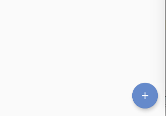
接受的答案工作正常,但在添加以下行后,它会拉伸添加在 FAB
上的图标<dimen name="design_fab_image_size" tools:override="true">56dp</dimen>
我正在分享截图:
上一个FAB按钮
在dimen.xml中添加design_fab_image_size并添加
android:src="@drawable/gradient"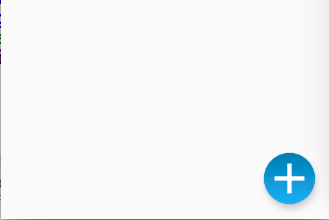
为了解决这个问题,我将 gradient.xml 替换为以下代码:
<layer-list xmlns:android="http://schemas.android.com/apk/res/android">
<item>
    <shape xmlns:android="http://schemas.android.com/apk/res/android"
        android:shape="oval">
        <gradient
            android:angle="90"
            android:startColor="#00FF00"
            android:endColor="#000000" />
        <size
            android:width="56dp"
            android:height="56dp" />
    </shape>
</item>
<item
    android:left="10dp"
    android:right="10dp">
    <shape android:shape="line">
        <stroke
            android:width="2dp"
            android:color="#ffffff" />
    </shape>
</item>
<item
    android:left="10dp"
    android:right="10dp">
    <rotate
        android:fromDegrees="90">
        <shape android:shape="line">
            <stroke
                android:width="2dp"
                android:color="#ffffff" />
        </shape>
    </rotate>
</item>
输出:
3
投票
投票
我尝试了很多不同的答案,但都有它们的缺点或不适用于
material FABImageView<ImageButton
android:id="@+id/floatingActionButton"
android:layout_width="56dp"
android:layout_height="56dp"
android:background="@drawable/fab_gradient"
android:elevation="6dp"
... />
fab_gradient.xml:
<ripple android:color="?attr/colorControlHighlight"
    xmlns:android="http://schemas.android.com/apk/res/android">
    <item>
        <layer-list>
            <item>
                <shape android:shape="oval">
                    <gradient
                        android:type="linear"
                        android:angle="90"
                        android:startColor="@color/startColor"
                        android:endColor="@color/endColor" />
                </shape>
            </item>
            <item android:drawable="@drawable/vector_icon" android:gravity="center" />
        </layer-list>
    </item>
</ripple>
2
投票
投票
<style name="FullFABStyle">
    <item name="fabSize">normal</item>
    <item name="maxImageSize">@dimen/fab_size</item>
    <item name="fabCustomSize">@dimen/fab_size</item>
</style>

<com.google.android.material.floatingactionbutton.FloatingActionButton
    android:layout_width="@dimen/fab_size"
    android:layout_height="@dimen/fab_size"
    style="@style/FullFABStyle"
    app:srcCompat="@drawable/your_background" />
所以,你不需要覆盖 dimen
1
投票
投票
这个方法也行。 在 drawable 中创建一个名为 fab_background.xml 的形状,您可以在其中进行所需的所有自定义操作
<?xml version="1.0" encoding="utf-8"?>
<shape android:shape="oval"   xmlns:android="http://schemas.android.com/apk/res/android">
    <size android:width="150dp" android:height="150dp"/>
    <gradient android:startColor="@color/colorAccentDark" android:endColor="@color/colorAccent"/>
</shape>
在布局中创建一个名为 custom_fab.xml 的布局,然后使用图像视图设置背景和 fab 图标
<?xml version="1.0" encoding="utf-8"?>
<LinearLayout xmlns:android="http://schemas.android.com/apk/res/android"
    xmlns:tools="http://schemas.android.com/tools"
    android:layout_width="50dp"
    android:layout_height="50dp"
    android:gravity="center"
    android:background="@drawable/fab_background"
    >

    <android.appcompat.widget.AppCompatImageView
        android:layout_width="24dp"
        android:layout_height="24dp"
        android:src="@drawable/right" />
</LinearLayout>
然后您可以使用
include例子
<?xml version="1.0" encoding="utf-8"?>
<RelativeLayout xmlns:android="http://schemas.android.com/apk/res/android"
    xmlns:app="http://schemas.android.com/apk/res-auto"
    xmlns:tools="http://schemas.android.com/tools"
    android:layout_width="match_parent"
    android:layout_height="match_parent"
    android:background="@drawable/background"
    android:orientation="vertical">


    <include layout="@layout/custom_fab"
        android:layout_width="45dp"
        android:layout_height="45dp"
        android:layout_alignParentEnd="true"
        android:layout_alignParentBottom="true"
        android:layout_margin="32dp"/>
</RelativeLayout>
1
投票
投票
floatingActionButton: FloatingActionButton(
    child: Container(
        width: double.infinity,
        height: double.infinity,
        decoration: BoxDecoration(
          borderRadius: BorderRadius.circular(30),
          gradient: LinearGradient(
              begin: Alignment.bottomLeft,
              end: Alignment.topRight,
              colors: [
                Color.fromRGBO(55, 59, 68, 1),
                Color.fromRGBO(66, 134, 244, 1)
              ]),
        ),
        child: Icon(Icons.add)),
    onPressed: () => _startAddNewTransaction(context),
  ),

0
投票
投票
使用
CardView<androidx.cardview.widget.CardView
android:layout_width="56dp"
android:layout_height="56dp"
android:clickable="true"
android:focusable="true"
android:foreground="?android:attr/selectableItemBackground"
app:cardCornerRadius="28dp"
app:cardElevation="12dp"
app:cardUseCompatPadding="false">
<RelativeLayout
android:layout_width="match_parent"
android:layout_height="match_parent"
android:background="@drawable/fab_gradient">
<ImageView
android:layout_width="24dp"
android:layout_height="wrap_content"
android:layout_centerInParent="true"
android:src="@drawable/icon_svg"
app:tint="@color/white" />
</RelativeLayout>
</androidx.cardview.widget.CardView>
以上答案不适用于 SVG,您可能还会看到拉伸的图标等。根据 fab 的材料设计,这是我用于我的应用程序的一种巧妙方法:

提示: 如果它没有出现在你想要的图层上方,请使用
elevation0
投票
投票
对于那些仍然有这个问题的人,实现这个的简单解决方案是通过设置FAB的foreground。
像下面这个例子:
 <com.google.android.material.floatingactionbutton.FloatingActionButton
        android:layout_width="wrap_content"
        android:layout_height="wrap_content"
        android:foreground="@drawable/circle_btn_gradient"
        />
可绘制代码(circle_btn_gradient.xml):
<?xml version="1.0" encoding="utf-8"?>
<layer-list xmlns:android="http://schemas.android.com/apk/res/android">
    <item>
        <shape android:shape="oval">
            <gradient
                android:startColor="#2F8FC5"
                android:endColor="#1FCEB9"
                android:angle="270"
                />

        </shape>
    </item>
    <item android:drawable="@drawable/baseline_add_24"
        android:top="15dp"
        android:left="15dp"
        android:right="15dp"
        android:bottom="15dp">
    </item>

</layer-list>
最新问题
- 累积聚合一个极坐标列表[struct[]]
- Azure Stream Analytics 从事件中心读取数据
- 在 ASP.NET Core 8 MVC 中将 IEnumerable<Entity> 从视图传递到控制器
- pgjdbc中prepareThreshold = 5有什么好处?
- 如何在java swing中以dt、dd内联形式包含JRadioButton的文本?
- 为什么在模拟器中调试应用程序时应用程序不断停止?
- 阶段的输出在下一阶段的情况下不可见
- 为什么我在 itemAtPosition() 上出错
- 如何正确修改给定图像中的单个像素值?
- 杰克逊 Shape.ARRAY /w Feature.ACCEPT_SINGLE_VALUE_AS_ARRAY
- 配置 pytest 夹具
- 如何在 Bootstrap 5.3.3 中使用表单选择来适应选择选项的宽度?
- 为什么 Elasticsearch 在搜索过程中不使用分析器令牌?
- “C:\Program”在“Git Bash Here”终端中未被识别为内部或外部命令 - Windows (salesforce sfdx) - 解决
- 如何为 ttk.Combobox 和 ttk.Entry 小部件设置相同的宽度?
- 在remix js中保存数据之前的确认消息
- 微服务中的ASP.NET Core身份验证和授权
- 在 NextJs(应用程序路由器)中获取 api 路由,以便在抛出错误时使用 JSON {ok:false} 进行响应
- 迭代 Pascal 代码中的 Inno Setup [Files] 部分
- MusicKitJS:无法播放用户库中的歌曲
© www.soinside.com 2019 - 2024. All rights reserved.