响应式flexbox布局图像溢出页脚
问题描述 投票:0回答:2
我做了一些网站,并使用flexbox进行装饰布局。
页面结构很简单。只有3个标签。
<header>
<section>
<footer>
[index.html的]
<html>
<head>
  <link rel="stylesheet" type="text/css" href="style.css">

</head>
<body>
  <header>
    <div class="header__left">
      <span>Email here or call</span>
    </div>
    <div class="header__center">
      <img src="img/logo.png">
    </div>
    <div class="header__right">
      <a href="#">About us</a>
      <a href="#">Our Work</a>
      <a href="#">Our People</a>
    </div>
  </header>
  <section>
    <img src="./img/dummy.jpg" alt="Sample photo">
    <img src="./img/dummy.jpg" alt="Sample photo">
    <img src="./img/dummy.jpg" alt="Sample photo">
    <img src="./img/dummy.jpg" alt="Sample photo">
    <img src="./img/dummy.jpg" alt="Sample photo">
    <img src="./img/dummy.jpg" alt="Sample photo">
    <img src="./img/dummy.jpg" alt="Sample photo">
    <img src="./img/dummy.jpg" alt="Sample photo">
    <img src="./img/dummy.jpg" alt="Sample photo">
    <img src="./img/dummy.jpg" alt="Sample photo">
    <img src="./img/dummy.jpg" alt="Sample photo">
    <img src="./img/dummy.jpg" alt="Sample photo">
  </section>
  <footer>
    THIS IS FOOTER
  </footer>
</body>
</html>
[style.css中]
html, body {
  padding: 0;
  margin: 0;
}
header {
  display: flex;
  height: 70px;
}
.header__left {
  flex: 1;
  display: flex;
  justify-content: center;
  align-items: center;
}
.header__center {
  flex: 1;
  display: flex;
  justify-content: center;
  align-items: center;
}
.header__right {
  flex: 1;
  display: flex;
  justify-content: center;
  align-items: center;
}
section {
  display: flex;
  flex-wrap: wrap;
  align-items: flex-start;
  max-height: 100vh;
}
section img {
  max-width: 25vw;
}
并定义max-width: 25vw;在1行显示4个图像。
当我进入网站时,它看起来像这样。

如果浏览器很小,它可以很好地工作。
但是当我增加浏览器大小时,
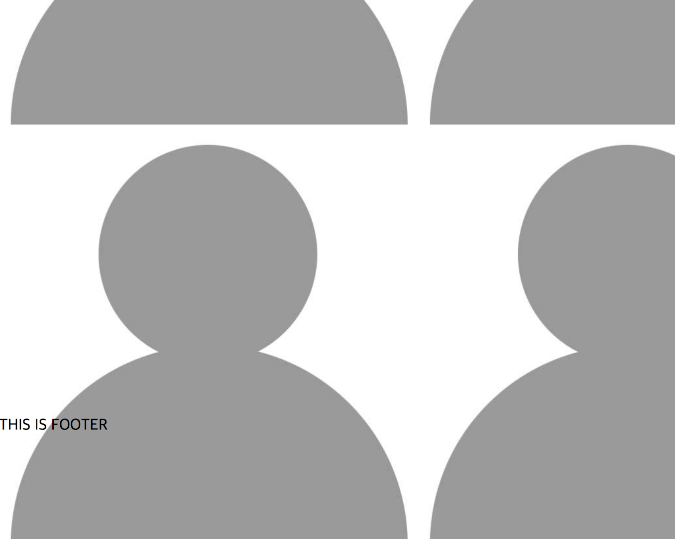
<section>入侵<footer>
有什么办法可以预防吗?
谢谢。
2个回答
0
投票
投票
看一下这个!只需要将高度和宽度改为100%https://jsfiddle.net/ksmLwngp/4/
html, body {
  padding: 0;
  margin: 0;
}
header {
  display: flex;
  height: 70px;
}
.header__left {
  flex: 1;
  display: flex;
  justify-content: center;
  align-items: center;
}
.header__center {
  flex: 1;
  display: flex;
  justify-content: center;
  align-items: center;
}
.header__right {
  flex: 1;
  display: flex;
  justify-content: center;
  align-items: center;
}
section {
  display: flex;
  flex-wrap: wrap;
  align-items: flex-start;
  max-height: 100vh;
}
section img {
  max-width: 25vw;
}

  .imgbox {
 width:100%;
   height: 100%;
  }

<html>
<head>
  <link rel="stylesheet" type="text/css" href="style.css">

</head>
<body>
  <header>
    <div class="header__left">
      <span>Email here or call</span>
    </div>
    <div class="header__center">
      <img src="img/logo.png">
    </div>
    <div class="header__right">
      <a href="#">About us</a>
      <a href="#">Our Work</a>
      <a href="#">Our People</a>
    </div>
  </header>
  <section>
  <div class="imgbox">
    <img src="./img/dummy.jpg" alt="Sample photo">
    <img src="./img/dummy.jpg" alt="Sample photo">
    <img src="./img/dummy.jpg" alt="Sample photo">
    <img src="./img/dummy.jpg" alt="Sample photo">
    <img src="./img/dummy.jpg" alt="Sample photo">
    <img src="./img/dummy.jpg" alt="Sample photo">
    <img src="./img/dummy.jpg" alt="Sample photo">
    <img src="./img/dummy.jpg" alt="Sample photo">
    <img src="./img/dummy.jpg" alt="Sample photo">
    <img src="./img/dummy.jpg" alt="Sample photo">
    <img src="./img/dummy.jpg" alt="Sample photo">
    <img src="./img/dummy.jpg" alt="Sample photo">
    </div>
  </section>
  <footer>
    THIS IS FOOTER
  </footer>
</body>
</html>
0
投票
投票
删除max-height: 100vh;上的fiddle示例
最新问题
- Woocommerce 订单保存到保存每个产品的 XML 文件
- 如何在 GNU 并行中为不同主机使用不同的 --workdir
- Flutter 在 Get.back() 之后调用 setState
- 哪个工具可以获取打开的浏览器的所有窗口句柄?
- ASP.NET Core 报告 - 允许外部图像
- 错误:找不到模块“camelcase”
- Python 3 中可以结合参数描述和类型提示吗?
- RxJS setTimeout 运算符等效
- 创建自定义 TableExpectation Great_expectations
- 创建新 XML 结构时出现 XSLT 代码问题
- 由于 TypeScript 错误而无法构建解决方案,但 noEmitOnError 为 false
- 远程错误:模块“remotion”没有导出成员“OffthreadVideo”
- mips 编程中的浮点数
- 自动创建 Jenkins 视图
- 如何防止 VS 2022 在 esproj 中显示带有 d.ts 文件的打字稿错误
- 有没有办法限制R进程运行的数量
- 在新选项卡中显示base64编码数据
- 意外的应用程序错误!无法读取未定义的属性(读取“包含”)
- API 管理 - 使设置查询参数以不区分大小写的方式工作
- 解决会话冲突:将多个社交媒体平台与 Next.js 和 NextAuth 集成
© www.soinside.com 2019 - 2024. All rights reserved.