[IE11 Flex容器在表内时溢出
问题描述 投票:0回答:1
在IE11和Google Chrome中查看以下代码示例。
在Chrome浏览器中,它按预期显示,但在IE11中,该表扩展到比包含块更大的宽度。这似乎是由display: flex引起的-删除display,flex-direction和justify-content样式会使所有内容重新弹出。
我希望IE11以与Google Chrome浏览器相同的方式显示我的内容。我强烈希望尽可能不要更改标记。
我还遇到了许多其他问题,这些问题涉及与IE相关的flexbox bug,它们都建议更改各种flex属性,但是我尝试过的任何方法都没有改变效果。在max-width上设置div.flex *确实可以,但我希望尽可能保持动态。
<html>

<body>
  <style>
    div.wrapper {
      background-color: lightgrey;
      width: 500px;
    }

    div.flex {
      border: 1px solid blue;
      display: flex;
      flex-direction: column;
      justify-content: center;
    }

    table.wrapper-table div.flex {
      border: 1px solid green;
    }
  </style>
  <div class="wrapper">
    <div class="flex">
      <p>This is some text that is quite a lot longer than the width of the content and therefore must wrap around to new lines</p>
      <p>This is some text that is quite a lot longer than the width of the content and therefore must wrap around to new lines</p>
    </div>
    <table class="wrapper-table">
      <tbody>
        <tr>
          <td>
            <div class="flex">
              <p>This is some text that is quite a lot longer than the width of the content and therefore must wrap around to new lines</p>
              <p>This is some text that is quite a lot longer than the width of the content and therefore must wrap around to new lines</p>
            </div>
          </td>
        </tr>
      </tbody>
    </table>
  </div>
</body>

</html>1个回答
0
投票
投票
您说过,“删除显示方式,伸缩方向和理由内容样式会使所有内容恢复原状。”
如果可以识别IE浏览器并应用特定样式,则可以参考此示例。
<html>

<body>
  <style>
@supports not (-ms-high-contrast: none) {
    div.wrapper {
      background-color: lightgrey;
      width: 500px;
    }

    div.flex {
      border: 1px solid blue;
      display: flex;
      flex-direction: column;
      justify-content: center;
    }

    table.wrapper-table div.flex {
      border: 1px solid green;
    }
}


@media screen and (-ms-high-contrast: active), (-ms-high-contrast: none) {
   div.wrapper {
      background-color: lightgrey;
      width: 500px;
    }

    div.flex {
      border: 1px solid blue;

    }

    table.wrapper-table div.flex {
      border: 1px solid green;
    }
}
  </style>
  <div class="wrapper">
    <div class="flex">
      <p>This is some text that is quite a lot longer than the width of the content and therefore must wrap around to new lines</p>
      <p>This is some text that is quite a lot longer than the width of the content and therefore must wrap around to new lines</p>
    </div>
    <table class="wrapper-table">
      <tbody>
        <tr>
          <td>
            <div class="flex">
              <p>This is some text that is quite a lot longer than the width of the content and therefore must wrap around to new lines</p>
              <p>This is some text that is quite a lot longer than the width of the content and therefore must wrap around to new lines</p>
            </div>
          </td>
        </tr>
      </tbody>
    </table>
  </div>
</body>

</html>
输出:
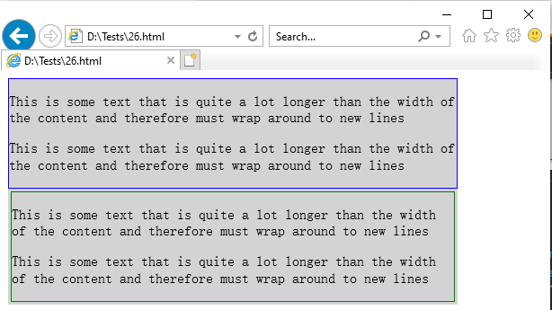
通过这种方式,您无需在标记中进行任何更改,并且您将在IE浏览器中获得类似的输出。
此外,您可以根据自己的要求修改代码。
最新问题
- 如何使用 Javascript(适用于 Google Sheets)过滤嵌套 JSON 数组的条件并仅从过滤器的第一个结果返回一个值?
- Kubernetes 部署无法下载 OpenAPI 错误
- 使用Python从Excel单元格中提取值
- vuejs 中 Visual Studio Code 格式错误
- 尝试使用 python pandas 删除列中没有数值的所有行
- 如何让android建议我的应用程序打开从whatsapp发送的位置?
- “行标签”显示为第一列标题并显示小计,同时使用 apache poi 生成 Excel 数据透视表
- /proc/procid/maps 中具有相同偏移量和权限的段
- Pywin32:SetWindowDisplayAffinity 不可用吗?
- 找不到“RNSplashScreen.h”文件
- 如何计算 tibble 中 n 行的平均值,并使用 r 中这些行的结果值将新列分配给 tibble?
- 由于版本问题导致获取依赖项出现问题
- R- data.frame 中的计数值
- 当我想登录时,类扩展不起作用
- 使用 fetch API 返回所有值,而不仅仅是最后一个值
- 如何让精灵动画在Godot 4.2.2中以调试模式运行
- 从子屏向父屏传递数据时出现颤动错误(执行订单)
- files.upload API 方法已被弃用,用于通过 Selenium WebDriver 4.0 将测试结果上传到 Slack
- 打开/关闭时我是否将 Unicode 三角形向上/向下指向?
- 属性 ::before 对于 CSS 实现不起作用
© www.soinside.com 2019 - 2024. All rights reserved.