使用CSS模糊图像或背景图像的边缘
问题描述 投票:22回答:3
我知道有一堆新的CSS过滤器,我想知道是否有办法将它们应用于图像或背景图像。我读过的所有内容都谈到了用阴影来柔化图像,然而,阴影是一种颜色,我想模糊图像的边缘,这样如果它们彼此相邻,我就可以更加无缝地将它们混合在一起。现在,看起来你只能使用阴影或对整个图像应用模糊(根据我所读到的内容)。
我能想出的最接近的是一个半透明的盒子阴影......就像这样
-webkit-box-shadow: 12px 29px 81px 0px rgba(0,0,0,0.75);
-moz-box-shadow: 12px 29px 81px 0px rgba(0,0,0,0.75);
box-shadow: 12px 29px 81px 0px rgba(0,0,0,0.75);
3个回答
78
投票
投票
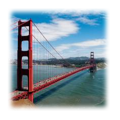
如果您正在寻找的只是模糊图像边缘,您可以简单地使用带有插入的框阴影。
工作示例:http://jsfiddle.net/d9Q5H/1/
HTML:
<div class="image-blurred-edge"></div>
CSS
.image-blurred-edge {
    background-image: url('http://lorempixel.com/200/200/city/9');
    width: 200px;
    height: 200px;
    /* you need to match the shadow color to your background or image border for the desired effect*/
    box-shadow: 0 0 8px 8px white inset;
}
17
投票
投票
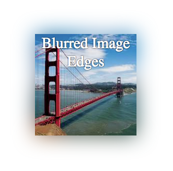
我不完全确定你所追求的视觉效果是什么,但这里有一种模糊图像边缘的简单方法:将图像放在另一个div中的div与模糊图像。
这里的工作示例:http://jsfiddle.net/ZY5hn/1/
HTML:
<div class="placeholder">
     <!-- blurred background image for blurred edge -->
     <div class="bg-image-blur"></div>
     <!-- same image, no blur -->
     <div class="bg-image"></div>
     <!-- content -->
     <div class="content">Blurred Image Edges</div>
</div>
CSS:
.placeholder {
    margin-right: auto;
    margin-left:auto;
    margin-top: 20px;
    width: 200px;
    height: 200px;
    position: relative;
    /* this is the only relevant part for the example */
}
/* both DIVs have the same image */
 .bg-image-blur, .bg-image {
    background-image: url('http://lorempixel.com/200/200/city/9');
    position:absolute;
    top:0;
    left:0;
    width: 100%;
    height:100%;
}
/* blur the background, to make blurred edges that overflow the unblurred image that is on top */
 .bg-image-blur {
    -webkit-filter: blur(20px);
    -moz-filter: blur(20px);
    -o-filter: blur(20px);
    -ms-filter: blur(20px);
    filter: blur(20px);
}
/* I added this DIV in case you need to place content inside */
 .content {
    position: absolute;
    top:0;
    left:0;
    width: 100%;
    height: 100%;
    color: #fff;
    text-shadow: 0 0 3px #000;
    text-align: center;
    font-size: 30px;
}
请注意,模糊效果正在使用图像,因此它会随图像颜色而变化。
我希望这有帮助。
0
投票
投票
<html>
<head>
<meta charset="utf-8">
<title>test</title>

<style>
#grad1 {
  height: 400px;
  width: 600px;
  background-image: url(t1.jpg);/* Select Image Hare */
}


#gradup {
  height: 100%;
  width: 100%;
  background: radial-gradient(transparent 20%, white 70%); /* Set radial-gradient to faded edges */

}
</style>

</head>

<body>
<h1>Fade Image Edge With Radial Gradient</h1>

<div id="grad1"><div id="gradup"></div></div>

</body>
</html>
最新问题
- eval:第 159 行:在 gitlab 管道上查找匹配错误时出现意外的 EOF
- 当请求长度超过 320 个字符时,我收到 400 bad request - invalid Url
- 如何使用 swashbuckle 在 .net 8 中自定义 swagger.json 文件名
- ASP.NET 授权允许“*”与“?”
- 被调用的构造函数不是 const 构造函数。尝试从构造函数调用中删除“const”,Flutter dart。怎么解决?
- 素数的判断
- 如何在scala数据帧中将Array[Long]转换为Vector类型?
- CORS错误,无法解决,为什么总是出现Access-Control-Allow-Origin?
- SQLAlchemy:检查对象是否已存在于表中
- 将 StorageClass 从 gp2 迁移到 gp3 - AWS EKS
- 如何将 Oat++ 与 OpenSSL 一起使用而不是 LibreSSL?
- 为什么我无法运行 Npm run dev?
- 如何修复:TypeError:'numpy.ndarray'对象不可调用
- Pythongenerate_blob_sas生成非工作SAS
- 如何在 Telegram API 中转发消息
- 我将如何对我的问题表设置限制,但答案表不会影响限制[关闭]
- 如何减小canvas.toJSON()的大小;带有导入的图像
- 当你知道今天是星期几时,如何找出一周的开始日期
- 我可以用什么来代替 sprintf?
- 如何根据数据类型交换列?
© www.soinside.com 2019 - 2024. All rights reserved.