如何制作圆角内部完全不透明的div,但外面是彩色的(圆边框和原边框线之间)?
问题描述 投票:1回答:1
假设我有一个图像作为父(绿色)元素的背景。
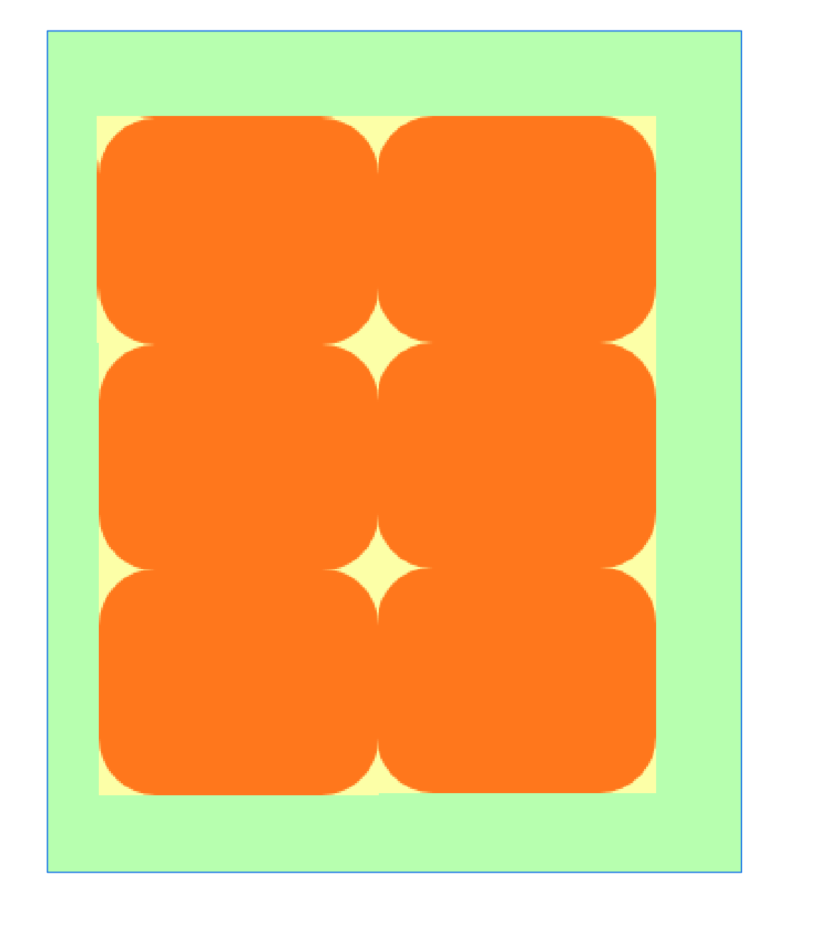
在子(网格)元素中,我想部分“覆盖”它。给定带圆角的子元素:
- 我不想“覆盖”边框内的图像(橙色),但是
- 我想在外面“覆盖”(黄色):在边界线到原始边框线之间。
“覆盖”是指用0%不透明度填充一些颜色,而不覆盖我的意思是橙色部分应该是完全不透明的。 (如果绿色部分代表图像本身,则用户应该看到相同的绿色而不是橙色。)
在绿色父母和橙色孩子之间引入一个新元素,用一些颜色填充黄色/外部部分会使橙色/内部部分也变色,这不是解决方案。
我怀疑这可以用SVG完成,但我不知道怎么做 - 也许还有另一种方法可以做到这一点。
1个回答
2
投票
投票
您可以考虑使用radial-gradient着色来实现这一目标。
这是一个例子:
.wrapper {
  padding:50px;
  display:inline-block;
  font-size:0;
  background:url(https://picsum.photos/id/1069/1000/800) center/cover;
}
.wrapper > div {
  width:150px;
  height:150px;
  display:inline-block;
  background:
    radial-gradient(farthest-side at bottom right,transparent 98%,yellow 100%) top left,
    radial-gradient(farthest-side at bottom left ,transparent 98%,yellow 100%) top right,
    radial-gradient(farthest-side at top    left ,transparent 98%,yellow 100%) bottom right,
    radial-gradient(farthest-side at top    right,transparent 98%,yellow 100%) bottom left;
  background-size:30px 30px;
  background-repeat:no-repeat;
}
<div class="wrapper">
<div></div>
<div></div>
<div></div>
<div></div>
<div></div>
<div></div>
</div>最新问题
- psql 与 postgres uri 和特殊字符的连接
- 美丽搜索。任务队列被冻结/卡住
- 媒体查询 min-width:319px) 和 (max-width:480px) 不适用于 Chrome,但适用于其他浏览器,而 @media(min-width:1601px) 不适用于任何地方
- 如何在使用 Livewire 上传之前在客户端压缩图像
- 如何从键值映射创建复选框列表平铺。颤振/飞镖
- 当我在模拟器中安装 flutter 应用程序时,它运行完美,但在我停止应用程序并再次运行后,它无法正常运行
- 我如何使用特定代码在ansible中获取play-book的输出并将其保存在excel文件中,
- 未定义名称“AppLocalizations”。 (文档)创建新项目后
- 是否可以在 TypeORM 中使用 TypeScript 联合类型?
- Woocommerce:仅强制将运输和付款方式设为单选按钮
- HTML 页面未显示
- 如何在 Zig 语言中比较两个忽略大小写的 UTF-8 字符串?
- 删除具有默认值(yang)的叶子
- 使用“testing-library”中的“screen”和“jsdom”时,如何并行运行测试?
- 如何让child_process.exec()运行.bat文件?
- 为 Google 预测服务客户端 - .NET 添加重试设置
- 使用 Decimal 库而不是 IEEE 754 数学的编译为 JavaScript 选项?
- 在相关图像上标记图像
- 客户端如何从QUIC短头数据包中识别目标连接ID?
- 从存储帐户部署代码时,Azure 函数事件中心触发绑定注册失败
© www.soinside.com 2019 - 2024. All rights reserved.