WPF中复选框左侧的文字?
问题描述 投票:47回答:8
将复选框内容(文本)放在复选框本身左侧的最简单方法是什么?
8个回答
77
投票
投票
最大化“宽松度”和“正确性”的解决方案是使用RightToLeft内容制作LeftToRight复选框:
<CheckBox FlowDirection="RightToLeft">
    <TextBlock FlowDirection="LeftToRight" Text="CheckBox Content:" />
</CheckBox>
或者如果你喜欢一种风格:
<Style TargetType="CheckBox">
    <Setter Property="FlowDirection" Value="RightToLeft" />
    <Setter Property="ContentTemplate">
        <Setter.Value>
            <DataTemplate>
                <ContentControl FlowDirection="LeftToRight" Content="{Binding}" />
            </DataTemplate>
        </Setter.Value>
    </Setter>
</Style>
25
投票
投票
在代码中:
System.Windows.Controls.CheckBox checkBox = new System.Windows.Controls.CheckBox();
checkBox.Content = ":CheckBox Enabled";
checkBox.FlowDirection = System.Windows.FlowDirection.RightToLeft;
在XAML中:
<CheckBox FlowDirection="RightToLeft" Content=":CheckBox Enabled" />
编辑
用户punker76帮助我注意到冒号“:”必须位于正确显示的文本前面(“CheckBox Enabled:”),可能是由于文本元素上的影响流方向引起的。很好的抓住。
16
投票
投票
另一种方法是制作新的自定义样式
<ResourceDictionary xmlns="http://schemas.microsoft.com/winfx/2006/xaml/presentation"
                    xmlns:Microsoft_Windows_Themes="clr-namespace:Microsoft.Windows.Themes;assembly=PresentationFramework.Aero"
                    xmlns:x="http://schemas.microsoft.com/winfx/2006/xaml">
  <SolidColorBrush Color="#F4F4F4"
                   x:Key="CheckBoxFillNormal" />
  <SolidColorBrush Color="#8E8F8F"
                   x:Key="CheckBoxStroke" />
  <Style x:Key="EmptyCheckBoxFocusVisual">
    <Setter Property="Control.Template">
      <Setter.Value>
        <ControlTemplate>
          <Rectangle Margin="1"
                     SnapsToDevicePixels="true"
                     Stroke="{DynamicResource {x:Static SystemColors.ControlTextBrushKey}}"
                     StrokeDashArray="1 2"
                     StrokeThickness="1" />
        </ControlTemplate>
      </Setter.Value>
    </Setter>
  </Style>
  <Style x:Key="CheckRadioFocusVisual">
    <Setter Property="Control.Template">
      <Setter.Value>
        <ControlTemplate>
          <Rectangle Margin="14,0,0,0"
                     SnapsToDevicePixels="true"
                     Stroke="{DynamicResource {x:Static SystemColors.ControlTextBrushKey}}"
                     StrokeDashArray="1 2"
                     StrokeThickness="1" />
        </ControlTemplate>
      </Setter.Value>
    </Setter>
  </Style>
  <Style TargetType="{x:Type CheckBox}"
         x:Key="ContentLeftCheckBoxStyle">
    <Setter Property="Foreground"
            Value="{DynamicResource {x:Static SystemColors.ControlTextBrushKey}}" />
    <Setter Property="Background"
            Value="{StaticResource CheckBoxFillNormal}" />
    <Setter Property="BorderBrush"
            Value="{StaticResource CheckBoxStroke}" />
    <Setter Property="BorderThickness"
            Value="1" />
    <Setter Property="FocusVisualStyle"
            Value="{StaticResource EmptyCheckBoxFocusVisual}" />
    <Setter Property="VerticalContentAlignment"
            Value="Center" />
    <Setter Property="Template">
      <Setter.Value>
        <ControlTemplate TargetType="{x:Type CheckBox}">
          <StackPanel Orientation="Horizontal">
            <ContentPresenter HorizontalAlignment="{TemplateBinding HorizontalContentAlignment}"
                              Margin="{TemplateBinding Padding}"
                              RecognizesAccessKey="True"
                              SnapsToDevicePixels="{TemplateBinding SnapsToDevicePixels}"
                              VerticalAlignment="{TemplateBinding VerticalContentAlignment}" />
            <BulletDecorator Background="Transparent"
                             SnapsToDevicePixels="true"
                             VerticalAlignment="{TemplateBinding VerticalContentAlignment}">
              <BulletDecorator.Bullet>
                <Microsoft_Windows_Themes:BulletChrome Background="{TemplateBinding Background}"
                                                       BorderBrush="{TemplateBinding BorderBrush}"
                                                       IsChecked="{TemplateBinding IsChecked}"
                                                       RenderMouseOver="{TemplateBinding IsMouseOver}"
                                                       RenderPressed="{TemplateBinding IsPressed}" />
              </BulletDecorator.Bullet>
            </BulletDecorator>
          </StackPanel>
          <ControlTemplate.Triggers>
            <Trigger Property="HasContent"
                     Value="true">
              <Setter Property="FocusVisualStyle"
                      Value="{StaticResource CheckRadioFocusVisual}" />
              <Setter Property="Padding"
                      Value="0,0,4,0" />
            </Trigger>
            <Trigger Property="IsEnabled"
                     Value="false">
              <Setter Property="Foreground"
                      Value="{DynamicResource {x:Static SystemColors.GrayTextBrushKey}}" />
            </Trigger>
          </ControlTemplate.Triggers>
        </ControlTemplate>
      </Setter.Value>
    </Setter>
  </Style>
</ResourceDictionary>
用法:
<CheckBox Style="{StaticResource ContentLeftCheckBoxStyle}" Content="CheckBox:" />
希望有所帮助!
13
投票
投票
另一种解决方法是,在定义全新的CheckBox样式时,为了避免上面讨论的流向和大量代码的细微问题,只需使用包含Label(带有所需的CheckBox内容字符串)和CheckBox的WrapPanel(没有)内容字符串)。
<WrapPanel>
    <Label Content="Checkbox content"/>
    <CheckBox VerticalAlignment="Center" Margin="5,0,0,0"/>
</WrapPanel>
12
投票
投票
我花了两个小时,但我找到了最好的决定
<Style x:Key="TextAlignLeft" TargetType="CheckBox">
    <Style.Resources>
        <Style TargetType="Path">
            <Setter Property="FlowDirection" Value="LeftToRight" />
        </Style>
        <Style TargetType="TextBlock">
            <Setter Property="FlowDirection" Value="LeftToRight" />
        </Style>
    </Style.Resources>

    <Setter Property="FlowDirection" Value="RightToLeft" />
</Style>
7
投票
投票
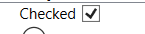
我知道已经有一段时间了,我迟到了。但经过几个复杂的答案并在互联网上搜索了很多,我终于找到了最简单的方法来实现这一点,而不会扭曲来自here的嘀嗒声。
<CheckBox Content="Checked" FlowDirection="RightToLeft">
    <CheckBox.Resources>
        <Style TargetType="{x:Type Path}">
            <Setter Property="FlowDirection" Value="LeftToRight" />
        </Style>
    </CheckBox.Resources>
</CheckBox>
结果:
4
投票
投票
最简单的方法是使用堆栈面板:
            <StackPanel Orientation="Horizontal">
                <TextBlock Text="Some Text"/>
                <CheckBox  />
            </StackPanel>
0
投票
投票
您可以编辑复选框模板,然后可以将文本块放在矩形的前面
最新问题
- 使用任务计划程序运行程序时的相对路径问题
- 如何将共享的proto文件导入到本地?
- c 中:Win 兼容的指针类型
- docker 编写 exec 与 | xargs
- Hikari - 驱动程序不支持获取/设置连接的网络超时。 (不支持的方法:IfxSqliConnect.getNetworkTimeout())
- 英国警察从 POWER BI 访问数据 API
- 从 Android 应用程序将图像上传到后端但缺少 EXIF 数据
- 如何实现隐藏可移动输入迭代器?
- 在 Next.js 14 中应用全局样式
- Python - Raspberry Pi 作为传感器数据的 BLE 发送器
- 如何更改 ggplot 中构面标签的文本
- 如何使用 fo-dicom 从嵌套标签序列中删除一个项目?
- 如何在VCL中更改TCheckBox的背景颜色?
- 如何在 magento 中创建优惠券代码,该代码将应用百分比折扣或固定值(以较低者为准)
- 如何解决“Android SDK 中缺少 avdmanager”错误
- 特定活动的自定义键盘
- 如何通过 Web 应用程序中的 URL 查看上传到 aws s3 存储桶中的任何文件
- 显示复选框中的按钮
- 将 safe.tensor 转换为 pytorch bin 文件
- 使用 ansible、packer 和 aws 安装软件包的新问题
© www.soinside.com 2019 - 2024. All rights reserved.