更改弹出菜单背景颜色
问题描述 投票:5回答:8
注意:我搜索了一个小时并尝试了stackoverflow已经提供的所有解决方案。
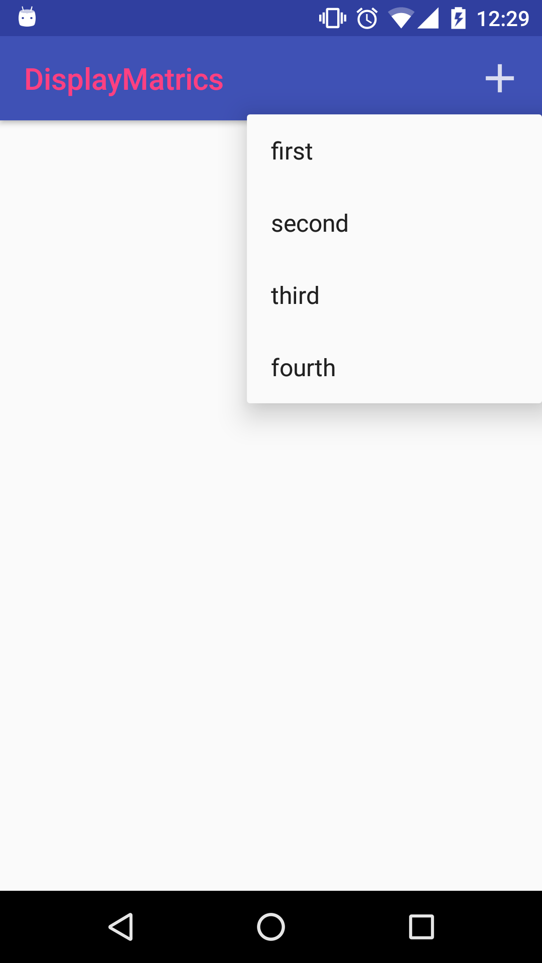
我正在研究主题叠加。我制作了一个示例应用程序,它会在单击操作栏图标时打开一个弹出菜单。这是我的styles.xml
<resources>

    <!-- Base application theme. -->
    <style name="AppTheme" parent="Theme.AppCompat.Light.NoActionBar">
        <!-- Customize your theme here. -->
        <item name="colorPrimary">@color/colorPrimary</item>
        <item name="colorPrimaryDark">@color/colorPrimaryDark</item>
        <item name="colorAccent">@color/colorAccent</item>

    </style>

    <style name="AppTheme.NoActionBar">
        <item name="windowActionBar">false</item>
        <item name="windowNoTitle">true</item>
    </style>


    <style name="AppTheme.AppBarOverlay" parent="ThemeOverlay.AppCompat.Light">
        <item name="android:textColorPrimary">@color/colorAccent</item>
    </style>

    <style name="AppTheme.PopupOverlay" parent="ThemeOverlay.AppCompat.Dark">
        <!-- added all to see which one will work.-->
        <item name="android:popupMenuStyle">@style/PopupMenu</item>
        <item name="android:itemBackground">@color/colorAccent</item>
        <item name="android:colorBackground">@color/colorAccent</item>

    </style>

    <style name="PopupMenu" parent="@android:style/Widget.PopupMenu">
        <item name="android:popupBackground">@color/colorAccent</item>
    </style>

</resources>
这是我的工具栏样式。
   <android.support.design.widget.AppBarLayout
        android:layout_width="match_parent"
        android:layout_height="wrap_content"
        android:theme="@style/AppTheme.AppBarOverlay">

        <android.support.v7.widget.Toolbar
            android:id="@+id/toolbar"
            android:layout_width="match_parent"
            android:layout_height="?attr/actionBarSize"
            android:background="?attr/colorPrimary"
            app:popupTheme="@style/AppTheme.PopupOverlay"/>

    </android.support.design.widget.AppBarLayout>
我把popupTheme设置为我在styles.xml中的那个。现在我想更改弹出菜单的背景颜色,该菜单目前是白色的。
这是代码。
 @Override
    public boolean onOptionsItemSelected(MenuItem item) {

        if(item.getItemId() == R.id.standard_menu){
            showPopupMenu(item);
            return true;
        }
        return super.onOptionsItemSelected(item);
    }

    private void showPopupMenu(MenuItem item) {
        PopupMenu p = new PopupMenu(this, findViewById(item.getItemId()));
        p.inflate(R.menu.pop_menu);
        p.setOnMenuItemClickListener(new PopupMenu.OnMenuItemClickListener() {
            @Override
            public boolean onMenuItemClick(MenuItem item) {
                Toast.makeText(MainActivity.this, "clicked.", Toast.LENGTH_SHORT).show();
                return true;
            }
        });
        p.show();
    }
8个回答
投票
我对接受的答案不满意,因为它并没有真正解释为什么没有应用OP自定义弹出式样式 - 不仅仅是背景,还有文本颜色等 - 所以我做了自己的实验。
重要的是要注意Toolbar创建的弹出窗口(当它有菜单项时)和用PopupMenu自己显示的弹出窗口之间存在差异。这些由不同的主题属性控制。此外,请注意有两个PopupMenu类:android.widget.PopupMenu和android.support.v7.widget.PopupMenu。
您明确显示的PopupMenus样式所需的主题属性是android:popupMenuStyle或popupMenuStyle。您有几个选项可以正确应用自定义样式:
(1)在活动(或应用程序)的主题中使用android:popupMenuStyle
<style name="AppTheme" parent="Theme.AppCompat.Light.NoActionBar">
    <!-- if using android.widget.PopupMenu -->
    <item name="android:popupMenuStyle">@style/PopupMenu</item>
    <!-- if using android.support.v7.widget.PopupMenu -->
    <item name="popupMenuStyle">@style/PopupMenu</item>
</style/>

<style name="PopupMenu" parent="ThemeOverlay.AppCompat.Dark">
    <item name="android:popupBackground">@color/popupBackground</item>
</style>

PopupMenu popup = new PopupMenu(this, anchorView);
请注意,在布局文件中不需要额外的内容。
(2)使用ContextThemeWrapper
<style name="AppTheme" parent="Theme.AppCompat.Light.NoActionBar">
    <!-- nothing special -->
</style/>

<style name="CustomPopupTheme" parent="ThemeOverlay.AppCompat.Dark">
    <!-- if using android.widget.PopupMenu -->
    <item name="android:popupMenuStyle">@style/PopupMenu</item>
    <!-- if using android.support.v7.widget.PopupMenu -->
    <item name="popupMenuStyle">@style/PopupMenu</item>
</style>

<style name="PopupMenu" parent="ThemeOverlay.AppCompat.Dark">
    <item name="android:popupBackground">@color/popupBackground</item>
</style>

ContextThemeWrapper ctw = new ContextThemeWrapper(this, R.style.CustomPopupTheme);
PopupMenu popup = new PopupMenu(ctw, anchorView);
注意在构造R.style.PopupMenu时如何不直接使用ContextThemeWrapper。这似乎有点迂回,但是如果你想让弹出主题与活动或应用主题分开(例如,可能只有一些弹出窗口需要你的特殊主题),它会很有用。
(3)使用你的AppBarLayout的上下文
<style name="AppTheme" parent="Theme.AppCompat.Light.NoActionBar">
    <!-- nothing special -->
</style/>

<style name="AppBarOverlay" parent="ThemeOverlay.AppCompat.Light">
    <!-- if using android.widget.PopupMenu -->
    <item name="android:popupMenuStyle">@style/PopupMenu</item>
    <!-- if using android.support.v7.widget.PopupMenu -->
    <item name="popupMenuStyle">@style/PopupMenu</item>
</style>

<style name="PopupMenu" parent="ThemeOverlay.AppCompat.Dark">
    <item name="android:popupBackground">@color/popupBackground</item>
</style>

<style name="PopupOverlay" parent="ThemeOverlay.AppCompat.Dark">
    <!-- changes the background of the Toolbar's popup -->
    <item name="android:colorBackground">@color/popupBackground</item>
</style>


<android.support.design.widget.AppBarLayout
    android:id="@+id/appbar"
    android:layout_width="match_parent"
    android:layout_height="wrap_content"
    android:theme="@style/AppBarOverlay">

    <android.support.v7.widget.Toolbar
        android:id="@+id/toolbar"
        android:layout_width="match_parent"
        android:layout_height="?attr/actionBarSize"
        android:background="?attr/colorPrimary"
        app:popupTheme="@style/PopupOverlay"/>

</android.support.design.widget.AppBarLayout>


AppBarLayout appBar = (AppBarLayout) findViewById(R.id.app_bar);
PopupMenu popup = new PopupMenu(appBar.getContext(), anchorView);
由于您已经拥有AppBar的主题叠加层,因此您可以使用它来保存弹出式主题参考。这也适用于工具栏的上下文,至少考虑到当前的布局,但请注意app:popupTheme在这里实际上并不相关,因为它影响Toolbar的弹出窗口,而不是你的PopupMenu。还要注意这与上面的选项2有多相似,这应该让你了解android:theme属性如何在引擎盖下工作;)
在我的实验中,android:itemBackground只在我使用它代替android:colorBackground风格的PopupOverlay时起作用。但是,最好使用android:colorBackground,因为这会改变弹出窗口的颜色,使圆角和可选项突出显示/纹理完整。
投票
在支持v7库中使用PopupMenu的“popupMenuStyle”,并为常规PopupMenu使用“android:popupMenuStyle”
投票
<style name="YOURSTYLE" parent="Widget.AppCompat.PopupMenu">
    <item name="android:textColor">@android:color/white</item>
    <item name="android:itemBackground">@android:color/holo_red_light</item>
</style>

Context wrapper = new ContextThemeWrapper(this, R.style.YOURSTYLE);
PopupMenu popup = new PopupMenu(wrapper, view);
可能对它有所帮助
投票
这对我有用
<item name="android:itemBackground">@color/primary</item>
将其插入您的主要样式我希望这适合您
投票
试试看
<style name="AppTheme.PopupOverlay" parent="ThemeOverlay.AppCompat.Light">
        <item name="android:colorBackground">@color/white</item>
        <item name="android:textColor">@color/grey_900</item>
    </style>
投票
将popupMenu样式添加到您的AppTheme:
<style name="AppTheme" parent="android:Theme.Light">
    <item name="android:popupMenuStyle">@style/PopupMenu</item>
</style>

<style name="PopupMenu" parent="@android:style/Widget.PopupMenu">
    <item name="android:popupBackground">@android:color/white</item>
</style>
manifest.xml文件:
 <application
    android:allowBackup="true"
    android:icon="@drawable/ic_launcher"
    android:label="@string/app_name"
    android:theme="@style/AppTheme" >
.............
</application>
我希望它能奏效。
投票
尝试像这样在PopupOverlay中使用colorPrimary
<style name="AppTheme.PopupOverlay" parent="ThemeOverlay.AppCompat.Light" >
    <item name="colorPrimary">@color/blue_ivy</item>
</style>
投票
以上解决方案都不适用于我,所以这就是我修复它的方法:
首先为活动制作一个新的主题,并且:
<style name="Theme.YourTheme" parent="Theme.AppCompat">
    <item name="android:itemBackground">@color/white</item>
    <item name="android:textColor">@color/black</item>
</style>
- 使项目的背景变白
<item name="android:itemBackground">@color/white</item> - 要反击使文字颜色变黑
<item name="android:textColor">@color/black</item>
最后,通过Manifest将主题应用于您的Activity:
    <activity android:name=".YourActivity"
        android:theme="@style/Theme.YourTheme"/>
最新问题
- 未捕获类型错误:无法读取未定义的属性“nodeName”
- 如何使用DIO在flutter中下载PDF文件
- Blazor 与 HttpContextAccessor 的热重载问题
- 如何从UCI机器学习存储库获取数据
- 如何使用 Mongoose 驱动程序在 NestJS 应用程序中实现 MongoDB 更改流?
- “发现 Python 解释器”在 VS Code 中花费无限时间
- Maven 错误 - 需要 START_TAG 或 END_TAG,而不是 TEXT
- 升级到Datatables.net v2.0后自定义CSS和BS5冲突
- 仅允许选中一个复选框,Angular 最佳实践。
- 如何使用laravel分页正确显示当前数据?
- NodeJS 中的 Kerberos 身份验证
- 工作表受保护时无法删除单元格/行/列 - 保护 Excel 中的特定范围
- Spring Data MongoRepository 按多个字段和投影分组的记录计数
- Picamera2 + 高品质相机问题
- 处理 Java AWS Lambda 的关闭
- 无法将图像推送到私有注册表:获取x509:证书对于ingress.local有效,而不是registry.local
- 世博会,React Native错误:不变违规:“main”尚未注册,ReferenceError:属性“user”不存在,js引擎:hermes
- Livewire 文件夹结构
- 如何在android studio(java)中自定义进度条并根据进度改变颜色?让它看起来像我的描述
- 如何搜索浏览器窗口对象以查找哪个对象或变量具有搜索到的值?