CSS Flexbox和响应式-非常经典的文章布局-可以在不使用JS或DOM的情况下完成?
问题描述 投票:1回答:1
这是我的目标:
这是code I tried。它是台式机的第一个版本,可以运行。但是不是移动的,我被告知要先编写移动代码。如果可能的话,我想在不使用JS的情况下同时设置桌面和移动“编排”。可以选择与flexbox互补。
html {
	box-sizing: border-box;
	font-size: 100%;
}
*, *:before, *:after {
	box-sizing: inherit;
}

.grid {
  display: flex;
  flex-wrap: wrap;
  margin-right: -10px;
  margin-left: -10px;
}


.col-m-1 {
	width: 8.333%;
}
.col-m-2 {
	width: 16.667%;
}
.col-m-3 {
	width: 25%;
}
.col-m-4 {
	width: 33.333%;
}
.col-m-5 {
	width: 41.667%;
}
.col-m-6 {
	width: 50%;
}
.col-m-7 {
	width: 58.333%;
}
.col-m-8 {
	width: 66.667%;
}
.col-m-9 {
	width: 75%;
}
.col-m-10 {
	width: 83.333%;
}
.col-m-11 {
	width: 91.667%;
}
.col-m-12 {
	width: 100%;
}


@media (min-width: 769px){
	.col-d-1 {
		width: 8.333%;
	}
	.col-d-2 {
		width: 16.667%;
	}
	.col-d-3 {
		width: 25%;
	}
	.col-d-4 {
		width: 33.333%;
	}
	.col-d-5 {
		width: 41.667%;
	}
	.col-d-6 {
		width: 50%;
	}
	.col-d-7 {
		width: 58.333%;
	}
	.col-d-8 {
		width: 66.667%;
	}
	.col-d-9 {
		width: 75%;
	}
	.col-d-10 {
		width: 83.333%;
	}
	.col-d-11 {
		width: 91.667%;
	}
	.col-d-12 {
		width: 100%;
	}
}
<head>
<meta charset="utf-8">
</head>
<body>
<article class="grid article">
<div class="my-img-supclass col-m-12 col-t-4 col-d-4">
<img src="img.jpg">
</div>
<div class="col-m-12 col-t-8 col-d-8">
<h2 class="article-h2"><span>a h2 title</span></h2>
<p class="article-p">some content</p>
</div>
</article>
<body>这在移动设备中不起作用,自第二格以来,图像显然完全落在底部。
1个回答
0
投票
投票
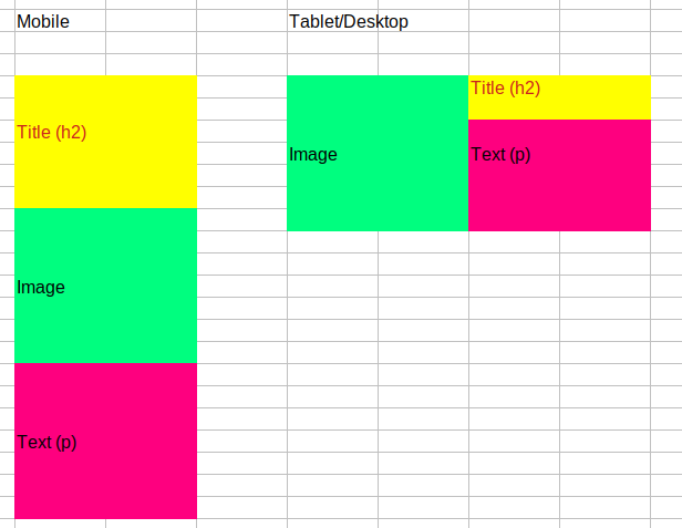
这是CSS Grid的好用例。 CSS-Tricks网站的网格为nice cheat-sheet。 all major browsers支持该功能。
想法是,您将定义body(或容器div)以显示为具有命名网格区域(通过grid-template-areas)的网格。这些区域与图像,标题和正文相对应。
然后,在媒体查询中,您可以重新映射网格布局。
我已将媒体查询设置为以800px触发,因此,当您运行下面的堆栈代码段时,应该会看到移动视图。如果您在摘要中单击“全屏”,则会看到桌面视图。
body {
  display: grid;
  grid-template-areas:
      "hero-image article-title"
      "hero-image article-body";
}

.hero-image {
  grid-area: hero-image;
  background: lime;
}

.article-title {
  grid-area: article-title;
  background: yellow;
  color: red;
}

.article-body {
  grid-area: article-body;
  background: magenta;
}

@media (max-width: 800px) {
  body {
    grid-template-areas:
        "article-title"
        "hero-image"
        "article-body";
}
<div class="hero-image">image</div>
<div class="article-title">title</div>
<div class="article-body">body</div>最新问题
- 使用少量控制点(~200)的 RBF 对大量点(~150k)进行高效重复插值
- 将 XML 字符串转换为对象时出错
- 使用笑话模拟小吃店
- CSS,浮动无限滚动绘制
- android api 资源限定符 - 如何做范围?
- C++ 中日期字符串的排序向量
- 运行存储过程后,我收到错误
- 为什么不将Mybatis集成到quarkus的系统中呢? [已关闭]
- 通过内联汇编使用 FSIN
- 未解析的参考kotlinx.android
- React-Native:配置项目“:react-native-screens”时出现问题
- 点击 StackView 元素,模拟器中没有任何反应
- AWS Cognito 用户如何更改密码 - 不是密码重置或强制更改,而是用户发起的更改?
- Bootstrap 5 data-bs-toggle“折叠”防止通过单击 div 中的按钮进行操作
- 将 Flex 父级置于页面底部
- 未找到约束“PRIMARY KEY | UNIQUE (ID)”;使用 Spring Tool Suite 4 IDE 的 SQL 语句
- 列出 firestore 中的所有集合组
- 如何使用 syslog4j 和 logback 来使用本机 Unix 套接字
- 如何将 syslog4j 与 logback 一起使用
- 变量没有改变(Laravel 10)
© www.soinside.com 2019 - 2024. All rights reserved.