如何使用角度材质中的 css 更改 md-input-container 占位符颜色?
问题描述 投票:0回答:8
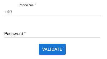
如何在 Angular Material 中使用 css 更改 md-input-container 占位符颜色?如下面的截图所示,我有电话号码。和密码文本字段。电话号码。文本字段包含电话号码,密码包含密码占位符名称。
8个回答
投票
在 Angular 的最新版本中,您可以删除输入中的占位符并在 mat-form-field 中添加 mat-placeholder 并使用类自定义 css
html:
<mat-form-field>
    <input matInput type="text">
    <mat-placeholder class="placeholder">Search</mat-placeholder>
</mat-form-field>
CSS:
.mat-focused .placeholder {
    color: #00D318;
}
投票
占位符在
Angular Material中被描述为
<label>。所以你实际上需要设置标签的样式而不是占位符。
一旦您单击(聚焦)输入,这个看起来像占位符的
<label><label>所以你只需要应用这个CSS:
/* When the input is not focused */
md-input-container label {
  color: red;
}

/* When the input is focused */
md-input-container.md-input-focused label {
  color: blue;
}
看看这个 Plunkr 演示。
投票
在 Angular 4+ 中
首先,您需要关闭 ViewEncapsulation 来设置材质元素的样式。请注意,这会破坏 Angular emulated-shadow DOM 默认值,您应该谨慎行事(https://blog.thoughtram.io/angular/2015/06/29/shadow-dom-strategies-in-angular2.html ).
在 dummy.component.ts 中:
@Component({
 ...,
 encapsulation: ViewEncapsulation.None,
})
然后在 dummy.component.html 中为您的 < mat-form-field > 元素指定一个唯一的类:
<mat-form-field class="dummy-input-field" floatPlaceholder="always">
  <input placeholder="Dummy"/>
</mat-form-field>
最后在 dummy.component.css 中应用样式:
.dummy-input-field .mat-input-placeholder {
  color: red;
}
同样,如果您想在字段聚焦时动态更改颜色:
.dummy-input-field.mat-focused .mat-input-placeholder {
  color: red;
}
投票
.container {
  .mat-form-field-outline,
  .mat-form-field-empty.mat-form-field-label,
  .mat-form-field-label,
  .mat-form-field-underline,
  .mat-input-element,
  ::placeholder {
    color: $white !important;
  }
}
上面的代码给出了下面的结果。我正在覆盖
form-field我正在使用 Angular 8.2.2 和 Angular Material 8.2.2
投票
对于具有 mat 前缀而不是 md 前缀的新版本材质,您可以通过 2 种方式执行此操作:
方式1:使用view encapsulation设置为none,然后将样式写入组件的css文件中,就像@user2245995在上面的答案中指出的那样。 尽管这是 Angular 建议的方式,但请注意,您在此处编写的样式将传播到所有子/父组件并影响那里的其他元素。
方式2:我们可以使用阴影穿透后代组合器,即/deep/或::ng-deep或>>>下面是一个示例
/deep/ label.mat-input-placeholder {
  color: #fff;   // choose the color you want
}
虽然到目前为止,角度文档中指定了此方法,但他们提到此方法很快就会被弃用。 了解更多:https://angular.io/guide/component-styles#!#-deep-
投票
我尝试尽可能确定垫输入的颜色,我敢于在这里分享结果,希望它能帮助其他人(按照问题中的要求处理占位符颜色自定义需求):
使用CSS自定义属性
注意:当焦点在此处或不在此处时,颜色被认为是不同的,这就是为什么我们在下面有 2 个块:
    --clear-button-color: lightblue;
    --asterisk-color: lightgreen;
    --label-color: springgreen;
    --underline-color: blue;
    --input-color: lightgray;

    --clear-button-focused-color: blue;
    --asterisk-focused-color: green;
    --label-focused-color: pink;
    --underline-focused-color: yellow;
    --input-focused-color: gray;
    --placeholder-focused-color: magenta;
    --caret-focused-color: blue;
SCSS 样式
    .mat-form-field {
        &.mat-focused {
            > .mat-form-field-wrapper {
                > .mat-form-field-flex {
                    > .mat-form-field-infix {
                        > .mat-input-element {
                            color: var(--input-focused-color);
                            caret-color: var(--caret-focused-color);

                            &::placeholder {
                                color: var(--placeholder-focused-color);
                            }
                        }
                        > .mat-form-field-label-wrapper {
                            > .mat-form-field-label {
                                > mat-label {
                                    color: var(--label-focused-color);
                                }

                                > .mat-placeholder-required {
                                    color: var(--asterisk-focused-color);
                                }
                            }
                        }
                    }
                    > .mat-form-field-suffix {
                        > .mat-focus-indicator {
                            > .mat-button-wrapper {
                                > .mat-icon {
                                    color: var(--clear-button-focused-color);
                                }
                            }
                        }
                    }
                }
                > .mat-form-field-underline {
                    > .mat-form-field-ripple {
                        background-color: var(--underline-focused-color);
                    }

                    background-color: var(--underline-focused-color);
                }
            }
        }

        > .mat-form-field-wrapper {
            > .mat-form-field-flex {
                > .mat-form-field-infix {
                    > .mat-input-element {
                        color: var(--input-color);

                        &::placeholder {
                            color: var(--placeholder-color);
                        }
                    }
                    > .mat-form-field-label-wrapper {
                        > .mat-form-field-label {
                            > mat-label {
                                color: var(--label-color);
                            }

                            > .mat-placeholder-required {
                                color: var(--asterisk-color);
                            }
                        }
                    }
                }
                > .mat-form-field-suffix {
                    > .mat-focus-indicator {
                        > .mat-button-wrapper {
                            > .mat-icon {
                                color: var(--clear-button-color);
                            }
                        }
                    }
                }
            }
            > .mat-form-field-underline {
                > .mat-form-field-ripple {
                    background-color: var(--underline-color);
                }

                background-color: var(--underline-color);
            }
        }
    }
投票
.mat-input-element::-webkit-input-placeholder {
    color: red;
  }
这是如果您使用与此类似的结构:
 <input
  matInput
  [placeholder]="placeholder"
/>
投票
“@角度/材料”:“14.1.0”,
在你的 styles.scss 中放入。
// before focus
.mat-form-field-label {
  color: red
}

// after focus
.mat-input-element::placeholder{
   color: red;
}
不建议在组件中使用::ng-deep。您可以通过添加元素 ID 前缀来限制效果,如下所示。我在这里使用了通配符
    // before focus
     [id*="red"]
    .mat-input-element::placeholder{
       color: red;
    }

   // after focus
   [id*="red"]
    .mat-form-field-label {
      color: red
    }
最新问题
- Python 异常处理程序不起作用,我不明白为什么
- 创建一个标准的 try-catch-块以通过应用程序使用
- 如何通过Web3.js提示连接另一个钱包
- UNION 仅从第一个 SELECT 返回结果
- 蓝牙 LE - 多种特征行为
- H@lp 与 OpenCV python
- 宽度 50% 和边距 0 px 未对齐
- 为什么我的不和谐机器人两次请求同一个文件夹?
- Vue Quill css仅应用于我的第一个Quill Editor组件+如何自定义工具栏
- PHP - usort() 部分区分大小写
- tfjs 错误:传递到堆栈的参数张量必须是 `Tensor[]` 或 `TensorLike[]`
- URDF文件与drake中MultibodyPlant状态的对应关系
- ESP-IDF:编译 ULP 模块:工具与列表 ['2.35_20220830'] 中支持的版本不匹配:/usr/bin/cc
- 如何 yt-dlp 将 YouTube 仅音频提取为 32 位浮点 48000 .wav?
- .Net Maui builder.Services.AddDbContext(..) 未注册建筑服务 DI sqlite
- 如何在 swiftui InsetGroupedListStyle 中删除 iOS 15 额外的顶部填充?
- 为什么在这个简单的测试用例网页中,flex子元素没有收缩?
- VSCode 图像:如何在资源管理器面板中添加
- 单击后更改按钮的背景颜色
- 反应状态/在组件之间传递信息