将两个元素彼此相邻以重叠
问题描述 投票:-1回答:2
我想得到以下结果:
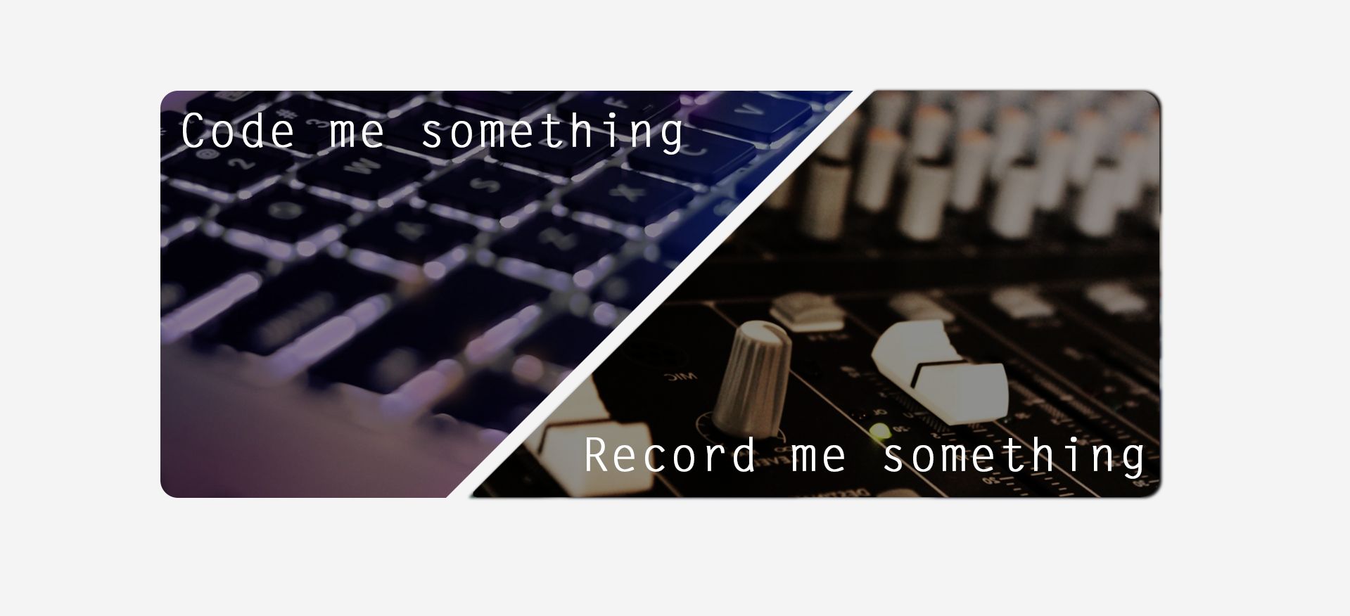
这是两个重叠的图像。
我非常接近用桌子和填充物实现这一点:
<div class="container">
  <table border="1">
    <tr>
      <th width=500px>
        <div align="center">
          <img
               src="./img/img_codemesomething.png"
               style="padding-left:100px"
               width=100% />
        </div>
      </th>
      <td width=500px>
        <div align="justify">
          <img
               src="./img/img_recordmesomething.png"
               style="padding-right:100px"
               width=100% />
        </div>
      </td>
    </tr>
  </table>
</div>
然而,结果是两者都变得非常小。或者左边开始比右边开始变大。我试图在两个图像上使用填充(左和右),但填充 - 右边没有任何作用,而填充左边将图像向右推,这意味着它不再居中。
这是这样的:
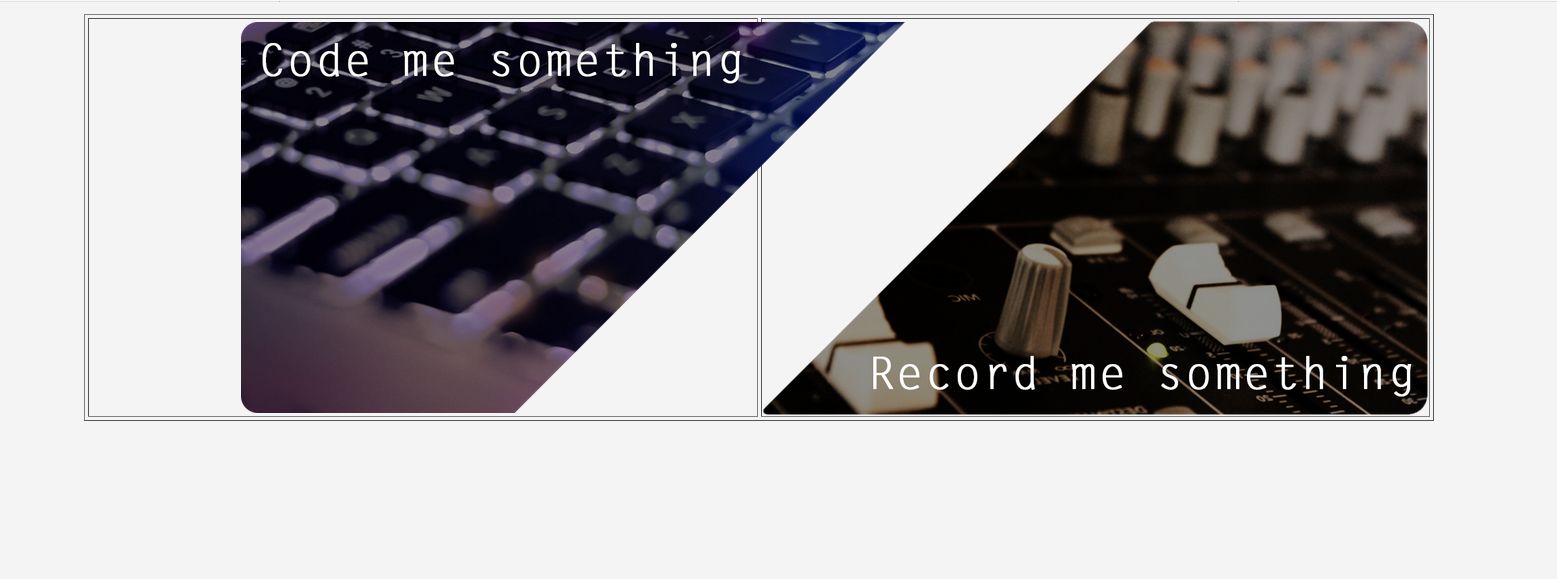
(忽略边框)。
如果id喜欢第一张图片中显示的结果。并且在浏览器中将其精确地放在宽度和高度的中心 - 我将如何继续这个?
谢谢:)
***编辑:
Css只不过是:
.container{
    width:900px;
    margin:auto;
}
***编辑2:好的,所以我非常接近。现在唯一的问题是,一切都向右移动而不再集中,但这就是我所做的:
<div class="container">
    <div class="centered">
                    <table border="0" width=1400px>
                    <tr>
                        <td width=500px height=400px>
                            <div>
                                <img
                                    src="./img/img_codemesomething.png"
                                    style="padding-left:40"
                                    width=210%
                                    height=210%
                                </img>
                            </div>
                        </td>
                        <td width=500px height=400px>
                            <div>
                                <img
                                    src="./img/img_recordmesomething.png"
                                    width=210%
                                    height=210%
                                </img>
                            </div>
                        </td>

                </table>
    </div>
</div>
CSS:
.centered {
  position: fixed;
  top: 50%;
  left: 50%;
  transform: translate(-50%, -50%);
}

.container{
    width:900px;
    margin:auto;
}
结果:
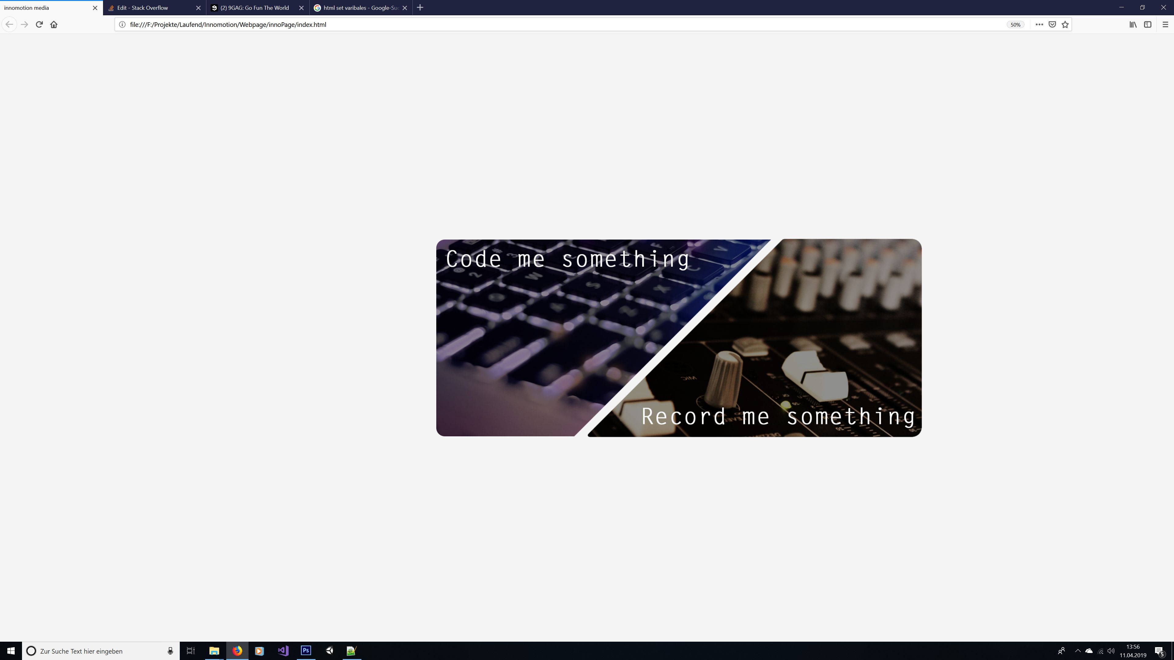
我试着让它坐在中心,但我也会检查其他解决方案。所以请密切注意:)
2个回答
2
投票
投票
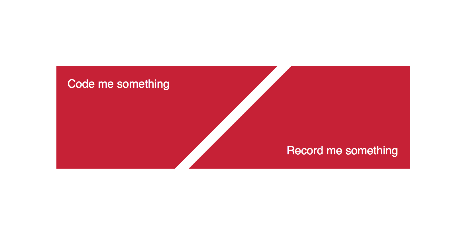
根据您的要求,这是您的解决方案,您可以使用图像而不是颜色。
  <div class="container">
    <div class="traingle">
      <div class="triangle-left">
        <p>Code me something</p>
      </div>
      <div class="triangle-right">
        <p>Record me something</p>
      </div>
    </div>
  </div>
css就在这里
.traingle{
    position: absolute;
    width: 620px;
    top: 50%;
    left:50%;
    transform: translate(-50%, -50%);
    display: flex;
    justify-content: space-between;
    align-items: center;
}
.triangle-left {
    width: 300px;
    border-top: solid 180px rgb(200,30,50);
    border-left: solid 0px transparent;
    border-right: solid 180px #00000000;
    margin-right: -156px;
  }
  .triangle-right {
    width: 300px;
    border-top: solid 0px rgb(200,30,50);
    border-left: solid 180px transparent;
    border-bottom: solid 180px rgb(200,30,50);
  }
   .traingle p{
    position: absolute;
    color: #fff;
    font-size: 20px;
    font-family: sans-serif;
   }

 .traingle .triangle-left p{
    top: 0px;
    left: 20px;
}
.traingle .triangle-right p{
    bottom: 0px;
    right: 20px;
}
1
投票
投票
您可以根据实际图像的尺寸实现此功能。基于图像尺寸计算值59%和70%。
<style>
    .container {
        position: relative;
        /**
         * As we are using absolutely positioned elements, parent element's height will not consider them
         * If you want to use this component inside normal flow of the document, that would mess things up.
         * So to make sure that component occupies the height of its children
         * Calculated as 70 * 59 / 100
         */
        padding-top: 41.3%;
    }
    .imageContainer {
        /**
         * Calculated as (W + W - S) / 2 - G
         * (200 - 100 * (slope.width / image.width)) / 2 - gap
         * Here slope.width / image.width = 0.58
         */
        width: 70%;
        position: absolute;
        top: 0;
    }
    .psuedoContainer {
        position: relative;
        /**
         * To make sure that image always follows the aspect ratio,
         * even if the container width changes.
         * Calculated as 100 * (image.height / image.width)
         */
        padding-top: 59%;
    }
    .psuedoHolder {
        position: absolute;
        top: 0;
        left: 0;
        right: 0;
        bottom: 0;
    }
    img {
       height: 100%;
       width: auto;
    }
</style>

<div class="component">
    <div class="container">
        <div class="imageContainer" style="left: 0;">
            <div class="psuedoContainer">
                <div class="psuedoHolder" style="text-align: left;">
                    <img src="./img_codemesomething.png" />
                </div>
            </div>
        </div>
        <div class="imageContainer" style="right: 0;">
            <div class="psuedoContainer">
                <div class="psuedoHolder" style="text-align: right;">
                    <img src="./img_recordmesomething.png" />
                </div>
            </div>
        </div>
    </div>
</div>
PS:你可以改变
.component的宽度,其他一切都将跟随套件你可以在任何你想要的位置定位.component
最新问题
- 寄存器读取错误:Modbus 错误:[输入/输出] Modbus 错误:[无效消息] 未收到响应,预计至少 4 个字节(收到 0 个)
- 如何在 Objective-C 中将对象转换为类? [已关闭]
- 在 Altair / Vega-Lite 中用独立轴连接两个地理形状图表?
- python playwright 块内联元素
- 在 R 中使用某些列创建多个新行
- 如何检查某列由某些行组成的百分比
- Cannonjs 碰撞处理
- msbuild 架构比较 - 空目标
- React + MUI 日期选择器,作为 iso 字符串控制,当字符串设置为空时,文本输入不会清除
- ASP.NET Core 8 Web API 为 .NET 8 客户端返回状态代码 400
- Android ML Kit - Text.Element 中的 getSymbols() 方法出现编译错误
- 如何为seaborn catplot的每个子图自定义文本刻度标签
- 如何确保页面仅在一段时间内可用
- 为什么 Robocode 运行速度最大为 1-2FPS(目标 FPS 滑块设置为 30 FPS)?
- 如何从 Context 属性中检索 ReceivedFileName 的值?
- 如何忽略部分JSON?
- 如何在剧作家驱动程序中发出 POST 请求? (蟒蛇)
- 是否可以将gltf转换为字节数组,然后将字节数组转换回文件?
- RSpec:测试救援_from
- 无法解决java中的stackoverflow错误
© www.soinside.com 2019 - 2024. All rights reserved.