无法创建Bootstrap网格
问题描述 投票:3回答:2
我陷入了一个我不知道去哪里的地方....我正在尝试为我的网站创建一个网格系统,但没有得到所需的输出。
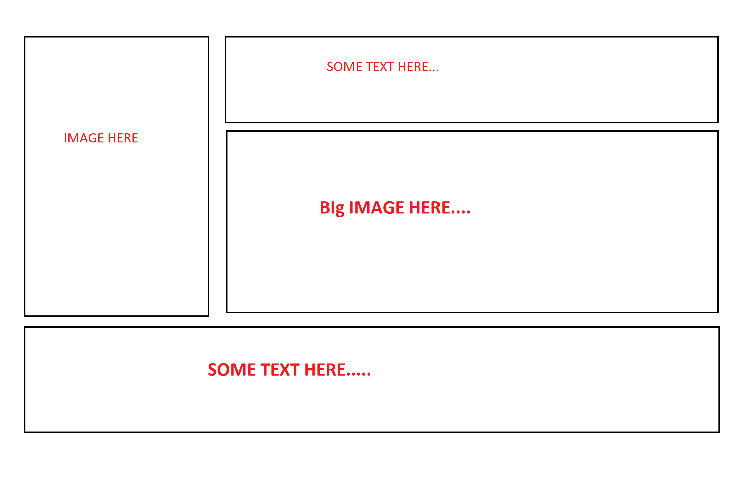
这是我想用Bootstrap 4创建的输出结构:
我的代码:
 <section class="homepage-banner-section">

            <div class="container">
                <div class="row">
                    <div class="col-sm-4 col-md-4">
                         <img src="img/home-banner-one.png" class="img-fluid" alt="Responsive image">
                    </div>
                    <div class="col-sm-8 col-md-8">
                        <div class="row">
                            <div class="col-sm-4">
                                Some text here
                            </div>
                            <div class="col-sm-8">
                                <img src="img/home-banner-two.png" class="img-fluid" alt="Responsive image">
                            </div>
                        </div>
                    </div>
                </div>
                <div class="row">
                    <div class="col-sm-12">
                        Some Text Here
                    </div>
                </div>
            </div>

        </section>
如果有人指导我正确的方向,我将不胜感激。缺乏关于bootstrap网格系统和列类的知识。
2个回答
3
投票
投票
如果你将col-sm-4改为col-12,你将在row中获得两个全宽列。
<link href="https://cdnjs.cloudflare.com/ajax/libs/twitter-bootstrap/4.3.1/css/bootstrap.min.css" rel="stylesheet"/>
<section class="homepage-banner-section">

  <div class="container">
    <div class="row">
      <div class="col-sm-4 col-md-4">
        <img src="img/home-banner-one.png" class="img-fluid" alt="Responsive image">
      </div>
      <div class="col-sm-8 col-md-8">
        <div class="row">
          <div class="col-12">
            Some text here
          </div>
          <div class="col-12">
            <img src="img/home-banner-two.png" class="img-fluid" alt="Responsive image">
          </div>
        </div>
      </div>
    </div>
    <div class="row">
      <div class="col-sm-12">
        Some Text Here
      </div>
    </div>
  </div>

</section>
2
投票
投票
您可以将section / container分为两列(左/右),然后将右列分为行(文本/图像)
类似下面的内容(见演示)
<link rel="stylesheet" href="https://stackpath.bootstrapcdn.com/bootstrap/4.3.0/css/bootstrap.min.css">
<script src="https://code.jquery.com/jquery-3.3.1.slim.min.js"></script>
<script src="https://cdnjs.cloudflare.com/ajax/libs/popper.js/1.14.7/umd/popper.min.js"></script>
<script src="https://stackpath.bootstrapcdn.com/bootstrap/4.3.0/js/bootstrap.min.js"></script>
<section class="homepage-banner-section">
  <div class="container">
    <div class="row">
      <!-- left column -->
      <div class="col-xs-4">
        <img src="https://placekitten.com/200/300" class="img-fluid" alt="Responsive image">
      </div>
      <!-- right column -->
      <div class="col-xs-8">
        <!-- first row -->
        <div class="row">
          <div class="col">
            some text only on right column
          </div>
        </div>
        <!-- second row -->
        <div class="row">
          <div class="col">
            <img src="https://placekitten.com/300/100" class="img-fluid" alt="Resp. img">
          </div>
        </div>
      </div>
    </div>
    <!-- footer -->
    <div class="row">
      <div class="col-xs-12">
        footer text that goes the width of the container
      </div>
    </div>
  </div>
</section>
最新问题
- Angular 可访问性并跳至导航链接
- 当软键盘可见时不会调用onBackPressed
- 如何去除联系表 7 中的跨度包装纸?
- 如何使用 JMX 导出器从 hazelcast JMX mbean 获取 hazelcast 指标
- 如何在nextjs中导入SVG
- 如何在 Android Studio 中更改 android vd 的路径
- 如何编写 xpath 来使用标签名称获取标签的值,该标签名称分别有 2 个桌面实例和移动实例
- 如何在Jupyter笔记本中显示带有文本和图像的表格?
- 我该如何解决这个问题:app = Flask(_name_) NameError: name '_name_' is not Defined
- Athena - 案例陈述计数
- 如何为 Lazygit 启用键盘映射?
- 动态树数据结构和HTML表格
- 在cmake中,如何将多个列表作为args传递
- Firefox - iframe - 即使在同源上,“跨源对象上的属性“文档”访问权限也被拒绝
- Media Foundation 如何支持多 GPU 系统?
- 如何在Keycloak管理API中进行身份验证?
- 限制 Electron webContents.findInPage() 搜索特定页面元素
- 如何为单一存储库设置 GitLab 管道,其中管道仅在文件更改时触发?
- 如何检查neo4j cypher中是否存在索引
- 如何使用 NOT IN 函数在 Top 10 列表中查找#10?
© www.soinside.com 2019 - 2024. All rights reserved.