小屏幕上的Bootstrap导航栏没有下拉列表
问题描述 投票:0回答:3
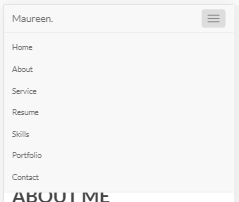
在点击汉堡图标的较小设备上,应显示导航栏的下拉菜单。
在我的原始文件中,我下载了bootstrap.min.js和bootstrap.min.css并将它们链接起来。我还在bootstrap.min.js之前链接了jquery库文件。我也尝试过使用CDN链接。但仍然没有好结果。当然,在调整浏览器大小时,导航栏会变得响应并变成汉堡图标。但点击该图标实际上没有任何事情发生。
@import url('https://fonts.googleapis.com/css?family=Lato:400,700');
body {
  background: #fff;
  font-family: 'Lato', sans-serif;
  font-style: normal;
  font-weight: normal;
  overflow-x: hidden;
}

html,
body {
  width: 100%;
  height: 100%;
}

.section {
  padding-top: 100px;
  padding-bottom: 100px;
  position: relative;
  background-color: #fff;
}

h1,
h2,
h3,
h4,
h5,
h6 {
  font-style: normal;
  font-weight: bold;
  letter-spacing: 0px;
}

h1 {
  color: #373737;
  font-size: 45px;
  line-height: normal;
}

h2 {
  color: #454545;
  font-size: 35px;
  line-height: 52px;
  margin-top: 0px;
}

h3 {
  color: #585858;
  font-size: 16px;
  line-height: 32px;
  letter-spacing: 6px;
  text-transform: uppercase;
}

h4 {
  color: #656565;
  font-size: 20px;
}

p {
  color: #878787;
  font-size: 16px;
  font-weight: normal;
  line-height: 25px;
  letter-spacing: 0.2px;
}


/*-------- Navigation section--------*/

.navbar-default {
  border: none;
  margin-bottom: 0;
  background-color: #ffffff;
  padding: 12px 0;
  border-bottom: 1px solid #000;
}

.navbar-default .navbar-brand {
  color: #444;
  font-weight: normal;
  font-size: 20px;
}

.navbar-default .navbar-nav li a {
  font-size: 12px;
  font-weight: bold;
  color: #858585;
  letter-spacing: 1px;
  text-transform: uppercase;
  -webkit-transition: all ease-in-out 0.4s;
  transition: all ease-in-out 0.4s;
  padding: 0 12px;
  margin: 15px 8px;
}

.navbar-default .navbar-nav>li a:hover {
  color: #000 !important;
}

.navbar-default .navbar-nav>li>a:hover,
.navbar-default .navbar-nav>li>a:focus {
  color: #000;
}

.navbar-default .navbar-nav>.active>a,
.navbar-default .navbar-nav>.active>a:hover,
.navbar-default .navbar-nav>.active>a:focus {
  color: #000;
}

.navbar-default .navbar-toggle {
  border: none;
  padding-top: 10px;
}

.navbar-default .navbar-toggle {
  background-color: transparent;
}

.navbar-default .navbar-toggle .icon-bar {
  background: #000000;
  border-color: transparent;
}


/*=============Home section ===============*/

.home {
  background-image: url(../images/bg.jpg);
  background-size: cover;
  background-attachment: fixed;
  background-repeat: no-repeat;
  background-position: center;
  position: relative;
}

#home {
  background-size: cover;
  display: -webkit-box;
  display: -webkit-flex;
  display: -ms-flexbox;
  display: flex;
  -webkit-box-align: center;
  -webkit-align-items: center;
  -ms-flex-align: center;
  align-items: center;
  height: 100vh;
  position: relative;
}

.home .home-content p {
  margin: auto;
  font-size: 12px;
}

.home .home-content .site-name {
  border: 4px solid #1a1a1a;
  letter-spacing: 5px;
  width: 240px;
  padding: 12px;
  border-bottom: 0;
}

.home .home-content h1 {
  text-align: center;
}

.home .home-content h3 {
  text-align: center;
}

.home .home-content {
  text-align: center;
}

.home .home-content .border {
  border: 4px solid #1a1a1a;
  width: 230px;
  padding: 28px 0px;
  margin: 15px auto;
  border-top: 0;
}

.section-btn {
  background: #454545;
  border: none;
  border-radius: 0px;
  color: #ffffff;
  font-size: 13px;
  font-weight: bold;
  letter-spacing: 1.6px;
  padding: 12px 32px 16px 32px;
  margin-top: 42px;
  -webkit-transition: all ease-in-out 0.4s;
  transition: all ease-in-out 0.4s;
}

.section-btn:focus,
.section-btn:hover {
  background: #000000;
  color: #ffffff;
}


/*=============About section ===============*/

.about-social li {
  display: inline-block;
}

.about-social li a {
  color: #000;
  display: inline-block;
  height: 42px;
  width: 42px;
  font-size: 20px;
  border-radius: 2%;
  border: 1px solid #d4d4d4;
  line-height: 40px;
  transition: all 0.5s;
  text-align: center;
}

.about-social li a:hover {
  color: #fff;
  border-color: #000;
  background: #2d2d2d;
}
<link rel="stylesheet" href="https://maxcdn.bootstrapcdn.com/bootstrap/3.4.0/css/bootstrap.min.css">
<!-- Navigation area -->
<nav class="navbar navbar-default navbar-fixed-top" role="navigation">
<div class="container">
<div class="navbar-header">
<button type="button" class="navbar-toggle" data-toggle="collapse" data-target="#navbar-collapse-main">
<span class="sr-only">Toggle navigation</span>
<span class="icon icon-bar"></span>
<span class="icon icon-bar"></span>
<span class="icon icon-bar"></span>
</button>
<!-- Logo text -->
<a href="index.html" class="navbar-brand">Maureen.</a>
</div>
<!-- Navigation -->
<div class="collapse navbar-collapse" id="navbar-collapse-main">
<ul class="nav navbar-nav navbar-right">
<li><a class="active" href="#home">Home</a></li>
<li><a href="#about">About</a></li>
<li><a href="#service">Service</a></li>
<li><a href="#resume">Resume</a></li>
<li><a href="#skills">Skills</a></li>
<li><a href="#portfolio">Portfolio</a></li>
<li><a href="#contact">Contact</a></li>
</ul>
</div>
</div>
</nav>
<!-- Home section start -->
<section class="home" id="home">
<div class="container">
<div class="row">
<div class="col s12 m12 l6 center-align">
<div class="home-content">
<h1>HELLO THERE!</h1><br/>
<p>My name is Maureen</p>
<h3>I AM A UI/UX DEVELOPER</h3>
<div class="border"></div>
<a href="#" class="">Download Resume PDF</a>
</div>
</div>
</div>
</div>
</section>
<!-- About section -->
<section class="section" id="about">
<div class="container">
<div class="row">
<div class="col-lg-6 col-md-6 col-sm-12">
<div class="mt-3">
<img src="images/profile-image.jpg" alt="" class="img-fluid mx-auto d-block img-thumbnail">
</div>
</div>
<div class="col-lg-6 col-md-6 col-sm-12">
<div class="mt-3">
<h2>ABOUT ME</h2>
<h3 class="mt-4">HELLO! <span class="text-custom">I'M MAUREEN DOE.</span></h3>
<p class="text-muted mt-4">Lorem ipsum dolor sit amet, consectetur adipiscing elit. Nam tempor sem et nisi efficitur tempor.Phasellus pharetra dolor in enim pellentesque tincidunt vel non nisi. </p>
<p class="text-muted mt-2">Nullam posuere eu ante ut pharetra. Donec laoreet volutpat viverra. Vivamus ultrices, nibh eu porttitor luctus, odio lacus semper dolor, non scelerisque tellus augue a risus.</p>
<p class="text-muted mt-2">Pellentesque habitant morbi tristique senectus et netus et malesuada fames ac turpis egestas. Donec quis ullamcorper tortor. Nulla quis bibendum ex. Etiam eget ullamcorper turpis, eu luctus nibh. </p><br/>
<div>
<ul class="about-social list-inline">
<li><a href="#"><i class="fab fa-facebook-f"></i></a></li>
<li><a href="#"><i class="fab fa-twitter"></i></a></li>
<li><a href="#"><i class="fab fa-instagram"></i></a></li>
<li><a href="#"><i class="fab fa-dribbble"></i></a></li>
<li><a href="#"><i class="fab fa-behance"></i></a></li>
<li><a href="#"><i class="fab fa-youtube"></i></a></li>
</ul>
</div>
</div>
</div>
</div>
</div>
</section>
<!-- End of about section -->
<script src="https://ajax.googleapis.com/ajax/libs/jquery/3.3.1/jquery.min.js"></script>
<script src="https://maxcdn.bootstrapcdn.com/bootstrap/3.3.6/js/bootstrap.min.js"></script>
<script defer src="https://use.fontawesome.com/releases/v5.0.6/js/all.js"></script>3个回答
0
投票
投票
您需要将jQuery和Bootstrap JS添加到标头中。
<script src="https://ajax.googleapis.com/ajax/libs/jquery/3.3.1/jquery.min.js"></script>
<script src="https://maxcdn.bootstrapcdn.com/bootstrap/3.4.0/js/bootstrap.min.js"></script>
这解决了这个问题。你需要这些,因为移动设备上的导航栏依赖于jQuery和Bootstrap JS。
0
投票
投票
在做这样的事情时,确保按照创建者的建议使用库/框架非常重要。
在引导程序时,您应该尽可能地保持所有CDN的版本控制尽可能相似。以下是为3.3.4列出的CDN
你有3.3.4 css和3.3.6 js
@import url('https://fonts.googleapis.com/css?family=Lato:400,700');
body {
  background: #fff;
  font-family: 'Lato', sans-serif;
  font-style: normal;
  font-weight: normal;
  overflow-x: hidden;
}

html,
body {
  width: 100%;
  height: 100%;
}

.section {
  padding-top: 100px;
  padding-bottom: 100px;
  position: relative;
  background-color: #fff;
}

h1,
h2,
h3,
h4,
h5,
h6 {
  font-style: normal;
  font-weight: bold;
  letter-spacing: 0px;
}

h1 {
  color: #373737;
  font-size: 45px;
  line-height: normal;
}

h2 {
  color: #454545;
  font-size: 35px;
  line-height: 52px;
  margin-top: 0px;
}

h3 {
  color: #585858;
  font-size: 16px;
  line-height: 32px;
  letter-spacing: 6px;
  text-transform: uppercase;
}

h4 {
  color: #656565;
  font-size: 20px;
}

p {
  color: #878787;
  font-size: 16px;
  font-weight: normal;
  line-height: 25px;
  letter-spacing: 0.2px;
}


/*-------- Navigation section--------*/

.navbar-default {
  border: none;
  margin-bottom: 0;
  background-color: #ffffff;
  padding: 12px 0;
  border-bottom: 1px solid #000;
}

.navbar-default .navbar-brand {
  color: #444;
  font-weight: normal;
  font-size: 20px;
}

.navbar-default .navbar-nav li a {
  font-size: 12px;
  font-weight: bold;
  color: #858585;
  letter-spacing: 1px;
  text-transform: uppercase;
  -webkit-transition: all ease-in-out 0.4s;
  transition: all ease-in-out 0.4s;
  padding: 0 12px;
  margin: 15px 8px;
}

.navbar-default .navbar-nav>li a:hover {
  color: #000 !important;
}

.navbar-default .navbar-nav>li>a:hover,
.navbar-default .navbar-nav>li>a:focus {
  color: #000;
}

.navbar-default .navbar-nav>.active>a,
.navbar-default .navbar-nav>.active>a:hover,
.navbar-default .navbar-nav>.active>a:focus {
  color: #000;
}

.navbar-default .navbar-toggle {
  border: none;
  padding-top: 10px;
}

.navbar-default .navbar-toggle {
  background-color: transparent;
}

.navbar-default .navbar-toggle .icon-bar {
  background: #000000;
  border-color: transparent;
}


/*=============Home section ===============*/

.home {
  background-image: url(../images/bg.jpg);
  background-size: cover;
  background-attachment: fixed;
  background-repeat: no-repeat;
  background-position: center;
  position: relative;
}

#home {
  background-size: cover;
  display: -webkit-box;
  display: -webkit-flex;
  display: -ms-flexbox;
  display: flex;
  -webkit-box-align: center;
  -webkit-align-items: center;
  -ms-flex-align: center;
  align-items: center;
  height: 100vh;
  position: relative;
}

.home .home-content p {
  margin: auto;
  font-size: 12px;
}

.home .home-content .site-name {
  border: 4px solid #1a1a1a;
  letter-spacing: 5px;
  width: 240px;
  padding: 12px;
  border-bottom: 0;
}

.home .home-content h1 {
  text-align: center;
}

.home .home-content h3 {
  text-align: center;
}

.home .home-content {
  text-align: center;
}

.home .home-content .border {
  border: 4px solid #1a1a1a;
  width: 230px;
  padding: 28px 0px;
  margin: 15px auto;
  border-top: 0;
}

.section-btn {
  background: #454545;
  border: none;
  border-radius: 0px;
  color: #ffffff;
  font-size: 13px;
  font-weight: bold;
  letter-spacing: 1.6px;
  padding: 12px 32px 16px 32px;
  margin-top: 42px;
  -webkit-transition: all ease-in-out 0.4s;
  transition: all ease-in-out 0.4s;
}

.section-btn:focus,
.section-btn:hover {
  background: #000000;
  color: #ffffff;
}


/*=============About section ===============*/

.about-social li {
  display: inline-block;
}

.about-social li a {
  color: #000;
  display: inline-block;
  height: 42px;
  width: 42px;
  font-size: 20px;
  border-radius: 2%;
  border: 1px solid #d4d4d4;
  line-height: 40px;
  transition: all 0.5s;
  text-align: center;
}

.about-social li a:hover {
  color: #fff;
  border-color: #000;
  background: #2d2d2d;
}
<link rel="stylesheet" href="https://maxcdn.bootstrapcdn.com/bootstrap/3.3.4/css/bootstrap.min.css">
<!-- Navigation area -->
<nav class="navbar navbar-default navbar-fixed-top" role="navigation">
<div class="container">
<div class="navbar-header">
<button type="button" class="navbar-toggle collapsed" data-toggle="collapse" data-target="#navbar-collapse-main" aria-expanded="false">
<span class="sr-only">Toggle navigation</span>
<span class="sr-only">Toggle navigation</span>
<span class="icon-bar"></span>
<span class="icon-bar"></span>
<span class="icon-bar"></span>
</button>
<!-- Logo text -->
<a href="index.html" class="navbar-brand">Maureen.</a>
</div>
<!-- Navigation -->
<div class="collapse navbar-collapse" id="navbar-collapse-main">
<ul class="nav navbar-nav navbar-right">
<li><a class="active" href="#home">Home</a></li>
<li><a href="#about">About</a></li>
<li><a href="#service">Service</a></li>
<li><a href="#resume">Resume</a></li>
<li><a href="#skills">Skills</a></li>
<li><a href="#portfolio">Portfolio</a></li>
<li><a href="#contact">Contact</a></li>
</ul>
</div>
</div>
</nav>
<!-- Home section start -->
<section class="home" id="home">
<div class="container">
<div class="row">
<div class="col s12 m12 l6 center-align">
<div class="home-content">
<h1>HELLO THERE!</h1><br/>
<p>My name is Maureen</p>
<h3>I AM A UI/UX DEVELOPER</h3>
<div class="border"></div>
<a href="#" class="">Download Resume PDF</a>
</div>
</div>
</div>
</div>
</section>
<!-- About section -->
<section class="section" id="about">
<div class="container">
<div class="row">
<div class="col-lg-6 col-md-6 col-sm-12">
<div class="mt-3">
<img src="images/profile-image.jpg" alt="" class="img-fluid mx-auto d-block img-thumbnail">
</div>
</div>
<div class="col-lg-6 col-md-6 col-sm-12">
<div class="mt-3">
<h2>ABOUT ME</h2>
<h3 class="mt-4">HELLO! <span class="text-custom">I'M MAUREEN DOE.</span></h3>
<p class="text-muted mt-4">Lorem ipsum dolor sit amet, consectetur adipiscing elit. Nam tempor sem et nisi efficitur tempor.Phasellus pharetra dolor in enim pellentesque tincidunt vel non nisi. </p>
<p class="text-muted mt-2">Nullam posuere eu ante ut pharetra. Donec laoreet volutpat viverra. Vivamus ultrices, nibh eu porttitor luctus, odio lacus semper dolor, non scelerisque tellus augue a risus.</p>
<p class="text-muted mt-2">Pellentesque habitant morbi tristique senectus et netus et malesuada fames ac turpis egestas. Donec quis ullamcorper tortor. Nulla quis bibendum ex. Etiam eget ullamcorper turpis, eu luctus nibh. </p><br/>
<div>
<ul class="about-social list-inline">
<li><a href="#"><i class="fab fa-facebook-f"></i></a></li>
<li><a href="#"><i class="fab fa-twitter"></i></a></li>
<li><a href="#"><i class="fab fa-instagram"></i></a></li>
<li><a href="#"><i class="fab fa-dribbble"></i></a></li>
<li><a href="#"><i class="fab fa-behance"></i></a></li>
<li><a href="#"><i class="fab fa-youtube"></i></a></li>
</ul>
</div>
</div>
</div>
</div>
</div>
</section>
<!-- End of about section -->
<script src="https://ajax.googleapis.com/ajax/libs/jquery/3.3.1/jquery.min.js"></script>
<script src="https://maxcdn.bootstrapcdn.com/bootstrap/3.3.4/js/bootstrap.min.js"></script>
<script defer src="https://use.fontawesome.com/releases/v5.0.6/js/all.js"></script>0
投票
投票
可能是jQuery 3.x与Bootstrap 3.x冲突的问题。如果你使用低于版本3的jQuery,它可能会工作。
检查我使用过jquery-1.12.4.min.js的Fiddle。
注意:此问题已从Bootstrap版本3.3.7开始修复。
<script src="https://code.jquery.com/jquery-1.12.4.min.js"></script>
最新问题
- 使用 flutter-webrtc 时发生 flutter 崩溃
- 如何解决“无效的隐私政策 URL”错误
- 如何在vscode中引用另一个组织任务?
- 如何从 GitHub 操作中的步骤访问本地主机?
- 无法在 Scala 3 中创建 ContextFunction1 的匿名实现
- GCP Cloud SQL Terraform Postgres 扩展
- phpunit - 不使用注入进行模拟?
- 使用 ChatGPT 的 PowerBI 自定义视觉效果
- Streamlit 指标与 delta 对齐
- Azure VS AWS 去哪个认证?
- 如何使用 telethon 将消息发送到电报中的特定主题[已关闭]
- 为什么我收到“不兼容的整数指针...”警告?
- 从 React 向 Django Rest 框架发送数据时发生内部服务器错误 500
- 在 OpenIddict 服务器中使用 KeyVaultSecurityKey 作为非对称签名密钥
- C# Linq All in Where 条件
- 如何在gitlab中为多分支管道jenkins添加webhooks
- 如何在React中自定义Mui的自动完成?
- 如何根据日期和时间将状态更新为过期或有效?
- 确定函数是否在代理处理程序中被访问或调用
- 为什么java代理会卡住并且不执行任何操作?
© www.soinside.com 2019 - 2024. All rights reserved.