是否有限制边界长度的方法?
问题描述 投票:197回答:10
有没有办法限制边框的长度。我有一个<div>,它的底部有一个边框,但是我想在<div>的左侧添加一个仅向上延伸一半的边框。
是否有任何方法可以在页面上不添加额外的元素?
10个回答
投票
希望这会有所帮助:
#mainDiv {
  height: 100px;
  width: 80px;
  position: relative;
  border-bottom: 2px solid #f51c40;
  background: #3beadc;
}

#borderLeft {
  border-left: 2px solid #f51c40;
  position: absolute;
  top: 50%;
  bottom: 0;
}
<div id="mainDiv">
<div id="borderLeft"></div>
</div>投票
您只能在每侧定义一个边框。您必须为此添加一个额外的元素!
投票
CSS生成的内容可以为您解决这个问题:
div {
  position: relative;
}


/* Main div for border to extend to 50% from bottom left corner */

div:after {
  content: "";
  background: black;
  position: absolute;
  bottom: 0;
  left: 0;
  height: 50%;
  width: 1px;
}
<div>Lorem Ipsum</div>((请注意content: "";声明对于呈现伪元素是必需的]
投票
:after岩石:)
[如果您玩了一点,甚至可以将调整大小的边框元素设置为居中显示,或者仅在旁边有另一个元素时才显示(如菜单中所示)。这是带有菜单的示例:
#menu > ul > li {
    position: relative;
    float: left;
    padding: 0 10px;
}

#menu > ul > li + li:after {
    content:"";
    background: #ccc;
    position: absolute;
    bottom: 25%;
    left: 0;
    height: 50%;
    width: 1px;
}
#menu > ul > li {
  position: relative;
  float: left;
  padding: 0 10px;
  list-style: none;
}
#menu > ul > li + li:after {
  content: "";
  background: #ccc;
  position: absolute;
  bottom: 25%;
  left: 0;
  height: 50%;
  width: 1px;
}
<div id="menu">
<ul>
<li>Foo</li>
<li>Bar</li>
<li>Baz</li>
</ul>
</div>投票
使用CSS属性,我们只能控制边框的粗细;不是长度。
但是我们可以通过其他方式模仿边界效果并控制其width和height。
使用CSS(线性渐变):
我们可以使用linear-gradient()创建背景图像并使用CSS控制其大小和位置,以使其看起来像边框。由于我们可以将多个背景图像应用于一个元素,因此可以使用此功能创建多个类似边框的图像并应用于元素的不同侧面。我们还可以用一些纯色,渐变或背景图像覆盖剩余的可用区域。
必需的HTML:
我们只需要一个元素(可能有一个类)。
<div class="box"></div>
步骤:
- 使用
linear-gradient()创建背景图像。 - 使用
background-size调整上面创建的图像的width/height,使其看起来像边框。 - 使用
background-position调整上述创建的边框的位置(如left,right,left bottom等。
必要的CSS:
.box {
  background-image: linear-gradient(purple, purple),
                    // Above css will create background image that looks like a border.
                    linear-gradient(steelblue, steelblue);
                    // This will create background image for the container.

  background-repeat: no-repeat;

  /* First sizing pair (4px 50%) will define the size of the border i.e border
     will be of having 4px width and 50% height. */
  /* 2nd pair will define the size of stretched background image. */
  background-size: 4px 50%, calc(100% - 4px) 100%;

  /* Similar to size, first pair will define the position of the border
     and 2nd one for the container background */
  background-position: left bottom, 4px 0;
}
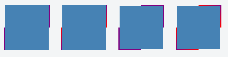
示例:
使用linear-gradient(),我们可以创建纯色边框以及渐变色。以下是使用此方法创建的边框的一些示例。
仅在一侧应用边框的示例:
.container {
  display: flex;
}
.box {
  background-image: linear-gradient(purple, purple),
                    linear-gradient(steelblue, steelblue);
  background-repeat: no-repeat;
  background-size: 4px 50%, calc(100% - 4px) 100%;
  background-position: left bottom, 4px 0;

  height: 160px;
  width: 160px;
  margin: 20px;
}
.gradient-border {
  background-image: linear-gradient(red, purple),
                    linear-gradient(steelblue, steelblue);
}
<div class="container">
<div class="box"></div>
<div class="box gradient-border"></div>
</div>示例在两侧应用边框:
.container {
  display: flex;
}
.box {
  background-image: linear-gradient(purple, purple),
                    linear-gradient(purple, purple),
                    linear-gradient(steelblue, steelblue);
  background-repeat: no-repeat;
  background-size: 4px 50%, 4px 50%, calc(100% - 8px) 100%;
  background-position: left bottom, right top, 4px 0;

  height: 160px;
  width: 160px;
  margin: 20px;
}

.gradient-border {
  background-image: linear-gradient(red, purple),
                    linear-gradient(purple, red),
                    linear-gradient(steelblue, steelblue);
}
<div class="container">
<div class="box"></div>
<div class="box gradient-border"></div>
</div>示例带有四边边框的示例:
.container {
  display: flex;
}
.box {
  background-image: linear-gradient(purple, purple),
                    linear-gradient(purple, purple),
                    linear-gradient(purple, purple),
                    linear-gradient(purple, purple),
                    linear-gradient(steelblue, steelblue);
  background-repeat: no-repeat;
  background-size: 4px 50%, 50% 4px, 4px 50%, 50% 4px, calc(100% - 8px) calc(100% - 8px);
  background-position: left bottom, left bottom, right top, right top, 4px 4px;

  height: 160px;
  width: 160px;
  margin: 20px;
}

.gradient-border {
  background-image: linear-gradient(red, purple),
                    linear-gradient(to right, purple, red),
                    linear-gradient(to bottom, purple, red),
                    linear-gradient(to left, purple, red),
                    linear-gradient(steelblue, steelblue);
}
<div class="container">
<div class="box"></div>
<div class="box gradient-border"></div>
</div>屏幕截图:
投票
对于水平线,您可以使用hr标签:
hr { width: 90%; }
但无法限制边框高度。仅元素高度。
投票
边框仅在每边定义,而不是在边的分数中定义。所以,不,你不能那样做。
此外,新元素也不会成为边框,它只会模仿您想要的行为-但它仍然会是元素。
投票
另一种方法是结合使用边界图像和线性渐变。
div {
  width: 100px;
  height: 75px;
  background-color: green;
  background-clip: content-box; /* so that the background color is not below the border */

  border-left: 5px solid black;
  border-image: linear-gradient(to top, #000 50%, rgba(0,0,0,0) 50%); /* to top - at 50% transparent */
  border-image-slice: 1;
}<div></div>jsfiddle:https://jsfiddle.net/u7zq0amc/1/
浏览器支持:IE:11 +
Chrome:全部
Firefox:15岁以上
[为了获得更好的支持,还添加了供应商前缀。
投票
这是CSS技巧,不是正式的解决方案。我将代码保留为黑色,因为它可以帮助我定位元素。然后,为您的内容上色(color:white)和(margin-top:-5px左右),使其看起来好像没有句点。
div.yourdivname:after {
content: ".";
  border-bottom:1px solid grey;
  width:60%;
  display:block;
  margin:0 auto;
}
投票
另一个解决方案是,您可以使用背景图像来模仿左边框的外观
- 创建图形所需的左边框样式
- 将其定位在div的最左侧(使其足够长,以应付较旧的浏览器大约增加两个文本大小)
- 将垂直位置设置为距div顶部50%。
您可能需要对IE进行调整(按照常规方式进行,但是如果这是您要使用的设计,那么值得一试。
- 我通常反对将图像用于CSS固有提供的功能,但是有时候,如果设计需要它,则没有其他方法可以解决它。
最新问题
- 如何让绝对定位的div响应不同的屏幕尺寸?
- C++ 调用结构体函数的指针
- 根据其他列 pandas 中的值创建新列
- 如何从可迭代的元组创建多维 numpy 数组?
- 在 Laravel 中将多维集合(数组)转换为具有点分隔键的扁平结构
- 我无法在 blazor 应用程序中调用 C# 函数
- 如何使 CNN 对 DNA 序列中模式的位置不变?
- 如何在宏(Laravel)中将多维集合(数组)展平为点表示法版本?
- 如何使用android在webview中播放视频?
- 我收到错误:PermissionError:[Errno 13]权限被拒绝:'/app/vol'
- Discord Bot 与 Pyton Minecraft 服务器状态
- 我有这个错误“#1273 - 未知排序规则:'utf8mb4_0900_ai_ci'”
- 如何用express.static修改静态文件内容?
- 读取并组合多个文件的每一行,并对该组合运行一个函数(以块的形式?)[R]
- 如何创建www-data:www-data
- 如何重命名arm elf .so文件中的动态符号?
- Swift:您没有权限将文件保存在“DerivedData”文件夹中
- PowerShell,自动化 Java JRE 11(Adoptium、Eclipse Temurin)安装和配置
- React 状态未在函数中更新
- 可以将Sketch中的Material主题直接导出到React吗?