如何创建可在移动设备上单击并悬停在桌面上打开的导航栏下拉列表
问题描述 投票:0回答:1
我正在使用 Bootstrap 5 创建一个网站。我正在尝试使用 Bootstrap 5 创建导航栏下拉菜单。目前,当您在移动设备上单击下拉菜单时,它会打开,但当您再次单击它时,它不会关闭。当您在桌面上时,如果将鼠标悬停在其上,它会正确打开和关闭,但是,如果您在桌面上,单击下拉菜单而不是悬停在其上,并将光标从下拉菜单上移开,下拉菜单将变为白色。
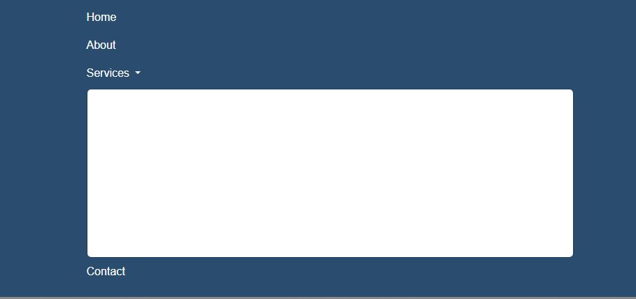
这就是它的样子
@import "./.fonts.css";
:root {
  --desktop: 1200px;
  --laptop: 992px;
  --tablet: 768px;
  --mobile: 576px;
}

body {
  background: hsl(233, 47%, 96%);
  font-family: 'Montserrat', sans-serif;
}

#copyright {
  border-top: 1px solid hsl(0, 0%, 20%);
}

.c-item {
  height: 900px;
}

.c-img {
  height: 100%;
  object-fit: cover;
  filter: brightness(0.6);
}

#team-img {
  height: 100%;
  object-fit: cover;
}

.dropdown:hover .dropdown-menu {
  display: block;
  background-color: hsl(210, 45%, 30%);
}

.dropdown-item:hover {
  background-color: hsl(210, 55%, 41%);
}

h3:after {
  background: none repeat scroll 0 0 hsl(210, 55%, 41%);
  bottom: -10px;
  content: "";
  display: block;
  height: 2px;
  position: relative;
  width: 100px;
}

h3 {
  font-weight: 300;
}

#sub-header {
  color: hsl(18, 100%, 62%);
}

#navbar-color {
  background-color: hsl(210, 45%, 30%);
}

.navbar-light .navbar-toggler-icon {
  background-image: url("data:image/svg+xml,%3csvg xmlns='http://www.w3.org/2000/svg' viewBox='0 0 30 30'%3e%3cpath stroke='rgba%28255, 255, 255, 1%29' stroke-linecap='round' stroke-miterlimit='10' stroke-width='2' d='M4 7h22M4 15h22M4 23h22'/%3e%3c/svg%3e");
}

.navbar-light .navbar-toggler {
  border: 1px solid white;
}


/* @media (min-width: 576px) {

} */

footer a i {
  color: hsl(0, 0%, 100%);
  text-decoration: none;
  color: white;
}


/* SMALL MEDIA QUERY */


/* @media screen and (min-width: var(--mobile)) and (max-width: var(--tablet)) { */

.dropdown:hover>.dropdown-menu {
  display: block;
  background-color: hsl(210, 45%, 30%);
  margin-top: 0;
  width: 175px;
  .btn {
    color: hsl(0, 0%, 100%);
  }
  .dropdown-item:hover {
    background-color: hsl(210, 55%, 41%);
  }
}

footer li:hover {
  color: hsl(24, 83%, 65%);
  transition: 0.2s;
}

footer i:hover {
  color: hsl(24, 83%, 65%);
  transition: 0.2s;
}


/* @media (min-width: 576px) {
        .nav-link::after {
            content: '';
            opacity: 0;
            transition: all 0.2s;
            height: 2px;
            width: 100%;
            background-color: hsl(18, 100%, 62%);
            position: absolute;
            bottom: 0;
            left: 0;
        }

        .nav-link:hover::after {
            opacity: 1;
            transition: all 0.2s;
        }
    } */


}
#nav_object {
  position: relative;
}
.nav-link:hover {
  /* text-decoration: underline; */
  /* border-bottom: 2px solid  hsl(18, 100%, 62%); */
}
#nav_object::after {
  content: '';
  opacity: 0;
  transition: all 0.2s;
  height: 2px;
  width: 100%;
  background-color: hsl(18, 100%, 62%);
  position: absolute;
  bottom: 0;
  left: 0;
}
#nav_object:hover::after {
  opacity: 1;
}
.nav-item a {
  position: relative;
}

.dropdown-toggle {
    color: white !important;
    }
<!doctype html>
<html lang="en">
<head>
<meta charset="utf-8" />
<meta name="viewport" content="width=device-width, initial-scale=1.0" />
<title>Home | </title>
<!-- <meta name="description" content="Write an awesome description for your new site here. It will appear in your document head meta (for Google search results) and in your feed.xml site description." /> -->
<link rel="stylesheet" href="/_bridgetown/static/css/main.c7d4dd3f1984a290e9be.css" />
<link href="https://cdn.jsdelivr.net/npm/[email protected]/dist/css/bootstrap.min.css" rel="stylesheet">
<link rel="stylesheet"
href="https://cdnjs.cloudflare.com/ajax/libs/font-awesome/6.4.0/css/all.min.css">
<link rel="stylesheet"
href="https://cdnjs.cloudflare.com/ajax/libs/font-awesome/6.4.0/css/all.min.css">
<link rel="stylesheet" href="./css/index.css" />
<link rel="stylesheet" href="./css/dropdown.css" />
<!-- <link rel="stylesheet" href="./css/login-modal.css"> -->
<link
rel="stylesheet"
data-purpose="Layout StyleSheet"
title="Default"
disabled
href="/css/app-937c1ff7d52fd6f78dd9322599e2b5d4.css?vsn=d"
>
<link
rel="stylesheet"
data-purpose="Layout StyleSheet"
title="Web Awesome"
href="/css/app-wa-8d95b745961f6b33ab3aa1b98a45291a.css?vsn=d"
>
<link
rel="stylesheet"
href="https://site-assets.fontawesome.com/releases/v6.4.0/css/all.css"
>
<link
rel="stylesheet"
href="https://site-assets.fontawesome.com/releases/v6.4.0/css/sharp-solid.css"
>
<link
rel="stylesheet"
href="https://site-assets.fontawesome.com/releases/v6.4.0/css/sharp-regular.css"
>
<link
rel="stylesheet"
href="https://site-assets.fontawesome.com/releases/v6.4.0/css/sharp-light.css"
>
<link rel="icon" type="image/x-icon" href="/Bootstrap-/images/favicon-32x32.png">
<script src="https://cdn.jsdelivr.net/npm/[email protected]/dist/js/bootstrap.bundle.min.js"></script>
</head>
<body>
<!-- NAVIGATION BAR START -->
<nav class="navbar navbar-expand-lg navbar-light py-3 sticky-top" id="navbar-color">
<div class="container">
<a href="/Bootstrap-/index.html">
<img src="./src/img/logo-topnav.png" height="45" width="225" class="img-fluid"/>
</a>
<!-- TOGGLE MENU START -->
<button
type="button"
class="navbar-toggler"
data-bs-toggle="collapse"
data-bs-target="#navmenu"
>
<span class="navbar-toggler-icon">
</button>
<!-- TOGGLE MENU CLOSE -->
<!-- TOGGLE MENU START -->
<div class="collapse navbar-collapse" id="navmenu">
<ul class="navbar-nav ms-auto">
<li class="nav-item"><a href="/Bootstrap-/index.html" class="nav-link text-white" id="nav_object">Home</a></li>
<li class="nav-item"><a href="/Bootstrap-/about.html" class="nav-link text-white" id="nav_object">About</a></li>
<li class="nav-item dropdown" id="dropdown">
<a class="nav-link dropdown-toggle" href="#" role="button" data-bs-toggle="dropdown" aria-expanded="false" id="">
Services
</a>
<ul class="dropdown-menu">
<!-- <li><a class="dropdown-item" href="#">Action</a></li>
<li><a class="dropdown-item" href="#">Another action</a></li> -->
<!-- <li><hr class="dropdown-divider"></li> -->
<li><a class="dropdown-item text-white" href="/Bootstrap-/cctv.html">CCTV Services</a></li>
<li><a class="dropdown-item text-white " href="/Bootstrap-/datacenter.html">Datacenter Support</a></li>
<li><a class="dropdown-item text-white" href="/Bootstrap-/digital-signage.html">Digital Signage</a></li>
<li><a class="dropdown-item text-white" href="/Bootstrap-/gen-support.html">General Support</a></li>
<li><a class="dropdown-item text-white " href="/Bootstrap-/net-support.html">Network Support</a></li>
<li><a class="dropdown-item text-white " href="/Bootstrap-/pos.html">POS Services</a></li>
<li><a class="dropdown-item text-white " href="/Bootstrap-/telecom.html">Telecom Services</a></li>
</ul>
</li>
<li class="nav-item"><a href="/Bootstrap-/contact.html" class="nav-link text-white" id="nav_object">Contact</a></li>
<script>
// Get the Services dropdown link element
const servicesDropdown = document.getElementById('servicesDropdown');
// Redirect to the services page when the dropdown link is clicked
servicesDropdown.addEventListener('click', function(event) {
event.preventDefault(); // Prevent default link behavior
window.location.href = this.getAttribute('href');
});
// Add the hover effect on desktop devices
if (window.matchMedia('(min-width: 576px)').matches) {
// When the mouse enters the dropdown link, show the dropdown menu
servicesDropdown.addEventListener('mouseenter', function() {
this.setAttribute('aria-expanded', 'true');
this.nextElementSibling.classList.add('show');
});
// When the mouse leaves the dropdown link or the dropdown menu, hide the dropdown menu
servicesDropdown.addEventListener('mouseleave', function() {
this.setAttribute('aria-expanded', 'false');
this.nextElementSibling.classList.remove('show');
});
}
</script>
<!-- TOGGLE MENU CLOSE -->
<!-- LOGIN/SIGNUP MODAL SECTION START -->
<!-- <button
type="button"
class="btn btn-primary"
data-bs-toggle="modal"
data-bs-target="#loginmodal"
>
Login/Signup
</button>
<div id="loginmodal" class="modal fade">
<div class="modal-dialog modal-dialog-centered">
<div class="modal-content">
<div class="modal-body">
<button
type="button"
class="btn-close btn-close-white"
data-bs-dismiss="modal"
></button>
<div class="myform bg-dark">
<h1 class="text-center" id="modal-styling">Login Form</h1>
<form action="#">
<div class="mb-3 mt-3">
<label for="email">Email Address</label>
<input type="email" class="form-control">
</div>
<div class="mb-3 mt-3">
<label for="password">Password</label>
<input type="passeord" class="form-control">
</div>
<button type="button" class="btn btn-light mt-3">LOGIN</button>
<p id="modal-styling">Don't have an account? <a href="#" id="modal-styling">Signup</a> </p>
</form>
</div>
</div>
</div>
</div>
</div> -->
<!-- LOGIN/SIGNUP MODAL SECTION CLOSE -->
</ul>
</div>
<!-- TOGGLE MENU CLOSE -->
</div>
</nav>
<!-- NAVIGATION BAR CLOSE -->
</body>
</html>1个回答
0
投票
投票
我无法重现您的屏幕截图中发生的情况。但是,当我将鼠标悬停在下拉列表中具有白色背景的项目上时。如果您使用 broser devtools 检查该元素,它会显示白色背景是由引导 CSS 中的这一行引起的
background-color: var(--bs-dropdown-link-hover-bg);所以我们只需要像这样覆盖 CSS 变量:
.dropdown-menu{
  --bs-dropdown-link-hover-bg: hsl(210, 55%, 41%) !important;
}
仅此而已。我已经完成了此操作,并注释掉了您尝试设置不再需要的这种颜色的其他一些 CSS。
@import "./.fonts.css";
:root {
  --desktop: 1200px;
  --laptop: 992px;
  --tablet: 768px;
  --mobile: 576px;
}

.dropdown-menu{
  --bs-dropdown-link-hover-bg: hsl(210, 55%, 41%) !important;
}

body {
  background: hsl(233, 47%, 96%);
  font-family: 'Montserrat', sans-serif;
}

#copyright {
  border-top: 1px solid hsl(0, 0%, 20%);
}

.c-item {
  height: 900px;
}

.c-img {
  height: 100%;
  object-fit: cover;
  filter: brightness(0.6);
}

#team-img {
  height: 100%;
  object-fit: cover;
}

.dropdown:hover .dropdown-menu {
  display: block;
  background-color: hsl(210, 45%, 30%);
}

/*
.dropdown-item:hover {
  background-color: hsl(210, 55%, 41%);
}
*/


h3:after {
  background: none repeat scroll 0 0 hsl(210, 55%, 41%);
  bottom: -10px;
  content: "";
  display: block;
  height: 2px;
  position: relative;
  width: 100px;
}

h3 {
  font-weight: 300;
}

#sub-header {
  color: hsl(18, 100%, 62%);
}

#navbar-color {
  background-color: hsl(210, 45%, 30%);
}

.navbar-light .navbar-toggler-icon {
  background-image: url("data:image/svg+xml,%3csvg xmlns='http://www.w3.org/2000/svg' viewBox='0 0 30 30'%3e%3cpath stroke='rgba%28255, 255, 255, 1%29' stroke-linecap='round' stroke-miterlimit='10' stroke-width='2' d='M4 7h22M4 15h22M4 23h22'/%3e%3c/svg%3e");
}

.navbar-light .navbar-toggler {
  border: 1px solid white;
}


/* @media (min-width: 576px) {

} */

footer a i {
  color: hsl(0, 0%, 100%);
  text-decoration: none;
  color: white;
}


/* SMALL MEDIA QUERY */


/* @media screen and (min-width: var(--mobile)) and (max-width: var(--tablet)) { */

.dropdown:hover>.dropdown-menu {
  display: block;
  background-color: hsl(210, 45%, 30%);
  margin-top: 0;
  width: 175px;
  .btn {
    color: hsl(0, 0%, 100%);
  }
  /*
  .dropdown-item:hover {
    background-color: hsl(210, 55%, 41%);
  }
  */
}

footer li:hover {
  color: hsl(24, 83%, 65%);
  transition: 0.2s;
}

footer i:hover {
  color: hsl(24, 83%, 65%);
  transition: 0.2s;
}


/* @media (min-width: 576px) {
        .nav-link::after {
            content: '';
            opacity: 0;
            transition: all 0.2s;
            height: 2px;
            width: 100%;
            background-color: hsl(18, 100%, 62%);
            position: absolute;
            bottom: 0;
            left: 0;
        }

        .nav-link:hover::after {
            opacity: 1;
            transition: all 0.2s;
        }
    } */


}
#nav_object {
  position: relative;
}
.nav-link:hover {
  /* text-decoration: underline; */
  /* border-bottom: 2px solid  hsl(18, 100%, 62%); */
}
#nav_object::after {
  content: '';
  opacity: 0;
  transition: all 0.2s;
  height: 2px;
  width: 100%;
  background-color: hsl(18, 100%, 62%);
  position: absolute;
  bottom: 0;
  left: 0;
}
#nav_object:hover::after {
  opacity: 1;
}
.nav-item a {
  position: relative;
}

.dropdown-toggle {
    color: white !important;
    }
<!doctype html>
<html lang="en">
<head>
<meta charset="utf-8" />
<meta name="viewport" content="width=device-width, initial-scale=1.0" />
<title>Home | </title>
<!-- <meta name="description" content="Write an awesome description for your new site here. It will appear in your document head meta (for Google search results) and in your feed.xml site description." /> -->
<link rel="stylesheet" href="/_bridgetown/static/css/main.c7d4dd3f1984a290e9be.css" />
<link href="https://cdn.jsdelivr.net/npm/[email protected]/dist/css/bootstrap.min.css" rel="stylesheet">
<link rel="stylesheet"
href="https://cdnjs.cloudflare.com/ajax/libs/font-awesome/6.4.0/css/all.min.css">
<link rel="stylesheet"
href="https://cdnjs.cloudflare.com/ajax/libs/font-awesome/6.4.0/css/all.min.css">
<link rel="stylesheet" href="./css/index.css" />
<link rel="stylesheet" href="./css/dropdown.css" />
<!-- <link rel="stylesheet" href="./css/login-modal.css"> -->
<link
rel="stylesheet"
data-purpose="Layout StyleSheet"
title="Default"
disabled
href="/css/app-937c1ff7d52fd6f78dd9322599e2b5d4.css?vsn=d"
>
<link
rel="stylesheet"
data-purpose="Layout StyleSheet"
title="Web Awesome"
href="/css/app-wa-8d95b745961f6b33ab3aa1b98a45291a.css?vsn=d"
>
<link
rel="stylesheet"
href="https://site-assets.fontawesome.com/releases/v6.4.0/css/all.css"
>
<link
rel="stylesheet"
href="https://site-assets.fontawesome.com/releases/v6.4.0/css/sharp-solid.css"
>
<link
rel="stylesheet"
href="https://site-assets.fontawesome.com/releases/v6.4.0/css/sharp-regular.css"
>
<link
rel="stylesheet"
href="https://site-assets.fontawesome.com/releases/v6.4.0/css/sharp-light.css"
>
<link rel="icon" type="image/x-icon" href="/Bootstrap-/images/favicon-32x32.png">
<script src="https://cdn.jsdelivr.net/npm/[email protected]/dist/js/bootstrap.bundle.min.js"></script>
</head>
<body>
<!-- NAVIGATION BAR START -->
<nav class="navbar navbar-expand-lg navbar-light py-3 sticky-top" id="navbar-color">
<div class="container">
<a href="/Bootstrap-/index.html">
<img src="./src/img/logo-topnav.png" height="45" width="225" class="img-fluid"/>
</a>
<!-- TOGGLE MENU START -->
<button
type="button"
class="navbar-toggler"
data-bs-toggle="collapse"
data-bs-target="#navmenu"
>
<span class="navbar-toggler-icon">
</button>
<!-- TOGGLE MENU CLOSE -->
<!-- TOGGLE MENU START -->
<div class="collapse navbar-collapse" id="navmenu">
<ul class="navbar-nav ms-auto">
<li class="nav-item"><a href="/Bootstrap-/index.html" class="nav-link text-white" id="nav_object">Home</a></li>
<li class="nav-item"><a href="/Bootstrap-/about.html" class="nav-link text-white" id="nav_object">About</a></li>
<li class="nav-item dropdown" id="dropdown">
<a class="nav-link dropdown-toggle" href="#" role="button" data-bs-toggle="dropdown" aria-expanded="false" id="">
Services
</a>
<ul class="dropdown-menu">
<!-- <li><a class="dropdown-item" href="#">Action</a></li>
<li><a class="dropdown-item" href="#">Another action</a></li> -->
<!-- <li><hr class="dropdown-divider"></li> -->
<li><a class="dropdown-item text-white" href="/Bootstrap-/cctv.html">CCTV Services</a></li>
<li><a class="dropdown-item text-white " href="/Bootstrap-/datacenter.html">Datacenter Support</a></li>
<li><a class="dropdown-item text-white" href="/Bootstrap-/digital-signage.html">Digital Signage</a></li>
<li><a class="dropdown-item text-white" href="/Bootstrap-/gen-support.html">General Support</a></li>
<li><a class="dropdown-item text-white " href="/Bootstrap-/net-support.html">Network Support</a></li>
<li><a class="dropdown-item text-white " href="/Bootstrap-/pos.html">POS Services</a></li>
<li><a class="dropdown-item text-white " href="/Bootstrap-/telecom.html">Telecom Services</a></li>
</ul>
</li>
<li class="nav-item"><a href="/Bootstrap-/contact.html" class="nav-link text-white" id="nav_object">Contact</a></li>
<script>
// Get the Services dropdown link element
const servicesDropdown = document.getElementById('servicesDropdown');
// Redirect to the services page when the dropdown link is clicked
servicesDropdown.addEventListener('click', function(event) {
event.preventDefault(); // Prevent default link behavior
window.location.href = this.getAttribute('href');
});
// Add the hover effect on desktop devices
if (window.matchMedia('(min-width: 576px)').matches) {
// When the mouse enters the dropdown link, show the dropdown menu
servicesDropdown.addEventListener('mouseenter', function() {
this.setAttribute('aria-expanded', 'true');
this.nextElementSibling.classList.add('show');
});
// When the mouse leaves the dropdown link or the dropdown menu, hide the dropdown menu
servicesDropdown.addEventListener('mouseleave', function() {
this.setAttribute('aria-expanded', 'false');
this.nextElementSibling.classList.remove('show');
});
}
</script>
<!-- TOGGLE MENU CLOSE -->
<!-- LOGIN/SIGNUP MODAL SECTION START -->
<!-- <button
type="button"
class="btn btn-primary"
data-bs-toggle="modal"
data-bs-target="#loginmodal"
>
Login/Signup
</button>
<div id="loginmodal" class="modal fade">
<div class="modal-dialog modal-dialog-centered">
<div class="modal-content">
<div class="modal-body">
<button
type="button"
class="btn-close btn-close-white"
data-bs-dismiss="modal"
></button>
<div class="myform bg-dark">
<h1 class="text-center" id="modal-styling">Login Form</h1>
<form action="#">
<div class="mb-3 mt-3">
<label for="email">Email Address</label>
<input type="email" class="form-control">
</div>
<div class="mb-3 mt-3">
<label for="password">Password</label>
<input type="passeord" class="form-control">
</div>
<button type="button" class="btn btn-light mt-3">LOGIN</button>
<p id="modal-styling">Don't have an account? <a href="#" id="modal-styling">Signup</a> </p>
</form>
</div>
</div>
</div>
</div>
</div> -->
<!-- LOGIN/SIGNUP MODAL SECTION CLOSE -->
</ul>
</div>
<!-- TOGGLE MENU CLOSE -->
</div>
</nav>
<!-- NAVIGATION BAR CLOSE -->
</body>
</html>最新问题
- 错误:函数组件不能有字符串引用。我们建议使用 useRef() 代替
- 具有全局组件和 TypeScript 支持的 Vue 3 库
- 松木脚本< closing one indicator when another has triggered>
- 如何使用jquery将数据从表导出到csv文件
- ASP.NET NormalizedUsername 在更新用户数据时发生变化
- 如何让超链接出现在页面右侧?
- 如何在 Windows 上使用 ffmpeg 从网络摄像头录制视频和音频?
- 没有名为 ipykernel_launcher 的模块
- 避免参数内传入查询中的 SQL 注入
- 使用python生成一个显示好友数量的字典
- 堆栈处于 UPDATE_COMPLETE_CLEANUP_IN_PROGRESS 状态且无法更新
- 使用 jQuery 在引导网格中添加/删除元素并防止删除第一个元素
- Python Pandas – 如何抑制 PerformanceWarning?
- 尝试通过powershell操纵输出
- 通过 Codeigniter 的活动记录方法从带有 LIMIT 的 suquery 中选择 SUM()
- 相当于 JavaScript 的 addEventListener 方法的 jQuery
- 艾美特的新线路
- “/”应用程序中服务器错误,找不到资源
- 如何比较两个共享相同内容的StructType?
- Terraform aws_lambda_function 需要 ECR 中的 Docker 映像
© www.soinside.com 2019 - 2024. All rights reserved.