React Native-创建形状的弯曲边缘
问题描述 投票:3回答:1
问题摘要
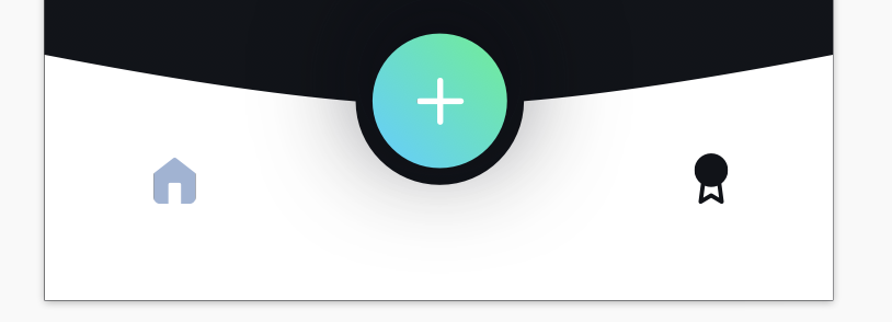
我对正在构建的应用程序具有下面的底部导航栏,但我不确定如何设置其样式,因为它比过去的样式复杂得多。我在设计白色部分的弯曲顶部边缘以及蓝色/绿色圆圈和白色部分之间的区域时遇到麻烦。
[我从模型中包括了导航栏的外观,因为它们之一似乎融合在一起。绿色/蓝色圆圈和白色部分之间的白色部分上方的黑色背景不应使用此导航栏设置样式,应该是在导航栏后面看到的背景。
任何帮助将不胜感激!
  <View style={styles.container}>
  </View>

container: {
    width: windowWidth,
    height: windowHeight * 0.1020935961,
    backgroundColor: "white",
    flexDirection: "row",
    justifyContent: "space-around",
    borderTopLeftRadius: -50,
    borderTopRightRadius: -50
  }
完整代码
const CustomTabNav = () => (
  <View style={styles.container}>
    <TouchableOpacity
      style={styles.instant}
      onPress={() => {
        NavigationService.navigate("Home");
      }}
    >
      <Image
        style={styles.homeImage}
        source={require("~/assets/images/homeIcon.png")}
      />
    </TouchableOpacity>
    <TouchableOpacity
      style={styles.ovalCopy}
      onPress={() => NavigationService.navigate("Competitions")}
    >
      <LinearGradient
        start={{ x: 0, y: 1 }}
        end={{ x: 1, y: 0 }}
        colors={[buttonGradientBlueColor, buttonGradientGreenColor]}
        style={styles.linearGradient}
      >
        <Image
          style={styles.plusImage}
          source={require("~/assets/images/plus.png")}
        />
      </LinearGradient>
    </TouchableOpacity>
    <TouchableOpacity
      style={styles.instant}
      onPress={() => NavigationService.navigate("Competitions")}
    >
      <Image
        style={styles.instantImage}
        source={require("~/assets/images/competitions.png")}
      />
    </TouchableOpacity>
  </View>
);

const styles = StyleSheet.create({
  container: {
    width: windowWidth,
    height: windowHeight * 0.1020935961,
    backgroundColor: "white",
    flexDirection: "row",
    justifyContent: "space-around",
    borderTopLeftRadius: -50,
    borderTopRightRadius: -50
  },
  homeImage: {
    width: windowWidth * 0.05,
    height: windowWidth * 0.05
  },
  instant: {
    flexDirection: "column",
    // alignSelf: 'center',
    justifyContent: "center"
  },
  instantImage: {
    width: windowWidth * 0.05,
    height: windowWidth * 0.05
  },
  ovalCopy: {
    width: 64,
    height: 64,
  },
  linearGradient: {
    borderRadius: 50, //TODO: make sure this is correct
    width: 64,
    height: 64,
    shadowColor: "#0a0b12cc",
    shadowOffset: {
      width: 0,
      height: -10
    },
    shadowRadius: 60,
    shadowOpacity: 1,
    alignItems: 'center',
    justifyContent: 'center'
  },
  plusImage: {
    width: windowWidth*0.064,
    height: windowWidth*0.064
  }
});
1个回答
0
投票
投票
[嘿,我想您可以用困难的方式做到,例如制作背景图片以获取弯曲的白色背景。或者,您可以在白色视图之上叠加2个“黑灰色”视图。第一个“黑灰色”可能像带有难以置信的大borderRadius,第二个是“ 100%”圆圈,比+按钮稍大。这就是我的意思:
<View style={{ flex: 1, backgroundColor:"white",height: HEIGHT ,width:WIDTH, alignItems: 'center', justifyContent: 'flex-start' }}>
            <View style={{ backgroundColor:"black",borderBottomLeftRadius:WIDTH*10,borderBottomRightRadius:WIDTH*10,height: HEIGHT*.6 ,width:WIDTH*2, alignItems: 'center', justifyContent: 'center' }}>
</View>
            <View style={{ backgroundColor:"black",borderRadius:60,height: 120 ,width:120, marginTop:-60,alignItems: 'center', justifyContent: 'center' }}>
                <View style={{ backgroundColor:"white",borderRadius:40,height: 80 ,width:80 ,alignItems: 'center', justifyContent: 'center' }}>
                    <Icon name="chevron-left" size={30} />
                </View>
            </View>
            <View style={{ backgroundColor:"transparent",height: 120 ,width:WIDTH, marginTop:-60,flexDirection:"row",padding:20, justifyContent: 'space-between' }}>
                <Icon name="chevron-left" size={30} />
                <Icon name="chevron-left" size={30} />
            </View>
    </View>
将获得的屏幕快照:Screenshoot
最新问题
- 通过三种方法计算CCA
- 通过预签名 URL 使用 Next.JS 应用程序访问 S3 中的文件不起作用 - 被 CORS 阻止
- Python 与 CustomTkinter - 将应用程序拆分为多个 python 文件
- SQS 处理传入消息大约需要 10 秒,这正常吗?可以加快速度吗?
- Google 一键登录有效,但正常的 google 登录不起作用
- 用给定的一组点扭曲图像
- iOS 上由 AWS(Route 53 + ELB)托管的 Django 后端上的 NSUrlErrorDomain -1004
- 将 JSON 字符串转换为 JSON 对象并保留所有数据
- 按 pandas 分组,同时保留所有行和列
- 尝试将React程序从16升级到17
- 如何通过 REST API 自己重现工作流程图
- PowerPoint 2007 - 在包含文本的表格、图表等上设置语言
- Flutter - 列中扩展小部件内的文本溢出
- js-sequence-diagrams 中的错误:较大图中的文本与箭头重叠
- GStreamer 1.24 Python 绑定已列入黑名单
- 有没有办法下载谷歌数据表单存储库?
- 如何在 Laravel 11 中将服务提供者发布到应用程序
- 如何提供整数列表作为selenium中的输入
- 合并时触发 Gitlab CI 管道
- 我不明白为什么Django内置的“Reverse”功能不起作用
© www.soinside.com 2019 - 2024. All rights reserved.