WPF TreeView:如何使控件相对于每个TreeViewItem对齐,但仍获得标题文本的缩进效果?
问题描述 投票:1回答:1
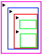
这是我要完成的目标的视觉化想法:
我希望左右两侧的所有按钮都垂直对齐,而不管TreeViewItem在树中的位置。我在实现这种效果时遇到了麻烦,同时还使标题以典型的嵌套方式缩进。
我最近的尝试涉及修改TreeViewItem模板;将按钮放入跨越主网格中所有列的DockPanel(向左或向右停靠),将扩展器和标题放在中间列,并使ItemsPresenter(ItemsHost)跨越下一行的所有列。这使everything对齐,包括标题内容。
这是我目前对TreeViewItem样式的简化版本:
<Style x:Key="ExpandCollapseToggleStyle" TargetType="{x:Type ToggleButton}">
    <Setter Property="Focusable" Value="False"/>
    <Setter Property="Width" Value="16"/>
    <Setter Property="Height" Value="16"/>
    <Setter Property="Template">
        <Setter.Value>
            <ControlTemplate TargetType="{x:Type ToggleButton}">
                <Border Background="Transparent" Height="16" Padding="5,5,5,5" Width="16">
                    <Path x:Name="ExpandPath" Data="{StaticResource TreeArrow}" Fill="{StaticResource TreeViewItem.TreeArrow.Static.Fill}" Stroke="{StaticResource TreeViewItem.TreeArrow.Static.Stroke}">
                        <Path.RenderTransform>
                            <RotateTransform Angle="135" CenterY="3" CenterX="3"/>
                        </Path.RenderTransform>
                    </Path>
                </Border>
                <ControlTemplate.Triggers>
                    <Trigger Property="IsChecked" Value="True">
                        <Setter Property="RenderTransform" TargetName="ExpandPath">
                            <Setter.Value>
                                <RotateTransform Angle="180" CenterY="3" CenterX="3"/>
                            </Setter.Value>
                        </Setter>
                        <Setter Property="Fill" TargetName="ExpandPath" Value="{StaticResource TreeViewItem.TreeArrow.Static.Checked.Fill}"/>
                        <Setter Property="Stroke" TargetName="ExpandPath" Value="{StaticResource TreeViewItem.TreeArrow.Static.Checked.Stroke}"/>
                    </Trigger>
                    <Trigger Property="IsMouseOver" Value="True">
                        <Setter Property="Stroke" TargetName="ExpandPath" Value="{StaticResource TreeViewItem.TreeArrow.MouseOver.Stroke}"/>
                        <Setter Property="Fill" TargetName="ExpandPath" Value="{StaticResource TreeViewItem.TreeArrow.MouseOver.Fill}"/>
                    </Trigger>
                    <MultiTrigger>
                        <MultiTrigger.Conditions>
                            <Condition Property="IsMouseOver" Value="True"/>
                            <Condition Property="IsChecked" Value="True"/>
                        </MultiTrigger.Conditions>
                        <Setter Property="Stroke" TargetName="ExpandPath" Value="{StaticResource TreeViewItem.TreeArrow.MouseOver.Checked.Stroke}"/>
                        <Setter Property="Fill" TargetName="ExpandPath" Value="{StaticResource TreeViewItem.TreeArrow.MouseOver.Checked.Fill}"/>
                    </MultiTrigger>
                </ControlTemplate.Triggers>
            </ControlTemplate>
        </Setter.Value>
    </Setter>
</Style>

<HierarchicalDataTemplate x:Key="HeaderTemplate" DataType="{x:Type models:Entity}" ItemsSource="{Binding Path=Entities}">
    <Label VerticalAlignment="Center">test</Label>
</HierarchicalDataTemplate>

<Style TargetType="{x:Type TreeViewItem}">
    <Setter Property="HeaderTemplate" Value="{StaticResource HeaderTemplate}"></Setter>
    <Setter Property="Background" Value="Transparent"/>
    <Setter Property="HorizontalContentAlignment" Value="{Binding HorizontalContentAlignment, RelativeSource={RelativeSource AncestorType={x:Type ItemsControl}}}"/>
    <Setter Property="VerticalContentAlignment" Value="{Binding VerticalContentAlignment, RelativeSource={RelativeSource AncestorType={x:Type ItemsControl}}}"/>
    <Setter Property="Foreground" Value="{DynamicResource {x:Static SystemColors.ControlTextBrushKey}}"/>
    <Setter Property="FocusVisualStyle" Value="{StaticResource TreeViewItemFocusVisual}"/>
    <Setter Property="HorizontalAlignment" Value="Left"></Setter>
    <Setter Property="Template">
        <Setter.Value>
            <ControlTemplate TargetType="{x:Type TreeViewItem}">
                <Grid HorizontalAlignment="Left" Width="300">
                    <Grid.ColumnDefinitions>
                        <ColumnDefinition Width="30"></ColumnDefinition>
                        <ColumnDefinition Width="*"></ColumnDefinition>
                        <ColumnDefinition Width="30"></ColumnDefinition>
                    </Grid.ColumnDefinitions>

                    <Grid.RowDefinitions>
                        <RowDefinition Height="Auto"/>
                        <RowDefinition/>
                    </Grid.RowDefinitions>

                    <DockPanel Grid.Column="0" Grid.ColumnSpan="3" Grid.Row="0" Margin="1,0,0,0">
                        <Button
                            DockPanel.Dock="Left"/>

                        <Button
                            DockPanel.Dock="Left"/>

                        <Button
                            DockPanel.Dock="Left"
                        Margin="0"/>

                        <Button
                            DockPanel.Dock="Right"
                            HorizontalAlignment="Right"/>

                        <Button
                            DockPanel.Dock="Right"
                            HorizontalAlignment="Right"/>

                        <Button
                            DockPanel.Dock="Right"
                            HorizontalAlignment="Right"/>
                    </DockPanel>

                    <StackPanel Orientation="Horizontal" Grid.Column="1" Grid.Row="0" Margin="25,0,0,0">
                        <ToggleButton x:Name="Expander" ClickMode="Press" Margin="15,0,0,0" IsChecked="{Binding IsExpanded, RelativeSource={RelativeSource TemplatedParent}}" Style="{StaticResource ExpandCollapseToggleStyle}"/>

                        <Border x:Name="Bd" BorderBrush="{TemplateBinding BorderBrush}" BorderThickness="{TemplateBinding BorderThickness}" Background="{TemplateBinding Background}" Padding="{TemplateBinding Padding}" SnapsToDevicePixels="true">
                            <ContentPresenter x:Name="PART_Header"  ContentSource="Header" HorizontalAlignment="{TemplateBinding HorizontalContentAlignment}" VerticalAlignment="{TemplateBinding VerticalContentAlignment}" SnapsToDevicePixels="{TemplateBinding SnapsToDevicePixels}"/>
                        </Border>

                    </StackPanel>

                    <ItemsPresenter x:Name="ItemsHost" Grid.Row="1" Grid.Column="0" Grid.ColumnSpan="3" Width="305"/>
                </Grid>

                <ControlTemplate.Triggers>
                    <Trigger Property="IsExpanded" Value="false">
                        <Setter Property="Visibility" TargetName="ItemsHost" Value="Collapsed"/>
                    </Trigger>
                    <Trigger Property="HasItems" Value="false">
                        <Setter Property="Visibility" TargetName="Expander" Value="Hidden"/>
                    </Trigger>
                    <Trigger Property="IsSelected" Value="true">
                        <Setter Property="Background" TargetName="Bd" Value="{DynamicResource {x:Static SystemColors.HighlightBrushKey}}"/>
                        <Setter Property="Foreground" Value="{DynamicResource {x:Static SystemColors.HighlightTextBrushKey}}"/>
                    </Trigger>
                    <MultiTrigger>
                        <MultiTrigger.Conditions>
                            <Condition Property="IsSelected" Value="true"/>
                            <Condition Property="IsSelectionActive" Value="false"/>
                        </MultiTrigger.Conditions>
                        <Setter Property="Background" TargetName="Bd" Value="{DynamicResource {x:Static SystemColors.InactiveSelectionHighlightBrushKey}}"/>
                        <Setter Property="Foreground" Value="{DynamicResource {x:Static SystemColors.InactiveSelectionHighlightTextBrushKey}}"/>
                    </MultiTrigger>
                    <Trigger Property="IsEnabled" Value="false">
                        <Setter Property="Foreground" Value="{DynamicResource {x:Static SystemColors.GrayTextBrushKey}}"/>
                    </Trigger>
                </ControlTemplate.Triggers>
            </ControlTemplate>
        </Setter.Value>
    </Setter>
</Style>
如何在保持停靠按钮对齐的同时让标题像图片一样嵌套?
1个回答
投票
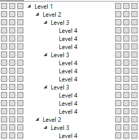
您到现在为止可能已经知道,这并不简单。问题在于,与ListBox和DataGrid等不同,TreeView没有类似行的结构。相反,它使用看起来像这样的层次结构:
有一个包裹整个控件的网格,但是对于任何给定的“行”,TreeViewItem不会一直延伸到要放置按钮的左侧。
因此,要实现此目标,您将必须重新模板TreeViewItem。默认模板使用网格放置其内容,行内容位于第0行,子级(如果有)位于第1行。重要的是,子级也位于第1列,这是TreeView进行缩进的方式。因此,第一步是在左侧添加3列,在右侧添加3列,以容纳要添加到每一行的六个按钮。然后,您将需要在每个级别上更改ItemsPresenter的Grid.Column和Grid.ColumnSpan,以使其占据整个控件的宽度。
当然,现在的问题是,您已经失去了缩进,因此您必须在网格中添加另一列以将其重新添加。要在任何给定级别正确缩进,您需要了解缩进其父级,该父级以前是布局本身固有的,但现在已被删除。有几种解决方法,但是最简单的IMO是使用附加属性,我将其称为TreeViewItemHelper.Indent。对于TreeView中的每个ItemsPresenter,您都需要计算要用于当前级别以下所有子级的缩进:
<ItemsPresenter x:Name="ItemsHost" Grid.ColumnSpan="10" Grid.Column="0" Grid.Row="1"
    local:TreeViewItemHelper.Indent="{Binding Path=(local:TreeViewItemHelper.Indent), Mode=OneWay, RelativeSource={RelativeSource AncestorType=ItemsPresenter}, Converter={StaticResource IndentConverter}}" />
[请注意,我实际上并没有在这里使用任何值,只是通过将每个TreeViewItemHelper.Indent绑定到上一级中的值,然后通过简单地增加固定量(即宽度用于扩展树节点的ToggleButton的设置):
public object Convert(object value, Type targetType, object parameter, CultureInfo culture)
{
    return new GridLength(((GridLength)value).Value + IndentSize);
}
最后,您需要将缩进实际应用于某处。我们已经在网格中为其创建了一个列,因此我们可以向该列添加一个虚拟控件,并将其宽度绑定到它所在的任何ItemsPresenter的缩进级别:
<Rectangle Grid.Column="3" Width="{Binding Path=(local:TreeViewItemHelper.Indent).Value, Mode=OneWay, RelativeSource={RelativeSource AncestorType=ItemsPresenter}}" Fill="Transparent"/>
将所有内容加在一起,摇匀,这是XAML看起来像重新模板TreeViewItem并为其分配样式的样子:
<local:IndentConverter x:Key="IndentConverter" />

<ControlTemplate x:Key="TreeViewItemControlTemplate1" TargetType="{x:Type TreeViewItem}">
    <Grid x:Name="tvGrid">
        <Grid.ColumnDefinitions>
            <ColumnDefinition Width="Auto"/>
            <ColumnDefinition Width="Auto"/>
            <ColumnDefinition Width="Auto"/>
            <ColumnDefinition Width="Auto"/>
            <!--<ColumnDefinition Width="0"/>-->
            <ColumnDefinition MinWidth="19" Width="Auto"/>
            <ColumnDefinition Width="Auto"/>
            <ColumnDefinition Width="*"/>
            <ColumnDefinition Width="Auto"/>
            <ColumnDefinition Width="Auto"/>
            <ColumnDefinition Width="Auto"/>
        </Grid.ColumnDefinitions>
        <Grid.RowDefinitions>
            <RowDefinition Height="Auto"/>
            <RowDefinition/>
        </Grid.RowDefinitions>

        <!-- Left buttons -->
        <Button Grid.Column="0" Width="12" Height="12" HorizontalAlignment="Center" VerticalAlignment="Center" Margin="2" />
        <Button Grid.Column="1" Width="12" Height="12" HorizontalAlignment="Center" VerticalAlignment="Center" Margin="2" />
        <Button Grid.Column="2" Width="12" Height="12" HorizontalAlignment="Center" VerticalAlignment="Center" Margin="2" />

        <Rectangle Grid.Column="3" Width="{Binding Path=(local:TreeViewItemHelper.Indent).Value, Mode=OneWay, RelativeSource={RelativeSource AncestorType=ItemsPresenter}}" Fill="Transparent"/>

        <ToggleButton x:Name="Expander" Grid.Column="4" ClickMode="Press" IsChecked="{Binding IsExpanded, RelativeSource={RelativeSource TemplatedParent}}">
            <ToggleButton.Style>
                <Style TargetType="{x:Type ToggleButton}">
                    <Setter Property="Focusable" Value="False"/>
                    <Setter Property="Width" Value="16"/>
                    <Setter Property="Height" Value="16"/>
                    <Setter Property="Template">
                        <Setter.Value>
                            <ControlTemplate TargetType="{x:Type ToggleButton}">
                                <Border Background="Transparent" Height="16" Padding="5" Width="16">
                                    <Path x:Name="ExpandPath" Data="M0,0 L0,6 L6,0 z" Fill="White" Stroke="#FF818181">
                                        <Path.RenderTransform>
                                            <RotateTransform Angle="135" CenterY="3" CenterX="3"/>
                                        </Path.RenderTransform>
                                    </Path>
                                </Border>
                                <ControlTemplate.Triggers>
                                    <Trigger Property="IsChecked" Value="True">
                                        <Setter Property="RenderTransform" TargetName="ExpandPath">
                                            <Setter.Value>
                                                <RotateTransform Angle="180" CenterY="3" CenterX="3"/>
                                            </Setter.Value>
                                        </Setter>
                                        <Setter Property="Fill" TargetName="ExpandPath" Value="#FF595959"/>
                                        <Setter Property="Stroke" TargetName="ExpandPath" Value="#FF262626"/>
                                    </Trigger>
                                    <Trigger Property="IsMouseOver" Value="True">
                                        <Setter Property="Stroke" TargetName="ExpandPath" Value="#FF27C7F7"/>
                                        <Setter Property="Fill" TargetName="ExpandPath" Value="#FFCCEEFB"/>
                                    </Trigger>
                                    <MultiTrigger>
                                        <MultiTrigger.Conditions>
                                            <Condition Property="IsMouseOver" Value="True"/>
                                            <Condition Property="IsChecked" Value="True"/>
                                        </MultiTrigger.Conditions>
                                        <Setter Property="Stroke" TargetName="ExpandPath" Value="#FF1CC4F7"/>
                                        <Setter Property="Fill" TargetName="ExpandPath" Value="#FF82DFFB"/>
                                    </MultiTrigger>
                                </ControlTemplate.Triggers>
                            </ControlTemplate>
                        </Setter.Value>
                    </Setter>
                </Style>
            </ToggleButton.Style>
        </ToggleButton>
        <Border x:Name="Bd" BorderBrush="{TemplateBinding BorderBrush}" BorderThickness="{TemplateBinding BorderThickness}" Background="{TemplateBinding Background}" Grid.Column="5" Padding="{TemplateBinding Padding}" SnapsToDevicePixels="True">
            <ContentPresenter x:Name="PART_Header" ContentTemplate="{TemplateBinding HeaderTemplate}" Content="{TemplateBinding Header}" ContentStringFormat="{TemplateBinding HeaderStringFormat}" ContentSource="Header" HorizontalAlignment="{TemplateBinding HorizontalContentAlignment}" SnapsToDevicePixels="{TemplateBinding SnapsToDevicePixels}"/>
        </Border>

        <!-- Right buttons -->
        <Button Grid.Column="7" Width="12" Height="12" HorizontalAlignment="Center" VerticalAlignment="Center" Margin="2" />
        <Button Grid.Column="8" Width="12" Height="12" HorizontalAlignment="Center" VerticalAlignment="Center" Margin="2" />
        <Button Grid.Column="9" Width="12" Height="12" HorizontalAlignment="Center" VerticalAlignment="Center" Margin="2" />

        <ItemsPresenter x:Name="ItemsHost" Grid.ColumnSpan="10" Grid.Column="0" Grid.Row="1"
            local:TreeViewItemHelper.Indent="{Binding Path=(local:TreeViewItemHelper.Indent), Mode=OneWay, RelativeSource={RelativeSource AncestorType=ItemsPresenter}, Converter={StaticResource IndentConverter}}" />
    </Grid>
    <ControlTemplate.Triggers>
        <Trigger Property="IsExpanded" Value="False">
            <Setter Property="Visibility" TargetName="ItemsHost" Value="Collapsed"/>
        </Trigger>
        <Trigger Property="HasItems" Value="False">
            <Setter Property="Visibility" TargetName="Expander" Value="Hidden"/>
        </Trigger>
        <Trigger Property="IsSelected" Value="True">
            <Setter Property="Background" TargetName="Bd" Value="{DynamicResource {x:Static SystemColors.HighlightBrushKey}}"/>
            <Setter Property="Foreground" Value="{DynamicResource {x:Static SystemColors.HighlightTextBrushKey}}"/>
        </Trigger>
        <MultiTrigger>
            <MultiTrigger.Conditions>
                <Condition Property="IsSelected" Value="True"/>
                <Condition Property="IsSelectionActive" Value="False"/>
            </MultiTrigger.Conditions>
            <Setter Property="Background" TargetName="Bd" Value="{DynamicResource {x:Static SystemColors.InactiveSelectionHighlightBrushKey}}"/>
            <Setter Property="Foreground" Value="{DynamicResource {x:Static SystemColors.InactiveSelectionHighlightTextBrushKey}}"/>
        </MultiTrigger>
        <Trigger Property="IsEnabled" Value="False">
            <Setter Property="Foreground" Value="{DynamicResource {x:Static SystemColors.GrayTextBrushKey}}"/>
        </Trigger>
    </ControlTemplate.Triggers>
</ControlTemplate>

    <Style TargetType="TreeViewItem">
        <Setter Property="Template" Value="{DynamicResource TreeViewItemControlTemplate1}" />
        <Setter Property="IsExpanded" Value="True" />
    </Style>
这是它使用的附加属性的类:
public static class TreeViewItemHelper
{
    public static GridLength GetIndent(DependencyObject obj)
    {
        return (GridLength)obj.GetValue(IndentProperty);
    }

    public static void SetIndent(DependencyObject obj, GridLength value)
    {
        obj.SetValue(IndentProperty, value);
    }

    // Using a DependencyProperty as the backing store for Indent.  This enables animation, styling, binding, etc...
    public static readonly DependencyProperty IndentProperty =
        DependencyProperty.RegisterAttached("Indent", typeof(GridLength), typeof(TreeViewItemHelper), new PropertyMetadata(new GridLength(0)));
}
最后是缩进转换器:
public class IndentConverter : IValueConverter
{
    private const int IndentSize = 16;  // hard-coded into the XAML template

    public object Convert(object value, Type targetType, object parameter, CultureInfo culture)
    {
        return new GridLength(((GridLength)value).Value + IndentSize);
    }

    public object ConvertBack(object value, Type targetType, object parameter, CultureInfo culture)
    {
        return Binding.DoNothing;
    }
}
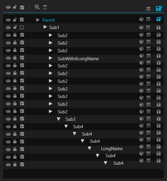
这是结果:
最新问题
- 为什么 TypeScript 让我使用界面上未定义的键?
- 为什么“x”的值改变了? [重复]
- 当您没有 Java POJO 时,反序列化 avro 消息的预期结果是什么?
- Xcode 上的退出代码 4 表示什么?
- 在流识别Python代码中使用生成器
- 如何使用协程将咖啡因缓存添加到 kotlin 的首选方法是什么
- React Native 错误 - Reanimated 的本机部分似乎没有初始化
- 终止由 Chromium 和 Selenium WebDriver 创建的不必要的 chrome 进程
- iOS 上的毛伊岛晴雨表读数导致应用程序崩溃
- 我如何更新反冲状态对象的特定值
- 将字节数组反序列化为结构体
- 如何获取API分页最后一页
- 如何让翻译相互借鉴
- 在java中使用selenium webdriver登录Gmail
- onUpdateAvailable 和 onInstall 事件。它们是如何工作的?
- 使用概念检查仅具有部分已知模板参数的模板类的继承
- 依赖intl ^0.19.0,版本解决失败
- 2 个或更多 .coverage 文件的差异(来自 Azure DevOps 代码覆盖率选项卡)
- HTML - 加载页面时的警报框
- Python列表同步更新[重复]