如何按列垂直对齐项目,但不在列内水平对齐
问题描述 投票:0回答:3
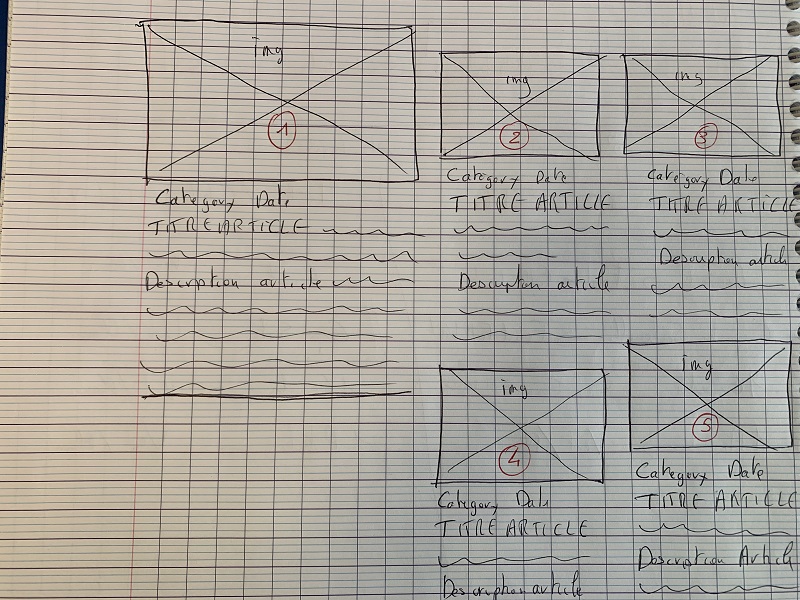
我的问题是: 如何使文章“4”和“5”根据位于它们上方的文章的高度定位自己,并且不对齐
我尝试了这 3 种解决方案但没有成功:
1/ 使用 css Grid -> css grid 允许我根据需要定位 5 个元素,除了这个高度对齐问题! 使用 css 网格,无论元素“2”和“3”的高度如何,元素“4”和“5”都对齐
2/ 使用 css Flex -> css flex 允许我根据需要定位 5 个元素,除了这个高度对齐问题! 我从这个页面得到了帮助: 网址: 但即使使用“align-items”和“align-self”我也无法让项目“4”和“5”与项目“2”和“3”的高度成比例地上升
3/ MASONRY -> 我也尝试过这种方法:
此方法使用css中的列:
.masonry { /\* Masonry container \*/
column-count: 4;
column-gap: 1em;
}

.item { /\* Masonry bricks or child elements \*/
background-color: #eee;
display: inline-block;
margin: 0 0 1em;
width: 100%;
}
我对这种方法的问题是项目在列内垂直显示
这是一个新闻站点,元素显示的顺序很重要:元素必须水平显示顺序
3个回答
0
投票
投票
试试这个:
.container {
  display: flex;
  justify-content: center;
  width: 100%;
}
.item {
  background-color: green;
  margin: 10px;
}
.col {
  display: flex;
  flex-direction: column;
}
<div class="container">
<div class="col col1">
<div class="item">Item 1</div>
</div>
<div class="col col2">
<div class="item">Item 2</div>
<div class="item">Item 4</div>
</div>
<div class="col col3">
<div class="item">Item 3</div>
<div class="item">Item 5</div>
</div>
</div>0
投票
投票
没有有效的代码片段很难调试,但如果我理解正确,我会按如下方式进行。
使用 flexbox 方法让你到达那里的大部分时间,但是将第 2 + 3 列放在一个单独的
<div>或者,为所有列设置一个
min-height0
投票
投票
我推荐Macy.js。调用文档:
使用脚本标签包括:
<script src="https://cdn.jsdelivr.net/npm/macy@2"></script>
并在 JavaScript 中添加以下代码:
var macy = Macy({
    container: '#macy-container', //Change to the parent element of the articals
    trueOrder: true,
    waitForImages: false, //If there are images set this to true
    margin: 24, //The gap between the columns
    columns: 2, //Total columns
    breakAt: { //Columns for each screen width (optional)
        1200: 5,
        940: 3,
        520: 2,
        400: 1
    }
});
查看文档以获取更多信息。
希望对您有所帮助!
最新问题
- <pre>需要什么CSS来换行长线,但只是所需的最小宽度?
- Laravel:ServiceProvider 中的 mcamara/laravel 本地化
- log.d(TAG, message)中的TAG是什么?
- Android 摘要魔法
- CXX1405 cmake 构建 android 项目时出现异常
- 七段显示不全
- 为什么C++11允许GC? [已关闭]
- WPF 应用程序资源定位器无法定位文件
- C++中如何定义匿名函数?
- “concat”这个词的实际或最初含义是什么?
- C++ winapi:如何将当前时间转换为字符串?
- SO是一场狗屎秀。感谢您的搭车。强制编译时 constexpr [重复]
- 如何随着行数的增加动态添加分页按钮到 HTML 表格的右下角?
- Haskell类型的具体数据构造函数
- 返回对临时、常量差异的引用
- 每隔几次访问后,Laravel cookie 存储就会超出
- 在 PLSQL 中使用 REGEXP_Replace 删除字符串末尾的 Char(13) 和 Char(10)
- 如何从父文件夹导入模块 python(Databricks 作业 - Python 脚本)?
- Vue3 prop String 或 PropType
- 使用 URL 获取 HEAD 提交哈希
© www.soinside.com 2019 - 2024. All rights reserved.